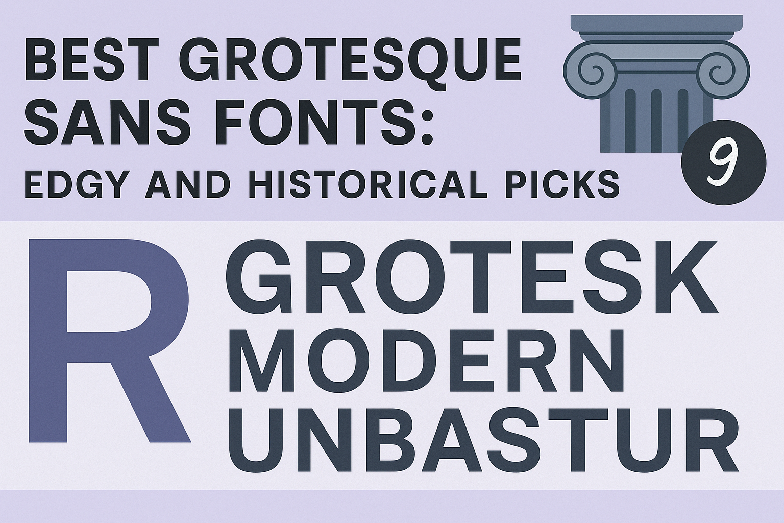
Grotesque sans serif fonts have a long history that dates back to the early 19th century. They offer a clean, simple look with a slightly rough edge, making them both timeless and modern. These fonts stand out for their versatility, balancing classic style with an edgy, straightforward design that works well in many projects.
Designers often choose grotesque fonts because they provide a neutral style that can easily blend with other design elements. Some popular examples include neo-grotesque fonts like Helvetica and Arial, known for their readability and smooth shapes. With so many options available, finding the right grotesque sans font can add a unique touch of history and style to any design.
Whether someone wants a bold look for branding or a clean font for digital use, grotesque sans fonts are solid choices. Their mix of old-school charm and modern clarity keeps them in demand for websites, print, and logos alike. For a selection of edgy and classic picks, exploring these fonts reveals plenty of creative possibilities. Learn more about these versatile options at 25+ Best Grotesque Fonts (Typefaces Ready to Download).
What Makes a Grotesque Sans Font?
Grotesque sans fonts have a rich history and distinctive design traits that set them apart. They are simpler than older serif fonts but more textured and uneven compared to newer sans-serifs. Understanding these details helps in choosing the right grotesque typeface for any project.
Defining Grotesque and Neo-Grotesque Styles
Grotesque fonts are among the earliest sans-serif typefaces, appearing in the early 19th century. They often have a slightly rough or uneven look, reflecting their origins before design tools allowed for perfect shapes. These fonts typically feature geometric letterforms with equal stroke thickness but less refinement.
Neo-grotesque fonts came later and are cleaner and more uniform. They keep the basic structure of grotesques but smooth out quirks for better legibility, like in Helvetica. Neo-grotesques feel more neutral and modern, while grotesques have a bolder, sometimes quirky character.
Key Visual Traits and Letterform Characteristics
Grotesque fonts usually have simple and slightly bold shapes. Their letterforms show a mix of straight and curved lines that create a sturdy, geometric feel. Many grotesques have capitals with nearly equal widths, a square-shaped “M,” and a double-story “A.”
Stroke weight tends to be even but can show slight irregularities. Features like a spur on “G” or “R” are common. These traits give grotesques a raw and somewhat informal vibe that stands out in headlines or posters.
How Grotesques Differ from Other Sans-Serif Fonts
Grotesques differ mainly in their texture and historical feel. Unlike modern sans-serifs, which often look sleek and polished, grotesques carry a bit of roughness and charm from early printing. They don’t have the delicate details of serif fonts but offer more personality than neutral sans-serifs.
Compared to neo-grotesques, grotesques feel warmer and less clinical. Their design has more visual character, which can add impact to design work. This makes them a great choice when a mix of nostalgia and sharpness is needed in typography.
Learn more about the history and styles of grotesque fonts at Creative Market’s What Are Grotesque Fonts? History, Inspiration and Examples.
A Brief History of Grotesque Sans Serif Fonts
Grotesque sans serif fonts have a strong place in typography, blending historical roots with modern use. They began as bold, simple alternatives to ornate serif fonts and evolved through design movements that shaped their look today.
Origins in the 19th Century
Grotesque typefaces first appeared in the early 1800s. They were among the earliest sans serif fonts, breaking away from the decorative serif styles common then. These fonts were called “grotesque” because many found them plain or even ugly compared to elegant serif fonts.
The first popular grotesque fonts were simple, with even stroke weights and straightforward shapes. They mostly used uppercase letters, like the “Two Lines English Egyptian” type from 1816. Newspapers and posters used grotesques for headlines, valuing their boldness.
Although crude by today’s standards, these early grotesques paved the way for sans serif fonts to become mainstream. They introduced lowercase letters and set the style for later designs like Franklin Gothic and Monotype Grotesque.
Evolution Through the 20th Century
In the 20th century, grotesques became more polished and versatile. Designers added more weights and styles, making them useful for body text, not just headlines.
The introduction of machine typesetting helped mass-produce grotesque fonts, bringing them to wider audiences. Fonts like Akzidenz-Grotesk, made in the late 1800s and widely used in the 1900s, inspired new designs like Helvetica.
This era saw grotesques balance geometric simplicity with readability. They moved from harsh and “ugly” to clean and modern, often used in newspapers, advertising, and corporate branding.
Influence of the Bauhaus Movement
The Bauhaus art school in Germany significantly influenced grotesque fonts in the 1920s and 1930s. Bauhaus designers favored minimalism and function, which fit well with grotesque’s clean lines and shapes.
Fonts inspired by Bauhaus ideals often have varied letter widths and simple forms. These features make the fonts practical while still having character.
Many grotesque fonts developed during this time reflected Bauhaus principles and helped shift typography toward modernism. The movement also inspired later grotesques with more experimental and subtle visual styles, blending art with practical design.
For more on grotesque and sans serif history, see the detailed overview on Creative Market.
Hallmarks of the Best Grotesque Fonts
The best grotesque fonts combine clear shapes, flexible use, and a clean style that fits many design needs. They balance easy reading with a fresh, sharp look, making them popular in various modern projects. These fonts stand out in both text and display settings because of their simple but strong features.
Legibility and Readability
Grotesque fonts are known for their clear letterforms that help readers easily recognize each character. Their slightly uniform stroke widths and minimal contrast create balanced shapes that reduce eye strain in long texts.
Uppercase letters in these fonts often have consistent heights and simple curves, making words flow smoothly when read. This clarity works well for screens and print, where fast reading is vital.
Good legibility means the font performs well in both small sizes for body text and large sizes for headlines. This makes grotesque typefaces a reliable choice for varied typography needs.
Versatility in Modern Design
These fonts fit many design projects because of their neutral and adaptable style. Designers use them in corporate logos, websites, mobile apps, and advertising because they don’t distract from the message.
Grotesque fonts work well with other font styles, allowing easy mixing in layered designs. They can look professional in formal settings or cool and casual in creative layouts.
Their subtle historical feel adds depth without looking outdated. This versatility is why grotesque fonts remain a go-to option for many modern designers looking for a timeless typeface.
Minimalist and Edgy Aesthetics
Grotesque fonts have a simple, no-frills design that aligns with minimalist principles. Their clean lines and lack of decorative elements create a sharp, neat appearance.
At the same time, some grotesque fonts include slight quirks in their shapes—like unusual curves or letter spacing—that add an edge. These details give the fonts personality without sacrificing readability.
This mix of simplicity and subtle uniqueness makes grotesque fonts perfect for projects that want to appear modern, clear, and a bit bold. They support straightforward communication with a touch of style.
For more details about how grotesque fonts fit into design, check out this best grotesque fonts guide.
Top Grotesque Sans Fonts and Their Iconic Families
Grotesque sans fonts have deep roots and modern appeal. They range from early, raw designs to polished families used worldwide. Many of these fonts balance legibility with style, making them favorites in branding and design.
Helvetica and Neo-Grotesque Icons
Helvetica is one of the most famous neo-grotesque fonts, known for its clean and neutral look. Born in the mid-20th century, it refined the grotesque style with smooth lines and balanced letterforms. Its font family includes multiple weights and italics, making it flexible for many uses.
Neo-grotesques like Helvetica focus on simplicity and readability. They often have uniform character widths and open counters. This style is popular in signage, corporate branding, and digital interfaces. Helvetica’s design aims to avoid drawing attention to itself, letting content speak clearly.
Akzidenz Grotesk and Early Landmarks
Akzidenz Grotesk is one of the earliest grotesque fonts, introduced in 1898. It set the stage for many later sans-serifs, including neo-grotesques like Helvetica. Akzidenz Grotesk features slightly rough shapes and less uniformity, giving it character.
This font family laid the groundwork for sans-serif typography in advertising and print. Its large x-height and solid structure make it readable even at smaller sizes. Designers often use Akzidenz Grotesk when they want a vintage or classic feel with a touch of simplicity.
Regime Grotesk and Contemporary Picks
Regime Grotesk brings a modern flavor to grotesque fonts with inspiration from 1920s and 30s Italian design. It blends historic elements with a fresh, balanced look. The family includes multiple weights, italics, and round variants for flexibility.
This font suits branding, print, and web projects aiming for a classic yet current appearance. Regime Grotesk supports many languages, adding to its versatility. Its carefully crafted forms make it a solid choice for designers seeking a timeless, elegant grotesque font.
For more modern grotesque fonts and their uses, see the list of best grotesque fonts and families.
Cutting-Edge Grotesques for 2025
New grotesque fonts for 2025 offer a mix of clean design and unique shapes. They work well for branding, web use, and bold print. These typefaces balance style with clear readability for different projects.
Focus Grotesk for Branding and Web
Focus Grotesk is a geometric sans-serif that stands out for its balance and versatility. Its clean lines and precise shapes make it great for logos, headlines, and body text alike.
This font family includes five weights and matching italic styles, giving designers flexibility. It works well on screens and print because of its well-planned spacing and kerning.
Focus Grotesk’s design comes from handmade geometric shapes, making it a bit more personal than standard digital fonts. This makes it popular for brands that want a modern yet approachable look.
Gorga Grotesque: Unique Geometry
Gorga Grotesque blends geometric and humanist elements to create a fresh style. It offers six fonts, with various weights and italics, supporting detailed typography needs.
One key feature is its many OpenType options, including ligatures and alternates, which add flair to text without losing clarity. These features appeal especially to advertising and marketing work.
The font was crafted with high attention to legibility and style. Its appearance is sleek yet readable, making it suitable for tech industries or innovative branding that wants to look forward-thinking and clean.
Hanken Grotesk: Versatile and Bold
Hanken Grotesk is a simple sans-serif that combines classic grotesque shapes with modern boldness. It’s known for its strong presence in body text and headlines.
This typeface family covers many weights, from light to black, offering options for many design purposes. Its boldness is useful in packaging, editorial, and poster design where attention is needed.
Its neutral style helps it fit easily into different themes, from corporate to creative projects. Unlike some highly stylized fonts, Hanken Grotesk stays clear and easy to read in long texts and short phrases.
Century Gothic and Other Modern Standouts
Century Gothic remains a well-known and widely used grotesque font because of its clean, round letterforms. It’s often chosen for digital and print media where clarity and friendly design matter.
Besides Century Gothic, other modern grotesques like JUST Sans and NorthBay Grotesk are gaining popularity. These fonts add subtle personality while keeping a polished, professional look.
Many of these modern fonts come with extended language support and multiple weights, making them flexible tools for global brands and projects that require diversity in typography. For more font options, see the best grotesque fonts for 2025.
Using Grotesque Sans Fonts in Design Projects
Grotesque sans fonts offer a clean yet distinct look that fits well in many design styles. They work best when thoughtfully paired with complementary fonts and used in the right contexts.
Tips for Pairing Grotesque Fonts
When pairing grotesque fonts with other typefaces, balance is key. Grotesque fonts have simple shapes but sometimes quirky details, so pairing them with a softer serif or a clean geometric sans serif often works well.
Avoid combining two highly similar sans serifs to prevent visual clash. Instead, match a grotesque font’s irregular curves with a smooth or more classic font style. For example, using a grotesque for headlines and a serif for body text can improve readability while keeping the design engaging.
Designers should also consider weight and size contrast. A bold grotesque paired with a light, smaller font creates clear hierarchy. Using font families with multiple weights within the grotesque style can make this easier.
Best Uses in Branding, UI, and Editorial
Grotesque fonts shine in many settings, including branding, user interface (UI), and editorial design. Their straightforward letterforms make them excellent for logos and company identities that need a modern, approachable feel.
In UI, grotesque fonts help maintain clarity on screens, especially when used in buttons, menus, and headers. Their clean lines keep digital layouts sharp and readable on different devices.
Editorial design benefits from grotesque fonts due to their neutrality combined with character. They fit well for magazine headlines, captions, and online articles where legibility and style are both priorities. Brands like news outlets and tech companies often choose grotesque fonts for this reason.
Leveraging OpenType Features and Variable Fonts
Many grotesque fonts now support OpenType features like small caps, alternate characters, and ligatures. These features give designers more control over text appearance without needing multiple fonts.
Variable fonts make grotesque types even more flexible. They allow smooth adjustment of weight, width, and other traits within one file. This reduces the need to load several font files and enables dynamic text styling.
Learn more about the best grotesque fonts and their applications at 99designs.