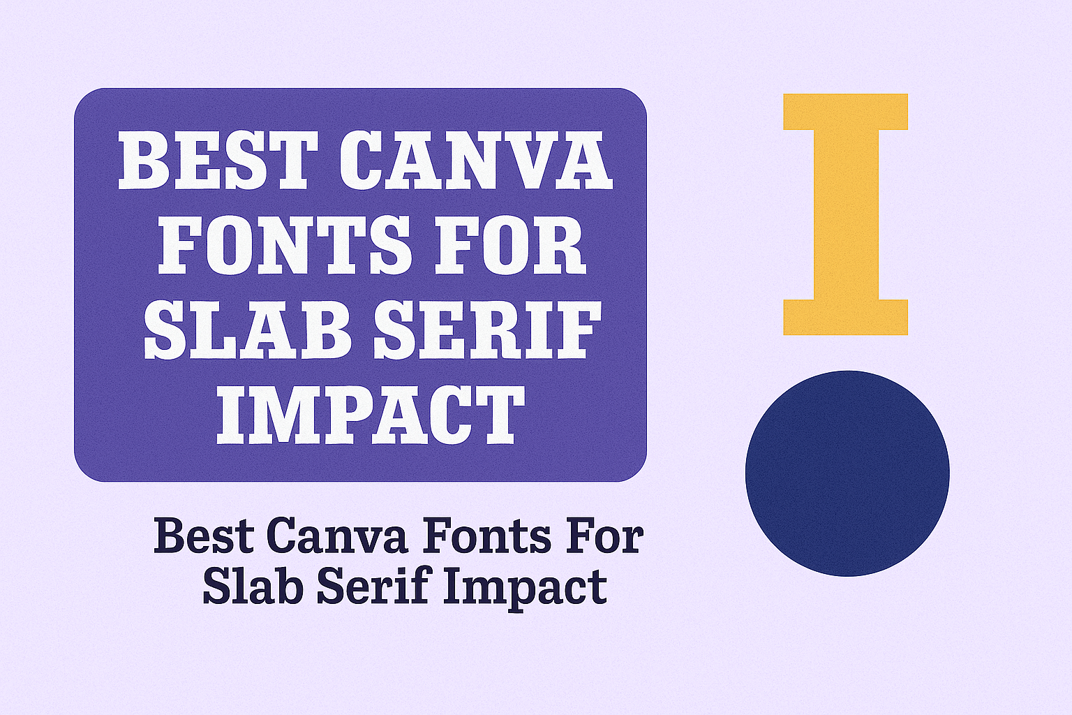
Slab serif fonts are known for their bold, blocky serifs that make text stand out with strength and clarity. For anyone using Canva, finding the right slab serif font can turn ordinary designs into eye-catching projects. The best slab serif fonts in Canva, like Aleo, Rockwell, and ChunkFive, combine readability with a strong visual impact that works well for headlines, logos, and posters.
These fonts bring a mix of modern style and classic boldness, making them great for various design needs. Whether someone wants a vintage feel or a sleek, professional look, Canva’s slab serif choices offer versatility and clear emphasis. Designers often use these fonts to create a balanced and memorable appearance that draws attention without losing clarity.
Using slab serif fonts correctly can help improve the design’s hierarchy and guide readers through the content smoothly. Mixing these fonts with simpler sans-serif styles or adjusting size and spacing can add interest while keeping everything easy to read.
Learn more about the best options and tips for slab serif fonts on Canva in this detailed guide to Best Slab Serif Fonts in Canva.
What Are Slab Serif Fonts?
Slab serif fonts are a type of font that stands out because of their thick, block-like serifs. These fonts are often used to create strong, bold statements in design. Understanding their unique traits helps designers use them effectively in projects.
Defining Slab Serif Fonts
Slab serif fonts have serifs that are large and rectangular or blocky in shape. Unlike other serif fonts with thin serifs, these are thick, giving the letters a solid, sturdy look. This style first became popular during the Industrial Revolution when bold letters were needed for posters and advertisements.
Sometimes called “Egyptian” or “square serif” fonts, slab serifs focus on clarity and impact. They work well in both print and digital designs.
Key Characteristics of Slab Serif
Slab serif fonts are known for their:
- Thick, blocky serifs: These are the small lines or strokes at the ends of letters, but bigger and more noticeable.
- Strong presence: The bold serifs make text look heavy and stable.
- Versatility: They can be used for headlines, titles, logos, and more without losing readability.
Many slab serif fonts also mix thick serifs with varying stroke widths, giving some modern examples a sleek feel while keeping the classic boldness.
Differences Between Serif, Slab Serif, and Sans Serif
Serif fonts have small, thin lines or strokes at the ends of letters that add elegance and help reading in print. Slab serif fonts are a type of serif font with much thicker serifs, creating a more solid and bold look.
Sans serif fonts, on the other hand, have no serifs at all. Their clean and simple lines make them popular for digital screens and modern designs.
To compare simply:
| Font Type | Serif Style | Appearance | Common Use |
|---|---|---|---|
| Serif | Thin, decorative lines | Classic, elegant | Books, newspapers |
| Slab Serif | Thick, blocky serifs | Bold, strong, friendly | Headlines, posters, logos |
| Sans Serif | No serifs | Clean, modern | Websites, mobile apps |
Slab serif fonts combine the readability of serifs and the boldness often needed to catch attention.
For more details on choosing slab serif fonts, see the article on the Best Slab Serif Fonts in Canva.
Why Choose Slab Serif Fonts in Canva
Slab serif fonts stand out because they create strong, clear visuals that catch the eye. They also work well in many types of projects, whether printed or digital. Plus, they help keep text easy to read, even when used in bold designs.
Impactful and Bold Designs
Slab serif fonts have thick, block-like serifs that make text appear sturdy and confident. This boldness helps headlines and titles grab attention quickly. When someone uses a font like Rockwell or Aleo in Canva, it gives the design a powerful look without losing style.
Designers choose slab serifs when they want their message to come across with strength and clarity. These fonts are great for posters, logos, and branding materials where making a strong first impression matters. Using bold slab serifs can turn simple text into a statement.
Versatility for Digital and Print
Slab serif fonts work well on screens and paper, which makes them very flexible. In Canva, users can pick from many slab serif options tailored for websites, flyers, social media posts, or print invitations.
Their solid shapes hold up in different sizes, so the fonts stay sharp whether on a phone screen or a business card. Some slab serifs like Zilla Slab balance modern touches with classic style, fitting a wide range of themes from tech to traditional.
This adaptability means designers don’t have to switch fonts between digital and print, saving time and keeping a consistent look.
Legibility and Readability
Slab serif fonts offer clear letter shapes that improve reading, especially in headings and short text. The thick, blocky serifs help define letter boundaries and reduce blurring on screens or printed materials.
In Canva, fonts like Robusto and ChunkFive combine style with easy reading. Their strong serifs support letter clarity at various sizes, so text stays readable from a distance or on small devices.
Adjusting font size, weight, and spacing in Canva helps maintain legibility, making slab serifs a smart choice for communication that must be understood fast and well.
Top Slab Serif Fonts in Canva for Maximum Impact
These fonts stand out for their unique shapes and clarity. They balance boldness with style, making them great choices for headings and bold statements. Each font brings a different flavor, from modern to classic, giving designs a strong voice.
Lazlord Slab Serif Expanded
Lazlord Slab Serif Expanded is perfect for grabbing attention. Its wide, bold letters make it ideal for posters and titles where visibility matters most. The expanded style gives text a confident, open feel without losing readability.
This font works well in Canva for projects that need a strong but clear statement. Its chunky serifs give a sturdy look, helping text to stand out from backgrounds. Lazlord is a solid choice for anyone looking for a bold slab serif that combines style with practical use.
Klose Slab
Klose Slab offers a mix of strength and modern simplicity. It has thick, square serifs that give it a bold presence but with clean, easy-to-read lines. This makes it great for headlines, calls to action, and brand logos.
In Canva, Klose Slab is favored for delivering a firm yet friendly look. It’s particularly good when the design calls for confidence without being too heavy. This font fits well in business projects aiming for a clear and trustworthy image with a contemporary touch.
TT Slab Condensed Thin
TT Slab Condensed Thin is a lighter, tighter slab serif option. It doesn’t take up much space but still carries the boldness typical of slab serifs. Its slim profile suits designs needing a neat, elegant touch without sacrificing impact.
This font is useful in Canva for web pages and printed materials where space is limited. Its condensed form allows for longer text blocks while keeping the strong serif style visible. TT Slab Condensed Thin helps create a balanced, polished look for professional designs.
For more options and insights into the best serif fonts in Canva, see detailed guides on best slab serif fonts in Canva.
Unique Slab Serif Font Styles for Creative Use
Slab serif fonts come in many styles, each bringing a different flavor to design projects. Some have decorative edges, while others evoke retro or modern vibes. These varied styles help designers find the perfect look for any creative need.
Yearbook Outline and Decorative Options
Yearbook outline fonts and decorative slab serifs add personality to headings and titles. These fonts often have bold outlines or extra flourishes, making text stand out without losing readability. They work well when creating playful or nostalgic designs.
Designers use these fonts on posters or invitations where showing style and clarity is important. The outlined shapes give a hand-crafted or vintage feel while keeping a strong presence on the page.
Examples include fonts with thick lines and shadow effects. These details help emphasize the text, making it eye-catching in creative layouts or fun branding.
Retro and Vintage-Inspired Slab Serif Fonts
Retro slab serif fonts bring a nostalgic touch, popular in vintage branding and posters. They feature chunky serifs with slightly worn or rounded edges, mimicking print styles from earlier decades.
These fonts are perfect for designs needing an old-school vibe. They combine boldness with warmth, creating a familiar and trustworthy feel.
Such fonts often appear in logos or signage where a classic yet bold impact is needed. Their strong shapes make text easy to read, even from a distance, supporting both style and function.
Modern Geometric Slab Serifs
Modern geometric slab serif fonts focus on clean lines and balanced shapes. They have precise edges and clear strokes, offering a sleek and contemporary look.
These fonts suit tech, corporate, or minimalist designs where professionalism meets creativity. They maintain readability while adding a sense of modern sophistication.
Examples include fonts with symmetrical serifs and consistent stroke widths. Designers favor them for websites, business cards, and branding that require clarity with style.
For creative options and more on these slab serif styles, you can explore the detailed best slab serif fonts in Canva.
Best Serif Font Alternatives to Slab Serifs in Canva
Choosing the right font adds character to designs, especially when looking beyond slab serifs. Some serif fonts offer elegance, while others mix well with slab serifs or create strong pairings. These options bring variety and style to any project in Canva.
Classic Serif Fonts for Elegance
Classic serif fonts bring a timeless and refined feel to designs. Fonts like Le Jour Serif, Noto Serif, and Afrah are great choices for adding sophistication. They feature delicate serifs and cleaner lines, which make them ideal for invitations, formal documents, or branding with a graceful look.
These fonts maintain readability while giving a touch of tradition. Unlike slab serifs, which are bold and blocky, classic serifs are lighter but still strong in presence. They work well when a design needs to feel professional but not too heavy.
Using these fonts in Canva is easy, and they fit well in projects that demand a polished tone without overwhelming the viewer.
Mixing Serif Fonts with Slab Serifs
Combining serif fonts with slab serifs can balance style and readability. For example, a classic serif font can be used for body text, while a slab serif like Robusto or Rockwell grabs attention in titles or headers.
This mix maintains a clear hierarchy. The sturdy slab serif creates impact at the top, while the elegant serif keeps the text easy to read below. This approach works well for posters, websites, and marketing materials where both style and clarity matter.
Designers using Canva can experiment with font sizes and weights to get the right contrast. It helps to keep the layout clean while making important text stand out.
Font Pairings That Work Well
Some font pairings in Canva work exceptionally well because they offer contrast without clashing. A good example is pairing Zilla Slab, a modern slab serif, with Open Sans, a simple sans serif for a clean look.
Alternatively, ChunkFive (a bold slab serif) pairs nicely with Merriweather, a softer serif font. This combo gives vintage charm with modern readability, useful in headlines plus body text.
Here’s a quick guide to pairing ideas:
| Slab Serif Font | Serif/Sans Serif Pairing | Best Use Case |
|---|---|---|
| Robusto | Open Sans | Bold headlines + text |
| ChunkFive | Merriweather | Posters, logos |
| Zilla Slab | Montserrat | Websites, branding |
These font combos help Canva users create designs that are both eye-catching and user-friendly.
Pairing Slab Serif Fonts with Other Canva Styles
Slab serif fonts have bold, blocky shapes that stand out well in designs. When paired with other font styles, they can create contrast and balance. Choosing the right match helps keep the text clear and visually interesting, especially in Canva projects.
Combining Slab Serif with Cursive Fonts
Slab serif fonts work well with cursive fonts because they balance strength with softness. The thick, sturdy edges of slab serifs contrast nicely with the flowing, handwritten look of cursive fonts. This contrast makes headings pop while keeping the text elegant.
Use slab serif for titles and cursive for smaller text or accents. Make sure the cursive font is legible and not too ornate to avoid hard-to-read text.
Tips for Harmonious Font Combinations
To pair slab serif fonts harmoniously, consider contrast and harmony. Use a bold slab serif with a light, simple font for good balance. Make sure the fonts share some design qualities, like similar letter spacing or stroke weight, to feel connected.
Keep the number of fonts limited—two or three fonts are best to avoid clutter. Also, test readability by viewing your design at different sizes. Canva’s tools let users easily experiment until the pairing feels right for the project.