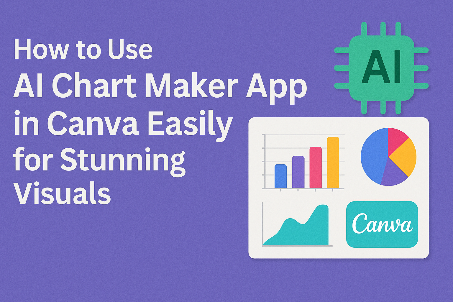
Using the AI Chart Maker app in Canva makes creating charts fast and simple. It lets users turn text descriptions into clear, easy-to-read charts within seconds. This saves time and helps anyone present data visually without complex tools.
The app works by letting users type what they want to show, and the AI takes care of building the chart. Users can also upload data files like CSV or XLSX to create charts automatically. This makes it great for students, teachers, and professionals who want neat visuals quickly.
Canva’s AI Chart Maker is easy to use, even for beginners. It combines design and data in one place, so users don’t need other software to make charts that look good and make sense.
Getting Started With the AI Chart Maker App
The AI Chart Maker app in Canva helps users create charts quickly by turning text into visuals. Users need to sign up, install the app, and then open it within Canva. Adjusting the basic settings ensures the charts look clear and fit their needs.
Signing Up and Installing the AI Chart Maker
To use the AI Chart Maker, users first need a Canva account. Signing up is free and only takes a few minutes by entering an email, Google, or Facebook login.
After logging in, they can find the AI Chart Maker in the Canva Apps section. Installing usually means clicking “Add” or “Use” on the app page. The app then becomes part of their Canva workspace.
No extra downloads are needed since it works inside Canva’s online platform. Once installed, users can access the app anytime without repeating this step.
Accessing the App Within Canva
Inside Canva, users locate the AI Chart Maker by clicking on the “Apps” tab on the left sidebar. Searching for “AI Chart Maker” helps if they don’t see it immediately.
After opening, the app prompts them to enter a text description of the chart they want. It can handle different types like bar charts, pie charts, or line graphs based on user input.
The app then generates a chart automatically that fits the description. Users can place this chart directly onto their current design project.
Configuring Basic Settings
Once the chart appears, users can adjust the basic settings to improve clarity. Options include changing chart type, colors, fonts, and labels.
It’s important to select settings that match the data and design style. Users can resize the chart or edit text labels for better understanding.
Saving changes is simple, usually with an “Apply” or “Done” button. This makes sure the final chart fits their project’s look and purpose perfectly.
For more about how the AI Chart Maker works inside Canva, see AI Chart Maker – Canva Apps.
Creating Charts Using AI
Creating charts with Canva’s AI Chart Maker is simple and efficient. Users only need to provide their data clearly and choose the right type of chart. The AI then analyzes the information and automatically generates a visual that fits the data best.
Inputting Your Data
Users start by entering the data they want to visualize. This can be typed directly into the app or copied from a spreadsheet. It is important to organize data in clear rows and columns with labels to help the AI understand the structure.
Correct formatting, such as using headers for categories and values, improves the accuracy of the charts. The AI reads this data and looks for patterns to decide the best way to present it visually.
Choosing Chart Types
After inputting data, users pick a chart style. Canva offers many options like bar, line, pie, and scatter charts. The choice depends on what the user wants to show, such as trends, proportions, or comparisons.
If users are unsure, the AI helps by suggesting chart types that match their data. This feature saves time and guides those who may not know which chart suits their information best.
Generating Charts Automatically
Once data and chart type are set, the AI creates the chart quickly. The AI processes the data and designs a clean, easy-to-read visual. Users can then customize colors, labels, and other design elements to fit their needs.
This automatic creation avoids manual design steps and helps produce professional charts without extra effort. The AI keeps the chart synced with any data updates, so changes reflect immediately in the visual.
For more details on this process, users can explore the AI Chart Maker on Canva.
Customizing Your Charts
The AI Chart Maker in Canva lets users change many parts of their charts to make data clear and visually appealing. Label edits, color adjustments, and adding titles or legends help create charts that fit the style and message of any project.
Editing Chart Labels
Editing chart labels is easy in Canva. Users just double-click the labels on the chart. This opens a small box where they can type new text or fix mistakes.
Labels can show numbers, categories, or descriptions. Making them clear helps viewers understand the data quickly.
If the chart has multiple data points, users can add or remove labels by clicking the chart’s data settings. This keeps the chart tidy and focused on key info.
Adjusting Colors and Styles
Colors and styles give a chart personality and make data easier to read. Canva offers many preset color palettes, but users can pick custom colors too.
Changing colors applies to bars, lines, or pie slices. This helps match charts to brands, reports, or personal tastes.
Users can also change styles like font size and type, as well as adjust chart backgrounds and borders for better contrast. These tweaks improve visual balance and make charts stand out.
Adding Titles and Legends
Titles give charts context, explaining what data is being shown. Canva allows easy title additions or edits by clicking above the chart area. Titles can be bolded or resized to grab attention.
Legends explain colors or symbols used in charts. They help viewers know what each part means without guessing.
Users can toggle legends on or off and move them around to fit the design. Adjusting font size or style in legends keeps charts professional and clear.
For tips on using Canva’s chart tools, see how to create charts and graphs in Canva.
Integrating AI Charts Into Canva Designs
Using AI-generated charts in Canva makes it easy to create visuals that fit different kinds of projects. The charts can be added to presentations, social media graphics, and matched with Canva templates for a smooth design process.
Inserting Charts Into Presentations
Adding AI charts to presentations helps make data clear and engaging. Users can generate a chart with Canva’s AI tools, then drag and drop it directly onto their presentation slides. The charts are customizable, allowing changes to colors, labels, and styles to match the presentation theme.
Charts can be resized and moved easily without losing quality. This flexibility helps keep the presentation clean and professional. It also saves time since users don’t need to create charts from scratch or switch between apps.
Embedding Charts in Social Media Graphics
AI charts add visual interest to social media posts by turning numbers into clear images. They can be combined with Canva’s photo and text tools to create eye-catching designs.
When embedding a chart, users can choose formats that fit Instagram posts, Facebook covers, or Twitter banners. Users can also change the chart style—from bar graphs to pie charts—depending on the message they want to share.
Syncing With Canva Templates
AI charts work smoothly with Canva’s pre-made templates. Users can pick a template that fits their project, then insert AI-created charts to update the content while keeping the design consistent.
This syncing saves time and avoids design clashes. Users can adjust charts to fit template layouts and keep fonts and colors uniform across all design elements. It’s especially helpful for branding or marketing materials where consistency is key.
For more on using AI in Canva designs, see detailed tips on integrating AI features.
Advanced Features of the AI Chart Maker
The AI Chart Maker in Canva offers several powerful tools that help users analyze data trends, export their work easily, and share charts with others in interactive formats. These features save time and make it simple to create charts that are both useful and professional.
Utilizing Trend Analysis
The AI Chart Maker can spot patterns in data automatically. It helps users understand if numbers are going up or down over time, which is useful for tracking progress or predicting future results. The tool can highlight key points like peaks, drops, and steady periods, making the data easier to read.
Users can also customize how trends appear, focusing on specific time ranges or types of changes. This helps make charts that match exact needs without being cluttered. Trend lines and moving averages are examples of options available to give a clearer picture of the data’s path.
Exporting Charts to Different Formats
Canva’s AI Chart Maker lets users save charts in several popular file types. These include PNG, JPEG, PDF, and SVG formats. Each format serves different purposes, such as using images in presentations or allowing others to edit the chart later.
The export process is simple. Users choose their preferred format and quality level, making sure the chart looks sharp wherever it’s used. This flexibility means charts can be used online, in emails, or printed clearly without extra work.
Sharing Interactive Charts
Interactive charts made with the AI Chart Maker allow more engagement. Instead of static images, viewers can hover or click to see detailed data points. This feature is great for reports or web pages where understanding exact numbers matters.
Charts can be shared through direct links or embedded into websites. Canva also supports collaboration, so teams can work on the same chart in real time. This makes it easier to get feedback and improve the visual display quickly without sending files back and forth.
For more details, explore the AI Chart Maker app on Canva.
Tips for Improving Chart Readability
To make charts easier to understand, it’s important to keep them simple. Too much information or clutter can confuse viewers. Using clear labels and avoiding unnecessary decorations helps the chart speak for itself.
Choosing the right colors matters. High contrast between the background and chart elements makes data stand out. It’s best to use colors that are easy on the eyes and avoid too many bright or similar shades.
Using consistent fonts and sizes helps the viewer read labels quickly. Bold important text like titles or key data points to draw attention. Avoid using too many different fonts as it can look messy.
Here’s a quick list to remember:
- Use clear, short labels
- Stick to simple color themes
- Highlight key numbers with bold text
- Avoid overlapping text or clutter
- Keep chart types appropriate for the data
These tips help anyone make charts that are easy to read and understand. For hands-on help, tools like the AI Chart Maker in Canva can guide users to create cleaner charts quickly.
Troubleshooting Common Issues
If the AI chart maker app in Canva is not working, the first thing they should check is their internet connection. A slow or unstable internet can cause delays or make the app unresponsive.
Sometimes, the app may glitch or freeze. Refreshing the browser or restarting the Canva app often fixes this problem quickly. It is also important to make sure the app and browser are updated to the latest version.
If charts do not generate correctly, clearing the browser cache can help. Old cache files may cause errors or prevent new features from working properly.
Users may experience lag or slow loading times. Closing other tabs or apps running in the background can free up memory and improve performance.
If none of these steps work, they should try switching to a different browser or device. Sometimes compatibility issues cause problems. More detailed fixes can be found in guides about common Canva not working issues and how to fix them.
Here is a quick checklist for troubleshooting:
| Issue | Suggested Fix |
|---|---|
| App freezes | Refresh browser or restart Canva app |
| Charts not generating | Clear browser cache |
| Slow loading | Close other tabs or apps |
| Features missing | Update browser and Canva app |
| Persistent problems | Switch browser or device |
Best Practices for AI Chart Creation in Canva
When using the AI Chart Maker in Canva, it’s important to start with a clear and simple text description. The AI works best when the input is specific. For example, instead of saying “sales data,” say “monthly sales from January to June.”
Users should choose the right chart type for their data. Bar charts work well for comparisons, while line charts show trends. Pie charts are good for parts of a whole. Canva offers different chart styles that fit these needs.
Keeping the chart clean and easy to read helps viewers understand the data quickly. Use bold labels and clear colors. Avoid too many colors or crowded elements that can confuse the message.
It’s helpful to review and adjust the AI-generated chart. Sometimes labels or data points might need tweaking. Canva makes it easy to click and edit any part of the chart after creation.
Users can combine charts with other Canva tools like Magic Write or layouts to make reports or presentations look professional. Using AI features together saves time and improves the final design.