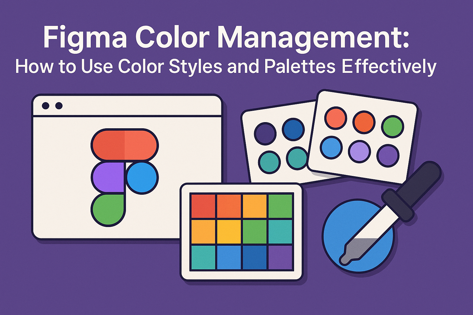
In the world of design, mastering color management in Figma is key to creating visually appealing projects. Figma allows users to use color styles and palettes, making it easier to maintain consistency throughout designs. By setting up global color styles, designers can ensure all elements align perfectly, saving time and effort.
Understanding how to create and organize color palettes effectively helps in building a more structured workflow. It also allows the designer to experiment creatively without losing track of the original theme. This approach enhances how designers communicate with their audience through color.
Incorporating color styles in projects reduces the complexity of swapping and updating colors across multiple designs. This streamlined process is accessible in various Figma tutorials that guide users step-by-step through the setup. Embracing these techniques can revolutionize the way projects are managed and presented.
Getting Started with Figma
Diving into Figma can seem overwhelming at first, but breaking it down into a few key parts helps. This guide focuses on familiarizing with the interface and how to set up your initial project effectively.
Understanding the Figma Interface
Navigating Figma begins with understanding its clean and intuitive interface. The toolbar at the top contains essential tools like the move, frame, and text tools. The left panel displays all your layers and pages, making it easy to manage components.
In the center is the main canvas, where designs take shape. To the right, the Properties panel lets users adjust colors, dimensions, and text styles. Shortcuts like pressing “F” for frames or “T” for text speed up workflow significantly. Regularly exploring tooltips and the Figma Community file guide can also help newcomers discover features and tips.
Setting Up Your First Project
Setting up a project in Figma starts with creating a new file. Users should decide on the dimensions based on the medium—such as web, mobile, or print. Using templates or design systems can provide a solid foundation and ensure consistency.
After setting the dimensions, creating frames or artboards helps organize each design screen. Naming layers clearly and grouping related components is a good practice. Using tools like grids and guidelines helps align elements precisely. Incorporating color combinations early in the design can establish a compelling visual theme. They also aid in creating distinctive designs for various projects.
Fundamentals of Color Theory
Color theory helps create designs that are visually appealing and effective. It plays a big role in how designs are perceived and can influence people’s decisions and emotions through color psychology and the organization of colors in harmonies.
Color Psychology
Color psychology explores how different colors can affect people’s feelings and behaviors. For instance, red often represents excitement or urgency, while blue can evoke calmness and trust. Brands use this theory to connect emotionally with their audience.
Different cultures may interpret colors differently, which is crucial for global brands. Designers should consider cultural context when choosing colors to ensure their message is clear. Understanding this can enhance the user experience and strengthen brand identity by using colors that align with the brand’s values and goals.
The Color Wheel and Harmonies
The color wheel is a tool that shows how colors relate to one another. It starts with primary colors: red, yellow, and blue. Mixing these creates secondary colors like green, orange, and purple. Further mixing gives tertiary colors.
Color harmonies come from specific arrangements of colors on the wheel. Common harmonies include complementary, analogous, and triadic combinations. Complementary colors sit opposite each other on the wheel and create vibrant contrast, whereas analogous colors are next to each other and provide unity. Triadic harmonies use evenly spaced colors and bring balance.
Designers can use these harmonies to achieve specific visual effects, depending on the brand’s needs and identity. Understanding these concepts is key to effective color use in any design.
Working with Color Styles
Color styles in Figma help designers maintain consistency throughout their projects. By organizing and applying these styles effectively, teams can create cohesive designs and streamline collaboration. Here’s how to make the most of color styles in Figma.
Creating Color Styles
To start with color styles, users can create custom palettes suited to their needs. In Figma, this is done by selecting the color, clicking on the styles option in the right sidebar, and choosing to create a new style. Naming the style clearly helps in quick identification and future use.
Users can also create text and effect styles to complement color styles. For example, setting up a base text color can be efficient for typography consistency. Similarly, styles for shadows or blurs can be defined for effects. Each choice helps maintain a unified look across different design elements.
Colors can also be grouped for specific purposes, like UI backgrounds or text layers. By organizing styles according to use, designers can ensure that their design system is simple and intuitive. This also aids in quicker onboarding for new team members.
Applying Color Styles to Elements
Once color styles are defined, applying them to elements becomes a straightforward process. Designers can select any object within Figma and easily apply a pre-defined color style to it. This ensures that every element is consistent with the defined design rules.
If a change in the style is necessary, updating the main color style will automatically replicate those changes across all instances using that style. This capability saves time and reduces errors by making global updates more manageable.
Designers often find it helpful to keep a well-structured set of styles. This approach simplifies workflow and enhances the overall speed of design iterations. Users can use these styles in various projects for replicating success and ensuring brand consistency.
Organizing Color Styles
Organizing color styles in Figma involves grouping them in ways that make sense for the team and project. By categorizing styles by purpose, like primary buttons or alerts, finding and applying them becomes less cumbersome.
Using descriptive style names helps with recognition. Short, clear names indicate the color’s role, such as “Primary Blue” or “Error Red.” This offers a quick understanding of their purpose at a glance, even for those new to the project.
Folders or groupings can be used in Figma to further enhance organization. This method separates styles into intuitive collections, such as text, background colors, or brand colors. Keeping this structure updated as projects evolve is key to maintaining efficiency and clarity.
Designing with Color Palettes
Using color palettes in design helps create visual harmony and consistency. This section covers selecting the right color palette, adding colors, and refining your palette for a seamless design process.
Choosing a Color Palette
Picking the right color palette is crucial for establishing a design’s mood and style. Designers often begin by considering the design’s purpose and target audience. For example, a playful children’s app might use bright, bold colors, whereas a corporate website may favor cool and neutral tones.
Various color schemes can be used, such as monochromatic, analogous, or complementary options. Monochromatic palettes focus on a single hue, while analogous schemes use colors next to each other on the color wheel. Complementary palettes involve contrasting colors, like blue and orange, providing a vibrant look. It’s also helpful to look into resources like Figma’s color combinations to see examples and get inspired.
Adding Colors to Your Palette
Adding colors to your palette in Figma can be done efficiently using plugins and tools. With plugins such as Color Palette Management with JSON, designers can import and export color styles, simplifying the process. It allows for the quick application of colors across the design with ease.
To start, open the Figma color picker and arrange squares representing each color. This provides a visual reference for how colors interact. Ensure colors are labeled clearly, like “Brand-25” or “Accent-Blue,” for quick access. Using Figma styles, apply colors consistently across different elements, ensuring continuity and cohesion in the design.
Editing and Refining Your Palette
Refining a color palette is an ongoing process. As the design evolves, the colors may need to be adjusted for balance and harmony. Figma offers tools to tweak hues, saturation, and lightness directly within the platform. Make sure to test how colors appear on different screens and in various lighting conditions.
Consider contrast and readability, especially for text and UI elements. Using the Frames X UI color palette guide can help achieve consistent contrast by selecting colors from the same saturation range. Regular iteration ensures the palette remains effective, improving the overall impact of the design.
Advanced Color Techniques
This section explores advanced techniques in Figma to enhance design projects. Focus areas include using gradients and overlays, along with opacity and blending modes to provide depth and sophistication.
Using Gradients and Overlays
Gradients can add dimension and influence how a design is perceived. In Figma, they can range from simple linear gradients to more complex radial ones. By adjusting colors smoothly between two or more points, gradients create an appealing transition.
Overlays are equally important. They help highlight specific areas or create visual layers. For instance, adding a semi-transparent overlay on a picture can make text more readable. It allows for focus on both the image and text without overwhelming either.
Using both gradients and overlays effectively can make any design attractive and dynamic.
Working with Opacity and Blending Modes
Opacity and blending modes control how layers interact in a design. Opacity adjusts transparency, allowing layers underneath to be visible. Lowering opacity can create a softer effect, which is great for backgrounds or when layering text over images.
Blending modes are a more advanced tool, blending layers in varied ways. For example, the “Multiply” mode darkens an image by mixing layers, while “Screen” lightens it. These modes can emphasize certain parts of the design, making them stand out.
By mastering these tools, designers can achieve precise visual effects and improve their creative workflow.
Collaboration and Sharing
Figma’s features make it easy to collaborate with team members and maintain consistent design elements. Sharing styles and using libraries are two key ways to ensure everyone is on the same page.
Sharing Styles with Your Team
Sharing styles in Figma ensures that all team members have access to the same design elements. To share styles, navigate to the four dots icon on the right-hand sidebar. This opens the styles menu where users can manage color, text, grid, and effect styles.
Styles can be linked directly to design files, allowing teams to maintain consistency across projects. When a style is updated, changes reflect instantly across all linked files. Teams can also organize their styles into folders for easy access and management.
Encouraging team members to adopt shared styles reduces confusion and design discrepancies. It creates a unified look for all projects and speeds up the design process. Shared styles are perfect for keeping branding consistent across various assignments.
Using Libraries for Consistency
Libraries in Figma offer an efficient way to ensure design consistency across projects. By publishing styles and components, users turn their files into libraries that team members can access. This feature helps keep design elements standardized, reducing repetitive work.
When a library is updated, changes automatically appear in any design using its components or styles. This ensures that everyone works with the latest design elements, minimizing errors. Libraries also save time by storing reusable elements, which can be quickly dragged and dropped into new projects.
Ensuring Accessibility
Creating accessible designs requires attention to color contrast. Ensuring that text and backgrounds differ enough in color helps everyone, including those with visual impairments, understand content better. Figma users should aim for a contrast ratio of at least 4.5:1, which meets WCAG AA standards.
Using tools in Figma, designers can check and adjust these ratios. Selecting colors within the same saturation range can aid in maintaining readability and visual harmony. This approach keeps the design user-friendly for diverse users.
Cross-Platform Color Consistency
Designs may be viewed on different screens and devices. It’s essential to maintain color consistency across these platforms. Setting a standard color profile, like sRGB, ensures colors appear the same on different displays. Figma allows users to choose their preferred color profile, which helps in keeping designs uniform across platforms.
Additionally, using standardized color styles and naming conventions in Figma can further enhance consistency. By adopting these practices, designers ensure that their color choices are deliberate and consistent regardless of how or where the final design is viewed.
Tips and Best Practices
Using color styles and palettes in Figma effectively helps designers create visually harmonious and user-friendly interfaces. Specific guidelines can enhance both the workflow and the outcomes, ensuring a cohesive design experience.
Effective Color Choices
Choosing the right colors is crucial for creating an appealing design. Using colors from the same saturation range can maintain contrast and visual harmony. For example, selecting colors like Purple-500 and Blue-500 helps ensure consistent intensity across the design.
Organizing colors into categories such as text, background, and accents aids in maintaining clarity and consistency. Colors can be used to evoke certain emotions or highlight important elements, like using burgundy for elegance or trust. Experimenting with different combinations can also reveal unique and effective palettes.
Avoiding Common Mistakes
A common mistake is failing to account for accessibility. Designers should ensure that text color contrast follows guidelines to remain readable by those with vision impairments. Double-checking contrast ratios helps here.
Another error is using too many colors. This can lead to a cluttered and confusing interface. Limiting the palette to a select few colors creates a more streamlined and cohesive design, making it comfortable for users to interact with.