Designing a custom print ad for local publications can be a powerful way to connect with the community. Using a tool like Vectr makes this process accessible and straightforward, allowing anyone to create visually appealing ads without needing advanced design skills.
Local ads often need to grab attention quickly, and a well-designed graphic can make a significant difference.
Understanding the specific audience is crucial for effective advertising. In local publications, ads should reflect the interests and needs of the community, ensuring they resonate with readers.
With Vectr, users can easily incorporate local images and tailored messages that speak directly to their target audience.
Crafting a compelling print ad also involves choosing the right layout and colors. Vectr provides templates and design elements that simplify this aspect, helping users create ads that look professional and inviting.
Engaging designs can lead to increased visibility, making it easier for local businesses to attract new customers.
Understanding the Basics of Print Advertising
Print advertising plays a crucial role in reaching local audiences effectively. Knowing the dimensions and formats available, along with essential design principles, can help create impactful ads.
Print Ad Dimensions and Formats
Choosing the right dimensions and format is key in print advertisements.
Standard sizes include:
- Full-page: Typically 8.5” x 11” for magazines.
- Half-page: Often 5.5” x 8.5”, great for less expensive options.
- Quarter-page: At 4.25” x 5.5”, ideal for small businesses.
Different publications may have specific size requirements. Always check guidelines before designing the ad.
It’s important to ensure the ad fits well in the chosen publication to maximize visibility.
Design Principles for Print Media
Designing for print media involves several important principles.
-
Visual Hierarchy: Use size and color to guide the viewer’s eye. The most important information should stand out.
-
Balanced Layout: Keep the layout balanced by using white space effectively. Too much text or images can overwhelm readers.
-
Readable Fonts: Choose fonts that are clear and easy to read. Avoid overly decorative fonts, especially for body text.
-
Strong Images: Use high-resolution images that draw attention and support the message.
By following these design principles, one can create a visually appealing print ad that resonates with the target audience.
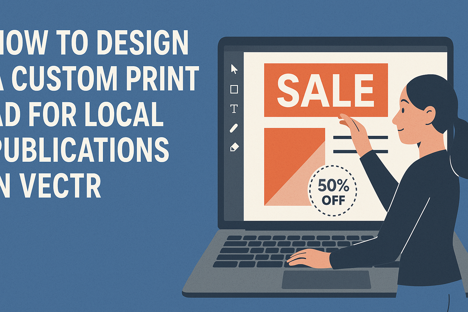
Getting Started with Vectr
Vectr is a user-friendly graphics editor that makes creating custom print ads simple. Users will learn how to navigate the interface and set up their artboard effectively, paving the way for a successful design process.
Navigating the Vectr Interface
When first using Vectr, it’s important to explore its layout.
The main tools are located on the left side, including options for shapes, text, and images.
The top menu offers file options such as saving and exporting.
On the right panel, users can find properties to adjust colors, sizes, and other design elements. This setup allows easy access to all necessary tools without being overwhelmed.
To enhance the design process, users can take advantage of layers.
Layers help organize elements and make it easy to edit individual pieces.
Practicing with these tools will boost confidence in creating graphics.
Setting Up Your Artboard
Creating the artboard is the next key step.
Users start by selecting the size of their ad, which depends on the publication’s requirements.
Vectr provides options for standard sizes, making this process straightforward.
Once selected, users can adjust the background color. A white or light background often works best for print ads to ensure text stands out.
After the background is set, it’s helpful to think about guides.
Users can create guides to help align text and images consistently.
This preparation helps ensure a polished final product.
With a well-set artboard, users are ready to start adding elements to their ad.
Crafting Your Print Ad Design
Creating a compelling print ad involves thoughtful choices in colors, fonts, images, and layout. Each of these elements plays a crucial role in making the ad visually appealing and effective in communicating its message.
Choosing Colors and Fonts
Colors and fonts can significantly influence how a print ad is perceived. They convey emotions and attract attention.
When selecting colors, a designer should consider the brand’s identity. For example, blue often represents trust, while red can create excitement.
Fonts should match the ad’s tone. For a professional look, serif fonts like Times New Roman may work well. For a modern feel, sans-serif fonts such as Arial are a great choice.
Mixing fonts can add visual interest, but it’s important to keep it simple.
Using two to three different fonts can create balance without overwhelming the viewer. A well-chosen color palette and font combo enhances readability and connection with the audience.
Incorporating Images and Graphics
Images and graphics are essential for grabbing attention. A striking photo can draw the eye and communicate the message instantly.
It’s vital to choose high-quality images that relate to the ad’s content.
For small businesses, local photos can create familiarity and trust. Using graphics like icons or logos can also reinforce branding.
When adding images, consider their placement and size. An image should complement the text rather than distract from it.
Always leave some white space around images to avoid a cluttered appearance, making sure everything feels cohesive.
Aligning Elements for Visual Balance
Visual balance is all about arranging elements in a way that feels right. A well-balanced ad ensures that no single part overshadows another.
Designers often use the rule of thirds to guide their layouts.
Text and images should work together harmoniously. Aligning elements creates a sense of order. For example, aligning text either left, right, or center can make an ad look structured.
Using grids in Vectr can help maintain consistency in spacing and alignment. This method ensures that all components have equal importance while still directing the viewer’s eye to key messages or calls to action.
Balancing elements enhances the ad’s overall impact, leading to better engagement.
Exporting and Preparing for Publication
In this section, the focus is on how to get a custom print ad ready for local publications. It covers optimizing the ad for the best print quality and details on setting up export settings.
Optimizing the Ad for Print Quality
To ensure the print ad looks great, it’s important to optimize the design.
Use high-resolution images, ideally 300 DPI (dots per inch). This resolution helps maintain clarity and sharpness when printed.
Key Tips:
- Margins: Always leave a margin, typically 0.125 inches, to prevent critical content from getting cut off.
- Color Mode: Set the color mode to CMYK, which is standard for print. This setting ensures colors are accurate when printed.
Make sure to proofread all text carefully. A clear, error-free ad represents professionalism and boosts credibility when published in local media.
Export Settings Overview
When exporting the ad, it’s crucial to choose the right settings to ensure quality.
Start by selecting the format. PDF is often preferred for print ads due to its compatibility and quality.
Export Steps:
- Select the right dimensions, matching the specifications provided by the publication.
- Use the “Pack and Go” feature (if available) to gather all assets in one file.
Always consult the specific guidelines of the publication to avoid any issues.
Incorrect settings can lead to unwanted results, like poor image quality or incorrect colors, so these steps are important for a successful print ad.