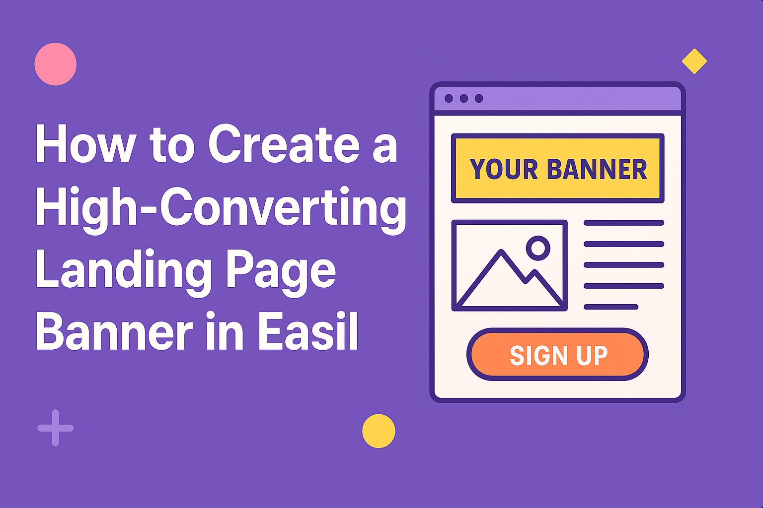
Creating a high-converting landing page banner can significantly enhance engagement and drive sales.
By using Easil’s intuitive design tools and templates, anyone can craft visually appealing banners that grab attention and lead visitors to take action.
Learning the right techniques can transform a simple banner into a powerful marketing asset.
Effective banners combine eye-catching visuals with clear, compelling messages. He or she should focus on color schemes, typography, and images that align with the overall brand while delivering a strong call to action.
The right mix can make a visitor stop scrolling and pay attention.
With the right guidance, anyone can create banners that not only look great but also convert. This article will explore practical tips and strategies for designing a landing page banner in Easil that truly stands out.
Understanding Landing Page Banners
Landing page banners play a crucial role in capturing a visitor’s attention. They are often the first thing users see, making them essential for conveying key messages quickly and effectively.
The following details highlight the purpose and structure of effective landing page banners.
The Purpose of a High-Converting Banner
A high-converting banner is designed to grab attention and drive actions. It serves to inform visitors about a specific offer, product, or service. The primary goal is to encourage users to click through.
To achieve this, banners must convey a clear message. They should include an enticing call-to-action (CTA), such as “Sign Up Now” or “Get Your Free Trial.”
The use of eye-catching visuals also enhances viewer engagement. Bold colors and attractive images can motivate visitors to explore further.
Anatomy of an Effective Banner
An effective banner comprises several key elements. These include engaging headlines, clear content, strong visuals, and a compelling CTA.
-
Headlines: Use concise, impactful language to grab attention immediately. It should highlight the main benefit of the offer.
-
Visuals: Choose images that resonate with the target audience. High-quality photos or graphics can make a significant difference.
-
Call-to-Actions: Place CTAs prominently to guide users on what to do next. Use contrasting colors for visibility.
Each of these components should work together seamlessly. A well-designed banner offers clarity and a straightforward path for users to follow, leading to higher conversion rates.
Designing Your Banner
Creating an effective banner requires careful selection of visuals, clever headlines, and thoughtful choices in color and font. Each element plays a key role in attracting attention and conveying the message.
Selecting the Right Visuals
Choosing the right visuals is crucial for a high-converting banner. The visuals should be relevant to the message and create an emotional connection.
High-quality images or graphics can grab attention quickly. They can also help illustrate the product or service being promoted.
Using imagery that reflects your brand’s identity adds consistency. It’s essential to ensure that visuals are not cluttered, as simplicity leads to better focus on the message.
Consider using illustrations or icons that align with the purpose of the banner. They can enhance comprehension and make the banner more visually appealing.
Crafting a Compelling Headline
A compelling headline draws the viewer in. It should clearly convey the value of what is being offered.
Use action words that evoke curiosity or urgency. Phrases like “Discover Now” or “Get Started Today” can encourage clicks.
The headline must be easy to read at a glance. Shorter headlines that pack a punch tend to perform better.
Position the headline prominently within the banner. It should stand out among other text and visuals, ensuring that it is the first thing people notice.
Choosing Colors and Fonts
Colors and fonts establish the banner’s tone and brand identity. Selecting the right colors can influence emotions and actions.
For instance, blue can convey trust, while red can evoke excitement. A balanced color scheme that complements the brand enhances recognition.
When it comes to fonts, clarity is vital. Use bold and legible fonts for headlines, avoiding overly decorative styles that may confuse readers.
Maintaining consistent font usage across all banners reinforces branding. Stick to a limited number of colors and fonts to keep the design cohesive and professional.
Optimizing for Conversion
Creating an effective landing page banner involves careful planning and execution. Focusing on key elements can significantly improve conversion rates, making the banner not just attractive, but functional.
Call to Action Essentials
A clear and compelling call to action (CTA) is crucial. It should be direct, encouraging visitors to take the desired action. Use strong, action-oriented words like “Sign Up,” “Get Started,” or “Download Now.”
Ensure the CTA button stands out visually. Using contrasting colors helps draw attention. An effective CTA is also strategically placed, ideally above the fold, so visitors see it without scrolling.
Additionally, consider incorporating urgency. Phrases like “Limited Time Offer” can motivate quick responses. Shortening the text on the CTA can also make it clearer and quicker to read.
Layout and Composition Tips
An effective layout enhances user experience. A good practice is to use a clean design with plenty of white space. This keeps the focus on the banner’s key message and CTA.
Use a large, eye-catching image or video that relates to the content. This visual element should support the message without distracting. Ensure that images are optimized for fast loading to keep visitors engaged.
Guiding the visitor’s eye is essential. Place elements in a logical flow: start with a strong headline, follow with supporting text, and end with the CTA. Keeping the layout consistent helps reinforce the brand’s identity.
Testing and Iterating
Testing is vital for optimizing conversion rates.
A/B testing allows for comparison between different versions of a banner. It helps identify what elements resonate best with the audience.
Test different colors, CTA placements, or images to see what works.
Make small changes at a time to isolate effects.
After testing, analyze the results to determine which version performs better.
Use these insights to iterate on design and messaging.
Continuous testing leads to ongoing improvements, helping the banner convert visitors effectively.

