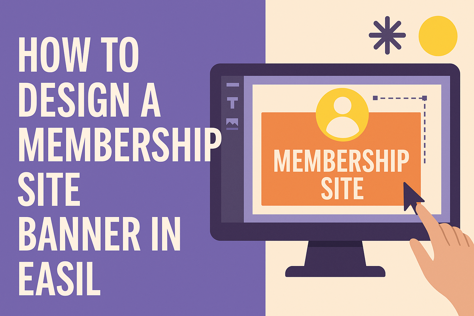
Creating a captivating banner for a membership site can attract more users and enhance the overall experience.
Using Easil, anyone can design a stunning membership site banner in just a few easy steps. This platform provides various templates and tools tailored to meet specific needs, making the design process simple and enjoyable.
With Easil, members can easily customize colors, text, and images, ensuring that their banner reflects their brand’s personality. Each design choice can help convey the right message and capture the attention of potential members.
Whether one is a seasoned designer or just starting, crafting a professional-looking banner is achievable with the right guidance in Easil.
This article will walk through the essential steps needed to create an effective banner that impresses visitors right from the start.
Understanding Banner Design Fundamentals
Creating an effective membership site banner requires a clear understanding of its purpose, the target audience, and key design principles.
Clarity in these areas can help convey the right message and attract potential members.
Purpose of Your Membership Site Banner
The banner serves as the first point of contact for visitors. Its main purpose is to grab attention and communicate the value of the membership site.
A well-designed banner should highlight key offerings. This could include exclusive content, community access, or special discounts.
In addition, it should create a sense of urgency or entice visitors to sign up. Effective wording can prompt action, such as “Join Now” or “Limited Time Offer.”
Target Audience and Brand Identity
Identifying the target audience is crucial for effective banner design. Different demographics respond to varying visual cues and messaging styles.
Understanding the audience helps in choosing appropriate colors, fonts, and images. For example, a site aimed at young professionals may prefer sleek designs, while a family-oriented site could use softer colors and playful fonts.
Brand identity must align with the banner design. Banners should reflect the overall look and feel of the membership site to maintain consistency. This consistency builds trust and recognition among visitors.
Essential Design Principles
Design principles play a significant role in banner effectiveness. Keeping the layout clean and organized helps viewers focus on important elements.
Contrast is key to making text stand out against the background. Using bold colors for calls to action can improve visibility.
Hierarchy ensures that the most important information is easily accessible. Place headlines prominently, followed by supporting text.
Additionally, white space creates breathing room. It prevents the banner from looking cluttered, allowing each element to shine.
Using these essential principles will enhance the overall impact of the banner. A simple, focused design often leads to higher engagement and conversions.
Using Easil to Create Your Banner
Creating a banner in Easil is an easy and enjoyable process. Users can navigate the interface smoothly, find the right template, and customize it to match their brand’s style.
Navigating the Easil Interface
The Easil interface is user-friendly. When users first log in, they are greeted with a dashboard that showcases recent projects and templates.
On the left side, there are menu options like “Templates” and “Designs.” Clicking on “Templates” opens up a variety of categories. Users can find options for social media, events, and marketing.
By simply clicking on a template, they can start designing right away. The intuitive layout helps users explore features without feeling lost.
Selecting the Right Template
Choosing the right template is crucial. Easil offers a vast collection tailored for different purposes. Users should consider the message and audience while browsing.
To filter templates, they can use keywords such as “membership” or “banner.” This will narrow down options effectively. Easil even provides pre-sized templates for various platforms.
Once a suitable template is selected, users can click on it to start editing. This step sets the foundation for a polished and professional banner.
Customizing Templates with Brand Elements
Customization is key to making a banner unique. Users can add their logos, change colors, and adjust fonts to fit their brand identity.
To start, they can upload their logo directly into Easil. After that, using the color picker, they can select brand colors that will resonate with the audience.
Additionally, Easil allows users to choose from various font styles. Consistent typography enhances brand recognition.
Simple adjustments enable users to craft a banner that not only looks great but also conveys their message clearly.
Incorporating Effective Imagery and Typography
Creating a compelling membership site banner involves careful selection of images and typography. These elements should resonate with the audience and convey the right message. Below are key considerations for each component.
Choosing Images That Connect
Images play a crucial role in grabbing attention. They should reflect the essence of the membership site and connect with the target audience. Using images that evoke emotion or represent community helps to establish a bond.
- Be Relevant: Choose images that relate directly to the content or services offered.
- Quality Matters: High-resolution images appear professional and trustworthy.
- Diversity is Key: Represent different groups to make everyone feel included.
Using unique and original photos can also set the banner apart from typical stock images. Remember, a well-chosen image can speak volumes and draw potential members in.
Typography That Speaks to Your Audience
Typography is not just about choosing a font; it’s about setting the tone of the banner. The font style, size, and color all contribute to how the message is perceived.
- Readability: Select fonts that are easy to read at a quick glance. Avoid overly fancy fonts.
- Brand Alignment: Use typography that matches the brand’s personality, whether it’s playful or professional.
- Hierarchy Matters: Vary font sizes to emphasize key messages. Headlines should stand out more than secondary text.
Incorporating these principles can help in crafting an attractive and effective banner that communicates directly with visitors. The right typography, combined with strong imagery, can enhance user engagement and encourage sign-ups.
Finalizing and Implementing Your Banner
Once the design is complete, it’s important to ensure everything is polished and ready for display. Attention to detail is key in this stage, from checking visual consistency to addressing technical requirements.
Reviewing Your Design for Consistency
Start by checking the colors used in the banner. They should align with the brand’s color palette. Consistent colors help create a cohesive look. Next, examine the fonts; they must match the site’s style and be legible.
Images should be high quality and relevant to the content. Ensure there is a visual hierarchy so viewers can quickly grasp the message. Consider using bold or larger text for key phrases.
Lastly, preview the banner on different devices. This helps ensure it looks great on desktops, tablets, and smartphones. A well-reviewed design will enhance user experience and engagement.
Technical Checklist Before Publishing
Before going live, there are a few technical aspects to review.
First, check the banner dimensions. They should fit well within the designated space on the website.
Common sizes include 728×90 pixels for banners and full-screen options for major announcements.
Next, ensure the file format is optimized. Using JPEG or PNG typically works best for web images.
It’s also crucial to compress the banner to improve loading speed without losing quality.
Finally, add any necessary alt text for accessibility and search engines. This helps screen readers understand the content, making the site more user-friendly.