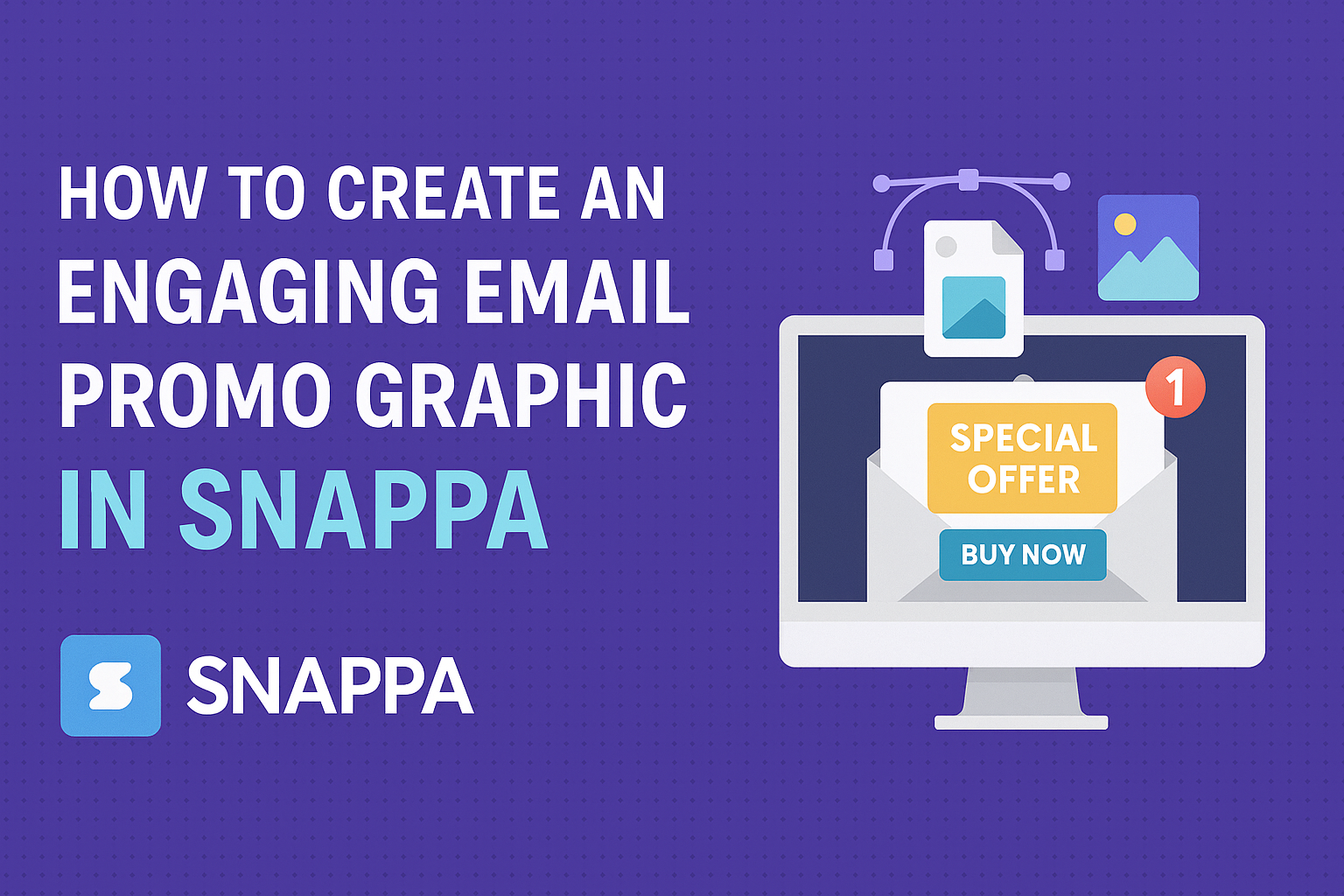
Creating engaging email promo graphics is essential for grabbing attention and driving conversions. Snappa makes it simple to design eye-catching visuals that can enhance any marketing campaign.
With its user-friendly interface and a range of customizable templates, even those without graphic design experience can produce professional-quality images in no time.
In today’s fast-paced digital world, standing out in a crowded inbox is vital. Effective email promotions not only look good but also communicate the intended message clearly.
By using Snappa, marketers can easily create stunning graphics that resonate with their audience, helping to boost engagement and sales.
Whether promoting a new product or sharing special offers, having a visually appealing email graphic can make all the difference. With the right tools and techniques, anyone can elevate their email marketing efforts.
Snappa’s accessible features empower users to unleash their creativity and connect with their audience effectively.
Getting Started with Snappa
To begin creating graphics in Snappa, users first need to set up an account. After that, they can familiarize themselves with the platform’s user-friendly interface, which is designed to simplify the graphic design process.
Setting Up Your Account
Creating an account on Snappa is straightforward. Users can sign up using their email address or link an existing Google account.
This quick setup allows immediate access to the platform’s features.
Once registered, users can explore the free plan or opt for the paid version that offers additional features. It’s beneficial to take a moment to verify the email, as this will ensure all functions are accessible.
After verification, users will find a welcome tutorial that guides them through the platform’s capabilities.
Understanding Snappa’s Interface
Snappa’s interface is designed to be intuitive, making it easy for users to navigate. At the top, there’s a menu bar that provides access to templates, graphics, and text tools.
Users will notice a canvas area in the center where designs come to life. On the left side, various design elements are categorized, including backgrounds, shapes, and stock photos.
This organization helps users quickly find what they need.
Additionally, helpful tips often pop up, guiding users as they create. With the drag-and-drop functionality, users can easily shape their designs, ensuring the process feels seamless and enjoyable.
Designing Your Email Promo Graphic
Creating an effective email promo graphic involves careful selection of templates, thoughtful color schemes, effective typography, and the right visual elements. Each choice can greatly impact engagement and response rates.
Selecting the Right Template
Choosing the right template is crucial for setting the tone of the email. Snappa offers many options that cater to different themes and styles.
- Consider Your Message: The template should match the purpose of the email, whether it’s for a sale, event, or announcement.
- Focus on Layout: A clean layout helps ensure that the key elements stand out. Look for templates that highlight images and text effectively.
- Customization: Ensure the template is easy to edit. Snappa allows personalization to help make the graphic unique to the brand.
Choosing a Color Scheme
Color plays a huge role in grabbing attention and conveying emotion. A good color scheme can enhance the graphic’s effectiveness.
- Use Brand Colors: Incorporating brand colors helps maintain consistency. This builds recognition and creates a professional look.
- Contrast is Key: High contrast between background and foreground elements makes text easier to read. Light text on a dark background or vice versa works well.
- Limit Your Palette: Stick to 2-3 main colors to avoid a cluttered appearance. This keeps the design harmonious and visually appealing.
Adding Text and Typography Tips
Text is essential for communication in email graphics. Choosing the right font and style can make a significant difference.
- Select Readable Fonts: Use clear, legible fonts that are easy to read on various screen sizes. Sans-serif fonts usually work best for digital content.
- Font Hierarchy: Use different font sizes and weights to create a visual hierarchy. The main message should be prominent, while secondary information can be smaller.
- Keep It Short: Limit the amount of text to keep it engaging. Use bullet points or short phrases to communicate ideas clearly.
Incorporating Visual Elements
Incorporating visual elements enhances the appeal and effectiveness of the graphic.
- Images and Icons: Use high-quality images related to the content. Icons can also simplify complex information and guide the reader’s eye.
- Balance Graphics and Text: Ensure there’s a good mix of text and visuals. Too much text can overwhelm the reader, while too many visuals can distract from the message.
- Use Spacing Wisely: Proper spacing around elements improves readability. Use margins and padding to keep text and images from feeling cramped.
Refining Your Design
Refining the design of an email promo graphic is crucial for making it more engaging. Attention to details like filters, layout, and visual balance can dramatically improve its appeal. Here’s how to enhance each aspect effectively.
Using Filters and Effects
Filters and effects can transform a basic graphic into something eye-catching. Applying slight brightness or contrast adjustments helps images pop.
Using a blur effect can create depth, allowing the main message to stand out. It’s essential to avoid overusing effects, as they can distract from the core message.
Experimenting with different filters provides a unique touch. For instance, a vintage filter might create a warm feeling, while a modern filter can give a sleek look. Adjust these settings in Snappa to see what suits the overall theme of the email best.
Adjusting Layout for Clarity
A clear layout ensures that the audience understands the main points quickly. Start by using grid lines or guides in Snappa, which help in aligning text and images uniformly.
Make sure the most important elements, like the call-to-action, are easily visible. Placement at the top or center often works best since it attracts the viewer’s attention first.
Spacing matters, too. Use ample white space to keep the design from feeling cluttered. This can help the audience absorb the information without being overwhelmed.
Tips for Visual Balance
Visual balance is essential for a polished graphic. Start by thinking about symmetry; balanced elements create a sense of order.
Try to distribute colors evenly. If one corner has a bright color, it helps to balance it with another bright color on the opposite side. This keeps the viewer’s eye moving through the graphic.
Also, varying text sizes can guide attention. A combination of large headings and smaller body text can create visual interest while maintaining clarity. Using these techniques can help engage the audience and enhance the overall effectiveness of the email promo graphic.
Exporting and Using Your Graphic
After creating a stunning email promo graphic in Snappa, the next steps involve downloading and integrating it into email campaigns. Understanding the best formats to use and how to implement graphics effectively ensures the design stands out without any issues.
Downloading the Right Format
When it comes to exporting graphics, choosing the right file format is crucial. Snappa allows users to download graphics in several formats, including PNG and JPG.
- PNG: Great for images with transparency and sharp edges. This format works well for logos and detailed images.
- JPG: Ideal for photographs and images without transparent backgrounds. It offers smaller file sizes but might lose some detail.
Users should opt for a resolution of at least 72 DPI for good display on screens. Higher resolutions can be used for print, but for email, balancing quality and loading speed is important.
Best Practices for Email Integration
Integrating graphics into email campaigns involves careful considerations.
First, the image size should fit well within the email layout. A width of 600 pixels is often a safe choice for most email platforms.
Additional tips:
- Use ALT text for images. This ensures that information is available even if images do not load.
- A/B test different graphics to see what resonates best with the audience.
Finally, check how the graphic appears on various devices.
Ensuring it looks good on both desktops and mobile screens maximizes engagement.