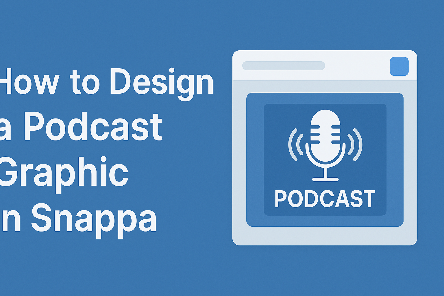
Creating a podcast graphic can be a fun and rewarding task. Using Snappa, anyone can design an eye-catching podcast cover that makes a lasting impression.
This user-friendly graphic design tool offers templates and easy-to-use features that simplify the design process.
When starting to design, it’s important to remember the specifications for podcast graphics. The ideal dimensions are 3000 x 3000 pixels, which ensures that the cover looks great on all platforms.
With Snappa, users can customize their designs with various fonts, colors, and images to fit their podcast’s theme.
The best part is that even those with little design experience can create professional-looking graphics. Snappa provides resources and guidance throughout the process, making it accessible for everyone. With the right tools and tips, anyone can bring their podcast vision to life.
Getting Started with Snappa
Snappa is a user-friendly tool that makes designing graphics simple. With a few easy steps, anyone can start creating professional-looking podcast graphics.
Understanding the Interface
When a user first logs into Snappa, they will see a clean and intuitive interface. On the left side, there is a navigation menu that includes options like “Templates,” “My Designs,” and “Graphics.”
At the center, users can find their workspace. This is where they can make adjustments and add elements to their designs. The right side features helpful tools like text options, shapes, and images.
Familiarizing oneself with these sections will help streamline the design process.
Setting Up Your Account
To get started with Snappa, the first step is to create an account. Users can sign up using their email address or link a Google account for quick access.
Once signed up, it’s important to confirm the email address to activate the account. Users can choose between a free plan or various paid options that offer additional features.
After setting up the account, users can explore Snappa’s various graphic templates and tools.
Selecting the Right Template
Choosing the right template is essential for creating a compelling podcast graphic. Snappa offers a wide range of pre-designed templates tailored for different needs, including podcast covers.
Users can easily browse through categories or use the search bar to find specific styles. Each template is fully customizable, allowing for the colors, text, and images to be adjusted.
Selecting a template that matches the podcast’s theme or tone helps in making an immediate impact. It sets the foundation for a polished design.
Designing Your Podcast Graphic
Creating an effective podcast graphic involves thoughtful choices in color, typography, imagery, and layout. Each element contributes to the overall appeal and communicates the podcast’s theme to potential listeners.
Choosing a Color Scheme
Selecting the right color scheme is crucial for setting the mood of the podcast graphic. Colors evoke emotions; for instance, blue can signify trust, while red can convey excitement.
Using a combination of three to five colors works best. Choose a primary color for the background, a secondary color for text, and one or two accent colors. Tools like color palette generators can help in selecting complementary colors.
It’s also essential to ensure readability by using high-contrast colors for text. This makes the graphic eye-catching and easy to read on different devices.
Adding Text and Typography Tips
Text plays a significant role in conveying the podcast’s title and tagline. Choosing the right font is essential. A bold font can demand attention, while a script font may express creativity.
Limit the number of different fonts to two or three. This keeps the design cohesive. Use larger font sizes for the title and smaller sizes for any subtext.
Consider spacing and alignment carefully. Text should be easy to read, with appropriate spacing to avoid overcrowding. Sticking to a hierarchy in text size also helps guide the viewer’s eye.
Incorporating Images and Icons
Images and icons can enhance the graphic by adding visual interest. When incorporating images, they should reflect the podcast’s content. A clear and relevant image can draw in potential listeners.
Icons can be used to symbolize ideas or concepts related to the podcast. Simple, recognizable icons work best.
Ensure that images are of high quality to maintain a professional look. Tools like Snappa also offer access to a library of stock photos and graphics that can be useful.
Layering and Composition Basics
Layering elements is key to creating depth in the podcast graphic. Start with the background, then add images, text, and icons. Each layer should be clearly defined.
Make use of negative space to prevent the design from feeling cluttered. This allows each element to breathe and stand out. Additionally, consider alignment to create balance within the design.
Experiment with the overall placement of elements until the composition feels right. The goal is to create a visually appealing and accessible design that represents the podcast effectively.
Fine-Tuning Your Design
Fine-tuning helps enhance the look of your podcast graphic. It focuses on adjusting transparency, aligning elements, and using grids for better structure.
Adjusting Transparency and Filters
Adjusting transparency can make elements blend better or stand out in your design. In Snappa, users can easily change the opacity of images or text. This allows for interesting layering effects.
Filters can also enhance visuals. Applying a filter can change the mood of the artwork. Users should experiment with different options to see what fits best. A slight adjustment in transparency or the right filter can turn a simple graphic into something eye-catching.
For example, lowering the opacity of a background image can help text pop without overwhelming the viewer. Finding the right balance is key.
Aligning Elements for Visual Balance
Visual balance is essential for a polished design. When elements are aligned well, they guide the viewer’s eye and create harmony in the graphic.
In Snappa, grids and alignment tools make this process easier. Users should try to evenly space elements and match their sizes. This creates a clean, professional look.
Tip: Pay attention to margins and padding. Consistent spacing around text and images will improve overall aesthetics. Proper alignment ensures that every piece of the design feels connected and intentional.
Using Grids and Guides
Grids and guides help establish a strong layout for any graphic. In Snappa, users can activate a grid feature. It allows them to see lines that break the canvas into sections. This makes positioning elements straightforward.
Using guides can also help place items symmetrically. It is helpful for aligning text, images, or logos. This not only improves organization but enhances the overall visual appeal.
Saving and Exporting
When designing a podcast graphic in Snappa, knowing how to save and export effectively can make a big difference. This process involves selecting the right file format and ensuring the graphic looks great on various platforms.
Choosing the Right File Format
Choosing the correct file format is important for the quality of the graphic. For podcast cover art, JPG and PNG are the most common formats.
JPG is great for photographs and detailed images. It offers good compression but may lose some quality.
PNG, on the other hand, is a good choice for images requiring transparency or sharp edges.
To save the graphic, she clicks the “Save” button within Snappa. If it’s the first time saving, she selects a folder or saves it to the default “All your graphics” folder. Each time she saves, the design will override the previous version.
Optimizing for Different Platforms
Different platforms often have their own requirements.
It’s essential to optimize the graphic for the best display.
For podcast cover art, dimensions of 3000 x 3000 pixels are ideal, giving a 1:1 aspect ratio.
Snappa also advises that graphics should be in RGB color space for bright and accurate colors.
When exporting, she ensures the graphic meets any platform specifications.
This helps avoid issues when uploading.
Taking these steps ensures that the podcast graphic looks professional and attractive on all platforms.