Creating a web banner that looks great on any device is essential for effective online marketing.
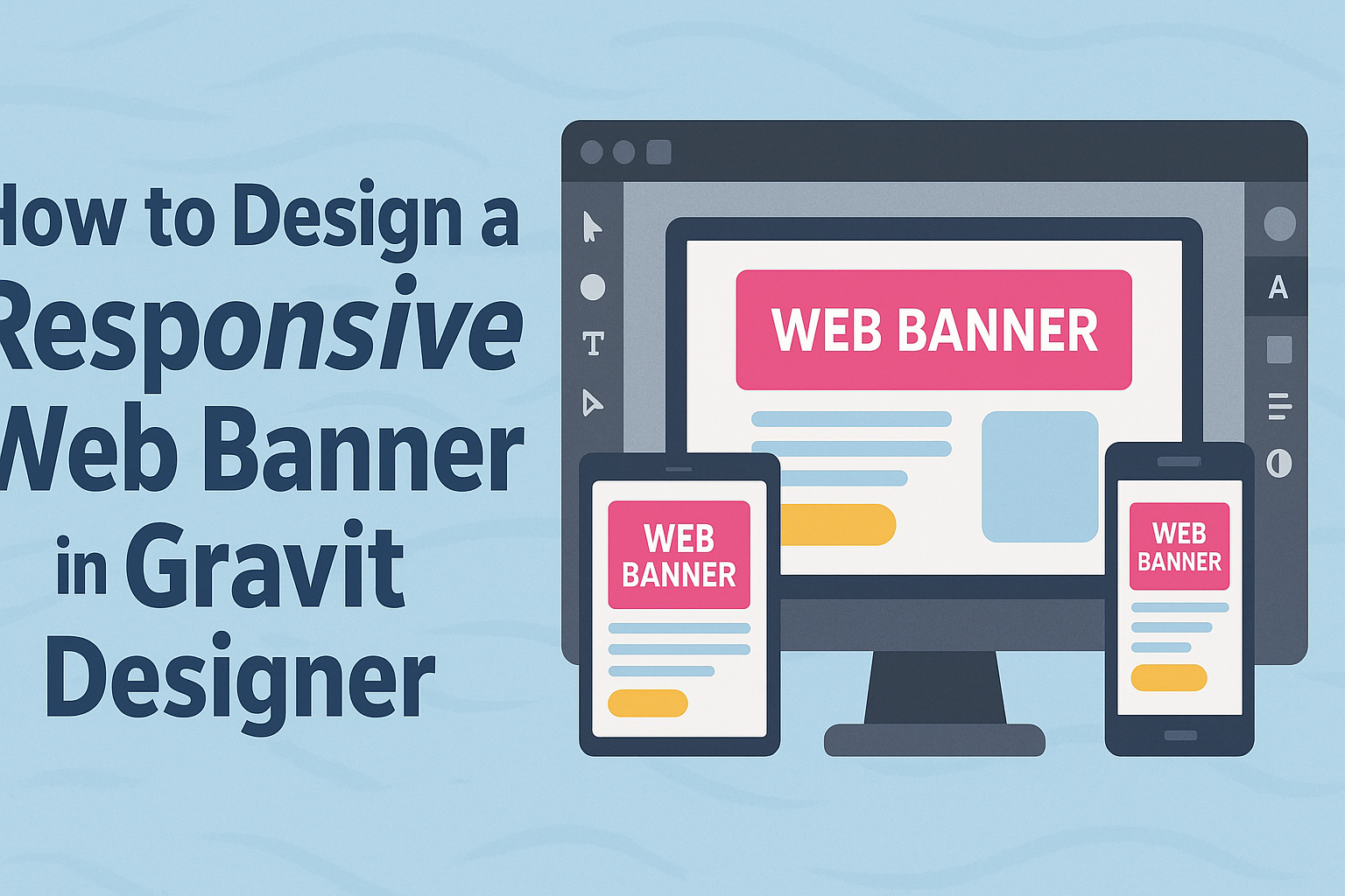
With Gravit Designer, anyone can easily design a responsive web banner that catches the eye and communicates key messages.
This tool offers flexibility and powerful features, making it ideal for both beginners and experienced designers.
In this guide, readers will discover practical steps to design eye-catching banners that adapt seamlessly to different screen sizes.
From choosing the right dimensions to applying design principles, each aspect plays a crucial role in achieving a successful banner.
By the end, they will gain valuable insights and techniques to create their own responsive web banners in Gravit Designer, ensuring their designs are not only appealing but also functional across all devices.
Understanding Responsive Web Banners
Responsive web banners adjust to different screen sizes and devices. This flexibility is crucial for effective online advertising.
A responsive design ensures that the message and visuals remain clear, no matter how the audience views the banner.
Importance of Responsiveness
Responsive banners are essential in today’s digital world. With so many devices—phones, tablets, and desktops—each has unique screen dimensions.
If a banner is not responsive, it may look distorted or hide important information on smaller screens.
A well-designed responsive banner can lead to higher engagement rates. According to studies, responsive ads often outperform static ones. This can result in more clicks and better returns on ad spending.
Proper scaling keeps the text readable and images appealing, maintaining user interest. Therefore, understanding responsiveness is vital for anyone creating web banners.
Gravit Designer Overview
Gravit Designer is a powerful design tool for creating responsive web banners. Its user-friendly interface allows users to craft designs without extensive technical skills.
One key feature of Gravit Designer is its ability to create assets that adapt to various screens. Users can set up artboards for different resolutions, ensuring their designs look great everywhere.
Additionally, Gravit Designer supports various file formats, making it easy to export designs. This flexibility helps designers create engaging banners that meet specific needs.
With tools to align, group, and layer elements, it simplifies the design process.
Overall, Gravit Designer is an excellent choice for designing responsive banners that appeal to a wide audience.
Setting Up Your Workspace in Gravit Designer
When designing a web banner, setting up the workspace is crucial for efficiency. This includes creating a new project and understanding how to work with artboards for optimal layout.
Creating a New Project
To begin, he needs to open Gravit Designer. Right from the start screen, he should click on “New Document.”
Here, he can choose the banner size. Common sizes include 728×90 pixels for leaderboard banners and 300×250 pixels for medium rectangles.
He can also select a print or web option for resolution. For web banners, a resolution of 72 DPI is typically sufficient.
Once the size is set, he can name his project. This helps keep everything organized.
After he clicks “Create,” he enters the design workspace, ready to start!
Working with Artboards
Artboards are essential when designing banners. They allow him to manage different versions in one project.
To add an artboard, he can go to “Page” in the menu and choose “Add Artboard.”
Each artboard can represent a different size or variation of the banner. He can easily switch between them by clicking on their tabs on the left side.
Organizing his designs in this way saves time and provides clear visual options.
While designing, he should utilize the layers panel to keep elements organized. By grouping related layers, he can quickly find what he needs as the project progresses.
Designing the Banner
Creating a responsive web banner involves careful consideration of images, text, branding, and design elements. Each part contributes to the overall effectiveness of the banner in capturing attention and communicating the message.
Choosing the Right Images
Images play a crucial role in web banner design. They should be high-quality and relevant to the content or product being advertised.
Choosing images that evoke emotion can increase the chances of user engagement.
It’s essential to consider image size and format for responsiveness. Images should be optimized for various devices to ensure they load quickly.
For a clean look, use images with ample negative space for text placement.
Avoid using lifestyle images with people unless absolutely necessary. Text overlay can be distracting if it covers someone’s face or important part of an image. Instead, opt for abstract or product-focused images to maintain clarity.
Working with Text and Typography
When designing a banner, text is just as important as images.
Using a clear and legible font helps convey the message effectively. Bold fonts are great for headlines, while simpler fonts work well for body text.
Limit the amount of text on the banner. A concise message can make a stronger impact. Bullet points or short phrases are effective for quick reading.
Contrast is key in text visibility. Use colors that stand out against the background. This will ensure that the message is easy to read on all devices.
Implementing Branding Elements
Branding elements should be integrated thoughtfully into the banner. This includes logos, colors, and taglines that represent the brand’s identity.
Consistency in branding increases recognition and trust among viewers.
Using color schemes that align with the brand’s palette helps maintain visual coherence. Each color can also evoke different feelings, so choose wisely.
Place the logo in a prominent yet non-intrusive position. It should be visible without overwhelming the overall design. Including a clear call to action can further bolster the brand’s messaging.
Using Vectors and Shapes
Incorporating vectors and shapes can enhance the visual interest of a banner. They can frame important text or images and direct the viewer’s focus. Shapes, such as rectangles and circles, can also help structure the layout.
Using a mix of shapes can create dynamic designs. For example, a rounded rectangle can soften the look of buttons, making them more inviting.
Ensure that vector graphics are high-quality and scale well on different devices. This allows the banner to maintain its professional appearance, regardless of screen size.
Making the Banner Responsive
Creating a responsive web banner is essential for ensuring it looks great on various devices. This section covers designing for different screens, exporting options, and methods for previewing and testing the banner effectively.
Designing for Multiple Devices
To design a responsive banner, it’s important to consider different screen sizes. Designers should start with a flexible layout using grids. This helps elements resize based on the screen.
Using vector graphics is a smart choice as they scale without losing quality. Avoid placing essential text or graphics close to the edges. This prevents them from being cut off on smaller devices.
Testing different dimensions, such as 300×250 pixels for mobile and 728×90 pixels for desktop, ensures the banner displays well across platforms. Keeping icons simple and using large fonts enhances readability.
Exporting Options for Responsiveness
When exporting the banner, choose formats that support responsiveness. PNG and SVG formats are excellent for maintaining quality.
It’s also good to export in various resolutions. Creating multiple size options allows for better optimization on different devices.
If the banner contains animations, keep file sizes small to ensure quick loading times. This improves user experience and engagement. Designers can use tools to compress images without losing quality.
Previewing and Testing
Previewing the banner is a crucial step. Designers should use tools that simulate how the banner will appear on different devices and formats.
Testing on actual devices provides a clearer picture of performance. Checking on smartphones, tablets, and desktops helps highlight any issues.
It’s also important to view the banner in different browsers to ensure consistency. Regular feedback from users can guide last-minute adjustments.
This process ensures the final product looks and performs well across all platforms.