Creating a modern business card can set a professional tone for networking opportunities. Using Gravit Designer is a fantastic way to bring unique design ideas to life. It allows anyone to create a standout card quickly and easily.
With its user-friendly interface and powerful vector design tools, it offers the perfect platform for both beginners and seasoned designers.
Colors and fonts play a crucial role in making a memorable impression, and Gravit Designer makes it simple to experiment with different styles.
Whether they choose a clean, minimalist look or a bold, vibrant palette, users can easily customize their designs to reflect their personal brand. This flexibility ensures that every business card can be as unique as the individual behind it.
Additionally, Gravit Designer’s accessibility on multiple operating systems means designers can work from anywhere.
This convenience makes it a top choice for those looking to create professional-quality business cards without being tied to a specific device. With the right tools at their fingertips, they can create something truly remarkable.
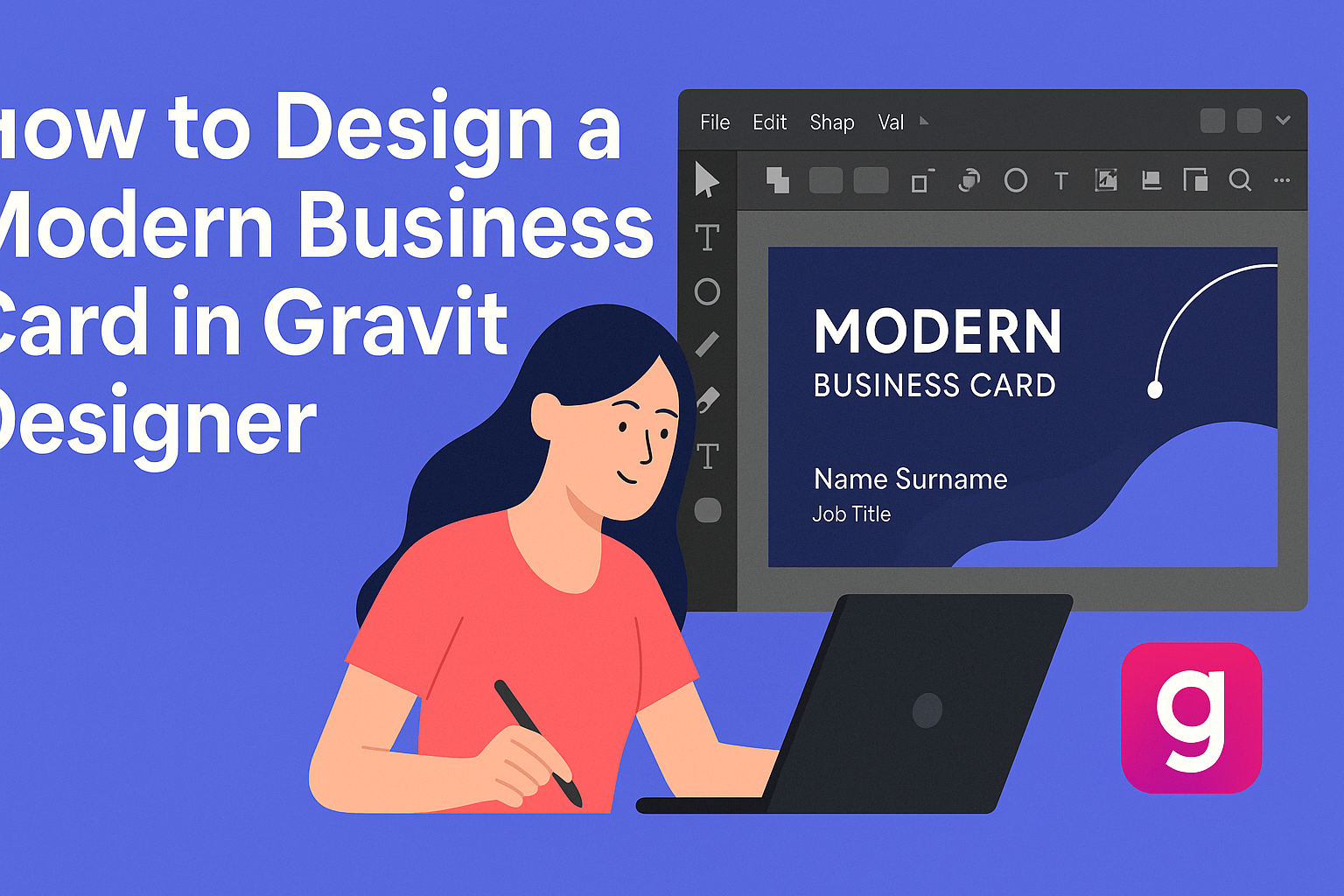
Getting Started with Gravit Designer
Gravit Designer is a powerful tool for creating stunning graphics. Using it effectively starts with understanding how to create a new project and navigating the interface.
Creating a New Project
To kick off, users can create a new project by opening Gravit Designer and selecting “New Design.”
They can choose from several preset sizes, such as Business Card or Custom Size.
It’s essential to select a size that works for the intended design. For a standard business card, 3.5 x 2 inches is a good choice. This ensures that the design fits nicely within the typical printing specifications.
Once a size is chosen, users can name their project and hit “Create.” This sets the stage for all creative work ahead.
Familiarizing with the Interface
The Gravit Designer interface is user-friendly and intuitive. The main screen consists of a canvas for design and several panels on the sides.
On the left, users will find the Tools Panel, which includes options like the Select, Shape, and Pen tools. The right panel is the Properties Panel, allowing adjustments to colors, strokes, and effects.
At the top, the Menu Bar provides access to file options and additional features. Taking time to explore each part makes navigating and designing smoother.
Setting Up the Workspace
Setting up the workspace for comfort and efficiency is vital. Users can rearrange panels by dragging them to preferred locations.
They can also enable or disable panels through the “View” menu. This customization helps users focus on the most important tools for their project.
For a clean workspace, hiding unnecessary panels can minimize distractions. Users can also zoom in and out easily using shortcuts to get the best view of their design.
By taking these steps, users can create a workspace that suits their style, making the design process more enjoyable.
Designing Your Business Card
Creating a business card requires thoughtful consideration of various elements. The size and orientation, color scheme, typography, and graphics all play vital roles in finalizing a modern design. Here’s how to tackle each aspect effectively.
Choosing a Size and Orientation
The standard business card size is 3.5 x 2 inches. This size fits easily in wallets and cardholders. However, designers can choose to go with unique dimensions to stand out.
Orientation is also key. A horizontal layout is traditional and familiar. Vertical cards can convey a sense of creativity and modernity. Consider which orientation best reflects the brand’s personality when making a choice.
Selecting a Color Scheme
Colors convey emotions and brand identities. It’s essential to choose a palette that aligns with the company’s values. For instance, blue can convey trust, while red may signal energy.
Monotone color schemes are trendy and can make a strong visual impact. Using shades of one color can unify the design and keep it striking. Applying a consistent color scheme throughout the card ensures a cohesive look.
Adding Text and Typography Best Practices
Text is crucial on a business card. Important information includes the name, job title, company name, phone number, and email address.
Choosing the right font enhances readability. Sans-serif fonts often work well for modern designs. Heavier weights help important details stand out.
Limit the amount of text to avoid clutter. Leave some white space for balance. This practice creates a cleaner look and helps key details pop.
Incorporating Graphics and Logos
Logos represent a brand and should be featured prominently. They should be clear and easily identifiable. The logo should not overpower the text but instead complement it.
Adding simple graphics can also enhance the design. Elements like borders or icons can organize information and enhance eye flow. Ensure graphics align with the brand’s image for a unified appearance.
Advanced Design Techniques
Incorporating advanced design techniques can elevate business cards to a professional level. Techniques like creating custom shapes and applying effects can make designs stand out. These methods enhance creativity and give personal flair.
Creating Custom Shapes
Custom shapes add uniqueness to a business card. Gravit Designer allows users to create these shapes easily. To start, utilize the Pen Tool for freehand design or modify existing shapes using Path Editing.
Here are some tips for custom shapes:
- Combine Shapes: Group multiple shapes to create complex designs.
- Use Boolean Operations: Merge or subtract shapes for unique silhouettes.
- Adjust Path Points: Fine-tune the shape by adjusting anchor points.
Creating custom shapes gives the card originality and can reflect the brand identity.
Applying Effects and Filters
Effects and filters can enhance the visual appeal of a business card. Gravit Designer offers various options for depth and texture.
Consider these techniques:
- Gradients: Use gradients for background fills to add dimension.
- Shadows: Apply shadows to text or shapes for a 3D effect.
- Blur Effects: Utilize blurs for a soft focus background that draws attention to text.
Mixing these effects can create an eye-catching design that communicates professionalism. Each element contributes to the overall theme and message of the business card.
Exporting and Sharing
After designing a business card in Gravit Designer, it’s essential to know how to export and share the design efficiently. This process involves choosing the right formats for different purposes and understanding how to make the design accessible to others.
Exporting Your Design
To export a design in Gravit Designer, users can utilize the EXPORT function. They can save the card as a JPEG, PNG, or SVG file, depending on their needs.
- Select the design: Click on the card to highlight it.
- Use the Export option: Go to the top menu and choose the export format.
- Adjust settings: For PNG or JPEG, set the resolution and size. For SVG, ensure the design is vector-friendly.
Once everything is set, hitting the export button will save the file to the computer, making it ready for use.
File Formats and Printing Tips
When choosing a file format for printing, PNG and PDF are popular choices.
- PNG: Best for digital sharing or online use due to its transparency support.
- PDF: Ideal for high-quality printing, preserving the design details.
For optimum print quality, he recommends using a resolution of at least 300 DPI.
This ensures clarity and sharpness in printed cards.
Before sending the design for print, a user should verify that colors are set to CMYK mode, as this aligns better with most printing services.