Creating a newsletter that captures attention and communicates effectively is essential in today’s digital landscape.
Designers can achieve this by using Sketch, a powerful tool that allows for flexibility and creativity. A simple and elegant newsletter design can enhance reader engagement and convey important information clearly.
To start designing a newsletter in Sketch, one should focus on layout, color schemes, and typography that reflect the brand’s identity.
A well-organized design helps guide the reader’s eye, making the content easier to digest. By incorporating elements like eye-catching headers and informative sections, the newsletter can stand out in crowded inboxes.
Using templates can also streamline the design process.
There are various resources available, including customizable email newsletter templates designed for Sketch users. These templates not only save time but also ensure a professional look that aligns with marketing goals.
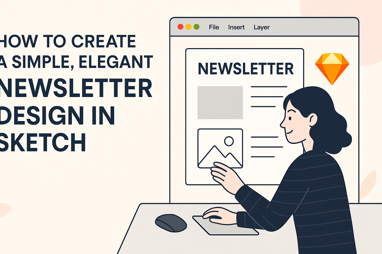
Setting Up Your Workspace
Creating a well-organized workspace in Sketch is crucial for designing an elegant newsletter.
This section focuses on choosing a template, understanding the Sketch interface, and exploring essential tools.
Choosing a Template
Start by selecting a template that suits the style of the newsletter. Sketch offers various pre-made templates to help designers get started quickly.
These templates provide a solid foundation and save time. When picking a template, consider the layout and structure. A sectioned layout may be great for newsletters with multiple articles, while a single-column layout works for simpler designs.
Once a template is chosen, you can customize it. Adding personal touches will help reflect the brand’s identity and keep the newsletter engaging.
Understanding The Sketch Interface
Familiarity with the Sketch interface is key for efficient design. The workspace consists of a toolbar, layers panel, and canvas where designs come to life.
The toolbar at the top includes tools for shapes, text, and more. Meanwhile, the layers panel on the left shows all the elements in the design. Understanding how to organize layers is vital as it affects the ease of editing later.
Using shortcuts in Sketch can also speed up the workflow, making tasks quicker and more efficient.
Essential Sketch Tools
Certain tools in Sketch are essential for creating a polished newsletter.
The Text Tool allows for easy placement and formatting of headlines and content. With it, designers can adjust font size, color, and style to maintain consistency.
The Shape Tool helps create blocks for images, articles, and sections. It’s handy for dividing the newsletter into organized parts.
Symbols are another powerful feature. They allow designers to create reusable components, ensuring uniformity throughout the newsletter. When changes are made to a symbol, they update automatically everywhere it appears.
By mastering these tools, designers can work more efficiently and produce high-quality newsletters that captivate their audience.
Designing the Layout
Creating a simple and elegant newsletter design involves careful consideration of layout elements.
A well-structured layout enhances readability and keeps the audience engaged. The following sections will explore grids, typography, and the effective use of visuals.
Grids and Guidelines
Using grids in design is crucial for maintaining balance and alignment. A grid helps to organize content cleanly, guiding the viewer’s eyes through the newsletter.
Designers should aim for a 1-column layout for mobile-friendly newsletters, ensuring all elements stack vertically.
In Sketch, the Layout Grid feature can be helpful. It allows designers to set margins and gutters, which helps create spaces between different sections. Using guidelines can further assist in aligning text and images for a neat appearance.
Working With Text and Typography
Typography plays a significant role in newsletter design. Selecting the right fonts ensures the text is easy to read and aligns with the overall theme.
It is advisable to choose 2-3 complementary fonts to create hierarchy without overwhelming the design.
Headings should be bold and stand out to draw attention, while body text should be clear and legible. Using a decent font size (around 14-16px for body text) keeps the content readable.
Designers can enhance visual interest by using text color to emphasize important points or calls to action.
Incorporating Images and Icons
Images and icons can elevate a newsletter’s look and feel. They help break up text and add visual appeal.
Designers should choose high-quality images that relate to the content and enhance the message.
Including icons simplifies complex information and provides quick visual cues. When adding images, keeping them within the grid ensures a polished layout. Using a consistent style for icons and images helps unify the design.
Remember to leave space around images for breathing room; this prevents a cluttered look and enhances overall elegance.
Adding Branding Elements
Incorporating branding elements helps create a cohesive look for a newsletter. This section covers essential components like logos, color schemes, and custom fonts that enhance brand identity.
Logo and Color Scheme
A brand’s logo is a key visual element. It should be prominently displayed at the top of the newsletter, ensuring it’s the first thing readers notice.
Choosing a color scheme that reflects the brand’s identity is crucial as well. He or she should pull colors from the logo to create a harmonious design.
Consistent use of these colors in headers, backgrounds, and buttons can help strengthen brand recognition. Using tools like color palettes can simplify this process by suggesting compatible colors.
Custom Fonts and Styles
Fonts and styles also play a vital role in branding. Selecting a custom font can make a newsletter look unique and professional.
It’s important to pick fonts that match the brand’s personality. For example, a playful brand might choose a casual font, while a corporate brand could opt for a more traditional style.
Combining a primary font for headings and a secondary font for body text creates visual contrast and maintains readability.
He or she should limit the number of fonts to two or three to keep a clean look.
Exporting and Sharing
When it comes to getting a newsletter out to the audience, proper exporting and sharing are key. This ensures the design looks great and receives the feedback needed for improvements before distribution.
Preparing for Export
Before exporting a design from Sketch, it’s important to finalize all elements.
This includes checking text alignment, font sizes, and color schemes. To prepare for export, select the artboard or layers intended for export. They can be selected individually or in groups.
After that, go to the Export menu and adjust the settings. It’s crucial to choose the right format, such as PNG for images or PDF for high-quality prints.
Using organized layers helps ensure smooth exporting. It allows for easier updates or changes later on. Developers can also export individual layers easily by selecting them.
Sharing for Feedback
Once the design is ready, sharing is the next step. Feedback is valuable as it improves the final product.
Sharing can be done through various platforms or by sending files directly via email.
Using tools like InVision or Figma allows for real-time feedback. These tools let stakeholders comment directly on specific areas of the design.
Alternatively, sharing a PDF file with stakeholders is another effective method. Make sure to clearly state what kind of feedback is needed. Asking specific questions can guide reviewers to provide more useful insights.
Final Touches Before Distribution
After gathering feedback, it’s time for the final touches.
Start by revisiting any areas that received critique. Making adjustments based on feedback ensures the newsletter meets the audience’s needs.
Double-check the final version for errors. This includes typos, broken links, and image quality.
If the newsletter will be sent via email, test it in different email clients. This ensures that it displays well across platforms.
With attention to detail, the newsletter will be ready for distribution, showcasing creativity and professionalism.