Designing a 3D button for a web or app interface can greatly enhance user interaction and engagement. Creating the illusion of depth and dimension makes buttons more visually appealing and actionable.
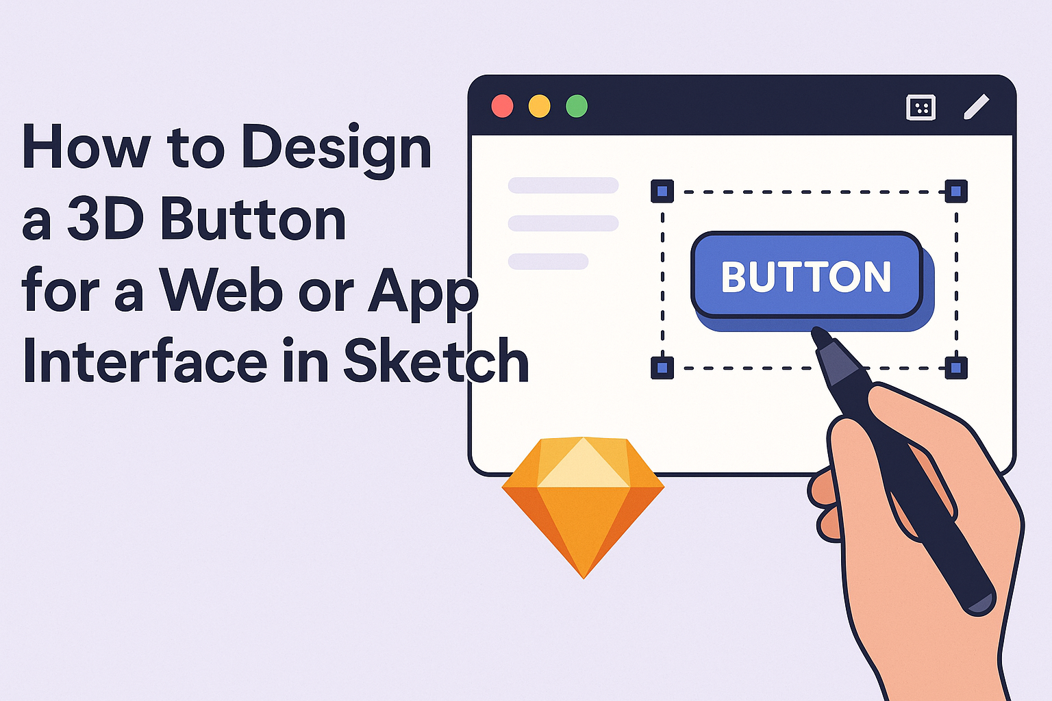
This article will guide readers through the process using Sketch, a popular design tool that simplifies crafting interactive elements.
With the right techniques, anyone can transform flat designs into eye-catching 3D buttons. The steps outlined will help streamline the design process, allowing designers to focus on creativity while achieving professional results.
Readers will discover useful tips to make their buttons not only attractive but also functional.
By following these guidelines, designers can stand out in a crowded digital landscape. The ability to create dynamic, engaging buttons will elevate their projects and improve user experience. Readers who want to take their design skills to the next level will find valuable insights ahead.
Getting Started with Sketch
Before diving into designing a 3D button, it’s essential to get familiar with Sketch. This program offers a user-friendly interface and powerful tools tailored for designing interfaces.
Understanding how to navigate Sketch effectively will enhance the design experience.
Understanding the Sketch Interface
The Sketch interface is straightforward, making it easy for beginners.
At the top, you’ll find the menu bar, which includes options for file, edit, and view. The tool panel on the left lets users access essential tools like the rectangle, oval, and text tools.
On the right side is the inspector panel. It provides options for styling, positioning, and properties of selected elements. Familiarizing oneself with this layout can speed up work processes and reduce the learning curve significantly.
Setting Up the Canvas
To start a design project, the canvas is where all the action happens.
Users can create a new artboard by pressing “A” and selecting from various preset sizes. These sizes make it easier to design for specific devices, like mobile or web.
He or she might also want to name the artboard for easy identification. It’s helpful to organize multiple artboards if working on several screen designs. The canvas allows for zooming in and out, ensuring precision while designing.
Exploring Basic Shapes and Tools
Basic shapes form the building blocks of any design in Sketch. The rectangle and oval tools are essential for creating the outline of buttons.
To create complexity, users can combine shapes using the “Union” tool or subtract elements with “Subtract”. They can also modify properties like stroke, fill color, and shadows through the inspector panel. This way, they can craft a 3D effect for buttons by playing with colors and layers.
Using keyboard shortcuts enhances efficiency. For example, “R” for rectangle and “O” for oval helps in quickly selecting tools to speed up the design process.
Designing the 3D Button
Designing a 3D button involves selecting the right colors, adding depth with shadows, and applying textures or gradients. Each step enhances the button’s appeal and usability, making it more engaging for users.
Choosing a Color Palette
The right color palette is essential for a 3D button. It should reflect the website or app’s branding while also being visually appealing.
Colors can be selected based on their emotional impact. For example, blue often conveys trust, while red can create excitement.
Using complementary colors can make the button stand out. It’s helpful to use tools like Adobe Color or Coolors to visualize different palettes. A combination of primary and accent colors often works well.
When choosing colors, consider accessibility to ensure that the button is easily visible for all users.
Adding Depth with Shadows and Highlights
To create a realistic 3D effect, shadows and highlights are crucial. Shadows give the button a grounded look, while highlights make it appear to pop off the screen.
A soft shadow under the button can simulate depth. The shadow color should be slightly darker than the button color to maintain harmony.
Highlights can be added to the top edges, mimicking light. Here, lighter shades from the button color should be used. This contrast improves visibility and interaction.
Testing different shadow intensities and highlight placements helps to find the perfect combination for the desired effect.
Applying Texture and Gradients
Applying texture can enhance the button’s tactile quality. Simple textures give it a unique feel without overwhelming the design.
Examples of textures include matte, glossy, or metallic finishes. These can be added using design software tools or overlays.
Gradients also play a key role in creating depth. A subtle gradient going from a lighter shade to a darker one creates a compelling visual.
Using a linear gradient can give a smooth transition, while a radial gradient can draw attention to the button’s center. Balancing textures and gradients makes the button look inviting and interactive.
Animating Your 3D Button
Animating a 3D button adds depth and interactivity to a web or app interface. By implementing hover effects and press animations, a designer can create a more engaging user experience.
Creating Hover Effects
Hover effects make buttons feel alive. When the user hovers over a 3D button, it can slightly lift or change color to signal interactivity.
To create a hover effect, a designer can use CSS properties like transform and transition. For instance, a simple hover effect can look like this:
.button {
    transition: transform 0.2s ease;
}
.button:hover {
    transform: translateY(-5px);
}
This code allows the button to move up slightly when hovered over. Designers can also adjust color or shadow to enhance the effect. Remember: a subtle touch often works best for a smooth experience.
Implementing Press Animations
Press animations provide visual feedback when users interact with the button. This can make the interface feel more responsive.
To implement a press effect, a designer can modify the button’s size or shadow during the click action. For example:
.button:active {
    transform: scale(0.95);
}
With this code, the button shrinks slightly when pressed, creating a realistic interaction. Adding a shadow change can also enhance the effect.
Using both hover and press animations, designers can ensure users feel connected to their actions. These simple techniques can significantly improve the overall user experience.
Exporting Your Design
Exporting designs correctly is crucial for seamless integration into web and app interfaces. This process involves preparing the assets to ensure they look great and perform well in final applications.
Slicing for Web and App Integration
Slicing is the method of dividing a design into smaller pieces for easier use in projects. In Sketch, designers can use the Slice tool to create exportable areas from their button designs.
- Select the Button: Click on the button layer in the artboard.
- Create a Slice: Use the Slice tool to draw a rectangular area around the button.
- Export Settings: In the Export panel, choose the resolution and format like PNG or SVG based on the intended use.
Designers should export at multiple resolutions for different screen sizes. This ensures the design maintains its quality and responsiveness on various devices.
Optimizing File Sizes for Performance
File optimization is vital for maintaining fast loading times.
Large files can slow down a website or app, affecting user experience.
To optimize file sizes:
- Choose the Right Format: PNG works for transparent images, while JPEG is great for photos. SVGs are excellent for vector graphics because they remain crisp at any size.
- Compress Assets: Use tools like TinyPNG or ImageOptim to reduce file size without sacrificing quality.
- Test After Export: Always preview the button in its intended environment to ensure it loads quickly and looks as expected.