Creating a product page for an e-commerce site can be a challenging task, but it is essential for attracting customers and driving sales.
A well-designed product page not only showcases the product but also enhances the shopping experience, making it easier for customers to make a purchase.
By using Sketch, designers can build an effective and visually appealing product page that meets the needs of both the business and the consumers.
Sketch offers tools that allow for creativity and precision in design, helping designers to layout product information, images, and call-to-action elements seamlessly. Understanding how to utilize these features can significantly impact how customers interact with the page.
This article will explore practical tips and techniques to create a full-fledged e-commerce product page in Sketch that can engage users and convert visits into sales.
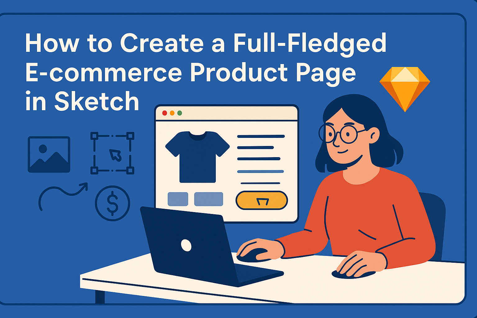
Understanding Sketch for E-commerce Design
Sketch is a powerful tool for designing e-commerce product pages. It offers intuitive features that help designers create engaging and user-friendly layouts specifically tailored for online shopping.
Getting Started with Sketch
To begin using Sketch, the first step is to download and install the software. It is available for macOS and offers a free trial.
After installation, users can create a new document and choose from various templates designed for web and mobile.
The interface is user-friendly, with a toolbar at the top and layers on the left side. New users should explore the sample files provided in the software. These examples give a great starting point for understanding how to structure a product page. Tutorials and online resources can further enhance skills when beginning with Sketch.
Key Sketch Features for Product Pages
Sketch includes several features that are particularly useful for designing product pages.
- Symbols allow designers to create reusable components, such as buttons and product images. This saves time and ensures consistency throughout the design.
- Artboards enable users to design multiple screen sizes efficiently, ensuring the product page looks great on any device.
- The Styling Tools provide options for colors, layouts, and typography. This aids in creating a visually appealing design that aligns with brand identity.
Using these features, designers can easily build an effective product page. They can focus on creating a seamless shopping experience that attracts customers and encourages purchases.
Crafting the Layout
Creating a well-structured layout is essential for a successful e-commerce product page. This section covers how to define a grid system, consider responsive design, and wireframe the product page for optimal user experience.
Defining the Grid System
A clear grid system helps organize elements on the page. It allows for consistent spacing and alignment, making the layout easy to navigate. A common approach is using a 12-column grid, which provides flexibility in design.
Key points for a grid system:
- Use consistent margins and padding.
- Align text and images to the grid columns.
- Keep key components like product images and descriptions within the same grid structure.
For instance, placing the product image in a larger span while providing ample space for descriptions alongside it can enhance readability.
Responsive Design Considerations
Responsive design is crucial for e-commerce sites. Customers access products on various devices, so layouts must adapt smoothly. Using flexible grid systems and media queries will ensure elements resize appropriately.
Important tips include:
- Test the layout on different screen sizes.
- Stack elements vertically on smaller screens for easier viewing.
- Maintain touch-friendly buttons and links for mobile users.
By keeping these factors in mind, it ensures a seamless shopping experience, no matter the device.
Wireframing Your Product Page
Wireframing serves as a visual blueprint for the product page. It allows designers to plan the content layout before creating detailed designs. This phase focuses on placement without distractions from design elements.
Steps for effective wireframing:
- Start with rough sketches to outline key components.
- Identify the hierarchy of information—what is most important for users to see first.
- Use tools like Sketch or Figma to create digital wireframes for clarity.
By focusing on user needs in the wireframe, it becomes easier to build an engaging and functional product page later on.
Adding Product Details
In this section, the focus is on key elements that enhance an e-commerce product page. These include using high-quality images, crafting engaging product descriptions, and designing a user-friendly checkout process.
Incorporating High-Quality Images
High-quality images are crucial for attracting customers. They provide a clear view of the product and help buyers feel more confident about their purchase.
Using multiple angles can showcase different features. For instance, displaying the product in use allows customers to envision how it fits into their lives.
Consider these tips:
- Use professional photography.
- Include zoom functionality for details.
- Highlight product variations, like colors or sizes.
High-quality images make a lasting impression and play a significant role in influencing buying decisions.
Writing Compelling Product Descriptions
A well-written product description captures the reader’s attention and informs them about the product. It should highlight features, uses, and benefits clearly and engagingly.
Start with a strong opening line that entices the reader. Then, provide specific details like dimensions, materials, or unique selling points.
Here’s how to improve descriptions:
- Use bullet points for quick facts.
- Answer common questions customers may have.
- Include a story that connects the product to the customer’s needs.
Effective descriptions can lead to higher conversion rates and a better shopping experience.
Designing an Intuitive Checkout Process
An easy checkout process is essential for reducing cart abandonment. The design should guide users smoothly from product selection to payment.
To achieve this, minimize the number of steps required. Provide clear instructions, and use familiar icons for actions like “Add to Cart.”
Key features to include:
- Guest checkout option to streamline purchases.
- Visible cart summary throughout the process.
- Clear calls to action for each step.
An intuitive checkout can significantly improve customer satisfaction and encourage repeat business.
Finishing Touches
Once the main design is complete, final adjustments can elevate the product page. Focusing on the right fonts and colors, engaging micro-interactions, and thorough previewing will ensure a polished look that enhances user experience.
Selecting the Right Fonts and Colors
Choosing the right fonts and colors is essential to convey the brand’s message. Fonts should be easy to read, with a hierarchy that guides the user’s eye through the page. Pair a bold font for headings with a clean, sans-serif font for body text.
Color selection should align with the brand palette. Consider using contrasting colors for call-to-action buttons to make them stand out. Aim for a palette that is pleasing to the eye and maintains accessibility.
Adding Micro-Interactions for User Engagement
Micro-interactions can greatly enhance user experience. These small animations provide feedback and make the interface feel more dynamic. For example, a button could slightly change color when hovered over, indicating it is clickable.
Another great option is animating product images as users scroll. This keeps users engaged and encourages them to explore more. Simple effects, like showing product details on hover, can also be effective without overwhelming the design.
Previewing and Testing the Design
Before finalizing the product page, thorough testing is crucial.
Preview the design on different devices to ensure it looks great on all screen sizes. This helps identify any layout issues that may arise.
It’s also valuable to gather feedback from real users.
Asking a few individuals to navigate the page can reveal strengths and weaknesses. Adjustments based on this feedback can lead to a smoother user experience.