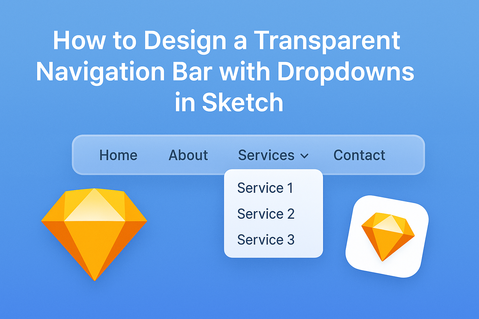
Designing a transparent navigation bar with dropdowns in Sketch can really enhance the look of a website. By following a few simple steps, designers can create a stylish and functional menu that draws users in without overwhelming them. This design is not only modern but also allows the content behind it to shine.
In this article, readers will learn how to set up a transparent navigation bar that seamlessly integrates with their site’s aesthetic. From customizing colors to adding smooth dropdown effects, each step will guide them through the process. With the right approach, anyone can make a navigation bar that is both user-friendly and visually appealing.
Getting Started with Sketch
Sketch is a powerful design tool that makes creating user interfaces easier.
Understanding its interface and setting up the workspace are key steps for anyone starting on their design journey.
Understanding the Sketch Interface
The Sketch interface is user-friendly, making it ideal for beginners.
Key components include the toolbar, the canvas, and the inspector panel.
The toolbar at the top provides access to essential tools like shapes, text, and symbols.
The canvas is where the actual design happens. Users can zoom in and out for detailed work or a broader view.
Meanwhile, the inspector panel on the right shows properties of selected layers, allowing quick adjustments. Familiarizing oneself with these components will enhance productivity and ease of use.
Setting Up Your Workspace
Setting up the workspace helps streamline the design process.
First, users should create a new document via File > New.
Next, adjusting the canvas size is critical. Users can set the size to fit the design requirements, whether it’s for mobile or desktop interfaces.
Organizing the workspace with useful panels is also beneficial.
Users can enable layers, pages, and symbols in the inspector panel. This organization makes it easier to manage assets during the design process.
Finally, exploring the different preferences under the Sketch menu can enhance the overall experience, allowing users to customize settings according to their workflow.
Designing Your Navigation Bar
In this section, readers will learn how to structure, style, and create a transparent effect for their navigation bar. Each step is crucial to ensure a visually appealing and user-friendly design.
Creating the Navigation Bar Structure
To begin designing the navigation bar, the first step is to create the basic layout using shapes.
Start with a rectangle that will serve as the background. This rectangle can be adjusted to the width of the screen to give it a full-width appearance.
Next, add text labels for the navigation items such as “Home,” “About,” and “Contact.” Use a clear, legible font and ensure that each label is spaced evenly.
Consider adding icons next to the text for a modern touch. Group the elements together so they can be easily moved and aligned later.
Styling the Navigation Bar
Now that the structure is set, it’s time to style the navigation bar.
Change the background color to something that suits the overall theme of the design. Light colors often work well as a base.
Adjust the font size and style to match the desired aesthetic. Play with effects like bold, italics, or different colors for hover states. This can help make the navigation items stand out when users interact with them.
Adding a subtle shadow beneath the navbar can also create depth. Use the layers panel to manage and organize all elements, ensuring they look great together.
Making the Navigation Bar Transparent
To achieve a transparent navigation bar, select the rectangle and adjust its opacity. Setting it between 70% and 90% can work well. This lets the background show through while still keeping the text readable.
Ensure that the text color contrasts well against the background. Dark text on a light background or vice versa typically works best.
Consider using RGBA colors if working with CSS. This allows better control over the transparency while ensuring colors remain vibrant. Test the navigation bar with different backgrounds to see how it performs visually.
Adding Dropdown Functionality
Creating functional dropdown menus is key to making a navigation bar user-friendly. This involves designing the dropdown elements and incorporating smooth animations for a better user experience.
Designing Dropdown Menus
To start, the dropdown menu should be visually distinct yet cohesive with the main navigation. Each dropdown can include items like categories or sub-pages.
Key elements to include:
- Background Color: A slight contrast helps it stand out.
- Text Styling: Font size and color should ensure readability.
- Padding and Margin: Adequate spacing makes items easier to click.
It is essential to ensure that each dropdown is properly aligned and anchored to its parent menu item. Users should have a seamless experience without confusion. Consider using a clear hover effect to indicate active items.
Animating Dropdown Elements
Adding animations can elevate the user’s interaction with the dropdown.
A simple fade or slide effect can make the menu feel more dynamic.
Animation options might include:
- Fade In/Out: Creates a smooth appearance and disappearance.
- Slide Down/Up: Adds an engaging visual when users open or close a dropdown.
Use tools like Sketch’s prototyping features to simulate these animations. It allows designers to see how the dropdown behaves in real-time.
Adjust the duration of animations to ensure they are neither too slow nor too fast. The goal is to enhance usability without distracting the user from navigating.
Testing Interactivity
After refining the design, it is vital to test how the navigation bar works.
Interactivity includes hover effects, dropdown menus, and overall responsiveness.
Check that the dropdown menus open smoothly and close when clicked outside. This provides a better user experience.
Make sure the navigation feels intuitive.
Use tools or prototyping software to simulate real user interactions. This allows for identifying any issues.
He or she should also gather feedback from users. Their insights can guide further improvements.
Testing helps ensure the navigation is user-friendly and engaging.