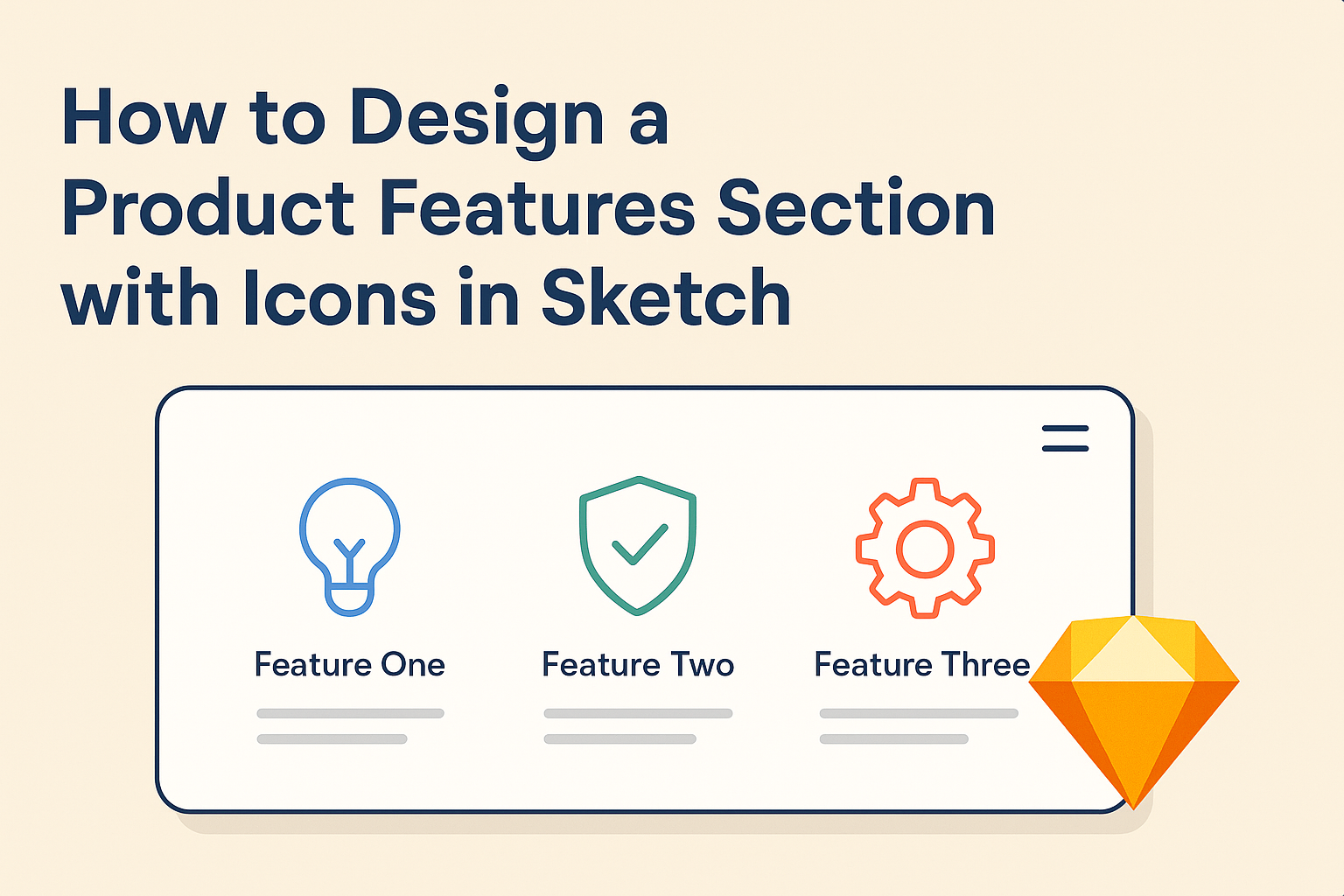
Designing a product features section can greatly enhance a user’s understanding of what a product offers. Using icons in Sketch not only makes the section visually appealing but also helps convey information quickly and clearly.
By integrating simple yet effective icons, designers can highlight key features and foster a better connection with the audience.
Creating this section in Sketch is a straightforward process, even for those who are new to the platform. With a few basic tools and techniques, anyone can craft an engaging layout that showcases features in a user-friendly manner.
This approach ensures that users can easily digest the information without feeling overwhelmed.
As the importance of visual design grows, understanding how to effectively use icons becomes essential. This article will explore practical tips and steps for designing a product features section that stands out and communicates effectively.
Understanding Sketch
Sketch is a powerful tool widely used for designing user interfaces and graphics. It allows designers to create icons and other visual elements effectively.
Familiarity with its interface and features is crucial for anyone looking to create a product features section with icons.
Getting Started with Sketch
To get started with Sketch, users need to download and install the application.
Once opened, they can create a new document by selecting “File” and then “New.”
Users should familiarize themselves with the canvas, where designs take shape.
Sketch supports various file formats, allowing importing and exporting designs easily. It also offers templates that help kickstart projects.
Beginners can explore tutorials to learn basic functions, such as shape creation and text addition, to build foundational skills.
Exploring the Sketch Interface
The Sketch interface is user-friendly and designed for efficiency. The main components include the toolbar, the layers panel, and the inspector.
The toolbar contains essential tools like the shape tool, text tool, and symbol tool.
Layers are displayed in the layers panel, which helps in organizing designs. Users can group, rename, and lock layers for better management.
The inspector shows properties for the selected objects, including colors, borders, and shadows.
Understanding these elements helps streamline the design process and makes it easier to focus on creativity.
Key Features of Sketch for Icon Design
Sketch offers unique features that benefit icon design. One important feature is Symbols, which allows users to create reusable design elements. Icons can be converted into symbols, saving time and ensuring consistency.
Another useful tool is the Styles feature, helping to maintain a cohesive look across designs. Users can set default styles for shapes, text, and more with just a few clicks.
Additionally, the ability to create artboards gives users the option to design multiple icons quickly. This layout makes it easier to see how icons work together, ensuring a harmonious design that enhances the product features section.
Planning Your Product Features Section
Creating a product features section with icons involves careful planning. It is essential to identify the core features, decide on an iconography style, and establish a layout strategy that appeals to users.
Identifying Your Core Features
The first step in planning is to identify the core features that the product offers. These should be the features that provide the most value to users.
Key considerations include:
- User Needs: Understanding what users want is crucial. This can come from user feedback or market research.
- Problem-Solving: Each feature should address a specific problem that users face.
- Prioritization: Use a prioritization method, like the MoSCoW (Must have, Should have, Could have, Would like), to highlight which features to showcase first.
These priorities help in making clear and focused decisions.
Deciding on Iconography Style
Choosing the right iconography style can greatly enhance how features are perceived. The icon style should match the overall design of the product.
Factors to consider include:
- Consistency: Icons should have a unified look. This could be line art, filled icons, or even 3D styles.
- Simplicity: Icons need to be simple enough to be easily recognizable. Users should understand the meaning at a glance.
- Brand Alignment: The icon style should reflect the brand’s identity. Compatibility with color schemes and typography is important for a cohesive appearance.
This careful selection boosts user comprehension and engagement.
Creating a Layout Strategy
The layout plays a key role in how features are displayed. A well-thought-out layout improves usability and visual appeal.
Tips for an effective layout include:
- Grid Systems: Utilizing a grid helps maintain alignment and spacing. This creates a neat and organized look.
- Visual Hierarchy: Arrange the features by importance, using size or positioning to draw attention to key features.
- Whitespace: Including adequate whitespace prevents the design from feeling cluttered. It enhances readability and focus.
By focusing on these elements, the product features section can effectively communicate value to users.
Designing Icons in Sketch
Creating icons in Sketch is an enjoyable process. Designers can effectively draw shapes, apply colors, and utilize symbols to enhance their icons’ appearance and functionality.
Drawing and Editing Shapes
To start designing icons, it is important to know how to draw and edit shapes. Sketch provides a variety of shape tools like rectangles, circles, and polygons.
- Create Shapes: Users can simply click and drag to create the desired shape.
- Edit Points: By selecting the shape, it’s easy to adjust points for precise design.
- Transform Tools: The transform options allow for scaling and rotating, which helps create unique designs.
Utilizing these features offers flexibility in design. Adjusting the size or shape is simple, enabling quick tweaks when needed. Each icon can stand out with a few adjustments.
Applying Colors and Effects
Color can transform a simple shape into an attractive icon. Designers can apply colors using the Fill tool. It allows for solid colors, gradients, or patterns.
- Color Picker: Using the color picker provides an easy way to select specific hues.
- Opacity: This feature helps to create layers of color and visual interest.
- Effects: Shadows and blurs can add depth, making icons more engaging.
By experimenting with colors and effects, designers can create visually appealing icons that match the product’s theme. Icons should be eye-catching yet relevant to their function.
Using Symbols and Libraries
Symbols in Sketch are a great time-saver. Designers can create reusable icons that stay consistent across projects.
- Create Symbols: With a right-click, icons can be converted into symbols for easy access.
- Libraries: Sketch allows users to save symbols in libraries for future use.
This keeps designs organized and quick to update.
- Instance Overrides: Designers can change colors or sizes of instances without altering the original symbol.
Using these features helps maintain a cohesive look in a design project. It streamlines the workflow, ensuring that icons remain consistent and easy to manage throughout the design process.