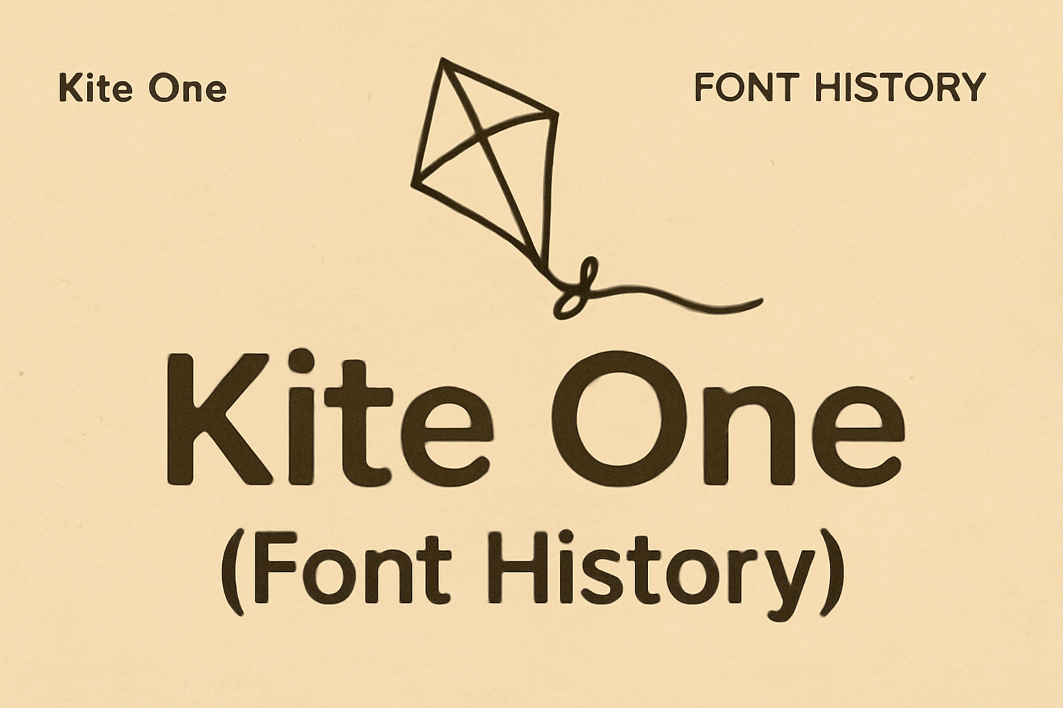
Kite One is a unique font that captures attention with its smooth, monoline design. Known for its clarity and fluid reading experience, this typeface is a favorite among designers.
The font features a slight inclination of 7 degrees, giving text a gentle flow that’s pleasant to read. Its rounded, humanist sans-serif style uses long ascenders and open shapes, adding to its readability. With these characteristics, Kite One is especially appealing for texts related to nature or clean layouts.
Designers appreciate its friendly appearance, making it suitable for both print and digital media. Kite One’s adaptability ensures it fits well in different contexts, enhancing visual communication. For those interested in exploring or downloading this font, Kite One on Fontsource offers easy access and installation options.
Origins of Kite One
Kite One is known for its rounded, monoline, humanist sans serif style, offering a friendly and modern look. The design focuses on achieving a fluid reading experience, marked by long ascenders and soft shapes. This section explores the design philosophy behind Kite One and provides insight into the creator’s background.
Design Philosophy
Kite One features a 7-degree inclination, making text flow naturally and comfortably. Its long ascenders and descenders enhance readability, especially in lengthy passages. The typeface’s soft shapes and open counterforms complement its overall friendly appearance.
The design philosophy centers around creating a font that feels welcoming and versatile. Kite One suits various applications, including educational materials and websites. Its aesthetic ties to the natural world, emphasizing simplicity and clarity. This makes it perfect for settings where warmth and ease of reading are essential.
Creator Background
Kite One was crafted by Eduardo Tunni, a well-regarded type designer known for his focus on readability and aesthetic charm. Tunni’s work often merges practicality with creativity, an approach reflected in Kite One. His background in design has enabled him to craft typefaces that meet modern needs while preserving classic elements.
Through years of experience, Tunni has honed his skills to offer fonts like Kite One that cater to diverse audiences. His contribution to typography extends to creating fonts that are accessible and visually appealing. The result is a typeface appreciated by both casual users and design professionals.
Typography Characteristics
Kite One is a typeface designed for clarity and ease of reading. This section explores its font style and how it enhances readability and usage across various contexts.
Font Style
Kite One is a sans-serif typeface known for its rounded, monoline design. This means the lines are evenly thick, giving a clean and seamless look. Its geometric shapes provide a modern feel, making it appealing for digital and print media.
The typeface features soft shapes and open counterforms, which contribute to a gentle and welcoming appearance. The slight inclination of 7 degrees adds a fluidity to the text, ideal for engaging readers over long passages. Its design makes it versatile for different applications, from children’s books to environmentally-themed materials.
Readability and Usage
This font is crafted to maximize readability. Long ascenders and descenders, along with soft terminals, enhance line spacing, allowing for smoother reading experiences. This quality makes it suitable for extensive texts where maintaining reader interest is key.
Kite One is often utilized in contexts that call for a natural and friendly atmosphere. It works well in educational settings and literature aimed at younger audiences. The clarity of its design ensures it remains engaging on both digital screens and printed pages. Discover more about its attributes on Google Fonts.
Technical Specifications
Kite One is a versatile sans serif font designed with accessibility and readability in mind. This section details its file format compatibility and the range of font weights and variants available.
File Format and Compatibility
Kite One is primarily available in the OpenType format (OTF). OpenType is widely supported on modern operating systems, making it compatible with most software that handles fonts. Users can install it on Windows, macOS, and Linux with ease.
This font can be used in various applications, including web design, graphic design, and word processing. It integrates well with web technologies, allowing designers to embed it on websites. For those managing websites, Kite One can be self-hosted or accessed through content delivery networks (CDNs), enhancing loading speed and ensuring privacy.
Font Weights and Variants
Kite One offers a single weight: regular 400. This makes it straightforward for those who prefer simple font choices that ensure consistency across different platforms. Although it doesn’t provide multiple weights, its clear and rounded design makes it suitable for both digital and print media.
Despite the singular weight option, the font maintains excellent readability due to its well-balanced structure. This makes it a preferred choice for long texts, such as children’s stories or educational material, where readability is paramount.
Designers appreciate its clean look, which pairs nicely with other typefaces, giving them flexibility in design projects.
Inclusion in Design Projects
Inclusion in design projects ensures that products and communications are accessible to everyone. It involves thoughtful choices in branding, identity, and media formats to reach diverse audiences effectively.
Branding and Identity
Inclusive branding involves creating an identity that resonates with a broad audience. This means considering diverse cultures, languages, and accessibility needs in visual and verbal communication. Brands often use simple, clear designs and language that are easy to understand.
Colors and Fonts: Colors should be chosen for clear visibility, even for those with color blindness. Fonts should be legible, like Kite One, which offers a friendly, readable style.
When developing brand identity, companies often include feedback from diverse groups to ensure inclusivity.
Print and Web Media
In print and web media, inclusivity focuses on accessibility and reach. Text size, contrast, and layout are important for readability. Designers choose fonts like OpenDyslexic and colors that enhance readability.
Website accessibility ensures users can navigate and understand content. This can involve alt text for images and keyboard-friendly navigation. Websites may also feature inclusive content, like transcriptions, ensuring all users can access information.
Print media applies these principles by using clear layouts and high-contrast colors to cater to all readers. Efforts in both media help build a more inclusive and engaging world for everyone.
Reception and Critiques
Kite One has been recognized for its unique design and versatility. It is particularly popular for use in natural world themes and children’s literature. Feedback from designers and everyday users sheds light on its usability and aesthetic charm.
Design Community Feedback
Designers applaud Kite One for its rounded, monoline style, which brings a friendly and modern touch to text. Its 7-degree inclination offers a smooth reading experience, aligning well with its clean and soft appearance. Many in the design community find it especially effective for long text passages, appreciating its long ascenders and open counterforms. These features contribute to its appeal in designs related to nature and informal, approachable themes.
However, some designers note limitations in its use for more formal or corporate projects. While it has a relaxed vibe, this can be less suitable for traditional settings. Still, the consensus remains positive, with Kite One praised for its balance of aesthetic appeal and functionality.
User Experiences
Users often highlight the comfort in reading because of Kite One’s smooth design features. Its monoline structure lends itself well to digital screens, giving a pleasant reading experience on websites and e-readers. Many users appreciate it for its readability in extended texts, such as children’s tales where its soft terminals can evoke a comforting tone.
Despite its strengths, some users feel the font might not stand out enough for headlines or display text. Yet, the soft shapes and inclined letters often make it an excellent choice for casual or creative content, maintaining positive feedback overall from a diverse user base.
Historical Milestones
Kite One has had a notable journey in the world of typefaces. Its design elements and versatility have brought various awards and industry usages, highlighting its importance in graphic design.
Awards and Recognitions
Kite One has been recognized for its unique and eye-catching design. While specific awards might not be widely documented, its inclusion in Google Fonts speaks to its credibility and popularity. Being part of such a platform indicates acceptance and approval by typography enthusiasts and professionals. Typeface awards often consider factors like legibility, innovation, and aesthetic appeal.
Being a monoline, sans serif typeface, Kite One has gained appreciation in design communities. Its easy readability and friendly style have made it a preferred choice for designers seeking a clean and modern look.
Key Usage in Industry
In the industry, Kite One has diverse applications. Its rounded, monoline structure makes it suitable for children’s books and educational materials, where clarity is crucial. The soft and inviting appearance of Kite One also works well in branding and marketing materials, particularly for products related to the natural world.
Designers often choose Kite One for projects needing a warm and approachable feel. Its combination of long ascenders, descenders, and open counterforms offers a balanced and versatile typeface option that adapts to different themes and messages.