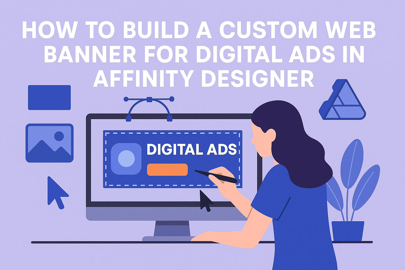
Creating a custom web banner for digital ads can be a fun and rewarding project.
With Affinity Designer, users can easily design eye-catching banners that attract attention and promote their brands effectively. This powerful software offers various tools and features that simplify the design process, making it accessible for beginners and experienced designers alike.
As digital advertising continues to grow, having a well-designed banner becomes essential for reaching audiences.
She can explore design tips, layout ideas, and effective use of colors that will make her banners stand out. By tapping into the features of Affinity Designer, he can create impactful ads that drive engagement and conversions.
Whether it’s for social media, websites, or email campaigns, a custom web banner can elevate any marketing strategy.
Those who take the time to craft a professional-looking banner will see the benefits in their campaign’s performance.
Understanding Web Banner Design
Effective web banner design requires attention to specific aspects that impact user engagement.
Key factors include size and resolution, color choices, and element balance. Each of these components plays a crucial role in how a banner captures attention and conveys a message.
Importance of Size and Resolution
The size of a web banner is critical for its visibility.
Common sizes include 728×90 (leaderboard), 300×250 (medium rectangle), and 160×600 (wide skyscraper). Selecting the right size ensures the banner fits well on different devices.
Resolution affects the clarity of the design. A banner should be at least 72 DPI for web use, ensuring it looks sharp on screens.
Designers should preview their banners on various devices to check for quality and fit.
Choosing the Right Color Scheme
Colors evoke emotions and can influence user behavior. When selecting a color scheme, it’s essential to consider the brand’s identity.
Complementary colors work well together and can make the banner pop while attracting attention.
Using colors consistently helps with brand recognition. Tools like Adobe Color can assist in creating a harmonious palette. Remember, too many colors can be distracting, so stick to two or three main shades for balance.
Balancing Elements for Visual Appeal
A well-designed banner has a balance of text, images, and whitespace. This makes it easy to read and visually attractive.
Key elements, like the call to action, should stand out but not overwhelm the viewer.
Using grids can help organize elements effectively. It’s essential to leave enough whitespace to avoid clutter. This allows each part of the banner to breathe, helping guide the viewer’s focus toward the main message.
Navigating Affinity Designer for Banner Creation
Getting comfortable with Affinity Designer is essential for creating stunning web banners. By setting up the workspace and familiarizing oneself with the tools, the design process can be much smoother and more efficient.
Setting Up Your Workspace
To start, launching Affinity Designer opens with a blank canvas. The first step is to set up the workspace for creating a web banner.
- New Document: Click on “File” and select “New.” Set the width and height, such as 1200 pixels by 600 pixels, for a standard banner size.
- Customize Workspace: Go to “View” and adjust the layout. He can arrange panels for easy access to tools.
- Save Workspace: Once the layout is perfect, save it. This ensures quick access in future projects.
Taking these steps allows for an efficient workflow, making design more enjoyable.
Familiarizing with Tools and Panels
The right tools make all the difference in design. Understanding the main tools in Affinity Designer is key to working on banners.
- Toolbar: The toolbar on the left holds essential tools like the Rectangle Tool and Text Tool. Using these aids in creating shapes and adding text easily.
- Context Toolbar: Just above the canvas, it changes based on the selected tool. This allows for quick adjustments, like color and size.
- Layers Panel: Found on the right, the Layers Panel helps manage different design elements. Organizing layers makes it simple to edit individual parts without disturbing others.
By knowing these tools and where to find them, he can create professional-looking banners swiftly.
Designing the Banner
Creating a custom web banner involves careful consideration of several elements. This section focuses on important aspects such as the background, text placement, and the incorporation of images or graphics to achieve an engaging design.
Creating a Background
The background sets the tone for the entire banner. Choosing the right color or image is essential. It should complement the message without overwhelming it.
Affinity Designer offers various tools to create a solid color background or import images. When using images, ensure they are high resolution to avoid pixelation.
Consider using gradients or patterns to add depth. A subtle texture can make the banner feel more dynamic. Test different backgrounds to see how they interact with other design elements.
Adding Text and Typography
Text is crucial for conveying the message clearly. The choice of typography can significantly impact readability and viewer engagement.
Select fonts that align with the brand’s personality. A bold font may work best for headlines, while a simpler font can enhance body text readability.
Use hierarchy to guide the viewer’s attention. This can be achieved through size, weight, and color contrasts.
Keep the text concise. Use bullet points for lists to break up information. Make sure there’s enough spacing between letters and lines to enhance clarity.
Incorporating Images and Graphics
Images and graphics can make a banner more visually appealing and informative. They should be relevant to the message being conveyed.
Affinity Designer allows users to easily add icons and images. Opt for graphics that enhance the message without making it cluttered.
Consider using illustrations for a unique touch. Transparent backgrounds can help images blend seamlessly into the banner.
Remember, quality matters. Low-resolution images can detract from the professional look. Always stay consistent with the overall color scheme and style for a cohesive design.
Preparing for Export
Before exporting a web banner in Affinity Designer, it’s essential to ensure the design is optimized for fast loading and looks great on various devices. Careful attention to file formats and sizes will help maintain quality and performance.
Optimizing for Web Performance
To optimize a web banner, focus on reducing file size without losing quality. This helps the banner load quickly, improving user experience.
- Image Compression: Use tools like Affinity Designer’s export settings to compress images. Aim for a balance between quality and file size.
- Color Profiles: Save the banner in RGB color mode since it displays best on screens, ensuring vibrant colors.
- Dimensions: Set the correct dimensions for the banner according to the ad platform’s specifications. Common sizes include 300×250, 728×90, and 160×600.
By keeping these points in mind, a designer can enhance the performance of the banner and make it more effective for online advertising.
Choosing the Right File Format
Selecting the appropriate file format is crucial for a web banner. Each format serves different purposes and affects quality and loading times.
- JPEG: Great for images with gradients. It compresses well but may lose some detail.
- PNG: Ideal for graphics with transparency and sharp edges. It maintains high quality but results in larger file sizes.
- GIF: Best for simple animations and small graphics. However, it has limited colors.
Choosing the right format based on the banner’s content can significantly affect its performance and visual appeal.