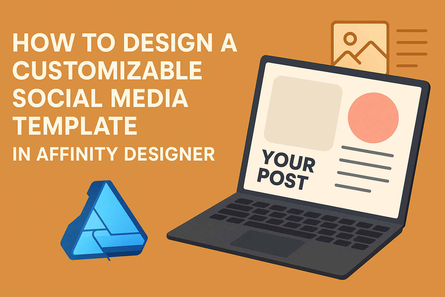
Creating eye-catching graphics for social media can be fun and rewarding. By designing a customizable social media template in Affinity Designer, anyone can streamline their content creation process and maintain brand consistency. This approach not only saves time but also allows for greater creativity with each post.
Affinity Designer offers various tools that make it easy to craft unique templates tailored to different platforms.
Users can start with a basic layout and customize elements like colors, fonts, and images to match their style. This flexibility helps them stand out in crowded feeds while sharing their message effectively.
Whether it’s for a business or personal brand, having a template saves time and effort in the long run. With a solid template in place, creators can focus more on engagement and strategy instead of starting from scratch every time they post.
Getting Started with Affinity Designer
Affinity Designer is a powerful tool for creating customizable templates. Knowing how to navigate its workspace and set up documents is essential for any designer.
Understanding the Workspace
When users first open Affinity Designer, they encounter a clean and user-friendly workspace. The main areas include the Toolbar, Context Toolbar, Color Panel, and Layers Panel.
- The Toolbar on the left holds the essential tools for drawing shapes and editing objects.
- The Context Toolbar changes based on the selected tool and provides options specific to that tool.
- The Color Panel allows designers to choose and adjust colors easily.
- The Layers Panel helps organize design elements, making it simple to manage different components of a project.
Familiarity with these areas enhances efficiency while working on templates.
Setting Up Your Document
Creating a new document in Affinity Designer is straightforward.
Users should click on File and then New. This action opens a dialog box for setting up document specifications.
Key settings include:
- Document Type: Choose between Print, Web, or Screen.
- Dimensions: Select the size for the template, like 1080×1080 pixels for social media posts.
- Resolution: Set the resolution, typically 72 DPI for web or 300 DPI for print.
After selecting these options, users can click Create, and their customized workspace will be ready for design tasks. Setting these parameters correctly is crucial for the final product.
Designing the Template Elements
Creating a customizable social media template involves several key elements. Focusing on the color palette, layout, and text styles makes it easier to design a template that meets diverse needs.
Choosing a Color Palette
Selecting the right color palette is crucial. A good palette enhances the visual appeal and ensures brand consistency.
Start by picking a primary color that reflects the brand’s personality. He can then choose complementary colors for accents.
It’s best to limit the palette to 3-5 colors. For example, a popular choice might be a combination of a bold color, a neutral shade, and an accent color. Tools like Adobe Color or Coolors can help in generating color schemes.
Make sure the colors work well on different devices and backgrounds. Ensuring accessibility is important, so check color contrast to assist those with visual impairments.
Creating a Flexible Layout
A flexible layout accommodates various types of content. This approach allows for easy adjustments based on the specific post needs.
Start by defining a grid system. A common choice is a 3-column grid, providing ample space for images and text. He should also include margins to keep elements from feeling crowded.
Incorporating placeholders for images ensures the design remains consistent. This helps in quickly swapping images without altering the layout. Using smart objects in Affinity Designer makes this process easier.
Keep in mind the importance of whitespace. Adequate spacing around elements helps create a clean look and guides the viewer’s eye through the content.
Working with Text Styles
Text styles add a professional touch and ensure readability. He should create distinct styles for headings, subheadings, and body text.
Using a maximum of two fonts is best. One font can serve for headings and another for body text. This balance keeps the design cohesive.
Adjusting font size, weight, and spacing improves clarity. For instance, a larger, bolder font can be used for headings to draw attention, while a simpler font works well for body text.
It’s important to maintain consistency in font usage throughout the template. Creating text styles in Affinity Designer will help keep everything uniform when creating multiple posts.
Customization Techniques
Customizing a social media template in Affinity Designer can make posts more engaging. Two effective ways to achieve this are through using symbols and assets, and adding placeholder elements. Each technique offers unique advantages to streamline the design process.
Using Symbols and Assets
Symbols in Affinity Designer allow for easy updates across multiple instances. When a designer edits a symbol, all related components update automatically. This feature is crucial for maintaining consistency in brand elements, like logos or icons.
To create a symbol, select the desired object and navigate to the “Layers” panel. Right-click and choose “Create Symbol.” Designers can then drag this symbol from the Assets panel into their project.
Using assets, such as pre-designed elements or graphics, can speed up the creative process. Access the Assets panel, choose from various categories, and drag elements into the workspace. This method helps maintain visual coherence and saves design time.
Adding Placeholder Elements
Adding placeholder elements is an effective way to visualize content layout. Designers can include boxes or shapes representing images, text, and other content. This practice allows a clearer view of how finalized posts will appear.
To create placeholder elements, use the Rectangle or Ellipse tools. Set dimensions that reflect the intended design, and style the placeholders minimally. Later, these boxes can easily be replaced with actual content.
Another benefit of using placeholders is testing different layouts. Designers can switch positions and sizes to see what works best visually. This flexibility aids in refining the overall design before finalizing it for posting.
Exporting and Sharing Your Template
Exporting and sharing a customizable social media template in Affinity Designer can enhance collaboration and simplify usage. Knowing the right file formats and sharing options will help the user distribute their designs effectively.
File Formats and Export Options
When exporting a template, it’s essential to choose the right file format based on how it will be used. Affinity Designer offers several options, including:
- PNG: Best for images with transparent backgrounds, suitable for social media posts.
- JPEG: Ideal for high-quality photos but doesn’t support transparency.
- PDF: A versatile option for print or digital sharing, keeping vector quality intact.
- Affinity File (.afdesign): Keeps layers and edits available for future work.
To export, the user should go to the “File” menu, select “Export,” and choose the desired format. Adjust settings such as resolution and quality based on the platform requirements.
Sharing Templates with Others
Sharing templates is a great way to collaborate with team members or clients.
Users can share the Affinity file directly, enabling others to make edits.
For easy sharing, the following methods can be used:
- Cloud Services: Upload to Google Drive or Dropbox for easy access.
- Email: Directly attach the Affinity file or exported format.
- Social Media: Upload images directly to platforms for immediate use.
It’s helpful to include usage instructions with shared templates.
This ensures others understand how to navigate and modify the design effectively.