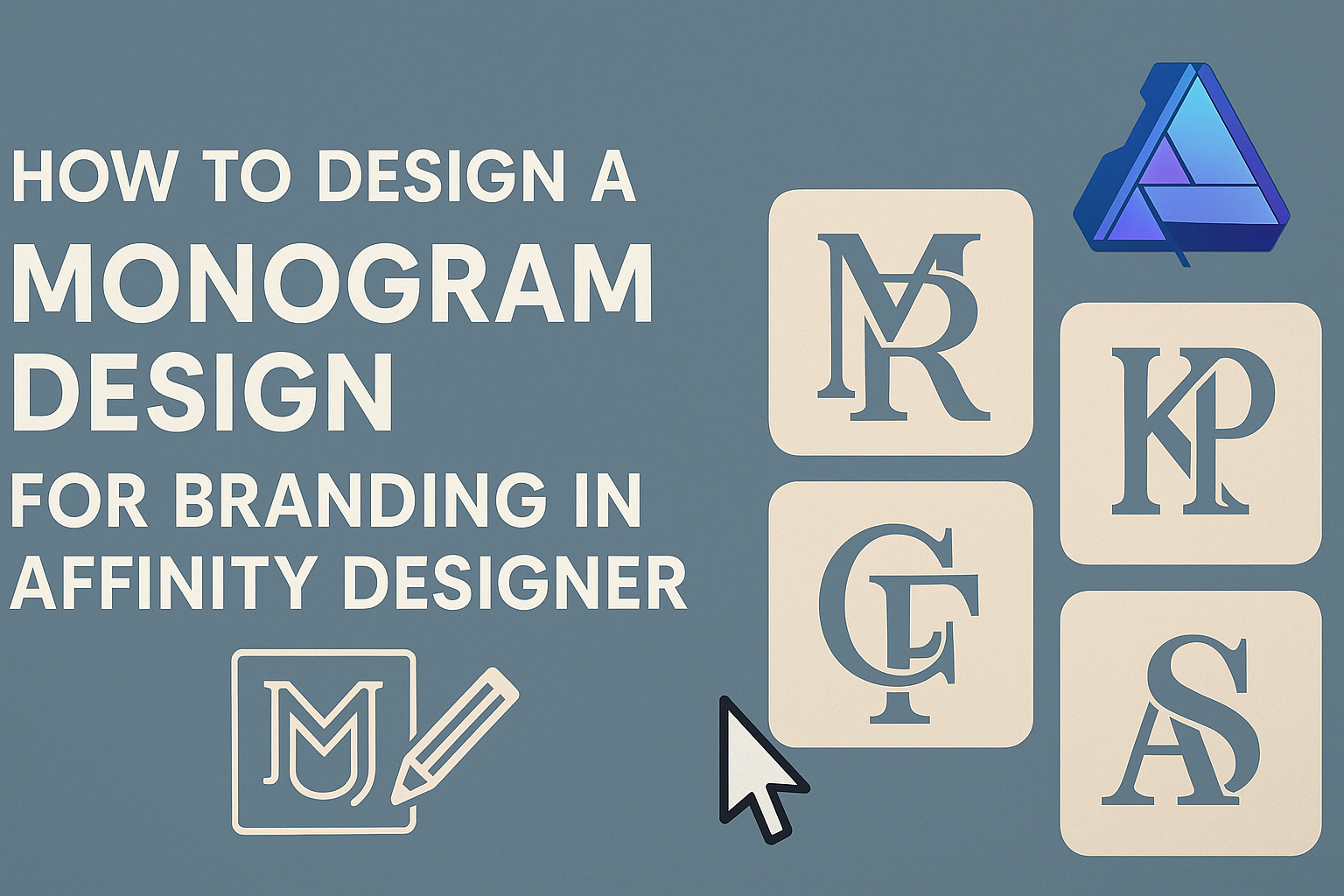
Creating a monogram design can elevate a brand’s identity and make it stand out in a crowded market. A well-crafted monogram not only reflects the personality of the brand but also enhances its memorability in the eyes of customers.
Affinity Designer is a powerful tool that can help anyone, from beginners to advanced users, create stunning monograms with ease.
To start designing a monogram, it’s essential to gather inspiration and think about the brand’s values and style. By understanding the core message, designers can choose the right fonts and shapes to convey that message effectively.
This guide will walk through the steps needed to harness the full potential of Affinity Designer while focusing on creating unique and impactful monograms.
As he or she explores the features in Affinity Designer, they will discover various techniques for combining letters and symbols. This customization allows for endless creativity, ensuring that each monogram truly represents the brand. With practical tips and tricks, anyone can master the art of monogram design in no time.
Getting Started with Affinity Designer
Affinity Designer provides a user-friendly platform for creating monograms.
Knowing how to navigate the workspace, set up documents, and utilize essential tools is key to effective design.
Understanding the Affinity Designer Workspace
The workspace in Affinity Designer is organized and intuitive. At the top, users find the menu bar, which offers easy access to different functions.
On the left side, the Tools panel provides essential tools like the Selection Tool, Pen Tool, and Text Tool.
The right side features the Context Toolbar, which changes according to the selected tool. Users can also customize the workspace layout to suit their preferences. This flexibility makes it easier to focus on design tasks without distractions.
Setting Up Your Document
Creating a new document is straightforward. Users can start by clicking “File” and then “New.” A dialog box will appear, allowing users to choose the document size, orientation, and units.
For monograms, it is often best to use a square format. This shape works well for symmetrical designs.
It’s also important to select the right color mode—RGB for digital designs and CMYK for print.
After setting up the document, users can adjust margins and bleed settings, which help with printing. These steps ensure that the design appears as intended across various platforms.
Essential Tools for Monogram Design
Affinity Designer offers several tools that are crucial for monogram creation.
The Pen Tool allows for precise shape creation and customization. This tool is excellent for making unique letterforms.
The Text Tool is equally important. Users can choose from a variety of fonts, including those specifically designed for monograms. Adjusting font size, spacing, and alignment helps achieve the desired look.
Additionally, the Shape Tool enables users to create geometric shapes that can be combined with letters. This combination results in unique and visually appealing designs. Mastering these tools will lay a strong foundation for creating impressive monograms.
Designing Your Monogram
Creating a monogram requires careful planning and creativity. Focusing on key elements such as concept development, typography choice, shape creation, and element combination is essential for a successful design.
Developing Your Concept
To start, it’s important to brainstorm ideas and define the brand’s message. Think about the values and personality of the brand.
Creating a mood board can help gather inspiration. Use images, color swatches, and examples of other monograms. This visual reference can guide the design process.
Identifying the initials that will represent the brand is crucial. Consider how these letters can interact. Sketching different layouts can lead to innovative designs.
Choosing the Right Typography
Typography plays a significant role in monogram design. The choice of font can convey the brand’s identity.
For a modern look, opt for clean and sans-serif fonts. Alternatively, if a classic feel is desired, serif fonts can add elegance.
It’s important to ensure the typeface is legible. Experiment with different sizes and spacing between the letters. This can enhance the overall aesthetic. Remember, the right typography can make a huge impact on the final design.
Creating and Refining Shapes
Shapes and lines are key to making a monogram visually appealing. Begin by experimenting with geometric shapes. Circles, squares, and triangles can be used to frame or connect initials.
Using Affinity Designer’s shape tools can simplify this process. Create various iterations and refine them based on balance and symmetry.
It’s essential to keep designs clean. Avoid overcrowding with too many complex elements. Simple shapes often make a stronger statement and are easier to recognize.
Combining Elements into a Cohesive Design
Once the letters, typographic choices, and shapes are prepared, it’s time to bring them together. Look for ways to integrate elements smoothly.
For example, overlapping letters or merging shapes can create a unified look. Pay attention to how elements interact with one another.
Testing different color combinations can also make a difference. Each color should complement the overall design. Use contrasting colors to enhance visibility but maintain brand consistency.
Finalizing Your Monogram
Finalizing a monogram involves careful attention to color, texture, and export settings. These elements will enhance the monogram’s visual appeal and ensure it looks great across various platforms.
Color Theory and Application
Choosing the right colors is crucial for monogram design. Different colors evoke different feelings and associations. For instance, blue conveys trust, while red expresses excitement.
Using a color wheel can help in selecting complementary colors that work well together.
Consider using two or three primary colors to keep the design clean. It is also important to test these colors on different backgrounds to ensure good contrast. Tools like Affinity Designer allow for easy experimentation with colors.
Adding Textures and Effects
Textures and effects can elevate a monogram’s look. Subtle textures can add depth without overwhelming the main design.
Options like a light paper grain or wood texture may work well, depending on the branding style.
Effects like shadows and glows can make elements stand out. When applying these effects, use them sparingly. Too much can distract from the main focus. Affinity Designer offers layer styles that make adding these details simple and fast.
Exporting Your Design for Various Media
Exporting is the final step in the design process. It’s essential to save the monogram in various formats suitable for different uses.
For instance, PNG is ideal for web use due to its transparency features, while PDF works best for print.
When exporting, consider the desired resolution.
A resolution of 300 DPI is standard for print, while 72 DPI is often sufficient for digital display.
Affinity Designer allows users to select formats and resolutions easily.
Properly exporting the design ensures it looks its best on any platform.