Creating elegant and simple PowerPoint templates can significantly enhance a presentation’s effectiveness.
By focusing on clean designs, cohesive color schemes, and clear typography, anyone can craft templates that captivate their audience and convey their message.
Emphasizing simplicity helps avoid distractions and makes the content more impactful.
Whether for a business meeting, a school project, or a creative pitch, the right template sets the stage for success.
With easy-to-follow steps, she can learn to design templates that not only look professional but also fit various purposes.
The key is to ensure the templates reflect the topic while maintaining an inviting aesthetic.
In today’s visually driven world, a well-designed template can make all the difference.
Readers will discover practical tips and insights that transform ordinary slides into elegant presentations.
They will be inspired to create templates that not only fulfill their needs but also leave a lasting impression.
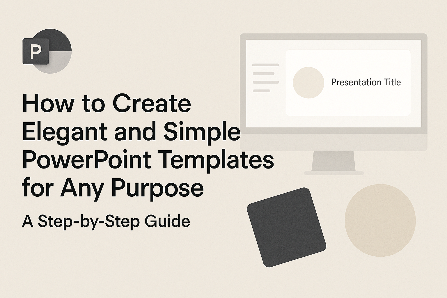
Understanding PowerPoint Templates
PowerPoint templates are useful tools that streamline the presentation creation process. They provide consistency in design and help users convey their messages effectively.
Definition and Benefits
A PowerPoint template is a pre-designed layout that includes elements like colors, fonts, and backgrounds. It serves as a foundation for creating new slides without starting from scratch.
Benefits of using PowerPoint templates include:
- Time-saving: Users can focus on content instead of design.
- Professional appearance: Templates ensure a clean and organized look.
- Customization: Templates can be adjusted to fit specific needs while keeping the core design.
Using a good template helps maintain engagement and clarity, making presentations more impactful.
Comparing Templates and Themes
While both templates and themes enhance presentations, they serve different purposes.
A template provides a structured layout for slides, such as where images and text should go. These templates can be saved as a distinct file type, ensuring they maintain their design features.
A theme, on the other hand, applies color schemes and fonts across all slides. Themes modify the overall look without changing the slide layout structure.
He or she might choose a template for consistent layout while using a theme for cohesive color scheme and font choices. Understanding these differences helps in selecting the right option for any presentation need.
Fundamentals of Design
A strong foundation in design fundamentals enhances the quality of PowerPoint templates. Understanding color theory, typography, and layout is essential for creating visually appealing presentations.
Color Theory
Color greatly impacts how a message is perceived. It can evoke emotions and set the tone for the presentation.
When choosing colors, it’s useful to consider color harmony.
Types of Color Schemes:
- Monochromatic: Variations of a single hue.
- Analogous: Colors next to each other on the color wheel.
- Complementary: Colors opposite each other for contrast.
Using tools like color wheels can help in selecting the right scheme. The combination should ensure that the text stands out against the background for better readability.
Typography Basics
Typography plays a key role in how information is communicated. Choosing the right font can enhance clarity and engagement.
Key Typography Tips:
- Font Selection: Use simple, clean fonts. Sans-serif fonts like Arial or Helvetica work well for digital presentations.
- Size Matters: Aim for a minimum of 24pt for body text to ensure visibility.
- Hierarchy: Use different font sizes and weights to create a clear hierarchy. Titles should be larger and bolder than body text.
It’s important to limit the number of different fonts used to maintain visual consistency.
Layout and Composition
The layout determines how elements are arranged on each slide. A well-planned layout improves information flow.
Key Layout Principles:
- Alignment: Keep elements aligned for a polished look. This creates a sense of order.
- Whitespace: Don’t underestimate the power of empty space. It helps prevent clutter and improves focus on key elements.
- Focal Points: Each slide should have a focal point that draws attention. This could be an image or a headline.
Following these principles can make the presentation more engaging and easier to follow.
Getting Started with Your Template
Creating an elegant and simple PowerPoint template involves a few key steps. By focusing on setup, color schemes, and fonts, anyone can design a template that enhances any presentation.
Setting Up a New Template
To start, the user should open PowerPoint and choose “New Presentation.” Once there, it’s essential to select a blank slide layout. This approach allows for complete customization.
Next, the individual should navigate to the “Design” tab, where options for slide size can be chosen. Standard sizes like 16:9 are commonly used, but adjusting the dimensions for specific needs can provide a unique touch.
After setting up the slide size, it’s a good idea to create a master slide. This slide controls the overall look. For consistency, adding a logo or header can establish a professional feel across all slides.
Choosing a Color Scheme
Selecting a color scheme is vital for a cohesive look. Light and muted colors often work well for backgrounds, while dark colors can be used for fonts. This contrast makes the text readable.
A good tip is to use up to three main colors. For instance, a soft background can be paired with a darker accent color for titles and a vibrant color for highlights. Tools like Adobe Color can help find appealing combinations.
Testing the colors on a few slides ensures they look good together. Adjusting the brightness and saturation can balance the overall appearance, making it more visually appealing.
Selecting Fonts and Styles
Choosing the right fonts can elevate a template.
It’s best to stick to two or three fonts: one for titles, one for body text, and perhaps a third for highlights. This creates a clear hierarchy.
For body text, sans-serif fonts like Arial or Calibri are easy to read. Titles can use a more stylish option like Bebas Neue for impact.
Size matters too; titles should typically be 36-44 points, while body text can be between 24-32 points. Consistent spacing and alignment will enhance the overall flow, making any presentation visually appealing and professional.
Customizing Slide Elements
To create an elegant and simple PowerPoint template, customizing slide elements is essential. This involves adjusting backgrounds, adding text boxes and shapes, and incorporating images and multimedia effectively. These steps enhance the visual appeal and functionality of the slides.
Working with Backgrounds
Customizing the background sets the tone for the entire presentation. Users can choose solid colors, gradients, or patterns to create a desired effect.
- Solid Color: Selecting a solid color can give a clean look. Go to the Design tab and choose “Format Background.”
- Gradient: Gradients add depth. Users can customize the color stops and direction for a professional appearance.
- Image Background: For more visual interest, an image can be used. Ensure that the image is not too busy, as it can distract from the content.
Remember, backgrounds should complement the content while keeping text readable. Light backgrounds with dark text or vice versa work best.
Inserting Text Boxes and Shapes
Adding text boxes and shapes is crucial for presenting information clearly. Text boxes can highlight key points, while shapes can help organize thoughts visually.
- Text Boxes: Click on “Insert” and select “Text Box.” Drag to create the desired size. Use bold or italics sparingly to emphasize important words.
- Shapes: Go back to the “Insert” menu, then click “Shapes.” Choose from rectangles, circles, and arrows for visual cues. Shapes can be colored or outlined for contrast.
- Alignment: Keeping elements aligned is key. Use guidelines for neatness. This ensures that the presentation looks organized and professional.
Plan the layout carefully to avoid clutter. Simplicity enhances elegance.
Adding Images and Multimedia
Images and multimedia can make presentations more engaging. They help convey messages effectively and keep the audience’s attention.
- Inserting Images: Use “Insert” then “Pictures” to import images. Resize and position them properly. Ensure they relate to the content and are of high quality.
- Videos: Videos can be linked or embedded. Use “Insert” then “Video” to add relevant short clips that support the topic.
- Audio: Adding audio can enhance feelings or provide background information. Users can click “Insert” then “Audio” to include sound effectively.
It’s important to ensure that multimedia is not overly distracting. Subtlety often works best.
Effective Content Placement
Effective content placement is crucial for creating engaging presentations. It helps guide the audience’s focus and enhances the message. Using alignment and grid systems, along with establishing visual hierarchy, can significantly improve slide clarity and impact.
Alignment and Grid Usage
Alignment ensures that elements on a slide look organized and professional. It helps create a clean layout that is easy to follow. Using a grid can provide a framework for placing text, images, and other visual elements.
When designing slides, he or she should follow these tips for grid usage:
- Establish margins: Keep consistent margins around the edges to frame the content.
- Utilize alignment tools: Most design software includes alignment options that can align objects to the left, center, or right.
- Follow a grid system: Use a grid to line up elements vertically and horizontally for a balanced look.
These strategies lead to a more polished presentation.
Visual Hierarchy in Slides
Visual hierarchy helps prioritize information. It guides the viewer’s attention from the most important to the least important details. Strong visual hierarchy makes it easier for the audience to grasp the message quickly.
To create a clear visual hierarchy, he or she should consider:
- Font sizes: Use larger fonts for titles and smaller ones for supporting text to differentiate importance.
- Color contrast: Apply contrasting colors to highlight key points or sections that need attention.
- Spacing: Adequate spacing between elements can separate ideas and make the slide less cluttered.
By following these steps, presenters can ensure their content is easy to read and understand.
Animation and Transitions
Using animations and transitions can greatly enhance a PowerPoint presentation. They help in capturing the audience’s attention and making information more engaging. Understanding how to use them effectively is key to creating a polished presentation.
Using Animations Effectively
Animations can bring slides to life, making each element appear in a smooth manner. It’s important to use animations sparingly. Too many can distract rather than enhance the message.
- Focus on Purpose: Each animation should serve a clear purpose, like revealing bullet points or guiding attention.
- Types of Animations: Common options include entrance, emphasis, exit, and motion paths. Entrance animations can make text appear as the speaker begins talking about it.
- Timing Matters: Adjust timing for a seamless flow. Set animations to trigger automatically or on click based on the presentation pace.
Using animations thoughtfully helps the audience stay engaged without feeling overwhelmed.
Choosing Slide Transitions
Slide transitions set the mood for moving from one slide to another. Selecting the right transition can enhance the storytelling aspect of the presentation.
- Subtle Choices: Simple transitions like Fade or Push often work best. They provide a professional look and feel.
- Consistency is Key: Use the same transition style throughout the presentation to maintain a cohesive flow.
- Avoid Overdoing It: Many flashy transitions can make the presentation seem chaotic. One or two well-placed transitions can create interest without distraction.
Selecting transitions thoughtfully contributes to a smooth viewing experience that keeps the audience focused on the content.
Master Slides and Layouts
Master slides are essential for creating consistent presentations. They allow users to set styles, fonts, and colors that apply to all slides. Custom layouts enhance flexibility by providing unique designs for different content types.
Creating and Editing Master Slides
To create a master slide, a user can navigate to the Slide Master view in PowerPoint. This option is located under the “View” tab. Once there, he or she can edit the main slide that controls the appearance of all others.
Users should focus on selecting a font style, background color, and adding any logos or designs needed. Changes made to the master slide will automatically reflect on all linked slides, ensuring a unified look. Adding placeholders for titles, text, and images can make future slide creation more efficient.
Designing Custom Layouts
Custom layouts allow for tailored designs suited to specific content.
In the Slide Master view, users can select “Insert Layout” to create a new layout. After creating the layout, he or she may choose to customize elements, such as adding specific text placeholders or image spots.
Renaming layouts helps keep things organized.
It’s recommended to think about the various content types, like charts or quotes, and create layouts that fit those needs. By having dedicated layouts, presentations can look polished and well-structured.
Saving and Sharing Your Template
Once a template is created, knowing how to save and share it effectively is crucial.
Properly exporting the template ensures it maintains its design and functionality. Sharing enables collaboration and helps others benefit from the design.
Exporting Different Formats
To save a PowerPoint template, it is essential to export it in the right format.
The most common format for templates is the .potx extension. This format preserves all the design elements and template features.
To export, follow these steps:
- Click on File in the top menu.
- Select Save As and choose your desired location.
- From the Save as type dropdown, select PowerPoint Template (*.potx).
This method ensures that the template is ready for future use.
Users can also save their templates in formats like .pdf for printing or sharing as a fixed document.
Sharing with Others
Sharing a PowerPoint template is straightforward. Users can share the file via email or upload it to cloud services like OneDrive or Google Drive.
When sending the template, it’s helpful to include instructions on how to open it:
- For Email: Attach the
.potxfile and inform the recipient to save it in the templates folder. - For Cloud Services: Provide a link to the shared file and ensure permissions are set for editing or viewing.
By sharing effectively, users can enhance their collaborations and ensure that everyone has access to the same design resources.
Best Practices and Tips
When creating elegant and simple PowerPoint templates, keeping design elements cohesive and effective is key. This section highlights practical strategies to maintain a professional look while ensuring ease of use.
Maintaining Consistency
Consistency is vital in any presentation. It creates a unified look, making it easier for the audience to follow along.
To achieve this, use the same color palette throughout the slides. Choose two to three main colors that represent the topic or brand.
Fonts should also remain consistent. Select one font for titles and another for body text. Stick to these choices to avoid confusion.
Additionally, ensure that images, icons, and graphics align in style. Whether illustrations or photos, they should complement each other. This uniformity reinforces the message and enhances clarity.
Simplifying Your Design
Simplicity is essential for effective communication. A clean design allows the audience to focus on the content instead of being distracted by clutter.
Start by limiting the amount of text on each slide. Aim for key points or bullet lists instead of long paragraphs. This keeps the information digestible.
White space plays a significant role too. It provides breathing room for the eyes, allowing better focus on each element.
Using visuals, such as charts and images, can help convey complex information in an engaging way. Opt for high-quality images that add value to the presentation.
Additional Resources for Learning
There are many resources available to enhance template creation skills.
Websites offer free templates and design tips that can inspire creativity.
For those looking for structured learning, online courses on platforms like Coursera or Udemy may provide valuable insights.
Blogs and articles about design tips can also serve as useful guides.
They often include examples of successful presentations and best practices.
It’s important to stay current with design trends, as this can influence how templates are perceived.
Engaging with community forums or social media groups related to presentation design can provide support and fresh ideas.