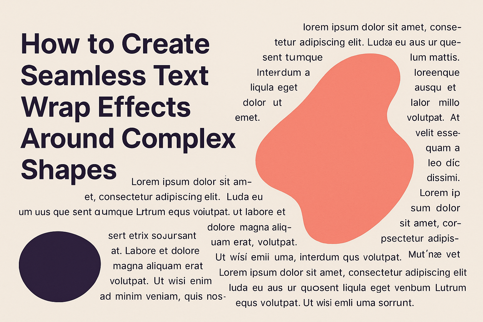
Creating seamless text wrap effects around complex shapes can enhance any design and make it stand out. This technique allows for text to conform to different outlines and contours, adding a unique twist to your projects.
Whether it’s for marketing materials, social media graphics, or personal art, mastering this skill is valuable for anyone looking to elevate their visual content.
Many designers find themselves struggling with how to make text fit beautifully around intricate shapes. By understanding the right tools and methods, anyone can achieve eye-catching effects that draw attention.
With the right techniques, it becomes easy to create designs that not only look professional but also convey the intended message effectively.
In this article, readers will discover straightforward steps to wrap text around complex shapes seamlessly. With helpful tips and practical examples, learning this skill can be both fun and rewarding.
Prepare to transform your designs into captivating works of art that impress and engage viewers.
Understanding Text Wrap Basics
Text wrap is a technique used in design to control how text interacts with objects.
Knowing the key elements of this process can help create a polished and professional look in layouts.
Defining Text Wrap
Text wrap determines how text flows around an object. In design software, like Adobe InDesign, users can apply various text wrap options.
Some common options include:
- No Text Wrap: Text ignores the object completely.
- Wrap Around Object Shape: Text flows around the object’s outer edges.
- Jump Object: Text will stop at the top of an object and continue below, leaving blank space.
Using these options can create different visual impacts, making text more engaging or legible.
Importance of Effective Text Wrapping
Effective text wrapping enhances the overall layout and readability. When text interacts thoughtfully with images or shapes, it creates a cohesive design.
A well-executed text wrap helps to:
- Direct the Reader’s Eye: It guides attention to important elements.
- Enhance Visual Appeal: A flowing design can make content more inviting.
- Improve Clarity: Less crowded text makes information easier to digest.
By mastering text wrap techniques, designers can create layouts that are both functional and aesthetically pleasing.
Working with Complex Shapes in Design Software
Creating seamless text wrap effects around complex shapes requires a solid understanding of different graphic types and manipulation techniques. This section will cover key concepts that will assist in achieving polished designs.
Vector vs. Raster Graphics
Vector graphics are made up of paths defined by points, lines, and curves. These graphics scale without losing quality, making them ideal for complex shapes, such as logos and illustrations. Software like Adobe Illustrator excels at handling vectors.
On the other hand, raster graphics are made of pixels, which can lead to quality loss when resized. Images like photographs fall into this category, often requiring more careful handling when wrapping text.
Using vector shapes ensures the text maintains clarity and sharpness, even when manipulated.
Manipulating Anchor Points and Paths
To create complex shapes, designers often manipulate anchor points and paths.
This task involves selecting specific points on a vector shape and adjusting their position. By clicking and dragging these points, they can reshape the design.
This manipulation allows for personalized shapes that wrap text effectively.
Designers should use tools like the “Direct Selection Tool” in Illustrator. This can make precise adjustments to the curves and angles of paths.
Keeping anchor points evenly spaced helps maintain symmetry in the design.
Utilizing Clipping Masks
Clipping masks are a powerful feature in design software. They allow designers to hide parts of layers, creating custom shapes.
By placing text inside a clipping mask, it becomes constrained within the shape’s boundaries.
To create a clipping mask, the designer selects the shape and the text. They then right-click and choose the “Make Clipping Mask” option.
This technique works well for complex shapes and enhances how text interacts visually. It ensures that the text fits seamlessly within any custom design without extruding beyond the intended borders.
Creating Text Wrap Effects Step-by-Step
Creating text wrap effects involves a series of specific steps that help achieve a polished look. By carefully setting up the document, positioning shapes, wrapping text, and fine-tuning the effect, one can create a seamless integration of text and graphics.
Setting Up Your Document
First, the user should choose the right dimensions for their project. They should open Adobe Photoshop and create a new document.
Selecting the appropriate settings, like resolution and size, is crucial for the final output quality.
Next, importing any images or graphics needed is vital. This allows the user to visualize how the text will interact with the shapes.
After placing the graphic, it’s helpful to lock the layer to avoid accidental movement later.
Lastly, organizing layers is a wise practice. Keeping the text and graphic layers separate ensures easier adjustments as the project progresses.
Positioning the Shape and Text
To wrap text effectively, the user must first position the shape appropriately. They should select the shape tool and draw around the graphic or the area where they want the text to flow.
It’s essential to ensure that the shape complements the overall design.
Next, it’s important to choose the correct text tool. The user should select the Horizontal Type Tool and click on the document where they want the text to appear. They can then type or paste their desired text.
Adjusting the text size and font to match the design helps maintain coherence. This step prepares the layout for the wrapping effect, ensuring the text fits well with the chosen shape.
Wrapping Text Around the Shape
Once the shape and text are positioned, it’s time to wrap the text.
The user should select the text, then navigate to the top menu and find “Type.” From there, they can choose “Wrap Text” options for their specific shape.
If using the Pen Tool to create a path, the user must select the created path with the Type Tool. This allows the text to follow the contours of the shape perfectly.
Adjusting text spacing might be necessary to enhance readability. The user can tweak settings like leading and tracking to ensure the text flows naturally around the shape.
Fine-Tuning the Wrap Effect
After wrapping the text, fine-tuning is essential for a polished look.
The user should check the alignment of the text and make adjustments as necessary. They can use the “Character” panel to change font styles and sizes for better visual impact.
Additionally, adding effects like drop shadows or strokes can enhance the text’s visibility against the background. Experimenting with these features can result in a more appealing wrap effect.
Lastly, keeping an eye on the overall balance of the design helps. The user should ensure that the text and graphic elements complement each other without one overpowering the other.
Advanced Tips and Tricks
Creating seamless text wrap effects requires attention to detail. It involves understanding how to balance text and images while making the design appealing. Here are some strategies to enhance text wrapping around complex shapes.
Handling Negative Space
Negative space is just as important as the text and images themselves. It can create balance and focus.
To utilize negative space effectively, designers should:
- Leave Breathing Room: Ensure there is enough space between the text and the shape to prevent clutter.
- Experiment with Alignment: Align text to the shape’s edges. It can lead to a more cohesive look.
- Use Margins and Padding: Adjust margins to give text a clean presentation. This reduces the risk of overlapping with graphic elements.
He or she should always assess how the negative space affects readability. Too much clutter can distract readers, while too little might make the design feel sparse.
Integrating Typography and Imagery
Combining typography with imagery can make a design pop.
Using different font styles and sizes allows the text to meld beautifully with the graphics. Here are some practical tips:
- Choose Contrasting Fonts: Select fonts that complement the imagery without competing for attention.
- Adjust Text Color: To enhance visibility, pick colors that stand out against the background. This creates a clear focal point.
- Curved Text Options: Consider using curved text to follow the shapes of the images. This creates a unified look.
By integrating typography skillfully, one can transform a simple layout into an engaging visual experience.
Maintaining harmony between text and design is crucial for effective communication.