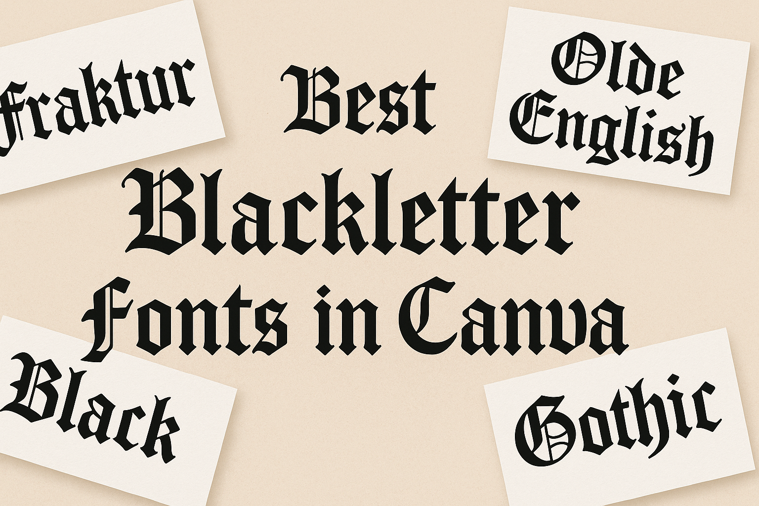
Blackletter fonts have a rich history and a unique aesthetic that can make any design stand out. Many designers look for ways to incorporate this style into their projects, especially on user-friendly platforms like Canva.
The best blackletter fonts in Canva not only capture the elegance of traditional gothic lettering but also offer modern twists that suit various design needs.
In this blog post, readers will discover a selection of the top blackletter fonts available in Canva. From bold and striking options to more subtle styles, these fonts can enhance brand identities, create eye-catching headlines, and bring a touch of vintage flair to any project.
With this curated list, anyone can find the perfect blackletter font to elevate their designs.
What Are Blackletter Fonts?
Blackletter fonts are a unique style of typography known for their rich history and distinct visual characteristics. They are often associated with medieval manuscripts and have a bold, ornate appearance that draws attention in various design contexts.
The History of Blackletter
Blackletter fonts, also known as Gothic scripts, originated in Western Europe during the 12th century. They were primarily used in handwritten manuscripts and early printed books, making them key to the spread of literature.
This style gained popularity in Germany and was used by notable printers like Johannes Gutenberg. The intricate designs symbolized craftsmanship and artistry.
Over time, blackletter lost some popularity in favor of more modern typefaces, but its historical significance remains strong. Today, blackletter fonts evoke a sense of nostalgia and are often used for decorative purposes.
Characteristics of Blackletter Typography
Blackletter fonts are defined by their sharp, angular lines and elaborate shapes. They typically feature thick and thin strokes, creating a strong contrast that catches the eye. Their letters often resemble calligraphy, with sweeping curves and pointed arches.
This style includes various types, such as Fraktur and Textura, each with unique features.
Blackletter is often used in logos, posters, and event invitations, giving a traditional or gothic feel. Designers choose blackletter fonts for their boldness and ability to convey a historical atmosphere.
Top Blackletter Fonts in Canva
Blackletter fonts are known for their unique, bold designs. They can add a touch of elegance and historical charm to any project. Here are some specific styles within the blackletter category that stand out in Canva.
Classic Blackletter Fonts
Classic blackletter fonts have a timeless appeal. They often draw inspiration from medieval manuscripts and old English writing.
A popular choice is Gothic Text, which features sharp angles and elaborate letterforms. This font is perfect for projects needing a vintage look.
Another great option is Old English Text MT. Its intricate design makes it ideal for formal invitations or themed events. These classic fonts effectively convey a sense of tradition and sophistication in designs.
Modern Blackletter Variations
Modern blackletter variations offer a fresh twist on traditional styles. Bromide is a fantastic example, featuring cleaner lines and a sleeker overall appearance. This font works well for branding and contemporary designs while retaining the blackletter essence.
Renaissance is another modern option that balances classic elements with a more minimalist approach. It is suitable for posters, social media graphics, and other digital media. These modern fonts appeal to designers looking for a stylish yet bold statement.
Decorative Blackletter Options
Decorative blackletter fonts add a unique flair to any design. Black Cameo showcases ornate details and plays well in creative projects. It’s a solid choice for logos, packaging, or anything that needs a touch of creativity.
Cambridge is another decorative font that combines elegance with legibility. Its stylish appearance makes it suitable for headlines and event graphics. These decorative options help designers create eye-catching works that stand out in a crowd.
Using Blackletter Fonts Effectively
When using blackletter fonts, it is important to prioritize legibility and design harmony. Choosing the right style and integrating it properly into your projects can enhance the overall impact of your design.
Best Practices for Legibility
To ensure that blackletter fonts are easy to read, they should be used thoughtfully.
A common suggestion is to avoid very small font sizes. Large text is clearer and makes the unique features of blackletter easier to see.
Contrast plays a key role as well. Dark text on a light background or vice versa is often best. This contrast helps the letters stand out, making them more legible at any distance.
Additionally, limiting the amount of text in blackletter is beneficial. Using it for headlines or emphasis rather than large blocks of text maintains clarity. Remember, it’s about balance and making sure your design remains user-friendly.
Design Tips for Blackletter Integration
When integrating blackletter fonts into designs, consider the overall theme and mood. These fonts often convey a historical or formal feeling, so matching them with appropriate visuals is essential.
Combining blackletter with simpler fonts can create contrast without overwhelming the viewer.
For example, pairing with a sans-serif font for body text can be effective. This allows the blackletter to shine without crowding the design.
Color choices also matter. Using a single bold color can make blackletter fonts pop.
Avoid busy patterns behind the text, as they can distract from the font itself. Keeping the design clean helps focus on the elegance of blackletter styles.