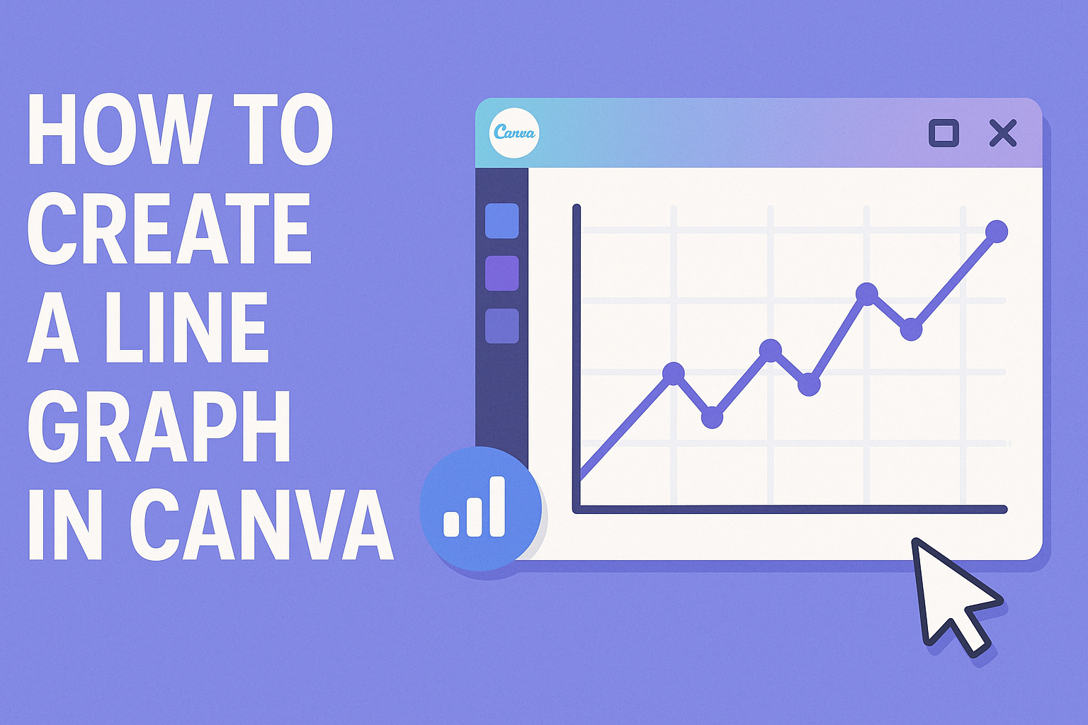
Creating a line graph can seem challenging at first, but it is an essential skill for visualizing data. In Canva, anyone can design a professional-looking line graph with just a few simple steps.
This user-friendly platform allows users to customize their graphs easily, making data presentation both effective and visually appealing.
Many people use Canva because it offers various templates and customization options. Users can select colors, fonts, and layouts that match their style or brand. This flexibility ensures that every line graph stands out and conveys the right message.
Whether for a school project, business presentation, or personal use, mastering line graph creation in Canva can enhance how information is shared. Step into the world of data visualization and discover how effortless it can be to turn numbers into insightful graphics.
Getting Started with Canva
Canva is a user-friendly design tool that makes creating visuals easy for everyone.
To begin, a user must sign up for an account, explore the dashboard, and choose a suitable template for their projects. Each of these steps is important for a smooth design experience.
Signing Up for an Account
To get started with Canva, a user needs to sign up for an account. They can do this by visiting the Canva homepage and clicking the “Sign up” button. The process is straightforward.
Users have the option to register using an email address, Google account, or Facebook account. After entering their details, they will receive a confirmation link in their email. Clicking this link will activate the account.
Once signed up, they may be prompted to choose whether they want a free or paid plan. The free plan is ideal for beginners, offering plenty of templates and features to start designing.
Navigating the Canva Dashboard
After logging in, users will see the Canva dashboard. This area is the central hub for all design activities. It features a clean layout with various options.
On the left side, users find a menu with links to templates, folders, and projects. They can easily access recently used templates, making it convenient to continue previous work. In the center, featured templates and design options appear based on user preferences.
At the top, users will see a search bar to quickly find what they need. Learning the dashboard layout helps users navigate the tool more effectively and saves time when designing.
Selecting the Right Template
Choosing the right template is crucial for a successful project. Canva offers thousands of templates to fit different needs. Users can browse categories like presentations, social media posts, and graphs.
To find a template, they can use the search bar or scroll through the featured options. Each template is customizable, and users can click on one to start editing.
After selecting a template, users can personalize it by changing colors, fonts, and text. This flexibility allows for unique designs that reflect individual styles and requirements perfectly.
Creating Your Line Graph
To create an effective line graph in Canva, users can focus on adding the graph element, inputting data, and customizing its appearance. Each step is straightforward and accessible, making the process smooth for anyone.
Adding the Line Graph Element
First, users should start by opening Canva and selecting a design type that suits their project. Once there, they can easily find the “Elements” tab on the left side of the screen.
They should search for “line graph” in the elements search bar. After the graph options appear, users can drag the preferred style onto their canvas. Many templates are available, allowing for selections that fit different themes or colors.
This simple step lays the foundation for the line graph and sets the user’s design into motion.
Inputting Your Data
After the line graph element is placed, the next step is to input data. Users can click on the graph, which will reveal a data table.
In this table, they can enter their data directly or copy and paste it from another source such as Excel. Each data point should have corresponding labels, often representing categories on the X and Y axes.
It’s important to check for accuracy before moving on. Accurate data ensures the graph effectively communicates the desired information.
Customizing Graph Appearance
Once the data is in, users can customize the graph’s appearance for clarity and appeal. To do this, they can navigate to the “Settings” tab after selecting the graph.
Here, customization options include colors, fonts, line style, and gridlines. Adjusting these elements can help differentiate data series or enhance the graph’s readability.
Users can also add a title that clearly describes what the graph represents. Personalizing the look makes the graph not only functional but also visually appealing.
Enhancing Your Design
When creating a line graph in Canva, paying attention to colors, fonts, and additional elements can make a significant difference. The right choices can help communicate the data more effectively and keep the viewer engaged. Here are some tips to enhance the design of a line graph.
Choosing Colors and Fonts
Color selection is vital for clarity and impact. It’s best to use a limited palette that aligns with the message of the graph. For line graphs, contrasting colors can highlight different data sets.
Consider using lighter colors for the background and bolder hues for the lines. This contrast helps the lines stand out.
Fonts also play a key role. Select clear, easy-to-read fonts for any text and labels. Sans-serif fonts are a great choice as they appear clean and modern. Using consistent font sizes and styles throughout the graph adds to the professional feel.
Adding Text and Other Elements
Text can provide essential context for the graph. Including a title at the top helps viewers understand what they are looking at. Labels for each axis should be clearly marked and easy to read.
Adding a legend is also important if there are multiple lines. It helps the audience know what each line represents.
In addition to text, shapes or icons can enhance the visual appeal. For example, using markers at key data points can draw attention. Incorporating these elements will not only improve the look of the line graph but also make the information more accessible.
Saving and Exporting Your Graph
After creating a line graph in Canva, users can easily save and share their work. There are two primary methods for this: downloading the graph as an image or sharing it online directly from Canva. Each method has its own steps and benefits.
Downloading the Graph as an Image
To download the graph, the user should click the “Download” button located in the top right corner of the Canva interface. A menu appears, allowing selection of file types such as PNG, JPG, or PDF. PNG is often the best choice for high quality, especially for online use.
Next, the user should choose the specific pages to download if multiple designs are present. After making selections, clicking the “Download” button again will save the file to the user’s device. The graph can then be found in the downloads folder, ready for use in presentations or reports.
Sharing Your Graph Online
For users who wish to share their graph online, Canva provides a straightforward option. They can use the “Share” button in the top right corner.
This opens a dialog where users can invite others via email or create a link.
Users can also adjust privacy settings to control who can view or edit the graph. Sharing via social media is another option, as users can choose platforms like Facebook or Twitter directly from the sharing menu.
This feature makes it easy to get feedback or present ideas to colleagues.