Justifying text can greatly improve the look of designs in Canva. To justify text in Canva, users simply need to select the text box and choose the “Justify” option from the alignment settings.
This feature helps create a professional and polished layout, especially useful for projects like brochures or social media posts.
Many designers find that justified text not only looks cleaner but also enhances readability. By mastering this technique, one can take their graphic design skills to the next level and impress clients or followers with stunning visuals.
With just a few clicks, anyone can transform their text to fit seamlessly within their design.
Understanding how to effectively justify text is crucial for anyone working in Canva. Once learned, this skill opens the door to more creative possibilities, allowing for a more cohesive and appealing design.
Getting Started with Canva
Canva is user-friendly and makes design easy for everyone.
Knowing how to start with Canva will ensure a smooth experience for creating beautiful graphics and layouts.
Creating a New Document in Canva
To begin, users must open Canva and create a new document. She can do this by clicking the “Create a design” button, found on the homepage.
This option allows her to choose from various templates suited for different needs, such as social media posts, presentations, or flyers.
After selecting the appropriate template, users can customize their design. They can adjust the size, add backgrounds, and choose various elements to fit their vision.
Saving the document is crucial, too. She should regularly use the “Save” option to ensure no progress is lost.
Understanding Canva’s Text Tools
Canva offers a range of text tools to enhance designs. Users start by clicking the “Text” button on the sidebar. This action reveals options for adding headings, subheadings, and body text to the document.
Each text box can be customized. Users can select fonts, adjust sizes, and choose colors to match their design.
Furthermore, they can use alignment options to position the text perfectly. Justifying text is also possible, which gives designs a clean and professional look.
Understanding these text tools is essential for effective design in Canva. They help create visually appealing graphics that convey the intended message clearly.
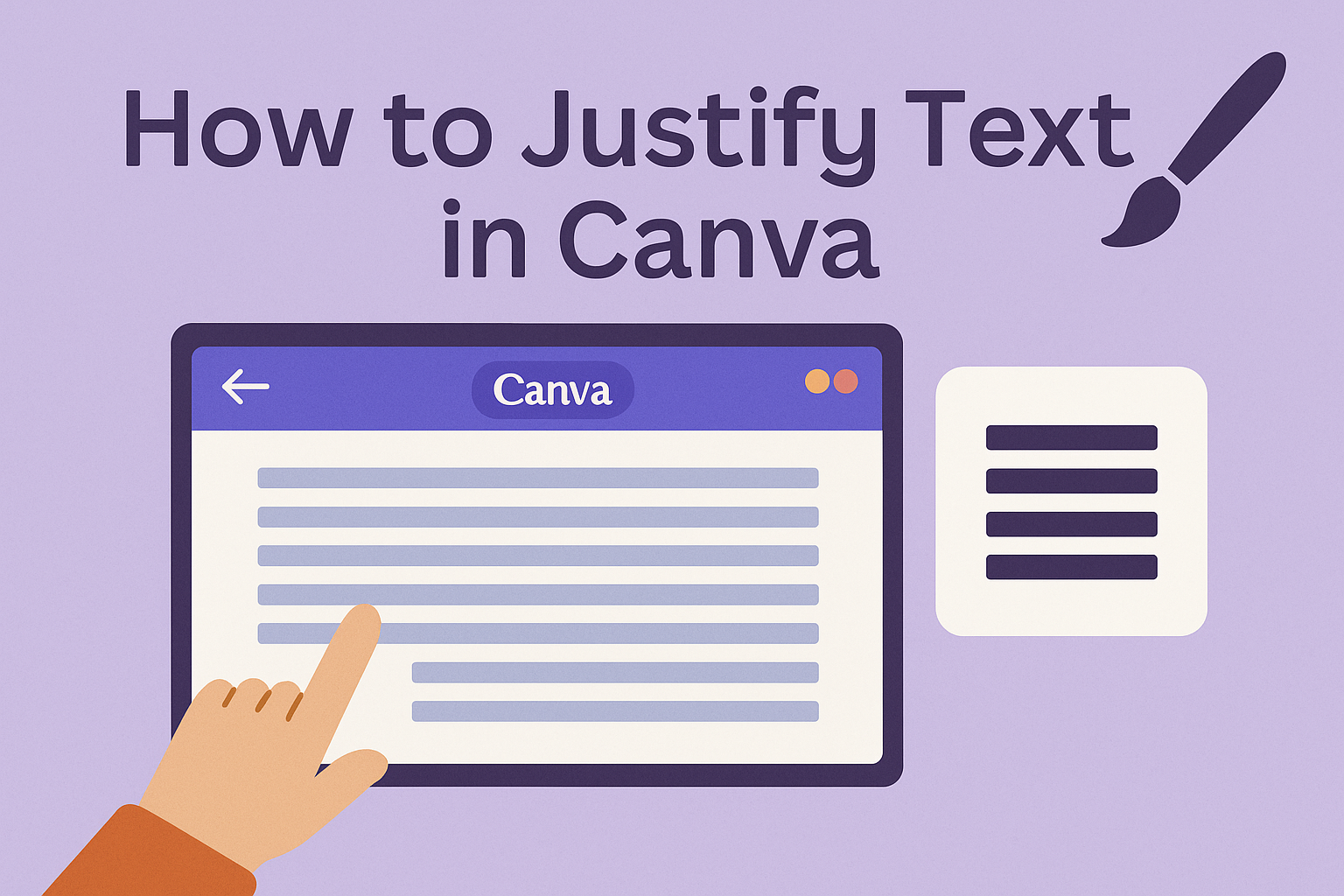
Justifying Text in Canva
Justifying text in Canva helps create clean and professional-looking designs. It aligns text evenly between margins, improving readability and presentation. Below are some straightforward methods to justify text effectively.
Using the Text Alignment Options
To justify text in Canva, users can start by selecting the text box they want to adjust. Once selected, they will see a toolbar at the top of the editor, which includes different alignment options.
For justification, they should click on the “Justify” button, which usually looks like four horizontal lines stacked evenly.
This feature ensures that all lines of text stretch across the entire width of the text box, creating a neat appearance.
Users can also choose between left, center, right, and justified text, depending on the design needs. Justifying text works especially well for creating block paragraphs, as it helps maintain uniformity in spacing.
Adjusting Text Spacing for Better Justification
After justifying the text, adjusting the spacing can enhance the overall look. The spacing adjustments include “Line Spacing” and “Letter Spacing.”
For line spacing, users can find the option in the toolbar that shows a vertical arrow with arrows pointing up and down.
Adjusting this allows them to increase or decrease the space between lines of text, improving readability.
Letter spacing can be adjusted similarly. This feature controls the space between individual letters, making it easier to read longer texts.
By fine-tuning both line and letter spacing, users can achieve a polished look that complements their design.
Design Tips for Text Justification
When justifying text in Canva, it’s important to maintain balance and ensure readability. This section covers how to create visually pleasing text blocks while keeping the content easy to read.
Balancing Text Blocks
To create balanced text blocks, it is crucial to ensure equal margins on both sides. This technique helps the text look tidy and organized.
Use short paragraphs to keep the reader engaged. Avoid lengthy blocks of text that can overwhelm the eyes. Incorporating bullet points or numbered lists can also help break up the text.
Another tip is to avoid over-justifying text, as it can create awkward spacing known as “rivers” of white space. A little extra space between words can enhance readability, so adjusting letter spacing can make a difference.
Optimizing Readability
Readability is key when justifying text. When choosing a font, select one that is clear and easy to read.
Size matters too; ensure the font size is appropriate for the medium, whether it’s print or digital.
Utilizing contrast between text and background colors can help make the text pop. Dark text on a light background is often the easiest to read.
Lastly, consider the line length. Lines that are too long or too short can strain the reader’s eyes. The ideal line length typically ranges from 50 to 75 characters for optimal comfort.