Vogue Font is popular for its stylish and elegant appearance, making it a favorite choice in the design world. Canva offers users the opportunity to access similar fonts that capture the essence of the original Vogue Font, allowing for a chic touch in various projects.
This blog post will explore how to effectively use the Vogue Font in Canva, as well as showcase alternatives that resonate with the iconic style of the fashion magazine.
For those looking to elevate their graphic designs, knowing how to incorporate the Vogue Font can make a significant difference. With different versions available, users can find the perfect font for invitations, headers, or social media graphics.
This post will guide readers through the steps to find and use the Vogue Font, ensuring that their designs stand out.
By tapping into the luxurious feel of the Vogue Font, anyone can create designs that impress and capture attention. Whether for personal or professional use, the right font choice can enhance the overall aesthetic of a project.
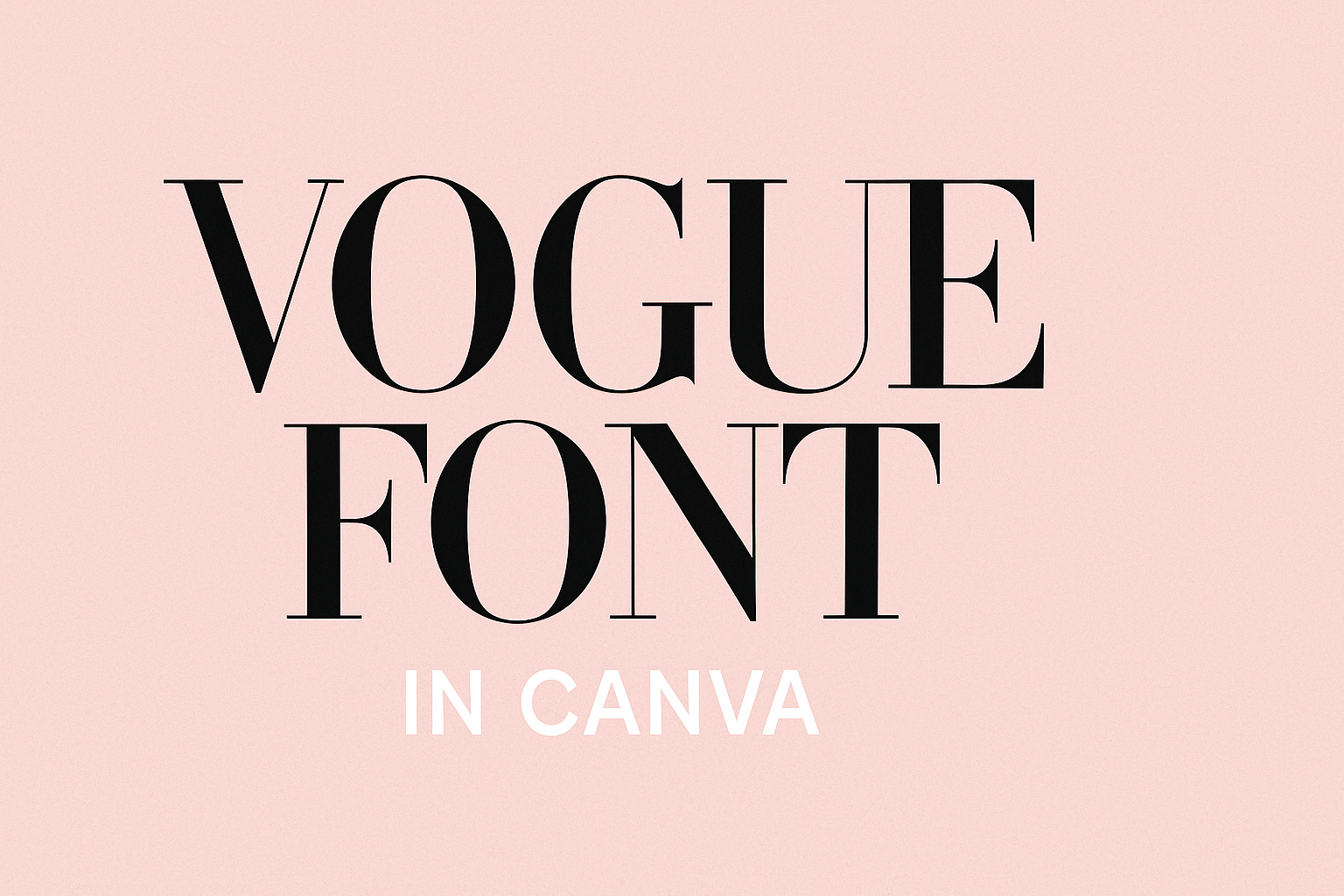
Exploring Vogue Font in Canva
Vogue Font holds a special place in the world of design. Its origins and characteristics contribute to its unique appeal, making it a favorite choice for many users in Canva.
Origins of the Vogue Typeface
The Vogue Typeface has a rich history that dates back to 1929. It was created for the iconic fashion magazine, Vogue. Known for its elegance, this serif font quickly became synonymous with high fashion and style.
This typeface has been featured on numerous magazine covers and fashion labels, emphasizing sophistication. Canva users can easily find it by searching for “Vogue” in the Fonts tab. Its classic look continues to influence designers today, making it a timeless option.
Characteristics of Vogue Font
Vogue Font is distinguished by its sleek and elongated letterforms. The elegant design showcases a balance between modern aesthetics and classic charm. It comes in regular and bold versions, allowing versatility for various projects.
This font is perfect for headers, logos, and even body text. Its strong presence makes it ideal for impactful designs, whether in invitations or marketing materials. The clean lines and sophisticated style ensure that any creation stands out beautifully.
How to Access Vogue Font in Canva
Accessing Vogue Font in Canva is simple and straightforward. Users can easily locate and utilize this elegant typeface for their projects. Here’s how to find it and use it effectively.
Finding Vogue Font
To find the Vogue Font in Canva, users can start by logging into their Canva account. On the main design page, they should click on the text tool, often represented by a “T” icon.
Next, in the font dropdown menu, they can either scroll through the list or type “Vogue” into the search bar. If the font is available in their version of Canva, it will appear among the results.
Canva might have variations of the font, so it’s good to check for options like bold or italic styles. If they do not see the Vogue Font, they might need to check their subscription level. Some fonts are exclusive to Canva Pro users, which may require an upgrade for access.
Using Vogue Font in a Project
Once the Vogue Font is found, using it in a project is easy. Users can simply click on the text box or create a new one.
With the text selected, they can choose the Vogue Font from the font dropdown.
It’s a great choice for headers, body text, or even invitations given its classy appearance. Users might want to adjust font size and spacing for better visibility.
They can also combine Vogue Font with other fonts in their design for a more dynamic look. Remember to keep text legible while enhancing the overall aesthetic of the project.
Design Tips for Using Vogue Font
Using Vogue font can add a touch of elegance and sophistication to any design. To make the most of its unique style, it’s essential to understand how to pair it properly and ensure it remains legible.
Pairing Fonts with Vogue
When choosing fonts to pair with Vogue, aim for balance. Vogue’s sleek and stylish design works well with complementary fonts. For example, a minimalist sans-serif font like Raleway can contrast beautifully with the more ornate Vogue font.
Consider these options:
- Raleway: A clean and modern sans-serif.
- Arvo: Bold yet contemporary, perfect for headlines.
By mixing styles, designers can create a visually appealing hierarchy. It’s advisable to use one font for headings and another for body text to enhance readability without overwhelming the viewer.
Best Practices for Readability
To ensure Vogue font remains readable, pay attention to font size and color contrast.
A larger size for headings, typically around 24-32 pt, will catch attention without straining the eyes. For body text, using 12-14 pt can keep things clear.
Color choices matter too:
- Dark text on a light background works best.
- Avoid overly busy backgrounds that can distract from the text.
Adjusting line spacing also helps improve readability.
For Vogue font, a line height of 1.5 to 1.75 can ensure that the text feels spacious and easy to read.
These small adjustments can significantly enhance the overall appeal of any design project using Vogue font.