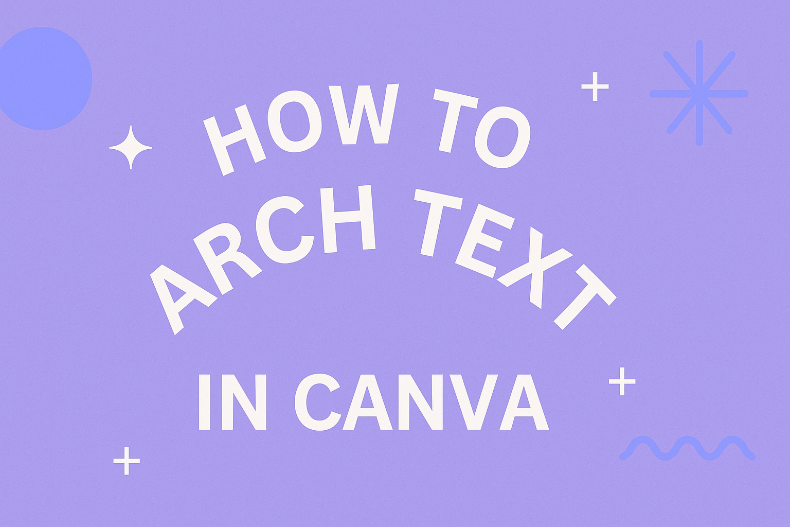
Arching text in Canva can be a fun way to add creativity to designs. It allows users to create unique visuals that catch the eye and enhance their projects.
Whether for social media posts, invitations, or logos, mastering this feature can elevate anyone’s design skills.
Canva makes it easy to curve text with just a few clicks. With built-in tools, they can adjust the angle and shape of their text to fit the theme of their design. This feature is perfect for both beginners and experienced designers looking to add a stylish touch.
By learning how to arch text, creators can differentiate their work and make it more appealing. Engaging with this simple technique can lead to more attractive and personalized designs that stand out in a crowded space.
Getting Started with Canva
Canva is a user-friendly design tool that makes it easy for anyone to create stunning graphics. He or she can start designing by creating a new project and exploring the interface.
Creating a New Canva Project
To begin, visit the Canva website and log in or sign up for an account. After signing in, click on the “Create a design” button, usually found in the top right corner.
Users can choose from a variety of formats, such as social media posts, presentations, or custom dimensions.
Once the desired format is selected, a blank canvas opens. This canvas is where all the magic happens. It’s important to remember that Canva saves projects automatically. Therefore, users do not need to worry about losing their work unexpectedly.
Understanding Canva’s Interface
The Canva interface is designed to be simple and intuitive. On the left side of the screen, users will find a menu with options like templates, elements, and uploads. This allows easy access to the tools needed for creating designs.
The top toolbar contains options for editing text, colors, and other features. Here, users can customize their projects with just a few clicks.
Understanding these elements will help streamline the design process and make creating beautiful graphics much easier. Additionally, users can use the “Help” button for guidance if they get stuck.
Techniques to Arch Text
Arching text in Canva can enhance designs and make them visually appealing. Understanding the different techniques available is key to mastering this feature.
Using the Curve Text Tool
The Curve Text Tool in Canva makes it easy to create arched text. To begin, select the text element you want to arch.
Next, click on the “Effects” button located in the top-right corner of the workspace. Scroll down to find the “Shape” section. Here, users will see the “Curve” option.
After clicking this, an adjustable slider will appear. This slider allows users to control how much the text curves. Moving it to the left creates an upward arc, while moving it to the right creates a downward curve.
Experimenting with this feature can give users various creative options for their designs, helping text flow well with any shape or layout.
Adjusting the Arch Degree
Adjusting the arch degree is crucial for achieving the right look. Users can fine-tune the curve after using the Curve Text Tool.
By selecting the text again, users can return to the “Curve” settings. Here, the slider helps to decide how tight or loose the arch should be. A higher degree creates a tighter curve, making it more circular, while a lower degree results in a softer arc.
In addition to the slider, Canva allows users to reposition the text within the arch. Using the offset controls, users can shift the text to the left or right within the arch. This flexibility gives users the chance to create unique designs that stand out.
Design Tips for Arched Text
Creating arched text can enhance a design and grab attention. It’s important to choose suitable fonts and balance the text with other design elements for a polished look.
Choosing the Right Fonts
Selecting the right font is essential for arched text. He should opt for fonts that are legible and complement the overall design.
Bold sans-serif fonts often work well for short phrases, as they maintain readability even when arched.
For longer text, a clean serif font can add elegance while remaining easy to read. It’s helpful to experiment with font weights. Mixing a bold font for emphasis with a lighter font for additional text can create a nice contrast.
Additionally, avoid overly decorative fonts, as they may lose clarity when curved. A good choice is clear fonts that maintain a consistent style across letters. This helps keep the focus on the message.
Balancing Text with Design Elements
Balancing arched text with design elements is crucial for visual appeal. He should consider the layout and ensure the text does not overwhelm other components.
Placing the text in a position that frames the design can make it stand out nicely.
Using whitespace effectively can create a clean look. It’s valuable to surround the arched text with enough space so it feels separate from other design elements. He can also add shapes or images that align with the curve of the text.
Finally, color plays a key role. Choosing a color that contrasts with the background helps the text pop. By paying attention to these details, he can create a harmonious design that draws the viewer’s eye.
Applying Finishing Touches
After arching text in Canva, it’s important to add final details that enhance its look and fit within the overall design. Making small adjustments can significantly improve the text’s visual appeal and ensure it aligns well with other elements.
Enhancing Visual Appeal with Effects
To make arched text stand out, apply effects such as shadows and outlines. These features can add depth and make the text more readable against various backgrounds.
- Shadow Effect: Add a subtle shadow behind the text. Set the shadow’s opacity around 30-50% for a soft look.
- Outline: Choose a contrasting color for the outline. This will help the text pop, especially on complex backgrounds.
Testing different font styles can also elevate the design. Bold or italicized fonts can create emphasis, while playful fonts can add character. Use a consistent color scheme that matches the overall design for a polished appearance.
Previewing and Adjusting Layout
After adding finishing touches, it’s vital to preview the design.
Canva allows users to see how the text looks in the full context.
Steps to Preview:
- Click the Preview button found in the top right corner.
- Review the overall layout carefully, checking for spacing and alignment.
Adjustments may be needed if the text appears too crowded or spaced out.
- Alignment: Ensure the text aligns well with images and other elements.
- Spacing: Use the spacing tool to fine-tune the distance between letters and the text box.
By continuously previewing and adjusting, the design can look sleek and professional.