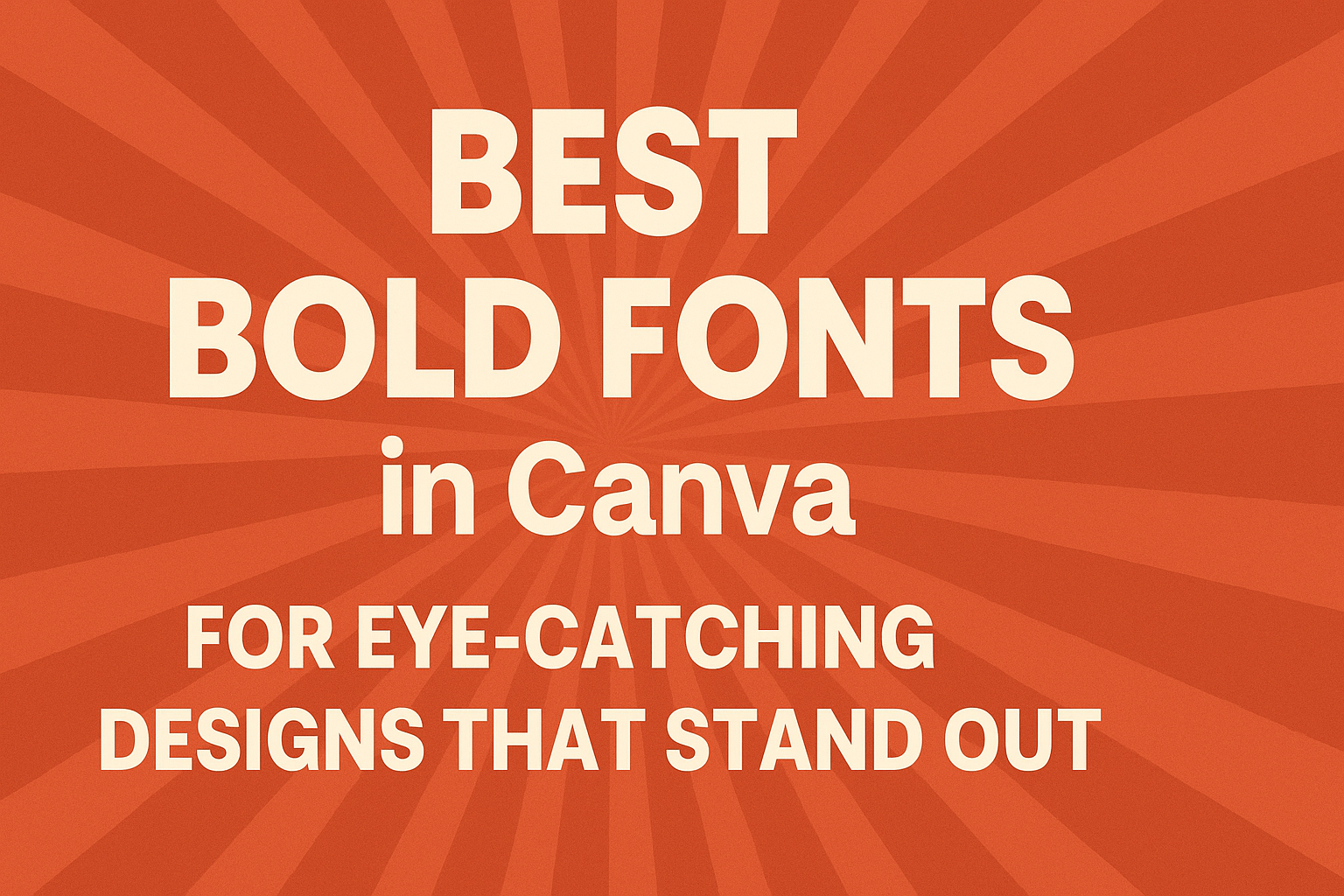
Choosing the right font can dramatically enhance any design project. The best bold fonts in Canva provide the perfect balance of visibility and style, making designs stand out.
With various options available, designers can easily find the right fit for their brand or project needs.
Bold fonts are not just eye-catching; they also convey strength and clarity. Selecting a bold font can help highlight important messages in designs, grabbing the attention of viewers instantly.
Understanding which bold fonts work best in Canva is essential for anyone looking to create impactful visuals.
In a world where first impressions matter, graphic designers and marketers alike need effective tools to communicate their ideas. This guide will explore some of the top bold fonts available in Canva that make a lasting impression and elevate design quality.
Importance of Choosing Bold Fonts
Choosing the right fonts is crucial in design. Bold fonts play a key role in grabbing attention and conveying messages effectively.
The Psychology of Bold Typography
Bold typography has a significant impact on how messages are perceived. It often conveys strength, confidence, and clarity. This makes them ideal for headlines or key points in a design.
When used correctly, bold fonts can help evoke emotions. For instance, a bold font can create urgency or excitement, while a more rounded bold style may feel friendly and approachable.
This psychological effect influences how the audience responds to the content.
Designers often choose bold fonts to make a statement. This choice can help communicate that a particular piece of information is important or urgent, guiding viewers on where to focus their attention.
Impact on Readability and Viewer Engagement
Bold fonts enhance readability, especially in digital designs. They stand out against backgrounds, making text easier to scan quickly.
This is especially important in ads or websites where viewers often skim content.
Engagement is also affected by typography choice. Bold fonts can draw the viewer’s eye to essential information, increasing the chances that they will read it.
This can lead to better interaction with the content, whether it’s a call to action or a headline.
Using bold fonts strategically can boost the overall impact of a design. It improves the chances that viewers will absorb the main messages and ideas effectively.
Selecting the Right Bold Font in Canva
Choosing the perfect bold font can truly elevate a design. Key considerations include how well fonts pair together and the contexts in which different font weights are best used.
Font Pairings and Compatibility
Pairing fonts effectively can enhance a design’s appeal. When selecting a bold font, consider its compatibility with other fonts.
A common approach is to mix a bold font with a lighter sans-serif or a classic serif font. This contrast can create visual interest.
For example, Lato Bold works well with Montserrat Light. The bold, impactful nature of Lato is balanced by the clean lines of Montserrat.
Another great combination is Raleway Extra Bold paired with Open Sans Regular. This mix keeps the design professional and readable.
Checking how fonts look together helps ensure they don’t clash.
Font Weight and Usage Scenarios
Understanding font weights is crucial for effective design. Bold fonts are strong and draw attention. They are excellent choices for headlines, presentations, or important calls to action.
For example, Borsok is an inviting bold font that excels in promotional materials. It creates warmth and approachability.
On the other hand, Boldesqo is perfect for authoritative headlines, making it suitable for reports and formal presentations.
Knowing when to use each font weight helps maintain clarity. A bold font might overwhelm smaller text, so balance is key.
Top Bold Fonts in Canva for Maximum Impact
Choosing the right bold font can greatly enhance any design. Certain fonts stand out for their timeless appeal, while others capture modern trends. Here are some options that make a significant impact.
Timeless Bold Fonts
Timeless bold fonts are classic choices that work in various designs. One of the favorites is Arial Black, known for its strong presence and readability. It’s perfect for headlines and posters, giving a sense of strength.
Helvetica Bold is another option. Its clean lines make it versatile in many contexts, from marketing materials to websites. This font has a professional look that is easy to read.
Georgia Bold also offers a unique style. With its serif design, it brings a touch of elegance to any project. It’s great for both digital and print media, making titles and headlines feel sophisticated.
Modern and Trendy Bold Fonts
Modern bold fonts can bring a fresh feel to any design. Montseratt Bold stands out with its geometric style. It’s eye-catching and trendy, making it ideal for social media graphics.
Another popular choice is Panton Bold. This font combines a modern sans-serif look with friendly curves, perfect for branding and promotional materials. It draws attention without being too overwhelming.
Seymour One also adds a playful touch. Its blocky appearance makes headlines fun and lively. This font is excellent for projects aimed at younger audiences.
Incorporating Bold Fonts into Your Design
Using bold fonts can greatly enhance a design by making important information stand out. It’s essential to create visual interest and maintain clarity.
Two main aspects to focus on are hierarchy and balance.
Creating Hierarchy With Typography
Establishing hierarchy helps guide viewers through the content. Bold fonts are excellent for headlines and key messages.
For instance, using a bold typeface for titles draws attention and sets the tone.
Incorporating different sizes also aids in hierarchy. A larger, bold font can create a striking heading, while smaller, regular weights can be used for body text.
This contrast allows important information to pop while maintaining a clean look.
When selecting bold fonts, consider the audience. A modern sans-serif might appeal to a younger crowd, while a classic serif may attract a more traditional audience.
Balance and Contrast in Design
Balance is key in any design, especially when using bold fonts.
Pairing bold fonts with lighter weights creates contrast that captures attention without overwhelming the viewer.
For example, a bold headline can sit above a paragraph in a light font. This contrast makes the design easier to read and more visually appealing.
Colors also play a role in balance. Darker bold fonts on a light background are easier to read and add to the overall harmony of the design.
Consider using whitespace strategically.
This gives the text room to breathe and reduces clutter. It helps highlight bold elements while maintaining a clean and professional look.