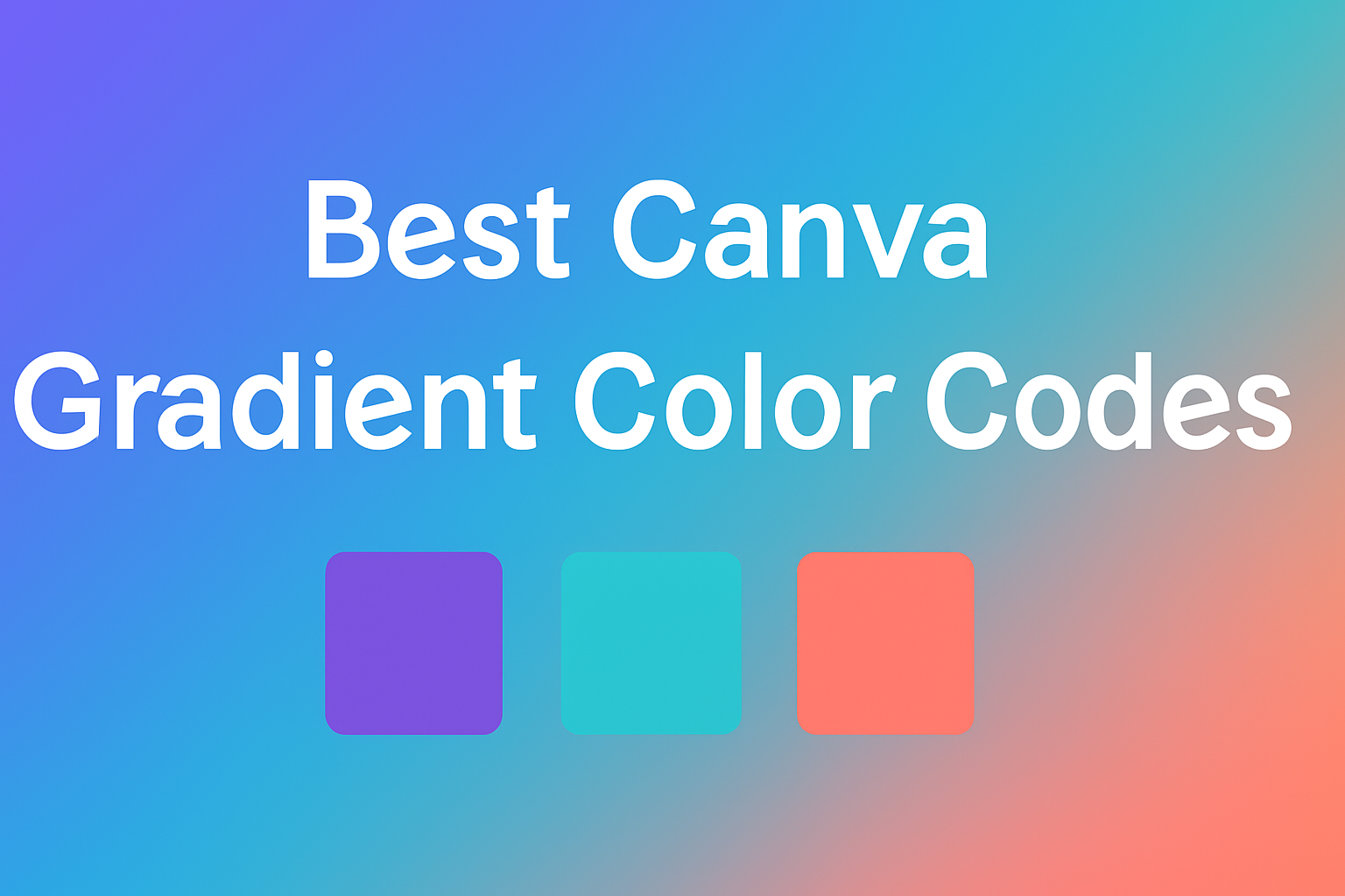
Canva is a powerful tool for creating stunning designs, and choosing the right colors can make a huge difference.
The best Canva gradient color codes enable designers to achieve dynamic and eye-catching effects that elevate any project.
With the right gradients, anyone can enhance their visuals, whether for social media posts, presentations, or any creative endeavor.
Exploring the world of color gradients can be exciting and rewarding. Designers can experiment with various shades and combinations to find the perfect match for their vision.
With the help of specific gradient color codes, it’s easier than ever to create professional-looking designs that stand out.
In this article, readers will discover a selection of top gradient color codes that they can use in Canva. These codes simplify the design process, making it accessible for everyone to add a modern touch to their work.
Understanding Gradients in Canva
Gradients can transform designs by adding depth and interest. They play a vital role in making visuals appealing.
Knowing how to use gradients effectively can enhance any design project.
The Basics of Color Theory
Color theory is important when working with gradients. It involves understanding how colors interact. A color wheel can help visualize this.
Complementary colors, which are opposite each other on the wheel, can create striking contrasts.
Analogous colors are next to each other and blend more gently. They provide a harmonious look.
Choosing colors based on these principles can improve the overall design.
In Canva, users can explore various color combinations. The tool allows adjustments, making it easy to experiment.
Finding the right balance in colors can bring designs to life.
Gradients and Color Transitions
Gradients involve smooth transitions between two or more colors. This technique can add emotion and depth to designs. A gradient can guide the viewer’s eye or create a focal point.
When creating a gradient, it’s essential to choose colors that blend well. The transition should feel natural rather than abrupt.
Canva offers options to customize these transitions.
Users can create linear gradients that flow in a straight line or radial gradients that radiate from a center point. Each style serves different design purposes and impacts how the overall design is perceived.
Types of Gradients
There are several types of gradients available in Canva. The most common types include:
- Linear Gradients: These create a transition along a straight line. They can be vertical, horizontal, or at an angle.
- Radial Gradients: These start from a central point and expand outward in a circular pattern. This type adds depth and focuses attention.
- Angular Gradients: These rotate around a point. They can create dynamic designs that draw the eye.
Each type serves a unique purpose in design. Understanding these types will help users choose the right gradient to enhance their visuals.
Canva allows users to mix gradients easily, adding a personalized touch to their work.
Setting Up Your Canva Project
To create stunning designs in Canva, users often begin by selecting a template or crafting a custom design. Each option has its advantages for various projects.
Starting with a Template
Users can start a design quickly by choosing a template. Canva offers a wide variety of templates for different purposes like social media posts, presentations, and flyers.
To find the right template, follow these steps:
- Open Canva: Go to the Canva homepage and log in.
- Search for Templates: Use the search bar to type in keywords related to the design needed.
- Select a Template: Click on a template that catches their eye. It can be customized later with colors and fonts.
- Add Elements: From the left sidebar, users can add text, photos, and elements to personalize the template further.
This method allows for quick and efficient design while still allowing creativity.
Creating a Custom Design
For those who want complete control, starting with a blank canvas is a great choice.
Users can create a custom design by:
- Choosing Dimensions: Click on “Create a design” and set specific dimensions or select a preset size.
- Adding Backgrounds: Users can choose a solid color or a gradient background to set the tone of their design.
- Incorporating Elements: They can drag and drop elements like shapes, lines, and graphics from the toolbar on the left.
- Adjusting Layouts: Users have the freedom to move and resize elements or use guides to align everything neatly.
This approach helps in designing unique and personalized projects that reflect individual style.
Creating Gradients in Canva
Creating beautiful gradients in Canva can enhance any design. This section explores how to use the color palette tool, custom gradient creation, and adjusting gradient directions.
Using the Color Palette Tool
Canva provides a user-friendly color palette tool for selecting gradient colors.
Users can start by clicking on an element they want to apply a gradient to. Then, they should select the color tile in the toolbar.
Once in the color options, there are preset gradients to choose from.
Users can pick one that fits their design. To customize, they can select the “+” icon to add colors. Up to two colors work best to achieve a smooth transition.
The tool also shows how colors blend together, allowing for easy adjustments.
Custom Gradient Creation
For those wanting a unique look, creating custom gradients is simple.
Users start by choosing an element, then click on the color tile. Here, they can find a “Custom” option.
After selecting “Custom,” they can manipulate the gradient bar. Clicking on the bar allows them to add color stops. They can also adjust the opacity to make parts of the gradient more transparent.
This feature helps create depth in the design. Users are encouraged to experiment until they find a combination that resonates with their vision.
Adjusting Gradient Directions
Adjusting the direction of gradients can add interest to a design.
Users can click on the gradient they’ve created and look for direction options. These options will usually allow for horizontal, vertical, or diagonal gradients.
To try out different directions, they can simply choose from the available presets.
Canva also allows for manual adjustments. By dragging the gradient handles, users can see how the colors shift in real-time.
This flexibility lets them perfectly align their gradients with the overall design theme.
Popular Gradient Color Codes
Using the right gradient color codes can transform a design. They help create mood and draw attention instantly. Below are popular gradient styles to consider for various themes.
Vibrant and Energetic Gradients
Vibrant gradients often feature bright colors that energize a design.
A popular choice is the combination of orange and pink. This pairing creates a lively effect and is perfect for promoting fun events or products.
Another option is a blue and purple gradient. This mix adds depth and can evoke feelings of creativity. Both combinations can draw viewers’ eyes, making them great for call-to-action buttons or social media graphics.
Examples of vibrant gradients:
- Sunset Bliss: #ff7e5f to #feb47b
- Ocean Wave: #00c6ff to #0072ff
These codes can easily be input into Canva to elevate any project.
Soothing and Calm Gradients
Soothing gradients use softer tones to create a relaxing atmosphere.
A classic mix is light blue fading into soft green. This gradient reflects tranquility and is ideal for wellness brands or meditation apps.
Another calming option is pastel pink and lavender. This combination gives a gentle touch, making it suitable for designs related to beauty or relaxation.
Examples of soothing gradients:
- Serene Sky: #a7c5eb to #e3f2fd
- Gentle Touch: #f1a7a1 to #fbc2d4
These color codes can enhance a peaceful feel in any design.
Professional and Business-Ready Gradients
For professional settings, gradient choices can convey sophistication.
A popular palette is navy blue transitioning to teal. This look feels modern and reinforces trust, making it ideal for corporate presentations.
Another effective option is dark gray melded with silver. This gradient adds elegance without being overwhelming, perfect for resumes or business cards.
Examples of professional gradients:
- Corporate Elegance: #001f3f to #007bff
- Silver Lining: #7d7d7d to #d3d3d3
Using these codes helps create a polished design suited for any professional environment.
Applying Gradients to Different Elements
Gradients can enhance various design elements in Canva, bringing colors to life. This section covers how to effectively apply gradients to text, backgrounds, and shapes to create stunning visuals.
Text and Typography
Applying gradients to text can make it stand out.
To start, select the text box in Canva. Click on the Color tile in the toolbar. Under the gradient option, choose a preset or create a custom gradient.
Users can adjust the gradient direction and colors to fit their design theme.
Gradients in text work best with bold fonts. They allow for a vibrant look that draws attention.
When using complex gradients, it’s essential to keep the text readable. Light backgrounds paired with dark text gradients often yield good visibility.
Backgrounds and Overlays
Gradients as background images add depth and interest.
Users can choose from existing gradient backgrounds or create their own.
To do this, select the background and click on Background color in the toolbar. Then navigate to the gradient section to apply different colors.
An effective gradient background blends colors harmoniously.
It’s common to use subtle gradients that do not distract from the main content. Users should consider layering a solid color overlay to enhance text readability.
This combination ensures the design is both attractive and functional.
Shapes and Icons
Gradients can also be applied to shapes and icons, adding visual interest to designs.
Start by selecting a shape or icon. Then, click on the Color tile and choose the gradient option.
Users can mix up to 10 colors for dynamic effects.
When using gradients for shapes, a good practice is to match colors with the overall design palette. This keeps the look cohesive.
Gradients can also make simple shapes more captivating, helping to emphasize important elements in the design.
Tips for Choosing the Right Gradient
Choosing the right gradient is essential for effective design. Colors can evoke emotions and influence readability. Here are two important factors to consider when selecting gradients.
Considering Color Psychology
Color psychology plays a crucial role in design. Different colors can trigger various feelings and reactions.
For example, blue often symbolizes trust and calmness, while red can convey energy and passion.
When selecting colors, think about the message he or she wants to send.
For instance, a soft pastel gradient might be suitable for a baby shower invitation, while a bold, vibrant gradient could work well for a sports event flyer.
Make a list of the emotions connected to each color. This will help in picking a gradient that aligns with the intended theme and target audience.
Balancing Colors for Readability
Balancing colors is key to maintaining readability. A poor color combination can make text hard to read or distract from the main message.
It’s important to ensure that background gradients do not overpower the text.
Use high-contrast pairs for best results. Dark text against a light gradient or light text over a dark gradient usually works well.
For example, a deep purple gradient background with white text can create a striking effect.
Experiment with opacity and blending options to find the right balance. Testing different gradients can lead to a more effective and eye-catching design.
Advanced Techniques
There are exciting ways to enhance gradient designs in Canva. Techniques like adding textures, animating gradients, and using gradient meshes can elevate creative projects and make them stand out.
Adding Textures to Gradients
In Canva, combining textures with gradients adds depth and interest.
To do this, users can start by selecting a gradient background. Next, they can search for texture elements from the ‘Elements’ tab.
After finding a desired texture, it can be added on top of the gradient.
Adjusting the transparency of the texture allows for a unique blend. This gives a polished, layered look, enhancing visual appeal.
Users can try various textures such as paper, fabric, or natural patterns to find the best fit for their design.
Animating Gradients
Animating gradients can make graphics more engaging.
Canva offers animation features that users can apply to gradient backgrounds or elements filled with gradients.
To animate, select the element with a gradient and click on the Animate button.
Users can choose from various animation styles. Popular options include Fade, Rise, or Pan.
Adjusting the duration and order of animations can create a lively presentation.
Gradient Meshes
Gradient meshes are an advanced technique used for creating smooth color transitions. In Canva, users can create a mesh effect by layering multiple gradients.
Start by creating a shape and then apply a gradient.
Next, duplicate the shape and change the color of the gradient slightly. Layer them with varying opacities to create the desired mesh effect.
This technique adds intricate details and depth. It allows for stunning and sophisticated designs that can elevate any project. Users can explore the blending modes in the Transparency settings to achieve even more unique effects.
Maintaining Brand Consistency
Maintaining brand consistency is vital for any business. It helps create a strong identity that customers recognize and trust.
Using gradients in a brand’s color palette can enhance this identity.
Here are some tips:
-
Choose a Defined Color Palette: Select a set of colors that represent the brand. This includes primary and secondary colors.
-
Use Gradients Wisely: Incorporate gradients that align with the brand colors. This can create visual interest while keeping the look unified.
-
Limit Colors in Designs: Stick to 2-3 main colors in designs. This ensures the brand remains recognizable.
-
Create Brand Guidelines: Document how and when to use certain colors and gradients. This helps everyone in the team stay on track.
-
Consistent Applications: Apply the same color combinations across all platforms. This includes social media, websites, and promotional materials.
Upcoming Gradient Trends
Designers are seeing fresh ideas in gradient colors. These trends can add vibrant energy to any project.
1. Bold Color Combinations
Expect to see striking colors paired together.
Bright shades like teal and orange are becoming popular. They catch the eye and add excitement.
2. Soft Transitions
Gentle, pastel gradients are also on the rise.
These gradients use softer colors that blend seamlessly. They create a calm, soothing look.
3. Multi-Color Gradients
Gradients with multiple colors are gaining popularity.
Using up to 10 colors can create stunning visuals. This trend offers creativity and depth in designs.
4. Nature-Inspired Palettes
Designers are turning to nature for inspiration.
Colors that reflect landscapes, like ocean blues and earthy greens, are trending. These palettes can evoke feelings of peace and connection.
5. Geometric Shapes
Using gradients within shapes is another trend.
Triangles, circles, or squares filled with gradients create modern designs. This adds a layer of interest and can enhance overall aesthetics.