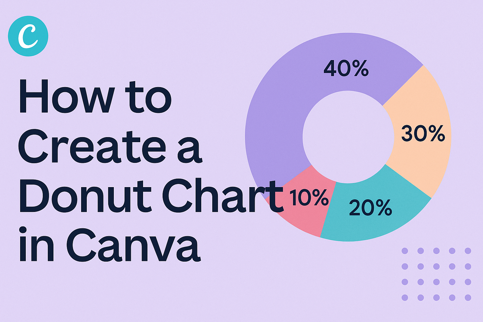
Creating a donut chart in Canva can be both fun and straightforward.
Many people use these charts to visualize data clearly, making complex information easier to understand.
With just a few simple steps, anyone can design a professional-looking donut chart that captures attention.
Canva provides various templates and design options to customize these charts.
Users can easily input their data, change colors, and adjust labels to match their unique style or brand.
This accessibility makes it a go-to choice for students, professionals, and anyone looking to present data engagingly.
Whether for a school project or a business presentation, a donut chart can enhance any visual report.
By learning how to create one in Canva, they can improve their ability to convey information effectively and creatively.
Understanding Donut Charts
Donut charts are a great way to display data visually.
They are similar to pie charts but have a hole in the center, allowing for additional information or design elements.
Knowing how to use them and when they are appropriate can enhance data presentation.
Defining a Donut Chart
A donut chart is a circular data visualization divided into segments or slices.
Each slice represents a proportion of the whole dataset. The main difference from a pie chart is the central hole, which can be used for labeling or highlighting key information.
Donut charts are useful for presenting parts of a whole.
They provide a clear view of how categories compare. When designing a donut chart, it is important to choose contrasting colors for each slice. This choice helps make the chart easy to read and understand at a glance.
When to Use Donut Charts
Donut charts are ideal for showing percentage data.
They work best when there are a limited number of categories. Too many slices can make the chart cluttered and confusing.
These charts can simplify complex data when communicating with an audience.
They are especially effective in business presentations, reports, and infographics. Always consider the audience before deciding to use a donut chart versus other visual representations, like bar or line charts. This ensures that the data is presented in the most effective way possible.
Getting Started with Canva
Canva is a user-friendly design tool that anyone can use to create beautiful charts. To get started, he or she needs to create an account on the Canva website.
-
Sign Up: Visit the Canva homepage. Click on “Sign up” and choose to register using an email, Google account, or Facebook account.
-
Choose a Template: Once logged in, he or she can search for “Donut Chart” in the template search bar. This will display various templates to choose from.
-
Open a Design: After selecting a template, they can click on it to start designing. The Canva editor will open, providing tools to customize the chart.
-
Adjust the Canvas: Users can resize the canvas by clicking and dragging the corners. This helps create a design that fits their needs.
-
Explore Tools: On the left side panel, they will find options to add text, images, and other elements. This makes it easy to enhance the donut chart.
-
Save Progress: It’s important to save the design frequently. He or she can do this by clicking on the “File” menu and selecting “Save” or just using the auto-save feature.
Canva is simple and fun, making it easy for anyone to create charts and graphics. Enjoy designing!
Designing Your Donut Chart
Creating a donut chart in Canva is a fun and creative process.
It involves selecting the right template and customizing it to fit specific needs. These steps will make the chart visually appealing and effective for presenting data.
Choosing a Template
First, users should start by selecting a template that fits their theme. Canva offers many free donut chart templates.
To find these, she can click on the “Charts” option located on the left side of the editor.
After selecting “Donut,” she can browse through available designs. It’s helpful to pick a template that matches the data’s purpose. For example, a colorful template can make sales data pop, while a more subdued one might suit an academic presentation.
Once a template is chosen, it sets the foundation for the entire chart. This makes the next steps easier and more focused.
Customizing the Donut Chart
Customizing a donut chart allows for better representation of data.
After selecting a template, the user should input her data into the table provided. Canva lets her edit data easily by clicking on the chart and selecting the “Edit” option.
Colors and styles also play a key role in customization.
Users can change segment colors to ensure they align with the brand or project theme. Canva provides a wide range of color palettes.
Labels are important too. Users should make sure each segment is clearly labeled for quick understanding. Adjusting font styles and sizes can also enhance clarity and visual appeal. To wrap it up, customization helps create a chart that not only looks good but also communicates data effectively.
Adding Data to Your Chart
When creating a donut chart in Canva, adding data is a crucial step.
Users can choose to input their data manually or import it from a file. Each method has its own benefits and is simple to follow.
Inputting Data Manually
To input data manually, a user starts by selecting the donut chart. They can then click on the “Data” button on the toolbar. A table will pop up, displaying default values.
The user can replace these with their specific data. It’s important to fill in both categories and values accurately to ensure the chart reflects the intended information. The chart will update in real-time, making it easy to see changes immediately.
For example, if a user wants to track sales in different regions, they would enter the region names in one column and the sales figures in the next. This direct method allows for quick adjustments as needed.
Importing Data from a File
For those who have larger datasets, importing data from a file can save time.
Users can prepare their data in a spreadsheet, ensuring it is organized in a way that Canva can read. Once ready, they can simply click the “Upload” option in the data table.
Canva supports formats like CSV and Excel. After importing, users should double-check to ensure the data aligns with the chart’s categories. Adjusting colors and labels can further enhance readability. This method is efficient and especially useful for users managing substantial amounts of data without manual input.
Customizing the Design
Customizing a donut chart in Canva can enhance its visual appeal.
By adjusting colors, styling text, and incorporating icons, users can create more engaging and informative designs.
Adjusting Colors
Colors play a crucial role in making a donut chart visually striking.
Users can select color schemes that match their brand or the theme of their project.
To adjust colors:
- Select the Chart: Click on the donut chart to bring up the editing options.
- Access the Color Palette: On the toolbar, find the color settings.
- Choose Custom Colors: Users can pick from pre-set colors or create custom shades.
It’s important to maintain contrast for readability. Using different colors for each segment helps convey information effectively. Lighter colors work well for backgrounds, while darker colors can highlight key data points.
Styling Text
The text in a donut chart must be clear and easy to read. Proper font choices and sizes can enhance overall clarity.
To style text:
- Select Text Areas: Click on any text elements in the chart.
- Change Font: Users have access to various fonts in Canva. Choose one that aligns with the chart’s context.
- Adjust Size and Alignment: Font size should be appropriate for visibility—usually between 12pt to 16pt works well.
It’s also helpful to use bold or italic text for emphasis. Consistency in font style across the chart adds professionalism, making the information more digestible for viewers.
Using Icons and Elements
Incorporating icons and elements can provide additional context to a donut chart. Icons can visually represent data segments, enhancing understanding.
To add icons:
- Open Elements Tab: Click on the elements section in the sidebar.
- Search for Icons: Input keywords related to the data represented in the chart.
- Place Icons Strategically: Drag and drop icons near relevant segments of the donut chart.
These elements can help communicate complex ideas quickly. Users should keep the design uncluttered; too many icons may distract from the main data. Balancing visuals with information is key for effective communication.
Saving and Sharing Your Chart
Once a donut chart is created in Canva, saving or sharing it becomes the next essential step.
Users can easily export their charts as images, share them on social media, or embed them in presentations. Each method ensures that the chart reaches an audience effectively.
Exporting as an Image
To save a donut chart as an image, users need to click on the “Download” button located at the top right corner of the Canva interface. From the drop-down menu, they can choose their preferred file format. Options include PNG, JPEG, and PDF.
- PNG offers high quality, perfect for web use.
- JPEG is a smaller file size, suitable for emails and social media.
- PDF is great for printing or sharing via professional platforms.
After selecting the desired format, clicking the “Download” button will save the chart to the user’s device. It’s a straightforward process that provides flexibility based on needs.
Sharing on Social Media
Canva also makes it simple to share created charts directly on social media platforms.
By clicking the “Share” button next to the download option, users can see a list of social media icons like Facebook, Twitter, and Instagram.
They can select the desired platform and customize the post with captions or hashtags. This feature allows immediate sharing, ensuring that the donut chart gets the attention it deserves. Users should double-check their settings to choose whether the chart is public or private before hitting the “Post” button.
Embedding in Presentations
For those wanting to include a donut chart in a presentation, Canva offers an easy embedding option.
First, users download the chart as an image or PDF. Then, they can open their preferred presentation software, like PowerPoint or Google Slides.
In the presentation, they simply drag and drop the downloaded image or insert it using the “Insert Image” feature.
This process ensures that the chart enhances the presentation visually and contextually. Using high-quality images boosts engagement during the presentation, making the data easier to understand.