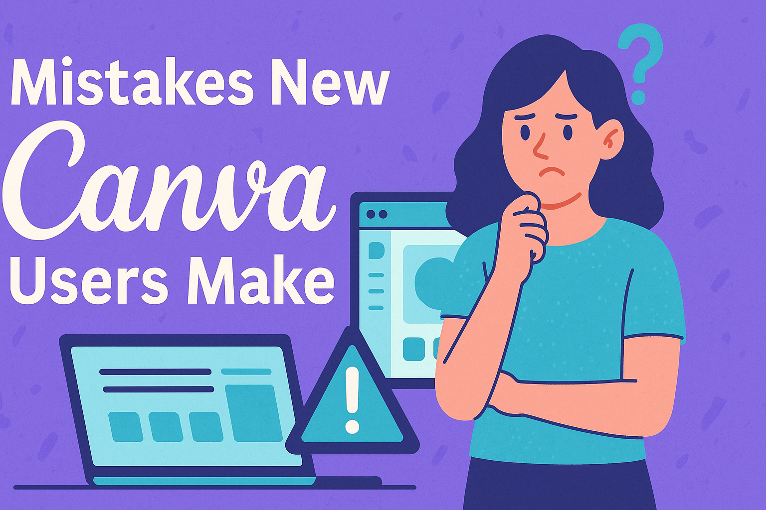
Navigating the world of Canva can be exciting, but it also comes with a few common pitfalls.
New users often dive in without realizing that simplicity is key. Using too many fonts or font styles in one design can make it look cluttered and confusing. Sticking to one or two fonts not only keeps your design clean but also makes it more visually appealing.
Organization is another hurdle for beginners. It’s easy to upload files only from the computer and overlook the potential of Canva’s project folders.
These tools help keep designs organized and easy to find later on. Taking advantage of the pink alignment lines can also save designs from looking disorganized and helps in creating a polished, professional look.
Understanding basic design principles like contrast and text size is crucial. Often, new users make the mistake of having text that’s too small or not providing enough contrast, which can affect readability, especially on mobile devices. A simple design that’s easy to read will have a stronger impact on viewers.
Understanding Canva Basics
New Canva users can make their experience smoother by familiarizing themselves with the user interface and setting up their accounts efficiently.
Knowing the layout and features helps in creating designs easily, while a well-set-up account lets them manage their projects better.
Navigating the User Interface
Navigating Canva’s user interface is simple once users understand its key components.
The main dashboard is the starting point, offering quick access to personal designs and templates. On the left, users find a menu with options for exploring templates, photos, and elements.
At the top, the search bar allows users to find specific design elements quickly. When editing, the toolbar provides essential tools like text addition and element positioning.
These tools, along with alignment guides, help create professional-looking designs. New users should explore the platform to familiarize themselves with features and shortcuts to enhance their productivity.
Setting Up Your Canva Account
Setting up a Canva account correctly begins with selecting the appropriate plan, whether it’s free or a premium subscription. Once logged in, users should complete their profile to personalize their experience and facilitate collaboration.
Organizing projects is easier with folders and labels. Users can save templates and finished projects in dedicated folders, enhancing efficiency in design management.
Notifications and settings should be customized according to user preferences to ensure they receive updates relevant to their projects. Taking these initial steps helps users streamline design processes and maintain better control over their creative work on Canva.
Common Design Blunders
Designing with Canva is fun, but it’s easy to fall into some traps. New users often make their designs too busy or fail to properly organize elements. Consistent use of fonts and colors is also crucial for professionalism. Let’s dive into these issues in more detail.
Overcrowding Your Design
Overcrowding can confuse viewers. Packing your design with too many elements makes it hard to focus. Each part should have a clear purpose. Think about using white space effectively. It helps your audience know where to look first.
Less is more. Focus on the main message you’re trying to convey. Choose a few key elements that tell your story best. This approach makes for cleaner and more impactful designs.
Many new designers are tempted to use all the cool features available. Although Canva offers many tools, you should use them thoughtfully. By resisting the urge to overcrowd, a design stays neat and effective.
Ignoring Visual Hierarchy
Visual hierarchy guides viewers through your design. With Canva, it’s about arranging text and images in order of importance. The most important elements should stand out the most.
Using size is a good way to create hierarchy. Bigger elements naturally draw the eye. Contrast is also useful. A strong contrast between elements helps spotlight key parts.
Layering text and images can create depth. But be careful! Overlapping too much can make the design messy. Visual hierarchy works best when used with simple organization techniques. This helps viewers understand the focus area quickly.
Using Inconsistent Fonts and Colors
Consistent fonts and colors give a cohesive look. New users often mix too many font styles, leading to a chaotic design. Sticking to one or two fonts keeps things tidy.
Colors should also complement each other. A mismatched palette can be distracting. Learning to use Canva’s color palettes can solve this. These palettes are pre-made and designed to work well together.
If you choose to create your own color scheme, try using a color wheel for guidance. Consistency is key. This ensures that viewers focus on the content, not the clashing styles. By doing so, your design becomes more appealing and professional.
Optimizing Image Usage
Using images effectively in Canva can elevate any project. This involves carefully selecting images that suit the content and applying resizing and cropping techniques to ensure they fit well, maintaining clarity and focus. Paying attention to these aspects can enhance the overall design impact.
Choosing the Right Images
Selecting the right image is crucial for good design. Images should fit the theme and purpose of the project. They should be clear, with high resolution, and complement the text or message.
Users should consider the context where the image will be used. For example, social media posts might benefit from brighter, eye-catching images, while a report might need a more subdued choice.
Sticking to a consistent style or color palette also helps in maintaining visual harmony across different designs.
In Canva, it’s helpful to use their vast library of stock images, as it offers high-quality options, saving time and ensuring a polished look. Paying attention to copyrights is important; Canva’s stock images usually carry the appropriate licenses for use.
Resizing and Cropping Techniques
Proper resizing and cropping can make images fit well without losing quality. In Canva, images can be resized easily by dragging the corners of the image frame. This ensures that pictures remain crisp and clear on different screens.
Cropping is another useful tool. By focusing on the core part of the image, designers can emphasize important details. This is especially useful when the original image includes unnecessary elements.
According to Canva’s own tips, careful cropping can enhance the mood or focus of the image.
It’s important to maintain the original aspect ratio when resizing to avoid distortion. Adjusting images to the right dimensions, especially for different platforms, ensures consistency and professionalism in the final design.
Effective Text Handling
Handling text in Canva requires effective strategies to create visually appealing designs. A key focus should be on balancing text with images and choosing complementary fonts.
Balancing Text and Imagery
Achieving a good balance between text and imagery is crucial for any design. Too much text can overwhelm the audience, while too little may not convey the message clearly.
A good strategy is to use visuals that align with the text and don’t overpower it. This can be done by adjusting the size and boldness of the fonts to ensure they stand out against the images.
Using white space effectively helps in separating text from images. It guides the viewer’s eye and makes the content easier to digest. Designers can also experiment with text alignment and placement, ensuring the flow feels natural.
When using images, it’s important to select ones that complement the text without distracting from it. Colors in the images should match the text tones, providing a cohesive look across the design.
Understanding Font Pairing
Selecting the right font pairing is essential for a polished design.
It’s recommended to limit fonts to two or three to maintain clarity and cohesiveness. Each font should serve a purpose, such as using a bold font for headings and a simpler one for body text.
Fonts should complement each other and match the design’s overall theme. For example, a playful font pairs well with a script style for creative projects, while a clean sans-serif works better for professional presentations.
When pairing fonts, also consider size and hierarchy. Larger fonts for headings and smaller ones for body text help establish a clear reading order.
Additionally, taking advantage of Canva’s design tools can ensure fonts blend well, enhancing the visual appeal rather than detracting from it.
Managing Templates and Elements
Effectively managing templates and design elements in Canva can save time and streamline creativity. Focusing on customizing templates and organizing design elements helps users enhance their design processes and prevent common mistakes.
Customizing Templates
Customizing templates is key to making designs unique. Canva offers a plethora of templates ready for personalization.
Users can start by selecting a template that matches their project’s theme. Adjusting colors, fonts, and images to fit the specific style of a brand or project is essential.
Aligning elements using Canva’s guidelines ensures a neat and professional look. It’s important to not go overboard with fonts, as consistency with typography helps maintain readability and aesthetic appeal. Avoid using too many different fonts which can clutter your design and confuse viewers.
Organizing Design Elements
Organizing design elements ensures a smooth workflow. Canva’s feature to create projects can be extremely helpful.
This feature helps keep various elements, like images and graphics, in designated folders for easy access.
Using folders for different categories—such as client work, personal projects, or templates—makes locating files straightforward. Utilize Canva’s team feature to collaborate effortlessly with others by sharing folders and designs.
Proper alignment of elements using the pink alignment lines provided by Canva also aids in efficient design creation.
Collaboration and Sharing
Collaboration and sharing in Canva allow users to work together on design projects and easily distribute creations. Users can manage permissions and share designs in various formats, making it a versatile tool.
Working with Teams in Canva
Canva offers powerful tools for team collaboration, allowing multiple users to edit a design simultaneously.
Users can share designs with their team by granting different permission levels, which can be managed within the platform. These permissions include options such as view-only or edit access, ensuring that team members interact with the design appropriately.
Designers can invite team members directly via email or send a link. This flexibility makes it easy to bring everyone on board, whether they are part of the marketing team or a freelance collaborator.
Notifications on the Canva homepage can also help streamline team coordination by highlighting shared projects and updates.
By using these features, individuals can maintain control over their designs while facilitating effective teamwork. It’s an efficient way to ensure that everyone contributes to the design process while maintaining a clear organizational structure.
Sharing and Exporting Your Designs
Sharing designs in Canva is straightforward, with options to distribute via email, link, or direct export.
Users can share designs by simply copying a link or using email sharing features, allowing for quick collaboration.
Canva also allows for control over access levels, so users can decide if someone can only view or edit the design.
Designs can be exported in various file formats such as PDF, PNG, or JPG. This flexibility makes it suitable for different purposes, whether it’s printing, digital marketing, or social media posts.
Users can also create templates to share with others, enabling efficient reutilization of design elements.
These sharing and exporting features make Canva a versatile tool for both collaboration and broader distribution, fitting a variety of design needs.
Making the Most of Canva Features
Canva offers a range of features that enhance design projects, from advanced tools to exclusive benefits available through Canva Pro.
By understanding and utilizing these features, users can significantly improve their design quality and efficiency.
Exploring Advanced Tools
Canva includes several advanced tools that can elevate designs.
One such feature is the Background Remover, which allows users to effortlessly remove backgrounds from images with a single click, saving time and enhancing visual appeal.
Another powerful tool is the Animation feature, which adds movement to static designs, making them more engaging and suitable for presentations or social media posts.
The Resize function is another valuable asset. It lets users adapt their designs to different formats without starting from scratch. This feature is significant for maintaining consistency across platforms.
Additionally, the Brand Kit enables users to upload logos, select brand colors, and choose fonts, ensuring that every project aligns with their branding.
Leveraging Canva Pro Benefits
Canva Pro offers several perks that can significantly benefit users.
With Canva Pro, users gain access to a larger library of images, illustrations, and fonts, greatly expanding creative possibilities.
The ability to create Custom Templates allows for quicker project turnaround and consistency across various designs.
Another advantage of Canva Pro is the Magic Resize tool, which allows designs to be resized for different platforms in just a few clicks, saving time and effort.
Additionally, the Collaboration Features are enhanced, providing options to create teams and share projects seamlessly. This is particularly useful for businesses or groups working on shared projects.