Design enthusiasts often seek ways to make their projects stand out, and mastering vertical text in Canva is a game-changer. By using this tool, creators can add a unique twist to their graphics, adding visual appeal and distinctiveness.
To create vertical text in Canva, simply add your text box and adjust it so the text appears vertically along your desired axis. This straightforward technique can completely transform your design.
Vertical text can elevate a simple project into something eye-catching and memorable. It draws the viewer’s attention and can be used to emphasize particular elements of a design.
By integrating vertical text, Canva users can unlock new creative possibilities and showcase their personal style.
Exploring Canva’s vertical text option allows users to engage their audience in a fresh and innovative way. Whether it’s for a presentation, social media post, or personal project, this tool provides flexibility in design.
Visit the Canva Templates guide for more detailed steps on using this feature.
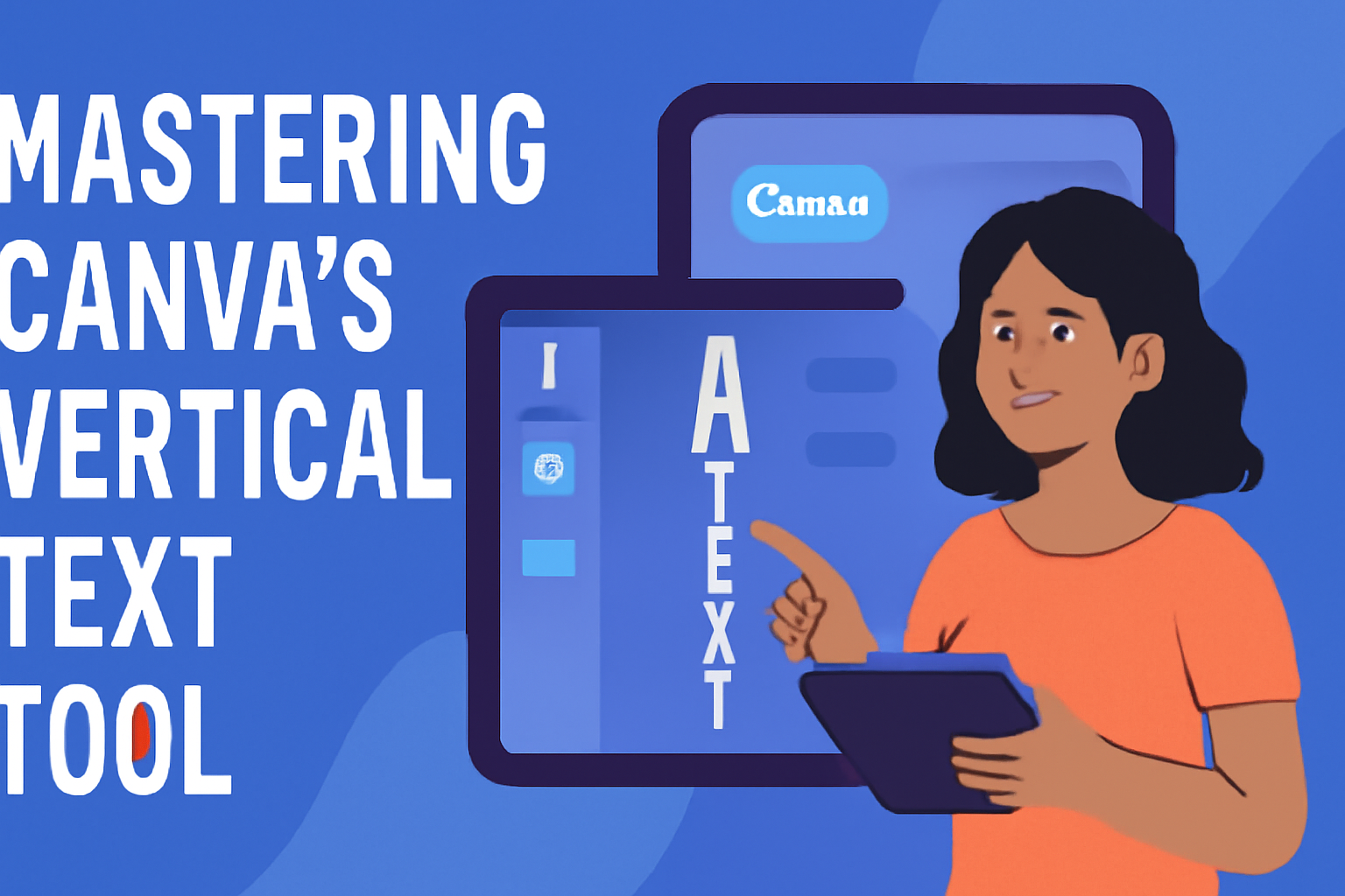
Understanding Canva’s Vertical Text Tool
Mastering vertical text in Canva enhances a design’s visual appeal. Learning how to explore Canva’s workspace, manipulate text, and use the text toolbar can help users create eye-catching designs.
Exploring the Canva Workspace
Navigating the Canva workspace is the first step to using vertical text effectively. Users begin by opening a new project on Canva’s website or app.
Once inside, they can find various design elements on the left-hand menu, including templates, photos, elements, and importantly, the text tool.
Familiarizing with this layout ensures quick access to needed tools. Designers can also find guidance and tips in tutorials and guides, like the step-by-step guide available on YouTube.
Basics of Text Manipulation
Text manipulation is key to achieving vertical text. Start by adding text to your canvas through the Text tab. Clicking “Add a Text Box” allows users to input text.
To make the text vertical, one method involves manually condensing it into a single column by hitting Enter after each letter.
There’s also a drag-and-drop feature that helps adjust text placement dynamically. Online resources provide more about this process.
Navigating the Text Toolbar
The text toolbar in Canva offers a range of options for modifying text. After selecting the text box, users can change font styles, sizes, and colors using the toolbar at the top.
For vertical text, features such as letter spacing and alignment help in refining the text’s layout and appearance.
Employing these tools allows designers to experiment and customize their designs fully. More detailed techniques can be seen in tutorials, guiding users through each step.
Getting Started with Vertical Text
Vertical text in Canva adds a unique flair to any design. By choosing the right font and adjusting text size and alignment, users can create visually appealing projects.
Selecting the Right Font
Selecting the right font is crucial for creating inspiring vertical text in Canva. Fonts with consistent thickness or sans-serif styles often look cleaner and are easier to read when stacked vertically.
Experimenting with different fonts can help find the perfect match for the project’s tone.
Heavier fonts might be more suitable for bold statements, while lighter fonts are excellent for subtle messages. Canva offers a wide selection of fonts to choose from, so users can explore various options to find the ideal style. It is also helpful to consider the design’s overall purpose and target audience when selecting a font.
Adjusting Text Size and Alignment
Adjusting the text size is vital to ensure readability and impact. Larger text may stand out more in a design, but it’s important to balance it with other design elements.
Users can use Canva’s text size tool to make precise adjustments.
Aligning the text properly is also essential. Left or center alignment usually works best for vertical text. These alignments maintain a clean look and prevent overlapping with other design elements.
Aligning text in an aesthetically pleasing way enhances the overall appeal and keeps the design from looking cluttered.
Advanced Vertical Text Techniques
Vertical text in Canva can add a unique flair to any design project. By exploring rotation, layering for hierarchy, and customizing font styles, users can elevate their designs significantly.
Rotating Text for Vertical Effects
Rotating text lets users create striking visuals easily. By selecting the text box and clicking on the rotate handle, text can be shifted to a vertical position.
For a more precise angle, the rotation degree can be manually entered in the toolbar.
This technique is perfect for emphasizing specific words or creating a different reading experience. It helps in making the text stand out, offering a dynamic element to the design.
Rotated text adds a layer of creativity, especially when juxtaposed with horizontal elements.
Layering Text for Visual Hierarchy
Layering text is a powerful tool to create depth and establish visual hierarchy. Begin by laying out multiple layers of text with varying sizes and styles.
Arranging larger text in the foreground with smaller, detailed text in the background can guide the reader’s attention effectively.
By using transparency and overlapping text boxes, users achieve a three-dimensional look. This approach is useful in projects where conveying a sense of order is crucial, such as in posters or brochures.
Placing text strategically not only enhances readability but also creates a compelling visual structure.
Customizing Font Color and Style
Customization of font color and style can significantly impact a design’s aesthetic. Canva allows users to choose from a vast array of fonts and color palettes.
Selecting contrasting colors helps in highlighting the text when layered over busy backgrounds.
Users can experiment with bold, italics, and various font sizes to find the perfect match for their design.
Access the text box toolbar to change the font style and color easily.
Customization empowers designers to align the text with the overall theme and mood of the project, enhancing the attraction and clarity of the text.
Design Tips for Vertical Text
Creating vertical text in Canva can add a unique touch to any design. It’s important to focus on keeping the text readable, ensuring it balances well with images, and using spacing creatively to make the text stand out.
Maintaining Readability
Readability is key when using vertical text. A tall font can make it easier to read vertically. Fonts like Arial or Roboto are simple and clear.
Choosing a font size that is large enough to read but not overwhelmingly big helps, too. Generally, aligning text to the left or center can make vertical text easier on the eyes. Avoid fancy fonts that are hard to decipher.
Using contrasting colors between the background and text can also enhance readability.
Balancing Text with Images
When adding vertical text to a design, it’s crucial to balance it with images. This ensures that neither element overshadows the other.
Placing text alongside an image or integrating it within images can create harmony.
Experimenting with alignment helps achieve this balance. Vertical text should not be too close to images, as this might appear cluttered. On the other hand, too much distance can make the design look disjointed.
Consider the size of both the text and images, ensuring neither dominates.
Creative Uses of Spacing
Spacing can be a powerful tool when working with vertical text. Using proper spacing can create a clean and visually appealing design.
Adjusting the line spacing allows for more or less space between lines and can be useful for taller text.
Incorporating space creatively can guide the viewer’s eye through the design. For example, staggered text can create a dynamic appearance.
Blank spaces don’t have to be empty; they can frame the text or add contrast. Spacing doesn’t just have to be vertical; diagonal layouts can also add interest to the text flow.
Application of Vertical Text in Design
Vertical text in Canva can transform the design of social media graphics, event invitations, and logos. This unique text style adds a modern flair and can draw attention to important details, making your designs stand out.
Social Media Graphics
Vertical text is a great way to make social media posts eye-catching. Platforms like Instagram and Pinterest value visuals that stand out in a feed.
By using vertical text, designers can create striking headlines or calls to action that capture attention immediately.
Vertical alignment helps balance other elements like images or icons. It allows for creative layouts that can convey messages effectively.
Users love to experiment with different fonts and colors, making designs more engaging and memorable.
With vertical text, social media graphics often appear more dynamic. They encourage viewers to pause and interact with posts, increasing engagement and reach.
Event Invitations
Using vertical text on event invitations can make them feel more elegant and sophisticated. Whether it’s a wedding, birthday, or corporate event, vertical elements can give an invitation a unique and memorable look.
This style can highlight key details, like the date or venue, making them pop on the invitation. It is particularly useful when space is limited or when a clean, minimalist design is desired.
Designers appreciate the flexibility that vertical text offers. It allows for creative positioning, blending seamlessly with other decorative elements like borders or illustrations, adding a personal touch to any invitation.
Vertical Text in Logos
Incorporating vertical text in logos can add a modern twist to a brand’s identity. This approach is particularly suitable for brands seeking to convey innovation or creativity.
Vertical text can make a logo look more streamlined and professional.
This style allows brands to communicate their names or taglines uniquely. It can be especially effective when used alongside symbols or icons, creating a balanced and cohesive design.
Designers use vertical text to break away from traditional horizontal layouts. This can help brands stand out in crowded markets, making their logos instantly recognizable and memorable.
Troubleshooting Common Issues
When using Canva’s vertical text tool, users may run into a few common challenges like aligning text properly, adjusting text boxes without distortion, and ensuring readability against various backgrounds. Addressing these issues will enhance design efficiency and visual appeal.
Aligning Vertical Text with Other Elements
Aligning vertical text with other design elements can be tricky. Often, text doesn’t line up as expected, which can disrupt the visual balance of the design.
To solve this, use Canva’s alignment tools. Select the text box, and use the alignment options in the toolbar to adjust its position relative to other elements.
Snap to grid is a handy feature that helps in perfectly aligning text.
If further refinement is needed, adjust by dragging the text box carefully until alignment looks just right.
Adjusting Text Boxes without Distorting Text
Distortion occurs if text boxes are resized incorrectly. To avoid this, ensure you hold the Shift key while resizing. This maintains the text’s aspect ratio.
Alternatively, using Canva’s corner handles, rather than side handles, helps in keeping the text proportionate.
Resize gradually and check the text frequently to avoid any unintended changes. Consistent font size and spacing also help in preserving text clarity while resizing. If ever distorted, there’s always the undo button to revert changes.
Ensuring Clarity on Different Backgrounds
When vertical text is placed against complex backgrounds, readability might suffer.
High contrast between text color and background ensures clarity.
Light text works on dark backgrounds and vice versa.
Canva offers a selection of text effects like shadows or outlines, which can further enhance visibility.
Consider using semi-transparent overlays beneath text when dealing with particularly busy backgrounds.
This simple strategy maintains text readability without altering the overall design.
Adjust text styling only if necessary to maintain design integrity and ensure the message remains clear and visible.