Creating eye-catching text is a great way to make any design pop, and Canva offers the perfect tools for this. With Canva, you can add stunning gradient effects to your text, making it vibrant and unique.
Whether you’re crafting an invitation, a promotional post, or a motivational quote, gradient text can really catch the viewer’s eye.
Using Canva’s versatile features, such as custom gradient styles and text effects, anyone can easily bring their creative ideas to life.
Readers interested in learning how to create beautiful gradient letters can find more detailed guides and tips on various websites.
From choosing the right colors to positioning the text perfectly, there’s plenty of flexibility in the tools available.
For those eager to explore and master this feature, grabbing attention has never been easier. Dive in, explore the possibilities, and start creating designs that stand out from the crowd!
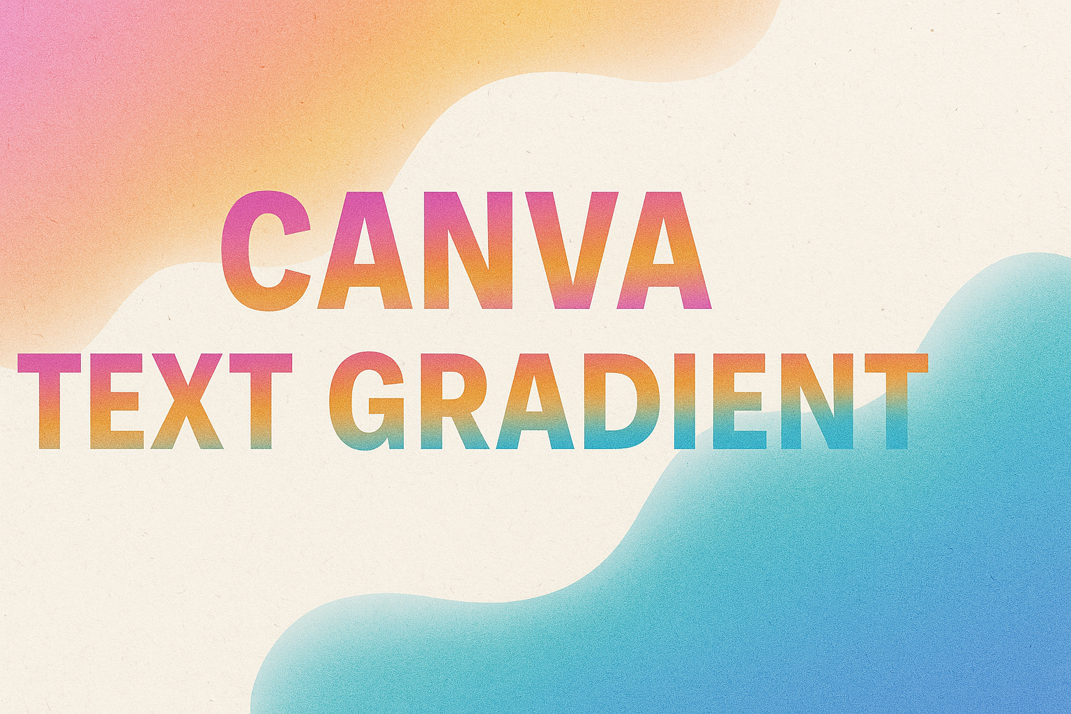
Understanding Canva Text Gradients
Canva text gradients add style and creativity to designs. They make text more visually appealing and can draw attention to specific content.
The Basics of Text Gradients
Text gradients in Canva are simple to use. First, the user must open Canva and start a new design or choose an existing one.
They can then type their text using the text tool.
After the text is prepared, the next step is to select the text and access the “Text Color” option.
Here, users can choose “Gradient” from the color options. Canva offers a variety of gradient styles, including linear and radial gradients.
Users can also customize these gradients by adjusting the colors and gradient angle to fit their design needs.
By dragging the gradient handles, the pattern can be adjusted for a better visual effect.
Benefits of Using Text Gradients
Using text gradients provides several advantages in Canva. First, they enhance the aesthetic of the text, making it more eye-catching. This can help in attracting the viewer’s attention to important information, such as titles or key points.
Second, gradients can add depth and dimension to designs, making them appear more dynamic and modern.
Different gradient colors can evoke different emotions, which designers can use to their advantage. For instance, warm tones might convey excitement, while cool tones can create a calming effect.
Applying gradients to text can make designs stand out, especially in promotional materials or social media posts.
Creating Text Gradients in Canva
Creating text gradients in Canva can give designs a vibrant and eye-catching look. This section will guide you through starting a project, choosing the right font, and adding gradient effects to the text.
Starting with a Blank Canva Project
To create a text gradient, one must first open Canva and start a new project. Users can choose a pre-made template or set custom dimensions for their design.
Once the project is open, the next step is to select a blank canvas. This offers flexibility and creativity in choosing elements later on.
It’s helpful to familiarize oneself with the toolbar on the left. This is where most of the design tools, like text and elements, can be found.
Selecting the Right Font for Gradient Text
Choosing the right font is important for achieving the desired impact of gradient text. Bold fonts often work best because they highlight color transitions more effectively.
Canva offers a wide range of fonts in its library. Exploring different font styles can help inspire unique design ideas.
Users should try different font weights to see what fits their vision. It’s important to keep readability in mind, especially for longer text passages.
Applying Gradient Effects to Text
To apply a gradient effect, users initially add the text to their project. Once the text is typed, they can proceed to apply the gradient.
One popular method is to create an image of a gradient background and adjust the text transparency to create a gradient appearance.
Another technique involves using Canva’s combination of elements and layering to achieve a custom gradient effect.
By exploring these tools, users can find the method that best suits their design needs.
Customizing Your Text Gradient
Customizing your text gradient in Canva can make your designs standout. Picking the right colors, setting the direction, and adjusting the intensity of the gradient are all important steps to achieve a perfect look.
Choosing Gradient Colors
Selecting the right gradient colors is the first step. Users can choose from Canva’s built-in colors or create their own by mixing different shades.
Think about the mood you want to convey. Bright colors can give a cheerful vibe, while darker shades may look more professional.
Experiment with contrasting colors for a bold effect or similar hues for a subtle transition.
It’s also helpful to incorporate your brand colors if you’re designing for a specific theme or product.
For more ideas, Canva offers a wide variety of preset gradient templates that can be customized further.
Adjusting Direction and Type of Gradient
After choosing colors, the next step is to set the gradient direction and type.
In Canva, gradients can be adjusted to horizontal, vertical, or diagonal orientations. This flexibility allows users to align the gradient with other elements on the page, enhancing overall design harmony.
There’s also an option to choose between linear and radial gradients.
A linear gradient will create a straight transition between colors, while a radial gradient spreads from a central point.
Experimenting with these settings will help users find the right balance that suits their design needs.
Fine-Tuning Gradient Intensity
Fine-tuning the gradient intensity is crucial for achieving the desired look.
On Canva, this can be adjusted by changing the transparency levels of the gradient colors.
Users can make the gradient more subtle by increasing transparency, or more vibrant by reducing it.
This feature allows for precise control over how much blending occurs between colors.
Consider the readability of your text—ensure that the gradient does not overwhelm the actual message.
If necessary, add a background element to make the text stand out, ensuring clarity and impact.
Adjustments here can significantly affect how your text is perceived.
Advanced Text Gradient Techniques
Creating eye-catching text gradients in Canva can add flair to any design project. This section highlights methods for achieving multicolor gradients, using overlays creatively, and adding movement through animation.
Layering Text for Multicolor Gradients
Layering text in Canva lets designers achieve stunning multicolor gradient effects. It involves duplicating text layers and applying different colors to each layer.
By adjusting the position and blending mode of each layer, users can create seamless transitions between colors.
This technique provides flexibility. Designers can experiment by overlapping layers in various ways. They can try different color combinations to enhance visual appeal.
Adjusting the transparency of layers can further refine the gradient effect, making it more subtle or vibrant as needed. This approach is perfect for emphasizing important elements in a design.
Creative Use of Transparency and Overlays
Utilizing transparency and overlays allows for unique gradient effects. By setting a text layer’s transparency to a lower level, it creates a blend with the background or other overlapping elements. This offers interesting color variations that can make the text pop.
Overlays, such as images or patterns, can be positioned over the text. Modifying their transparency allows the gradient effect to peek through.
Additionally, choosing complementary overlay colors can enhance the intended mood or theme of the design.
Experimenting with these elements often leads to an appealing balance between visibility and style.
Animating Text Gradients
Animating text gradients can add dynamic appeal to graphic designs. Canva offers tools to apply simple animations that make gradient text more engaging.
One approach is to transition different gradient layers over time to create a shifting color effect.
Designers can also apply movement to gradient text itself. Text can slide, fade, or bounce while changing colors, drawing attention to specific messages or highlights.
Settings for speed and direction are adjustable to align with the overall design theme.
Paying attention to timing ensures that animations are smooth and captivating, ultimately enhancing the viewer’s experience.
Design Inspiration and Ideas
When working with Canva’s text gradient features, inspiration can be found in many places. The tips below guide users on exploring Canva’s community and highlight real-world examples of gradients that make an impact.
Exploring Canva’s Design Community
Canva’s design community offers a rich source of inspiration for text gradients. Users can join the community to access galleries and user-generated content. Here, designers showcase their work, sharing innovative gradient styles and creative ideas.
Participating in community challenges can provide fresh perspectives. Members often share insights and tips, making it easy to learn new techniques.
By studying others’ work, designers can refine their own skills and discover new ways to use gradients.
Engaging with this community also encourages collaboration. Users can connect with other designers, exchange feedback, and learn from each other’s successes and challenges.
Case Studies of Effective Text Gradients
Analyzing effective text gradients can offer practical insights into what works well.
For instance, many ecommerce sites use subtle gradients to make product names pop. Gradients can draw attention without overwhelming the rest of the content.
Educational infographics also benefit from clear text gradients. Text stands out against detailed backgrounds, improving readability. This approach helps viewers absorb information quickly.
Several popular brands utilize bold gradients in logos. These case studies demonstrate how gradients can convey a brand’s identity efficiently.
Reviewing such examples helps designers understand when and how to apply gradients for maximum impact.
Learning from real-world examples provides a deeper understanding of effective gradient use that resonates with audiences. This knowledge can inspire new, creative ways to apply text gradients in various projects.
Troubleshooting Common Issues
In working with Canva text gradients, users might face a few challenges. These might include the gradient not appearing as expected or issues with printing the design with gradients. This guide addresses these common concerns.
Gradient Text Not Displaying Correctly
Sometimes, the gradient effect may not show as planned. Check these common fixes:
-
Accurate Selection: Ensure the correct text is selected, and the gradient option is applied. It’s easy to mistakenly apply changes to the wrong text box.
-
Software Updates: Ensure Canva is updated. New updates can fix bugs and improve features.
-
Clear Cache: Occasionally, clearing your browser cache can help resolve display issues.
Tip: Adjust the gradient handles. This feature can be used to refine the gradient’s appearance, making sure the colors spread exactly how you want.
Text Gradient Printing Tips
Printing gradients can sometimes result in unexpected colors. Ensure your gradients print properly with these helpful tips:
-
High-Resolution Export: Always export your design in a high-resolution format. This can prevent pixelation and color loss in print.
-
Color Profiles: Check the color profile settings. Use CMYK for print and RGB for digital designs. This ensures the colors appear vibrant in both formats.
-
Print Preview: Use a print preview tool. This can help identify any issues before the final print.
Helpful Resources: Consult Canva’s Text Gradient Guide for additional support and examples tailored to printing needs.
Best Practices for Text Gradients
Using text gradients in Canva can transform your designs by adding depth and visual appeal. It’s essential to focus on making the text readable, aligning with brand guidelines, and ensuring compatibility across different platforms.
Ensuring Readability
Text gradients can sometimes make text hard to read if not used properly. To prevent this, designers should choose contrasting colors for the gradient to ensure clarity. For instance, pairing a light color with a darker one can help the text stand out.
It’s also important to view the design on different screens and distances to make sure the text is legible.
Adjusting the size and font style is beneficial as more simplistic fonts often work best with gradient effects, keeping the text clear and easy to read.
Maintaining Brand Consistency
When applying gradient text, it’s crucial to maintain a brand’s visual identity.
This can be done by sticking to the brand’s color palette. Use gradients that reflect the brand’s core colors to ensure that the design feels familiar and consistent.
Brands often have specific fonts and styles that represent them. Make sure the gradient effect does not overpower these elements.
Subtle gradients often work well, preserving the brand’s essence while adding a modern touch.
Staying true to brand elements enhances recognition and ensures audience connection.
Optimizing for Various Platforms
Designs appear differently across platforms, like social media, websites, or print.
It’s important to test gradient text on each platform to make sure it looks good and doesn’t lose its impact. Canva makes this easy by allowing users to preview designs in different formats.
File types also play a role in how gradients display.
Designers should save projects in high-quality formats, such as PNG or SVG, for the web to ensure the gradients remain smooth.
For print, using CMYK colors may be necessary to preserve the gradient’s vibrant appearance.