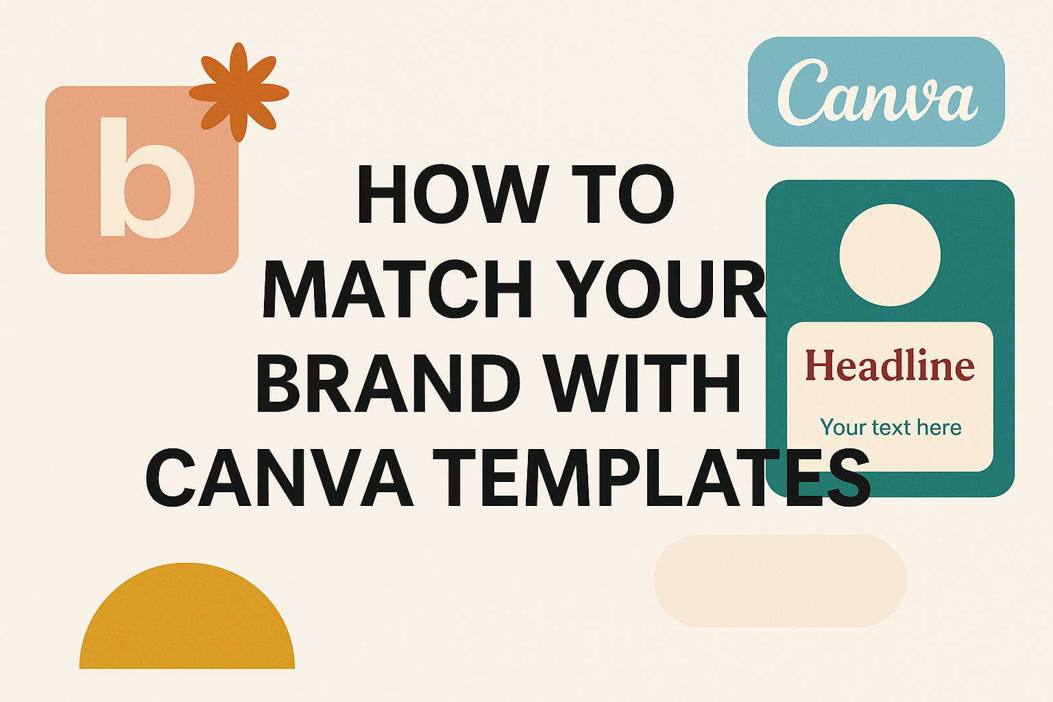
Creating designs that truly represent your brand can feel overwhelming when you’re working with pre-made templates. Many business owners struggle to make generic Canva templates look unique and professional while staying true to their brand identity.
The key to matching your brand with Canva templates lies in setting up a comprehensive brand kit and following a systematic approach to customization. This process involves more than just changing colors and fonts. It requires understanding your brand’s visual identity and knowing which template elements to modify for maximum impact.
This guide walks through everything from establishing your brand identity to using advanced Canva Pro features for professional results. You’ll learn how to customize Canva templates to match your brand effectively and maintain consistency across all your marketing materials.
Establishing Your Brand Identity
A strong brand identity serves as the foundation for selecting and customizing Canva templates that truly represent your business. This involves pinpointing your brand’s essential characteristics and translating them into consistent visual elements that guide all design decisions.
Defining Your Brand’s Core Elements
Your brand’s personality forms the backbone of every design choice you’ll make in Canva. Start by identifying three to five core values that define what your business stands for.
Consider your target audience’s preferences and pain points. A fitness brand targeting busy professionals might emphasize efficiency and energy, while a handmade jewelry business could focus on creativity and personal connection.
Write down your brand’s mission in one clear sentence. This statement should capture why your business exists beyond making money.
Define your brand voice using specific adjectives. Is your tone professional and authoritative, or friendly and approachable? These characteristics will influence everything from color choices to typography.
Document your unique selling proposition. What makes your business different from competitors? This distinction should shine through in your visual choices and messaging across all Canva designs.
Developing a Visual Style
Your visual style transforms abstract brand concepts into concrete design elements that customers can recognize instantly. Color psychology plays a major role in how people perceive your brand.
Choose 2-4 primary colors that reflect your brand personality. Blue conveys trust and reliability, while orange suggests enthusiasm and creativity. Test these colors with your target audience to ensure they create the right emotional response.
Select fonts that match your brand voice. Modern sans-serif fonts work well for tech companies, while script fonts suit creative businesses. Limit yourself to 2-3 font families to maintain consistency.
Develop a signature style for images and graphics. Will you use bright, high-contrast photos or muted, minimalist illustrations? This choice affects how users perceive your brand’s energy level and approach.
Create templates for common design elements like borders, icons, and layouts. Having these ready saves time and ensures consistency across all your Canva projects.
Setting Brand Guidelines
Brand guidelines act as a roadmap for maintaining consistency across all your Canva designs and marketing materials. Document specific hex codes for each brand color to ensure exact matches every time.
Establish rules for logo placement and sizing. Your logo needs adequate white space around it and should never be stretched or distorted. Set minimum size requirements for different applications.
Typography Rules:
- Headlines: [Primary font name and size range]
- Body text: [Secondary font name and size range]
- Captions: [Font specifications for small text]
Define image standards including photo filters, contrast levels, and subject matter preferences. Creating branded templates in Canva helps maintain these standards automatically.
Create a simple one-page reference sheet with color codes, fonts, and key rules. This guide ensures anyone creating designs for your brand stays consistent, whether they’re using Canva templates or creating custom graphics.
Preparing Your Canva Brand Kit
Setting up your brand kit correctly saves time and keeps designs consistent. The process involves gathering visual assets, defining exact colors, and choosing the right fonts for your brand identity.
Collecting Logos and Design Assets
Your logo serves as the foundation of your brand kit and needs multiple versions for different uses. Upload your main logo along with variations like horizontal layouts, stacked versions, and simplified icons.
Essential logo formats to include:
- Full color version on white background
- White version for dark backgrounds
- Black version for single-color printing
- Simplified icon or mark without text
High-resolution PNG files work best because they maintain quality and support transparent backgrounds. Each logo should be at least 300 DPI to ensure crisp printing and clear display across all design projects.
Users should also gather any secondary graphics like patterns, icons, or watermarks they use regularly. Canva’s brand kit feature allows storage of multiple brand assets in one organized location. This makes it easy for team members to access approved visuals without searching through folders or asking for files.
Setting Up Your Color Palette
Colors create instant brand recognition and emotional connections with audiences. Start by identifying your primary brand colors and their exact hex codes to ensure consistency across all materials.
Color palette structure:
- Primary colors: 2-3 main brand colors used most frequently
- Secondary colors: 2-4 supporting colors for accents and variety
- Neutral colors: Grays, whites, or beiges for backgrounds and text
Each color needs its specific hex code, RGB values, and CMYK values for different printing needs. Write these down before uploading to avoid guessing shades later.
Canva allows users to input custom hex codes directly into their brand kit. This ensures the exact shade appears every time rather than similar-looking alternatives. Many brands also include different tints and shades of their main colors to provide more design flexibility while maintaining brand consistency.
Selecting and Uploading Brand Fonts
Typography communicates personality and professionalism just as much as colors and logos do. Choose fonts that reflect your brand voice and remain readable across different sizes and mediums.
Font hierarchy to establish:
- Primary font: Main headings and titles
- Secondary font: Subheadings and emphasis text
- Body font: Paragraphs and general content
Most brands work well with 2-3 fonts maximum to avoid visual confusion. One font for headings and another for body text creates clean, professional designs without overwhelming viewers.
Canva Pro users can upload custom fonts directly to their brand kit for team access. Free users can select from Canva’s extensive font library and save their choices as brand fonts. Both options ensure consistent typography across all projects and eliminate guesswork when team members create new designs.
Choosing the Right Canva Templates
Finding templates that match your brand aesthetic and meet your specific content needs creates the foundation for professional-looking designs. The key lies in using strategic filters and understanding which template formats work best for different marketing materials.
Filtering Templates by Brand Aesthetic
Users should start by applying style filters to narrow down options that align with their brand personality. Canva’s filtering system allows designers to select from categories like minimalist, modern, or elegant styles.
Color filtering helps identify templates that already use similar tones to the brand palette. While colors can be changed later, starting with compatible schemes saves time during customization.
Typography style becomes crucial when evaluating template options. Templates with clean, simple fonts work better for corporate brands, while creative businesses might prefer decorative typography.
Key filtering criteria include:
- Design style (minimalist, bold, vintage)
- Color palette compatibility
- Layout complexity
- Font personality
Users should also consider the template’s structural elements. Templates with too many decorative elements require more editing time to match simpler brand aesthetics.
Identifying Template Types for Your Needs
Different marketing materials require specific template structures to be effective. Social media templates need space for captions and hashtags, while presentations require clear hierarchy for information flow.
Common template categories include:
- Social media posts – Square formats for Instagram, vertical for Stories
- Marketing materials – Flyers, brochures, email headers
- Business documents – Presentations, reports, proposals
- Custom templates – Branded layouts for recurring content
Instagram carousel templates work well for step-by-step tutorials or product showcases. Single-post templates suit quotes or announcements better.
Presentation templates should prioritize readability and logical flow. Look for designs with consistent slide layouts and clear visual hierarchy.
Marketing materials like flyers need strong focal points and space for contact information. Templates with too much text or cluttered layouts reduce effectiveness.
Users can follow specific template creators whose design styles consistently match their brand needs. This approach streamlines future template selection and maintains visual consistency across campaigns.
Customizing Canva Templates for Brand Consistency
Making templates match your brand requires changing colors, fonts, logos, and images to create a unified look. These changes help businesses maintain professional design standards across all their marketing materials.
Applying Brand Colors and Fonts
Brand colors create instant recognition for any business. Users can upload their specific color codes into Canva’s brand kit feature. This makes it easy to apply the same colors across all templates.
The Brand Kit stores up to 12 brand colors for quick access. Companies should add their primary and secondary colors first. These colors should match exactly what they use on their website and other materials.
Font choices affect how people see a brand. Canva’s brand management tools help teams maximize consistency at every touchpoint. Users can upload custom fonts or choose from Canva’s library.
Consistent typography makes designs look more professional. The same fonts should appear in headlines, body text, and captions. This creates a cohesive look that customers will recognize.
Incorporating Logos and Branding Elements
Logos need proper placement and sizing in every design. Users should upload high-quality logo files in PNG format with transparent backgrounds. This ensures logos look crisp on any background color.
Brand elements include icons, patterns, and graphic styles that make a company unique. These elements should appear consistently across all templates. They help create a recognizable visual identity.
Logo placement affects the overall design balance. Logos work best in corners or headers where they don’t compete with main content. The size should be large enough to see clearly but not overwhelming.
Creating branded templates in Canva saves time and maintains consistency across content. Users can lock certain elements to prevent accidental changes to important branding components.
Replacing Images and Graphics
Stock photos should match the brand’s style and message. Images with similar lighting, colors, and moods create a cohesive look. Users should avoid mixing different photo styles in the same design.
Custom graphics often work better than generic stock images. They help brands stand out from competitors who might use the same templates. Original photos and illustrations show authenticity.
Image quality affects how professional a design looks. All photos should have high resolution and good lighting. Blurry or pixelated images make the entire design appear unprofessional.
Customizing Canva templates to match brand graphics requires attention to visual consistency. The same filter or editing style should be applied to all images within a design project.
Best Practices for Maintaining Visual Consistency
Successful brand consistency requires building a well-organized template library and ensuring all marketing materials follow the same visual standards. These practices help teams create professional content that strengthens brand recognition across every platform.
Building a Consistent Template Library
A strong template library starts with organizing designs by category and purpose. Teams should create separate folders for social media posts, presentations, and marketing materials to make finding the right template quick and easy.
Each template needs to follow established brand guidelines for colors, fonts, and spacing. This means locking in approved brand colors and typography choices across all designs. Templates should include placeholder text that matches the brand’s voice and tone.
Essential template categories include:
- Social media graphics for different platforms
- Presentation slides for various departments
- Email headers and promotional materials
- Print materials like flyers and brochures
Regular template audits help identify outdated designs that need updates. Teams should review their library monthly to remove old versions and add new templates that reflect current brand standards.
Aligning Templates Across Marketing Channels
Different marketing channels require specific formatting, but the visual brand elements must stay consistent. Social media posts need square or vertical formats, while presentations use landscape layouts. The key is maintaining the same color palette, fonts, and design style across all formats.
Teams should create platform-specific templates that adapt brand elements to each channel’s requirements. Instagram templates might emphasize bold visuals, while LinkedIn templates focus on professional layouts. Both should use identical brand colors and typography.
Channel alignment checklist:
- Same logo placement and sizing rules
- Consistent color usage across platforms
- Matching font hierarchy and spacing
- Similar image treatment and filters
Cross-team coordination prevents visual inconsistencies from developing. Marketing, sales, and social media teams should all access the same template library and follow identical brand standards when creating content.
Advanced Tips Using Canva Pro
Canva Pro unlocks powerful features that make brand matching faster and more consistent. The Brand Kit centralizes all visual elements, team collaboration streamlines workflows, and custom template creation saves hours of design time.
Leveraging the Brand Kit Feature
The Brand Kit is Canva Pro’s most valuable tool for brand consistency. It stores brand colors, fonts, and logos in one central location.
Users can upload their logo variations and Canva automatically removes backgrounds. The system stores up to 100 brand colors with hex codes for perfect matching.
Canva Pro’s Brand Kit allows quick font and color swapping across any template. The “Change all” feature updates every design element instantly.
Brand fonts can be uploaded as custom files. This ensures exact typography matching even with unique typefaces.
The Brand Kit syncs across all team members. Everyone accesses the same approved colors and fonts automatically.
Collaborating with Teams
Team collaboration prevents brand inconsistency across departments. Multiple users can edit designs simultaneously without version conflicts.
Comment features let team members leave feedback directly on design elements. Approval workflows ensure brand guidelines are followed before publishing.
Shared folders organize templates by campaign or department. Team admins control access levels and editing permissions.
Real-time editing shows when colleagues make changes. This prevents duplicate work and maintains design continuity.
Brand templates can be locked to prevent accidental changes to key elements. Team members customize only approved sections while maintaining brand standards.
Time-Saving Tricks for Custom Templates
Professional design workflows improve significantly with custom template creation. Users build branded templates once and reuse them hundreds of times.
Magic Resize instantly adapts designs for different social media platforms. One Instagram post becomes Facebook covers, Pinterest pins, and Twitter headers automatically.
Template folders organize designs by purpose or client. Quick search functions locate specific templates within seconds.
Bulk editing features update multiple templates simultaneously. Color palette changes apply across entire template collections instantly.
Custom templates can include placeholder text and images. Team members simply replace content while maintaining perfect brand alignment.
Animation presets save time on motion graphics. Pre-built brand-appropriate transitions and effects speed up video template creation.