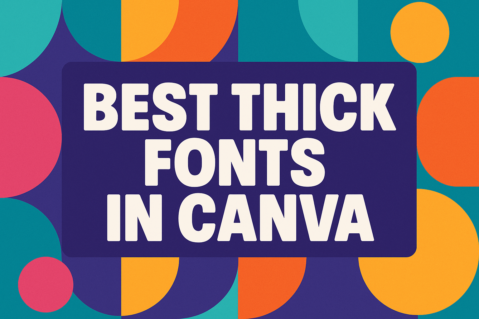
Picking the right font can make or break a design, and Canva makes that choice simple with a wide range of bold options. The best thick fonts in Canva give text strong impact, clear readability, and a polished look for everything from logos to social media graphics. These fonts stand out without needing extra effects, which makes them a reliable choice for both personal and professional projects.
Thick fonts work well when someone wants their message to be noticed right away. Whether it’s a headline, a poster, or a brand logo, these typefaces bring weight and confidence to any design. Canva offers a variety of serif, script, and display styles that balance creativity with clarity.
This article explores what thick fonts are, highlights the top bold choices available in Canva, and shares tips for pairing them with other styles. It also shows creative ways to use them across different projects so anyone can design with more confidence and efficiency.
What Are Thick Fonts in Canva?
Thick fonts in Canva are designed with heavy strokes that make text more visible and easier to read. They are useful in typography when designers want strong emphasis, clear legibility, and a bold visual style. These fonts work well for headlines, logos, and other display text where attention is important.
Defining Font Weight and Thickness
Font weight refers to how light or heavy the strokes of letters appear. In Canva fonts, thickness ranges from thin and delicate lines to bold and heavy strokes. Thick fonts fall on the heavier end of this scale and are often labeled as bold, extra bold, or black.
Designers choose thick fonts when they need words to carry more visual weight. A heavier stroke makes text appear larger and stronger, even without increasing the font size. This improves readability in posters, banners, and other designs viewed at a distance.
For example, fonts like Montserrat Bold or Lot are widely used because their shapes remain clear even when scaled up or down. This makes them reliable options for consistent design work.
Why Thick Fonts Stand Out in Design
Thick fonts stand out because their wide strokes create strong contrast against backgrounds. In typography, this contrast improves legibility, especially in digital graphics where quick readability matters.
They also help organize visual hierarchy. A designer can use a thick font for headings while pairing it with a lighter font for body text. This contrast guides the reader’s eye and makes designs easier to follow.
Thick fonts are also versatile. They can look professional in business presentations or playful in personal projects depending on the typeface chosen. For instance, Peace Sans balances friendliness with strength, while Cubao Narrow feels more casual and fun.
Where to Find Thick Fonts in Canva
Canva includes a wide range of thick fonts that are free to use for personal and commercial projects. Popular options include Montserrat, FAT, and Wedges, each offering a different style for headlines, logos, or posters. A curated list of the best thick fonts on Canva highlights several examples worth trying.
Users can browse Canva’s font library by searching for bold or heavy weights. Many fonts come with multiple weights, so switching from regular to bold is simple. This flexibility makes font selection easier when experimenting with typography in different designs.
For additional inspiration, guides such as 17 must-have bold fonts in Canva showcase typefaces that work especially well for impactful headlines. These resources help designers find fonts that match their project’s tone and purpose.
Top Thick Fonts in Canva
Thick fonts in Canva stand out because they balance readability with strong visual impact. Some offer playful curves, while others lean toward elegant or dramatic styling, giving designers different ways to match tone with purpose.
Nectarine
Nectarine is a bold, rounded display font that feels energetic and approachable. Its letters are wide and smooth, making it a good choice for projects that need a friendly but eye-catching look.
Designers often use Nectarine for posters, event graphics, and social media headers. The font’s playful curves keep it from feeling too rigid, which makes it useful for creative brands that want to appear modern and fun.
It pairs well with thinner fonts like Monoton or Celandine because the contrast helps headlines stand out while body text remains easy to read. Nectarine works best in larger sizes since its thickness can overwhelm smaller text blocks.
The Seasons
The Seasons is a serif font with thick strokes that give it a classic and refined appearance. Unlike many heavy fonts, it combines elegance with readability, making it suitable for both print and digital designs.
This font works well for wedding invitations, seasonal promotions, or branding that wants to highlight tradition and sophistication. Its letterforms have subtle curves and sharp serifs, which add a polished touch without looking outdated.
Designers often pair The Seasons with lighter sans serif fonts to balance formality with modern simplicity. Compared to fonts like Goudy or Catchy Mager, The Seasons feels more versatile for both decorative and professional uses.
Stars & Love
Stars & Love is a decorative, thick script font that blends bold strokes with a handwritten feel. It’s not as formal as serif-heavy fonts, but it carries a warm and personal style that works well for casual design projects.
This font is popular for greeting cards, T-shirt designs, and playful branding. Its thick curves keep it visible in colorful layouts, while the script style adds a touch of personality that block fonts can’t provide.
Because of its decorative nature, Stars & Love is best used for short phrases or headlines. Pairing it with simple fonts like Celandine or clean sans serifs helps maintain balance and prevents the design from feeling cluttered.
Giaza
Giaza is a bold serif display font with dramatic thick strokes and sharp contrasts. It feels modern yet carries a sense of luxury, making it a strong choice for branding, magazine titles, and high-end product packaging.
The font’s tall letterforms and stylish serifs give it a commanding presence, especially in large headlines. Unlike playful fonts such as Nectarine, Giaza leans toward elegance and authority.
Designers often compare Giaza to Goudy or other popular fonts with strong serifs, but Giaza stands out with its unique balance of thickness and refinement. It works best when paired with minimalist fonts to keep the focus on its bold shapes.
Best Serif Thick Fonts
Serif fonts with bold weight give designs a strong yet classic look. They balance readability with style, making them useful for both digital and print projects.
Goudy
Goudy is a traditional serif font with thick strokes that make text easy to read at larger sizes. It has a warm and slightly old-fashioned feel, which works well for invitations, book covers, or branding that wants a timeless look.
Designers often choose Goudy when they want a serif font that feels both sturdy and approachable. Its heavier weight gives headlines presence without looking harsh.
For font pairing, Goudy works nicely with simple sans serif fonts like Helvetica or Montserrat. This combination creates contrast while keeping the design balanced and professional.
Noto Serif
Noto Serif is a versatile typeface created by Google. It was designed to support many languages, which makes it a reliable choice for international projects. Its thick styles are especially good for headings, presentations, and websites that need clear, consistent typography.
The font has a clean and modern look while still keeping the elegance of traditional serifs. This makes it suitable for both business and creative uses.
Noto Serif pairs well with geometric sans serif fonts such as Lato or Open Sans. The contrast between the thick serifs and smooth sans serif lines helps guide the reader’s eye through content.
Brittany
Brittany is a serif font with a thicker, more decorative style compared to Goudy or Noto Serif. It has a playful and stylish character, making it popular for lifestyle blogs, fashion branding, and social media graphics. Its bold strokes help text stand out while keeping a touch of elegance.
This font is best used in titles, logos, or short phrases rather than long paragraphs. Its design is more expressive, so it works well when a project calls for personality and flair.
For font pairing, Brittany looks good with minimalist sans serif fonts. A clean partner font helps balance its decorative qualities and ensures the design stays readable.
Bold Script and Display Thick Fonts
Thick script and display fonts bring personality and impact to designs. They balance style with readability, making them useful for logos, posters, and digital graphics where text needs to stand out.
Citadel Script
Citadel Script combines the flow of cursive handwriting with bold strokes that make it easy to read even at smaller sizes. It works especially well for invitations, branding, and signage where a touch of elegance is needed without losing clarity.
Designers appreciate how its thick curves give weight to each letter. This makes it more versatile than thinner script fonts, which can sometimes fade on busy backgrounds.
Best uses for Citadel Script:
- Wedding invitations
- Restaurant menus
- Boutique logos
It strikes a balance between formal and approachable, making it a reliable choice for both personal and professional projects.
Eyesome Script
Eyesome Script leans into a modern calligraphy style with bold, sweeping strokes. Unlike delicate calligraphy fonts, its thick lines hold up well in digital and print formats. This makes it a strong option for marketing materials or social media graphics where text needs to grab attention quickly.
The font has a playful yet stylish feel. It works well when paired with simple sans serif fonts, creating contrast that highlights headlines or product names.
Key strengths:
- Bold enough for posters and flyers
- Stylish enough for branding
- Readable at multiple sizes
Its mix of script flow and bold structure makes it appealing for both casual and trendy designs.
White Star
White Star falls into the display font category with a bold, blocky style. It is not a script font but instead focuses on delivering strong visual impact. Designers often use it for titles, banners, and T-shirt graphics where the goal is to be noticed instantly.
The font’s heavy strokes and geometric shapes give it a modern look. It pairs well with lighter fonts when contrast is needed in layouts.
Common uses for White Star:
- Event posters
- Merchandise graphics
- Large headlines
Because of its thick and striking design, White Star is best reserved for short text where maximum visibility matters.
Creative Uses for Thick Fonts in Design Projects
Thick fonts help designers create strong visuals that stand out on both digital and print platforms. They work best when used with intention, whether for attention-grabbing titles, building a recognizable brand, or making social media posts easy to read at a glance.
Making Impactful Headlines
Headlines often set the tone for the entire design project. Using thick fonts ensures the main message is visible even from a distance, which is especially useful for posters, flyers, and website headers.
Designers often pair thick fonts with lighter body text to create balance. This type of font pairing keeps the layout readable while still drawing attention to the most important words.
For example, fonts like Montserrat or Peace Sans provide a clean, bold look that works well for large titles. According to Graphic Pie, these fonts are widely used in display designs because of their readability and confidence. Choosing the right size and spacing also matters, since poor adjustments can make even the best fonts hard to read.
Branding and Logo Design
Logos often rely on simple but strong typography. Thick fonts make it easier for a brand to stay memorable because their bold shapes hold up across different sizes and formats.
When selecting fonts for logos, designers look for styles that match the brand’s personality. A company that wants to appear professional may use a font like Lot, while a playful brand might choose something more rounded, such as Wedges.
Consistency is key in branding. Once a thick font is chosen, it should be used across marketing materials, websites, and packaging. This repetition builds recognition and helps the brand stand out in competitive markets, as seen in many businesses that use bold Canva fonts.
Social Media Graphics
Social media platforms often shrink text, so fonts need to stay legible at smaller sizes. Thick fonts perform well here because their heavy strokes remain clear on mobile screens.
Designers also use thick fonts to highlight short, punchy phrases. This works especially well in quote graphics, ads, or announcements where quick readability is important.
Pairing a bold typeface with simple backgrounds prevents clutter. For example, using FAT or Extenda 100 Yota on a plain background creates strong contrast, making posts more eye-catching in crowded feeds. Many designers rely on these heavy Canva fonts to ensure their content gets noticed quickly.
Tips for Pairing and Selecting Thick Fonts
Thick fonts can add strong emphasis, but they work best when paired with lighter typefaces and used in ways that keep text easy to read. Choosing the right combinations depends on balance, readability, and the overall design purpose.
Mixing Thick and Thin Fonts
Designers often pair bold, heavy fonts with lighter ones to create clear hierarchy. For example, a thick display font like Cosmic Octo Heavy or Foda Display can serve as a headline, while a thinner sans serif supports body text. This creates contrast without overwhelming the reader.
A good rule is to avoid using two thick fonts together. Instead, balance a strong style with something clean and simple. Fonts like One Little Font or Just Believe can work as accent text when combined with a standard sans serif.
Contrast is not only about weight but also about spacing and style. A geometric heavy font may pair well with a rounded, softer font. This difference makes each element stand out while keeping the design cohesive.
Ensuring Legibility
Thick fonts can lose clarity if used in small sizes or long passages. They are best for headings, logos, or short phrases. For longer text, a balanced serif or sans serif keeps content readable.
Legibility also depends on spacing. Adding extra letter spacing to bold fonts prevents characters from blending together. This is especially important when using script-style thick fonts like Ghisella.
Color choice plays a role too. High-contrast color combinations, such as dark text on a light background, improve readability. Designers should avoid pairing heavy fonts with busy backgrounds, as this reduces clarity.
Font Pairing Examples
Some combinations work well across different design needs. For instance:
| Thick Font | Paired With | Best Use Case |
|---|---|---|
| Cosmic Octo Heavy | Open Sans Regular | Posters, bold headlines |
| Foda Display | Lato Light | Branding, modern layouts |
| One Little Font | Montserrat Regular | Invitations, short quotes |
| Ghisella | Roboto Condensed | Elegant titles, accents |
Designers can explore curated lists like Canva’s font pairing guide to find more tested combinations.