Creating minimalist posters using Photoshop’s shape tools can transform your design process and result in sleek, eye-catching visuals. Mastering minimalist design involves understanding how to use shapes and space effectively to draw viewers’ attention to what’s important. This approach emphasizes simplicity and focus, making it easier for the message to stand out.
In this guide, aspiring designers can explore how the Rectangle and Ellipse tools help achieve geometric harmony in poster creation. Using a limited palette of two or three colors can enhance this effect, providing a coherent and calming aesthetic. This method is particularly engaging for those looking to blend style with simplicity.
Using Photoshop’s shape tools, anyone can create compelling minimalist designs. These tools allow for a blend of creativity and precision that’s ideal for both beginners and experienced designers alike. Experimenting with different shapes and layouts can unlock unique design possibilities, showcasing the elegance of minimalism in visual art.
Understanding Minimalist Design
Minimalist design is all about focusing on simplicity by stripping away anything unnecessary and using only essential elements. It emphasizes clean lines, ample white space, and a limited color palette to create striking visuals.
Principles of Minimalism
Minimalism in design revolves around simplicity and efficiency. By using only necessary elements, it conveys a clear message. Key principles include reducing clutter, using whitespace effectively, and focusing on functionality. Designers often prefer a limited color palette, typically using 2-3 colors, to create harmony and balance. Typography plays a crucial role, with a focus on readability and elegance. These principles help create an impactful design that grabs attention and communicates effectively.
History and Evolution
The roots of minimalist design can be traced back to the early 20th century. Movements like Bauhaus and De Stijl were influential in emphasizing simplicity and pure form. Over time, minimalism has evolved, impacting various fields like architecture, interior design, and graphic art. In the digital age, minimalist design principles have been adapted for interfaces and web design, where clarity and ease of use are paramount. This evolution reflects ongoing trends and the desire for clarity and functionality.
Influence of Minimalism in Visual Art
Minimalism has left a lasting mark on visual art. Artists have embraced the minimalistic approach to create thought-provoking works by reducing art to its essentials. This influence is evident in sculptures, paintings, and installations where artists focus on form and space. In modern graphic design, minimalist posters often use bold typography and simple imagery to convey messages. These artistic choices reflect a broader trend toward clean and uncluttered design, appealing to contemporary audiences.
Getting Started with Photoshop
Starting with Photoshop can seem tricky, but understanding a few essentials makes it easy. Learning the interface, setting up a personalized workspace, and grasping the concept of layers will set a strong foundation for creating impressive designs.
Interface Basics
Photoshop’s interface is designed to put all essential tools at your fingertips. The main workspace includes the toolbar on the left, which holds tools like the brush, eraser, and selection tool. On the right, you’ll find panels for layers, history, and adjustments.
The menu bar at the top has options for file, editing, and image settings. It’s key to become familiar with these features to navigate the software efficiently. Shortcuts are helpful, so spending time learning a few can make the design process quicker.
Setting Up Your Workspace
Customizing your workspace in Photoshop helps improve workflow. Users can arrange panels to fit their preferences by dragging and dropping them where needed. The Window menu lets users show or hide different panels, like layers or color swatches.
Artboards can be used if designing for multiple screen sizes. Save your workspace setup under Window > Workspace > New Workspace. This way, preferences can be quickly loaded when opening Photoshop again.
Understanding Layers and Groups
Layers are a fundamental part of Photoshop, allowing for non-destructive editing. Each layer can include different elements of the design, such as text, images, or shapes. Users can change the order of layers by dragging them up or down in the layers panel.
Groups help organize layers, especially in complex designs. To create a group, select multiple layers, then press Ctrl+G (Cmd+G on Mac). Grouping keeps the workspace tidy and lets designers tweak or move multiple layers at once. Basics like blending modes and opacity are also in the layers panel, offering more creative possibilities.
Designing Your Poster
Creating a minimalist poster requires careful attention to detail. Key elements include a thoughtful color scheme, well-chosen fonts, and the ability to create balance and harmony in the design.
Choosing a Color Scheme
A limited color palette is crucial in minimalist design. Typically, this involves using 2-3 complementary colors. Starting with a neutral base, such as white or gray, can help make accent colors stand out.
Bright accents, like red or blue, add interest without overwhelming the design. Choosing colors that evoke the right emotion or meaning is important, as colors have psychological effects on viewers. Tools like color wheels or online palette generators can support this process.
Keep in mind the poster’s purpose and audience. Choose colors that align with the overall theme and message.
Selecting Fonts for Minimalist Design
Fonts play a significant role in maintaining the minimalist aesthetic. Sans-serif fonts, such as Helvetica or Arial, are typically preferred for their clean lines and readability. They help convey a modern and sleek look.
Consistency is key when selecting fonts. Limit the design to one or two font types to maintain visual coherence. Larger font sizes can be used for headlines to draw attention, while smaller fonts can convey additional information.
Contrast in text can also be created by varying the weight or style, like using bold or italic, to highlight important details without cluttering.
Creating Balance and Harmony
Achieving balance involves distributing visual elements evenly across the poster. This makes the design feel stable and pleasing to the eye. Asymmetrical balance can be effective by carefully arranging elements to create interest without symmetry.
Harmony is about making sure all the components work together cohesively. This is achieved through alignment and spacing, ensuring nothing feels out of place. White space, or negative space, is an essential part of minimalist design, giving the elements room to breathe and attracting attention to focal points.
Using grids can help align elements neatly and maintain the design’s structure. A well-balanced poster feels intentional, guiding the viewer’s eye smoothly across the design.
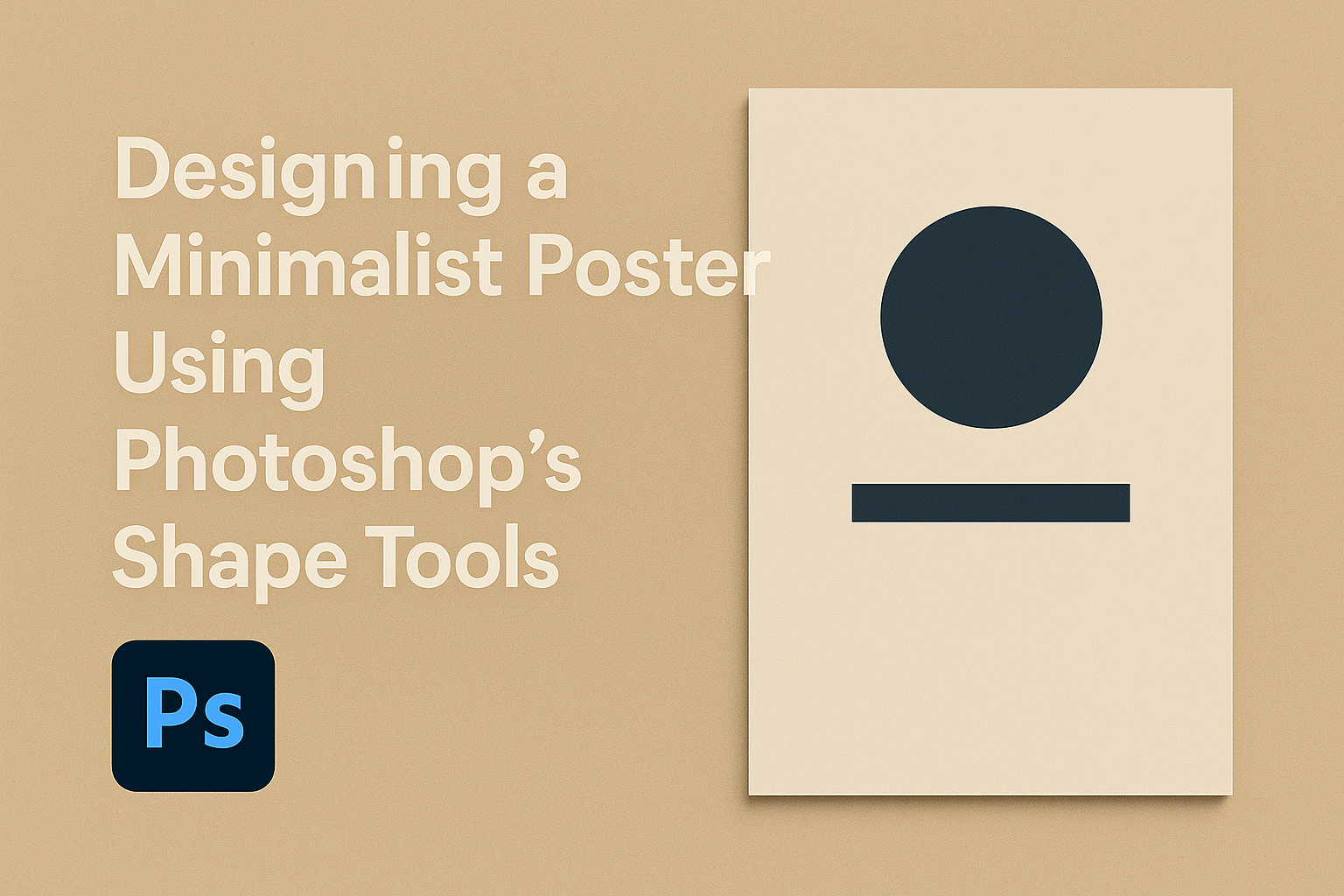
Working with Shape Tools
Photoshop’s Shape Tools are essential for creating minimalist poster designs. They provide flexibility and control, whether you’re drawing rectangles, ellipses, or combining shapes for more complex designs. This section guides you on using these tools effectively.
The Rectangle Tool
The Rectangle Tool in Photoshop is a fundamental element for minimalist designs. It allows users to create simple or more elaborate shapes by clicking and dragging on the canvas. Artists can adjust fill and stroke colors, adding contrast and emphasis to specific areas. The power of this tool comes from its simplicity and versatility, making it ideal for constructing basic layouts quickly.
Rectangles can also be manipulated to form grids or frames. This is helpful when organizing information neatly and attractively. By holding the Shift key, rectangular shapes can be constrained to perfect squares, offering consistent proportions. Pairing rectangles with text or images can create a balanced and pleasing visual hierarchy.
The Ellipse Tool
The Ellipse Tool offers similar functionality to the rectangle counterpart but with circles and ovals. Creating graceful curves and soft edges is straightforward with this tool. Just like rectangles, ellipses are useful for adding subtle elegance or bold statements within the poster design.
Circular shapes can draw attention to particular elements. By holding the Shift key while dragging, users can produce perfect circles. This is especially effective for emphasizing focal points or creating symmetry. Additionally, combining circles with other geometric shapes enriches the design’s complexity and depth. The tool’s flexibility enhances creative expression, making it invaluable for composition.
Combining Shapes for Complexity
To develop more advanced and intriguing designs, combining shapes allows designers to experiment while maintaining simplicity. Check out this Adobe guide to learn more about creating and manipulating shapes.
By layering rectangles and ellipses, designers can create unique and eye-catching patterns that still adhere to minimalist aesthetics. Using shape blending options, such as union, subtract, and intersect, allows for more intricate overlaps and cuts, adding interest without clutter.
Grouping multiple shapes helps maintain organization in complex designs. This method often leads to innovative patterns that provide both function and form, enriching the overall design. Shape combinations can also effectively guide the viewer’s attention and create focal points within the poster, enhancing its visual story.
Adding Text to Your Poster
When designing a minimalist poster, adding text is crucial for communication and impact. Balance simplicity and clarity with typography choices and design elements. Attention to layering, font size, and spacing will enhance the poster’s aesthetic appeal and message.
Using the Text Tool
The Text Tool in Photoshop is essential for adding text to your minimalist poster. It allows users to click on the canvas and start typing immediately. Adjust the font style, size, and color in the options bar at the top of the workspace.
Shortcuts make the Text Tool more efficient. Pressing “T” activates the tool, and holding “Shift” while resizing keeps proportions. To move the text, select the Move Tool (V) and drag it to the desired position. This helps position text precisely on the poster.
Use guides or the grid feature to align text perfectly. This ensures consistency and balance in design, making your minimalist poster more visually appealing. Keep text straightforward for the best impact.
Typography Best Practices
Choosing the right typography is key in minimalist design. Simple and clean fonts like Helvetica or Arial work well. These fonts are easy to read and don’t distract from the main message.
Font size and spacing are important to consider. Text should be large enough to read from a distance but not overpowering. Adjust line spacing for clarity, ensuring text isn’t cramped or too spaced out. Consistent spacing creates a more organized look.
Sticking to a limited palette of 2-3 colors, including font color, maintains a sleek design. Bold or italic styles can emphasize specific words or phrases without cluttering. Consistency in typography helps enforce brand identity or theme.
Layering Text with Shapes
Layering text with shapes creates depth and interest in a minimalist poster. Use shapes as backgrounds for text, like a rectangle with a contrasting color behind important information. This technique helps draw attention to specific details without overwhelming the viewer.
In Photoshop, layers are essential for maintaining flexibility in design. Place text on a separate layer above the shape layer. Group related layers to keep the workspace tidy.
Experiment with transparency for added effect. Lowering the opacity of a shape can subtly highlight the text without overpowering it. Keep balance and harmony between text and shapes, ensuring neither dominates unnecessarily.
Applying Final Touches
Once the fundamental elements of the poster are in place, it’s crucial to refine the layout, use space wisely, and prepare the design for sharing or printing. These tweaks enhance the overall presentation and effectiveness of the minimalist poster.
Using Alignment and Grids
Alignment is key to a professional look. By aligning text and images, the design feels more cohesive. Most design software offers grid and guide features, which help achieve precision. Grids provide a structured layout, ensuring balance and symmetry.
Using the grid system, objects can be spaced evenly, creating a harmonious design. This balance makes the poster more visually appealing. Adjusting the alignment of titles and any focal points can draw the viewer’s eye and enhance the intended message. Consistent spacing and alignment prevent elements from looking scattered.
Incorporating Negative Space
Negative space is the area surrounding the main elements. It helps emphasize and draw focus to the content. By ensuring there is enough empty space, the design becomes more elegant and less cluttered. This simplicity guides the viewer’s attention to what’s important.
Being intentional with negative space enhances the clarity of the message. It allows the design to breathe and avoids overwhelming the viewer. Thoughtfully leaving space around key elements, like titles or images, ensures they stand out. This approach also adds to the minimalist aesthetic, making each element feel purposeful.
Exporting Your Design
Exporting is the final step to share or print the design. Choosing the right format is crucial for the best quality. Typically, PDFs work well for printing, maintaining high resolution. Meanwhile, JPEGs or PNGs can be used for digital sharing.
Ensuring the export settings match the intended use is essential. For print, ensure settings are set to high resolution. For digital, optimize the size to avoid long load times without losing quality. Check that all elements appear as intended in the final export. This attention to detail will help the design look its best, regardless of the medium.