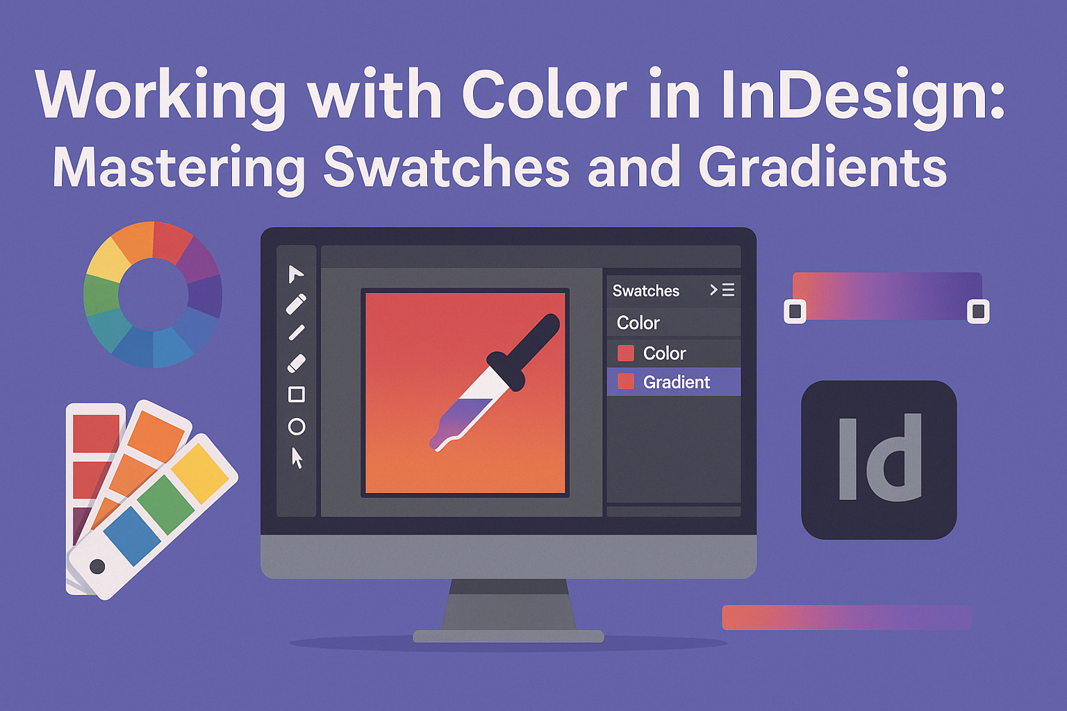
Working with color in InDesign can greatly enhance any design project. Using color swatches and gradients effectively allows designers to create cohesive and visually appealing artwork with ease.
By mastering these tools, they can streamline their workflow and achieve consistent results across different design elements.
Color swatches make it easy for designers to apply specific colors throughout their projects. This feature helps avoid the hassle of searching for the right shade repeatedly.
Gradient tools offer the ability to blend colors smoothly, adding depth and interest to designs.
Whether she is working on a brochure, an advertisement, or any other type of visual, understanding how to use swatches and gradients will empower her to express creativity more freely.
With the right techniques, they can bring their visions to life and make their work stand out.
Understanding Color in InDesign
Color is a crucial aspect of design in InDesign. It involves a blend of theory, models, and application. This section discusses the basics of color theory, the differences between RGB and CMYK, and the importance of spot colors.
Color Theory Basics
Color theory is the foundation of effective design. It includes key concepts such as the color wheel, primary, secondary, and tertiary colors.
- Primary Colors: Red, blue, and yellow. These cannot be created by mixing other colors.
- Secondary Colors: Green, orange, and purple. These are made by mixing primary colors.
- Tertiary Colors: Created by mixing primary and secondary colors.
Using complementary colors can create a striking contrast in designs. Analogous colors, which are next to each other on the color wheel, help to create harmony.
Knowing these basics allows a designer to make informed choices that enhance their work.
Color Models: RGB vs. CMYK
In design, understanding color models is essential. RGB (Red, Green, Blue) is used for screens. It combines light to create colors.
- Application: Ideal for digital designs such as websites.
- Color Range: Offers a wider range of bright colors.
CMYK (Cyan, Magenta, Yellow, Black) is used in printing. It mixes inks to produce colors.
- Application: Best for printed graphics, such as brochures or posters.
- Color Limitations: Not all RGB colors can be replicated in CMYK.
Choosing the right model affects the final appearance of a design, whether digital or printed.
The Significance of Spot Colors
Spot colors are premixed inks used in printing. They ensure consistency across prints, especially for brand colors.
Using spot colors can prevent variations that may occur with CMYK mixing. This is why many brands opt for this approach to maintain their identity.
- Common Task: Designers can create custom spot colors and save them in InDesign.
- Branding: Spot colors help preserve brand integrity by maintaining the same color for every print job.
Creating and Managing Color Swatches
Color swatches are essential for designers using InDesign. They help streamline the design process by allowing consistent color application throughout a project. Below are key points about adding, editing, deleting, and importing or exporting swatches.
Adding New Swatches
To add a new swatch, the user can navigate to the Swatches panel by selecting Window > Color > Swatches.
Here, clicking on the New Swatch button or choosing New Color Swatch from the panel menu opens the swatch options.
Users can specify color modes like CMYK or RGB and adjust sliders for precise color selection.
After creating, the swatch will appear in the Swatches panel. To apply a swatch, simply select the object or text and click on the desired swatch. This feature helps maintain color consistency across multiple design elements.
Editing and Deleting Swatches
Editing a swatch is easy. By double-clicking on the swatch in the Swatches panel, the user can modify its color or name. This flexibility allows quick updates without changing every object separately.
If a swatch is no longer needed, users can delete it by selecting the swatch and clicking the Delete Swatch button. A confirmation dialog will appear to prevent accidental deletions.
It is important to note that deleting a swatch removes it from all objects using it.
Importing and Exporting Swatches
InDesign allows users to import and export swatches for efficient workflow management. To import swatches, the user can go to the Swatches panel menu and select Load Swatches.
This opens a dialog to choose swatch files from other InDesign documents.
Exporting swatches follows a similar path. The user can select Save Swatches from the menu, allowing for easy sharing of color schemes with other projects. This feature is excellent for brand consistency and team collaboration on design tasks.
Mastering Gradients
Gradients add depth and interest to designs in InDesign. Understanding the types of gradients, how to create and edit them, and how to apply them effectively is essential for any designer.
Types of Gradients
In InDesign, there are two main types of gradients: linear and radial.
- Linear gradients transition colors in a straight line. This creates a smooth change from one color to another.
- Radial gradients spread outward from a central point. It looks like a burst of color radiating from the center.
Choosing the right type depends on the design’s goal. Designers may also create custom gradients by adjusting colors and settings to fit specific needs.
Creating and Editing Gradients
Creating a gradient in InDesign is straightforward. To start, open the Gradient panel by navigating to Window > Color > Gradient.
Next, select an object, then click and drag to create a gradient directly on it.
To edit a gradient, double-click the gradient stops under the preview. This allows changing colors easily.
Designers can also adjust the gradient angle and length in the panel for precise results.
Applying Gradients to Objects
Applying gradients to objects enhances their visual appeal.
First, select the object you want to apply a gradient to.
Click the Fill box in the Swatches panel or Toolbox. If the Gradient Fill box doesn’t show, choose Show Options.
After selecting, pick a gradient from the options available or create a new one.
Don’t forget to adjust the Opacity and settings to fine-tune how the gradient interacts with the object behind it.
Doing this can give designs a polished and professional look.
Color Application Techniques
Color application in InDesign involves using tools like color swatches and gradients to enhance design projects. These techniques allow for effective color management, making designs visually appealing and cohesive.
Using Color Swatches in Your Designs
Color swatches help designers manage colors efficiently. They can create custom swatches for consistency throughout a document.
To create a new swatch, follow these steps:
- Open the Swatches panel (Window > Color > Swatches).
- Click on the “New Swatch” icon.
- Define the color values using CMYK, RGB, or HEX.
This feature allows designers to apply colors to text, shapes, and backgrounds quickly. They can also rename and organize swatches for better access during the design process.
Using swatches simplifies color changes. By adjusting one swatch, all instances in the document update automatically.
Advanced Gradient Effects
Gradients add depth and interest to designs. They blend two or more colors smoothly to create visual effects.
InDesign provides powerful tools to customize gradients.
To work with gradients, access the Gradient panel (Window > Color > Gradient). From here, users can create new gradients, adjust colors, and set gradient angles.
Designers can apply gradients as follows:
- Select an object or text.
- Choose a gradient from the panel.
- Use the Gradient Tool to adjust the gradient direction and length directly on the design.
This technique allows for dynamic backgrounds or highlights in texts and shapes. It can elevate the overall look of any project.
With practice, mastering gradients can unlock many creative possibilities.