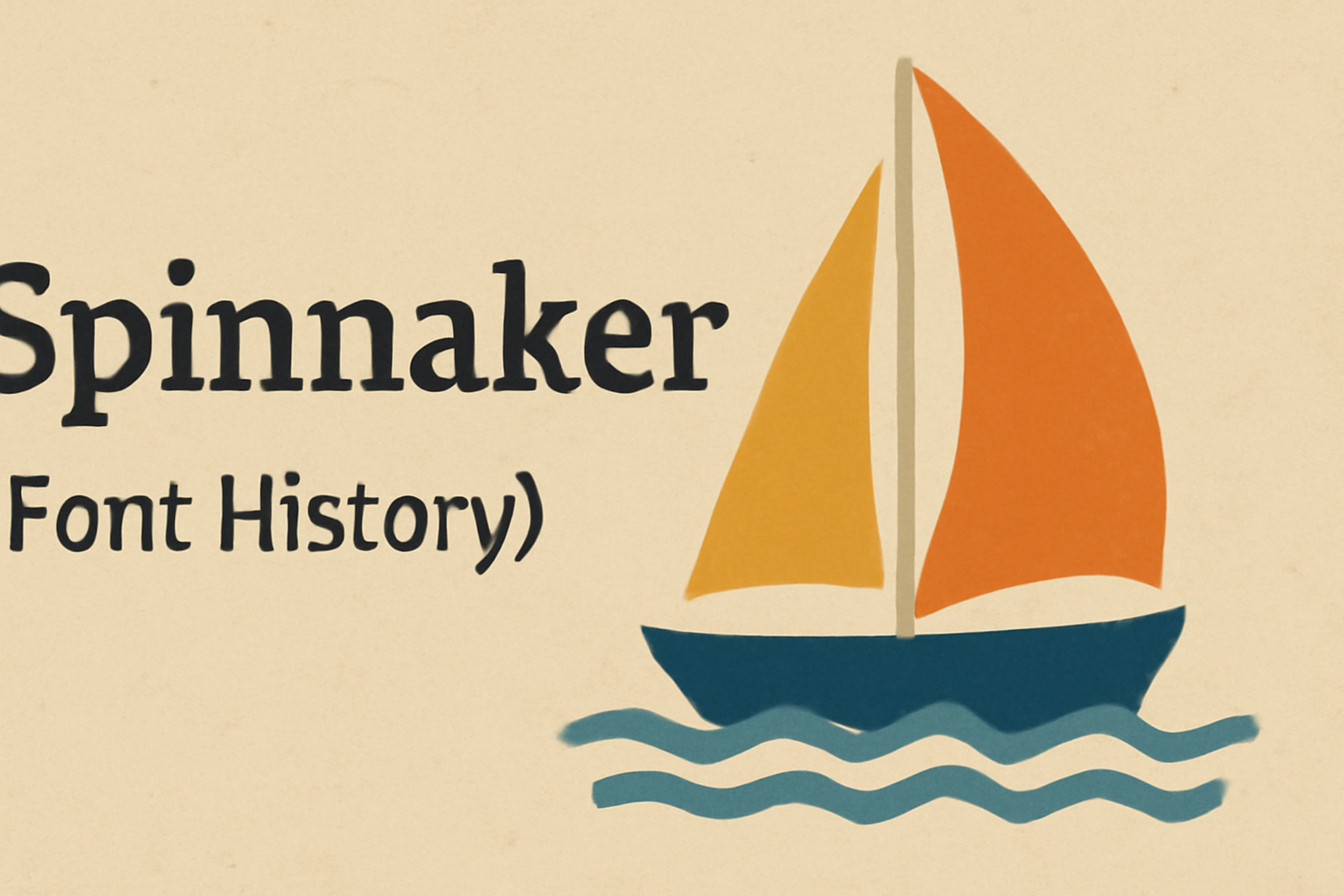
Spinnaker is a sans-serif typeface that captures the spirit of adventure and exploration. Inspired by lettering found on French and British travel posters, Spinnaker brings a nautical theme to its design. Designed by Vernon Adams, this font released in 2011, is recognized for its clean lines and open letterforms, making it highly legible.
The font’s slightly wide letterforms add a whimsical touch, making it suitable for a variety of uses. Perfect for medium to large sizes, Spinnaker offers a youthful, breezy feel. Its unique design has made it a favorite among those seeking a creative yet functional typeface.
Whether used in posters, branding, or digital media, Spinnaker stands out with its distinctive maritime flair. Discover how Spinnaker can enhance your projects by exploring its nautical charm and practical utility.
Origins of Spinnaker Typeface
Spinnaker is a unique typeface with an interesting background and a maritime-inspired design. Knowing about its designer and the influences behind its creation helps to appreciate how it came to be.
Designer Background
Vernon Adams, the creator of Spinnaker, was a well-regarded typeface designer. He was noted for his work in developing free fonts that were functional and aesthetically pleasing. His passion for accessible design helped him produce several popular fonts.
He studied at Reading University in the UK, where he honed his skills in typeface design. By focusing on both the utility and appearance of typefaces, Adams made a significant impact on the open font world. This dedication is evident in the clean lines and readability of his creations.
Inspiration for Spinnaker
Spinnaker was inspired by a sense of adventure and the nautical themes of travel posters from France and the UK. The whimsical and breezy feel of sailing influenced Adams in crafting this typeface. This influence is evident in its open letterforms and clean design, which evoke a light, airy aesthetic.
Spinnaker’s name itself suggests its maritime roots. The font’s low contrast and slightly wide structure enhance its legibility. Its design reflects a balance of playfulness and utility, fitting comfortably in both creative and practical use cases. These elements together create a font that feels both classic and modern.
Design Characteristics
Spinnaker is a versatile sans-serif typeface blending elegance and functionality. Its design features derive from historic travel posters, offering wide and appealing letterforms that maintain clarity while adding a hint of charm.
Visual Style
Spinnaker draws inspiration from French and UK lettering found on travel-by-ship posters. This influence gives it a unique character with a youthful and whimsical touch. The font has slightly wide letterforms, which provide a feeling of openness and balance. The design is low contrast, meaning there is little variation between the thick and thin parts of the letters, enhancing readability. This style choice makes Spinnaker particularly suitable for medium to large size print, where its distinctive features can be fully appreciated.
Typography Features
Spinnaker includes several typography features that enhance its appeal. It is an open-source typeface designed by Elena Albertoni, known for her attention to detail. The font offers only a single style, making it ideal for specific design contexts. It supports a wide range of languages, such as Western European, Central European, and South Eastern European languages. This broad language support adds versatility to the font’s application in diverse projects. Additionally, Spinnaker’s letterforms include interesting characters like the unique designs of “a” and “k”, providing a touch of individuality to any text.
Evolution Over Time
The Spinnaker font showcases an intriguing journey from its early stages to its modern versions. Beginning with its initial adaptations, Spinnaker reflects the design trends of its time. Gradually, it has been modified to meet contemporary design needs while retaining its classic charm.
Early Adaptations
Spinnaker’s origins are rooted in the early 20th century, drawing inspiration from nautical themes. Its name reflects its marine influences, with sleek lines resembling the curves of a sail. Early versions of Spinnaker aimed to combine readability with a sense of adventure, reflecting the spirit of exploration. Designers initially applied it to convey messages of openness and freedom in their work.
It gained popularity in promotional materials for seaside and travel-related industries. The simple yet elegant design helped it stand out. Spinnaker’s early adaptations showcased an effective blend of tradition and innovation, making it a preferred choice for many creative projects during its early years.
Modern Interpretations
In recent years, Spinnaker has undergone several updates to suit modern tastes. Its design has maintained its core elements while adopting a sleeker appearance for digital platforms. This transition allowed it to stay relevant as users demand more adaptable and screen-friendly fonts.
Designers today appreciate Spinnaker for its versatility in both print and digital domains. It can be used in websites, logos, and promotional materials. The font continues to evoke a sense of adventure, making it ideal for projects seeking to convey excitement and exploration. With these adjustments, Spinnaker remains a timeless choice in today’s fast-paced design landscape.
Usage and Applications
Spinnaker is a versatile sans-serif typeface well-suited for both media displays and corporate branding. Its clear and open letterforms make it highly legible, adding a playful yet professional touch.
Popular Uses in Media
Spinnaker is often utilized in media because of its effective legibility and unique style. Its design is inspired by French and UK travel posters, giving it a nostalgic yet modern look. This makes it ideal for posters, headlines, and other display purposes. Medium to large sizes showcase its low contrast and slightly wide letterforms effectively.
Designers choose Spinnaker for digital interfaces due to its youthful sense of whimsy combined with modern utility. This makes it suitable for web design, especially where a clear, readable font is crucial. Its open-source nature allows seamless integration across various platforms, making it popular in digital communications.
Corporate Branding
In the corporate world, Spinnaker finds its place in branding thanks to its balanced and professional appearance. The font’s moderate x-height and clear character differentiation provide the clarity required for brand identity and messaging. Its slightly whimsical style can make brands appear approachable and modern.
Businesses often use Spinnaker for logos, marketing materials, and presentations. Its slight width and coherent design enable effective communication while maintaining a stylish edge. Companies seeking a font that bridges playful and formal themes often turn to Spinnaker for a unique brand identity.
Spinnaker’s adaptability in different sizes and platforms ensures its continued relevance in both print and digital branding. This versatility makes it a valued choice for businesses aiming to create a lasting impression.
Technical Details
Spinnaker is a versatile sans-serif typeface with a unique nautical theme. It supports various formats and provides broad compatibility across different platforms and languages.
Font Formats and Files
Spinnaker is available in popular font formats to ensure broad usability. The most common formats include TrueType (TTF) and OpenType (OTF). TTF is widely used for general purposes and works well on both Mac and Windows systems.
OTF offers additional features such as advanced typographic capabilities. Spinnaker’s file size is manageable, making it easy to download and install quickly. Users can find Spinnaker available for free, which supports its adoption in both personal and commercial projects. This flexibility in file options and its free availability contribute to its widespread use.
Compatibility and Accessibility
Spinnaker’s design is suitable for various applications, enhancing both readability and visual appeal. It is compatible with many operating systems, including Windows, macOS, and Linux. This ensures that it can be deployed across multiple devices and software applications.
The font supports a wide range of languages, such as Western European, Central European, and South Eastern European languages. This broad linguistic support makes Spinnaker accessible to a diverse audience. Its open-source nature further strengthens accessibility by allowing easy modification and adaptation to meet specific needs.
Reception and Critique
Spinnaker’s unique design has captured the attention of both the design community and everyday users. While designers often appreciate its whimsical style, user reviews focus on its readability and utility in various applications.
Design Community Feedback
The design community highly values Spinnaker for its charming and playful appearance. Its creation draws inspiration from French and British travel posters, leading to wide appreciation for its nostalgic feel. Designers, like those at The Font Review Journal, recognize its ability to balance whimsy with utility, making it a good choice for creative projects. Its slightly wide letterforms and distinctive characters such as ‘a’ and ‘k’ contribute to its appeal among professionals. Typewolf highlights its role in creating visually engaging combinations.
User Experience Reviews
Users often praise Spinnaker for its readability, especially in medium to large text sizes. This makes it a favorite for digital and print projects that require clarity. Its single available style ensures consistency across uses, although some might seek more diversity. Google Fonts and 1001 Fonts offer insights into its practical applications, where its utility shines in various design settings. Many users find its youthful, airy design fitting for modern and whimsical themes, while still maintaining the clarity typical of a sans-serif font.