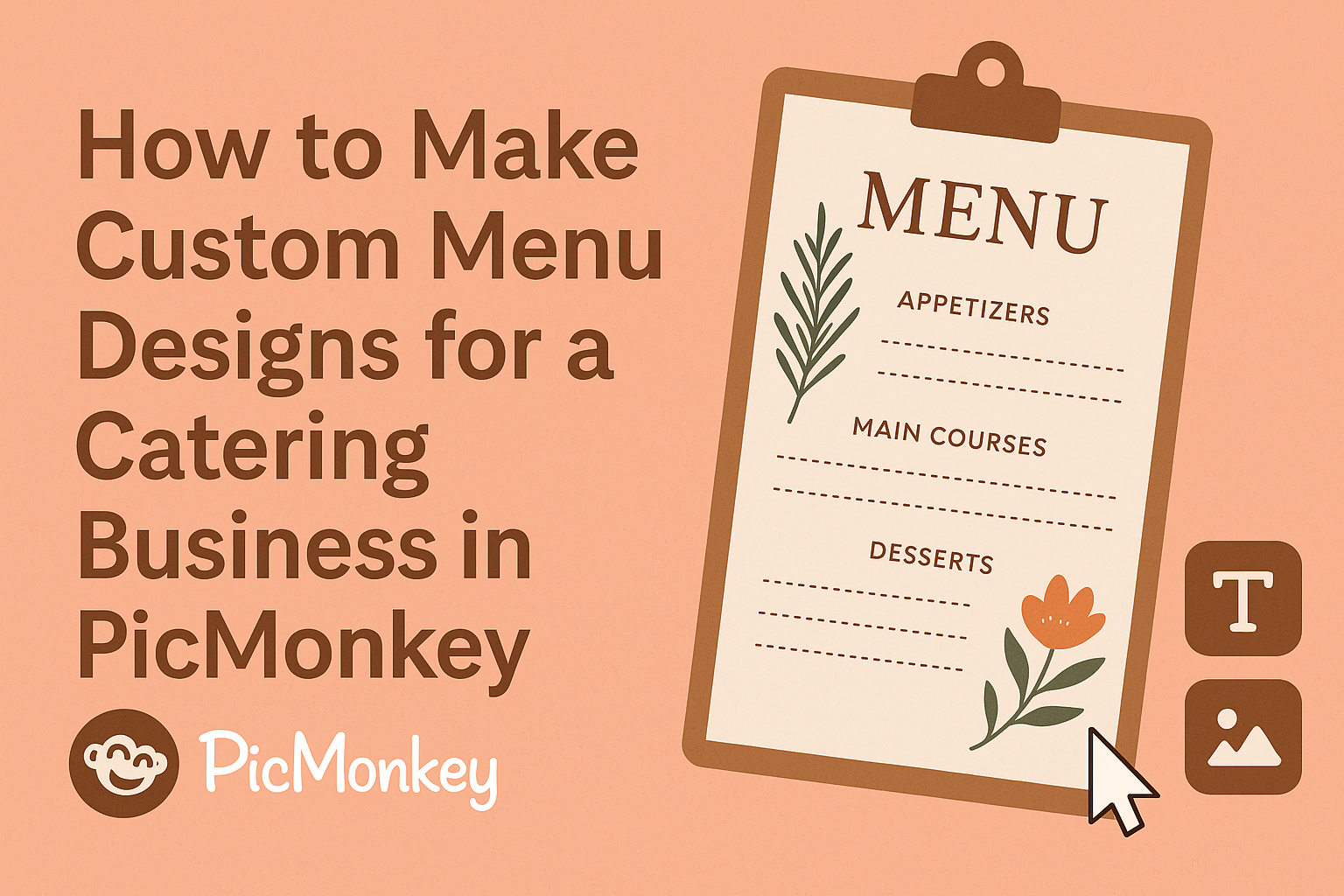
Creating custom menu designs for a catering business can feel daunting, but it doesn’t have to be.
Using PicMonkey, a user-friendly design tool, allows anyone to craft beautiful menus that reflect their unique brand and offerings. With a variety of templates and easy editing options, even those with little design experience can make a stunning impact.
Many caterers struggle to find ways to stand out in a competitive market. By designing a well-organized and visually appealing menu, they can showcase their culinary skills and attract more clients. PicMonkey makes this process simple and enjoyable, letting caterers focus on what they do best: creating delicious food.
Whether starting from scratch or customizing existing templates, the possibilities are endless.
Menu design is a crucial part of a successful catering business, and with the right tools, anyone can create eye-catching menus that leave a lasting impression.
Understanding PicMonkey Basics
Learning the basics of PicMonkey is essential for creating custom menu designs. It offers a user-friendly interface, pre-made templates, and customizable workspaces to make the design process simpler.
Navigating the Interface
When she opens PicMonkey, the interface is simple and straightforward. Prominent tools are easy to find.
At the top, there are options like Design, Edit, and Collage.
On the left, the Toolbox shows options for adding images, text, and elements.
Tip: Hovering over icons reveals their functions.
A clear view of the editing area appears in the center, where designs come to life. Users can easily switch between tools to fit their needs.
Starting with Pre-Made Templates
PicMonkey offers a wide range of pre-made templates, perfect for beginners. These templates save time and inspire creativity.
To start, click on the Templates button.
Users can browse categories like Restaurant Menus or Catering. Each template can be customized to match a brand’s style.
Tip: Choose a template that resonates with the intended menu design. Once selected, it opens in the editor for easy adjustments. Users can add their menu items, change colors, and adjust fonts with just a few clicks.
Customizing Your Workspace
Customizing the workspace in PicMonkey enhances the design experience. Dragging and dropping tools allows users to arrange their workspace to suit their style.
By clicking on the Workspace option, users can choose layouts that fit their needs. This flexibility helps maintain focus while designing.
Tip: Keep frequently used tools easily accessible.
Setting up personal preferences can lead to more efficient workflow. Users can quickly adapt their workspace, leading to faster design creation.
Creating Your Menu Design
Creating a custom menu design for a catering business involves several key elements. It’s important to focus on the right canvas size, a cohesive color scheme, text best practices, and the inclusion of appealing images and graphics. Each of these components plays a vital role in how the menu is received by clients.
Selecting the Right Canvas Size
Choosing the right canvas size is crucial for a menu. This decision affects how the layout looks and how much information can fit.
Typically, catering menus work well on standard sizes like 8.5 x 11 inches for easy printing. He or she should consider whether the menu will be displayed as a brochure or a full-page layout.
Brochure designs might require a foldable size like 11 x 17 inches. Be sure to leave some margins to prevent text from getting cut off during printing.
Choosing a Color Scheme
A color scheme can set the tone for the entire menu. It’s advisable to select colors that reflect the brand’s personality and appeal to the target audience.
For example, earthy tones might work well for a farm-to-table catering service.
Using a maximum of three main colors keeps the design simple and elegant. He or she can use online tools like Adobe Color to explore complementary color palettes. Testing colors in different light conditions can ensure they look good everywhere.
Adding Text and Typography Best Practices
Text content should be clear and easy to read.
Choosing the right fonts matters a lot; it’s recommended to use no more than two different fonts throughout the menu.
A bold font can be used for headings while a simpler font works well for descriptions.
Maintaining a logical hierarchy helps guide the viewer’s eye. This could mean larger text for the title, medium for categories, and smaller for individual items. Ensuring that the text contrasts with the background enhances visibility.
Incorporating Images and Graphics
Images and graphics make the menu visually appealing. High-quality photos of dishes can entice customers to choose specific items.
It’s better to use a few well-shot images rather than cluttering the menu with too many.
Graphics can include decorative elements like borders or icons that complement the menu theme. He or she should ensure that these images do not distract from the main content. A good rule is to leave enough white space to let the design breathe.
Branding Your Menu
Creating a strong brand identity in catering menus is essential. It helps attract attention and connect with customers. By focusing on logo placement, color schemes, and consistency, a catering business can ensure that its menu stands out.
Logo Placement and Size
The logo serves as a visual anchor for the menu. Placing it prominently at the top or in a corner can make it easily recognizable.
The size should be substantial enough to catch the eye but not overpower the menu items. A good rule of thumb is to make the logo around 10-15% of the menu width.
This balance ensures the logo enhances the menu’s appeal without overshadowing the food options. A well-placed logo can boost brand recall and create a cohesive look.
Using Brand Colors and Fonts
Colors play a crucial role in making a menu visually appealing. Using brand colors throughout the design reinforces recognition.
For instance, if a business uses green and gold, these colors should appear in headings, borders, and backgrounds.
Fonts can express the personality of the brand. Choosing clear, readable fonts ensures the menu is easy to navigate.
Pairing a stylish font for headings with a simpler one for descriptions can maintain interest. This combination helps create a polished and inviting menu design.
Consistency Across Different Menus
Consistency is key for brand recognition. Whether it’s a wedding catering menu or a drop-off lunch service, using the same design elements helps maintain a unified brand image.
This includes using the same logo placement, colors, and fonts across all menus.
Design templates in PicMonkey can be handy for ensuring this consistency. They make it easy to adapt menu designs while keeping the brand aesthetic intact.
By sticking to a familiar look, customers will quickly identify the catering service and feel confident in their choice.
Finalizing and Exporting Your Design
In this stage, paying attention to details can ensure a polished and professional appearance for the catering menu. The process involves carefully reviewing the design and selecting the right exporting options for different uses.
Reviewing the Design
Before exporting the menu, it’s essential to review the design thoroughly. Checking for typos, alignment issues, and color consistency can make a big difference.
Using the zoom feature in PicMonkey allows the designer to see the finer details. This is a good time to ensure all images are clear and well-placed.
Consider gathering feedback from peers or colleagues to get different perspectives.
Here’s a quick checklist for the review process:
- Spelling and grammar: Look for any mistakes.
- Font sizes and styles: Ensure consistency throughout.
- Images: Check clarity and proper placement.
- Color scheme: Ensure colors match the branding.
Taking the time to review will enhance the final product.
Exporting Options for Print and Digital Use
Once the design is finalized, exporting it correctly is crucial. PicMonkey provides various options suitable for both print and digital formats.
For print menus, PNG or PDF formats are recommended. PDFs ensure high quality and preserve layout when printed. Meanwhile, PNG is great for images that may need a transparent background.
For digital use, such as social media or websites, exporting as a JPEG or GIF works well. These formats reduce file size and facilitate easy sharing online.
When exporting, check the resolution settings. Make sure a 300 DPI (dots per inch) is set for prints, while 72 DPI is selected for digital displays. This ensures clarity regardless of the medium used.