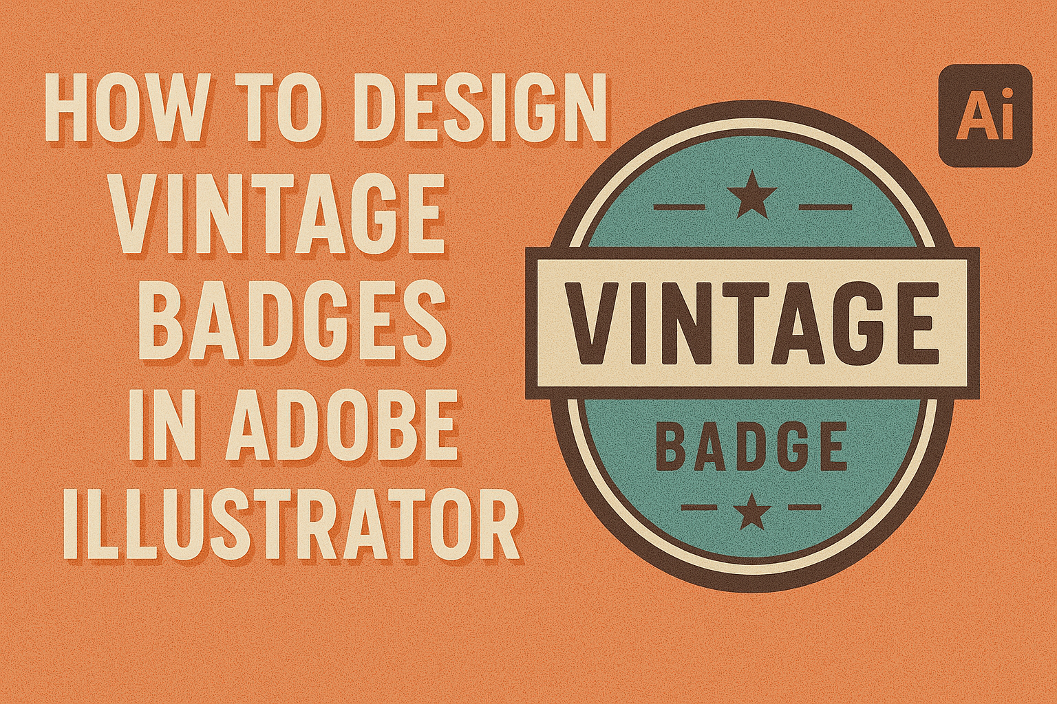
Creating a vintage badge in Adobe Illustrator combines creativity with practical design skills. This tutorial will guide users through the process of designing vintage badges, a popular style that brings a timeless aesthetic to any project. Adobe Illustrator offers the perfect tools for crafting these intricate and stylish logos.
Vintage badges draw inspiration from past design trends, featuring elements like hand-lettered typography and ornate details. These designs not only serve as striking logos but also enhance brand identities with a classic touch. By following the techniques outlined here, designers can achieve the perfect blend of modern and vintage styles.
With the help of Adobe Illustrator, anyone can transform basic shapes and text into a badge that stands out. Those keen on learning more can explore some video tutorials, such as a Vintage Badge Logo Design Tutorial, which offer step-by-step guidance and creative tips.
Getting Started with Adobe Illustrator
Adobe Illustrator is a powerful tool for creating eye-catching designs, including vintage badges. To begin your design journey, it’s important to grasp the layout of the workspace, configure your document settings appropriately, and become familiar with the essential tools and panels.
Understanding the Workspace
The workspace in Adobe Illustrator can initially seem overwhelming, but it’s organized to help users efficiently access various tools. When opening Illustrator, they’ll see the main area where design work happens, surrounded by different panels and toolbars. The Toolbar on the left contains essential tools like the Selection Tool, Pen, and Type Tool. On the right, various panels display options for colors, layers, and properties.
Learning how to arrange and customize the workspace helps users work more effectively. They can drag panels to different parts of the screen or dock them to keep everything neat. It’s useful to know how to create and save personalized workspaces for different projects. This minimizes time spent rearranging layouts each time a new task comes up.
Setting Up Your Document
Before diving into design, make sure to set up your document with the right specifications. Choose “File” then “New” to start a new project. A dialog box appears, allowing the customization of the document. The document’s size, color mode, and units can all be adjusted to suit project needs. For print, selecting CMYK color mode is recommended, while RGB is better for digital designs.
It is important to set the artboard size according to where the design will be used. An appropriate resolution should be chosen to ensure design quality. Adobe Illustrator allows design for both web and print, so ensuring you’re working with the right settings from the start prevents issues later.
Familiarizing with Tools and Panels
Adobe Illustrator boasts an array of tools and panels. At first, focus on mastering key ones like the Pen Tool, which is essential for creating shapes and paths, and the Type Tool for adding text. The Color Panel lets users select and adjust colors for their designs. The Layer Panel is crucial for organizing elements and making complex designs easier to manage.
Practice using shortcut keys to speed up the design process. For instance, pressing “V” selects the Selection Tool while pressing “P” activates the Pen Tool. As you grow more comfortable with these elements, you’ll find that navigating through Illustrator becomes second nature.
Vintage Design Fundamentals
Understanding vintage design fundamentals is essential for creating compelling badge logos. These fundamentals include exploring different design styles, choosing the right color palettes, and selecting suitable fonts.
Exploring Vintage Design Styles
Vintage design is about capturing the aesthetic of past decades. Each era has its own unique style, such as Art Deco of the 1920s, with its geometric shapes and bold lines, or the psychedelic colors and patterns of the 1960s.
Designers should examine classic logos from these periods to identify key visual elements. Hand-drawn illustrations, ornamental details, and traditional layouts are common features. By studying these styles, one can learn how to blend historical elements with modern design techniques. Incorporating textures, like graininess or weathered effects, can also enhance the retro feel.
Choosing a Color Palette
Choosing the right color palette is crucial for capturing a vintage look. Colors can evoke a specific time period and mood. Earthy tones, like browns and muted mustard yellows, often reflect the early 20th century, while pastels can evoke the 1950s.
It’s important to keep the color palette limited to maintain authenticity. Complementary and contrasting colors can help highlight different elements of a badge. Online tools and color wheel resources can aid in finding harmonious combinations. Adding aged effects like faded or distressed colors can further solidify the vintage appearance.
Selecting Appropriate Fonts
Fonts play a significant role in creating a vintage design. Classic typefaces like serif fonts are popular for their timeless appeal. Consider fonts that reflect the era you are aiming to represent, such as script fonts for a 1950s style or bold, block letters for a 1920s look.
Experiment with different font pairings. Combining a decorative font for titles with a simpler font for descriptions can create a balanced design. Pay attention to spacing and alignment to ensure clarity. Mocking up the typography on the badge before finalizing can help in achieving the desired vintage charm.
Creating the Badge Shape
Creating a vintage badge shape in Adobe Illustrator involves starting with basic shapes, applying transformations, and fine-tuning with anchor points. These steps help users craft unique designs that stand out.
Using Basic Shapes
To begin designing a badge, the use of simple geometric shapes is essential. Circles, rectangles, and polygons can serve as a strong foundation. The Ellipse and Rectangle tools are often used to establish the primary shape.
For instance, by holding the Shift key while drawing with the Ellipse tool, a perfect circle can be created. This ensures symmetry and precision from the start.
Overlaying shapes, such as combining a circle and a star, can add layers and complexity. This step sets the stage for a distinct badge design. Alignment is crucial here; using the Align panel ensures that elements are centered correctly.
Applying Transformations
With the basic shape in place, transformations help refine the design. Scaling, rotating, and reflecting the shapes add interest and detail. Use the Transform panel for precise adjustments in size and orientation.
Rotating elements by specific angles can break the monotony. For instance, angling a star within a circle introduces dynamic movement. Reflecting shapes can create symmetry, which is often a hallmark of vintage design.
Uniform scaling ensures all parts of the badge appear balanced. But for added visual interest, try non-uniform scaling for certain decorative elements. The results can help the badge stand out with unique visual appeal.
Adding and Subtracting Anchor Points
Fine-tuning the badge’s shape involves careful manipulation of anchor points. Using the Pen tool, additional points are added to straight paths to introduce curves and detail.
For more customization, the Direct Selection tool allows for selecting and adjusting individual anchor points. This provides control over the badge’s contour. Adding anchor points along a line can create new angles and curves.
Conversely, subtracting unnecessary anchor points can simplify the design, making it cleaner and more elegant. This step helps avoid a cluttered look and ensures the badge has a professional finish. These changes are essential for achieving a distinctive vintage style.
Styling the Badge
Styling a vintage badge in Adobe Illustrator involves several creative techniques. Focusing on fill and stroke, textures and patterns, and effects helps in crafting appealing and unique designs. These steps will give any badge a distinctive look.
Applying Fill and Stroke
The fill and stroke options are essential for defining the basic look of a badge. To start, select the shape of the badge. Use the fill tool to apply a solid color or gradient that matches your design vision. For vintage badges, muted tones or earthy colors work well.
Next, the stroke is applied. This outlines the badge and enhances its appearance. Set a width that complements the fill, choosing a simple color for contrast. Try using dotted or dashed lines to add a classic touch.
Experiment with transparency settings. Adjust the opacity to create depth, making the badge feel more layered and refined.
Adding Textures and Patterns
Textures and patterns add richness and detail to a badge. In Illustrator, patterns can be applied to fills or strokes. Choose a pattern that captures the vintage style, like stripes or dots.
Textures can be overlaid to give the badge a worn or aged appearance. Import textures you like and apply them to the design using a clipping mask. Adjust the blend mode to integrate the texture smoothly.
Patterns can also be customized. Modify colors or shapes to better fit the design’s theme. Experimenting with different combinations helps achieve a unique look.
Utilizing Effects and Appearances
Effects and appearances enhance the overall design. Start by exploring the Effects menu in Illustrator. You can apply effects such as drop shadows or glows.
A drop shadow adds depth and makes the badge stand out. Adjust the distance and blur for a subtle effect. Inner and outer glows can make certain elements pop.
The Appearance panel offers more options to modify the badge’s look. It allows stacking multiple effects and controls their attributes. This helps you fine-tune the final design.
Using these tools effectively will give any vintage badge a polished and professional look.
Adding Text Elements
When designing vintage badges in Adobe Illustrator, adding text is essential for personality and flair. Key techniques include creating text paths, applying styling and warping effects, and layering text to enhance visuals.
Creating Text Paths
Creating text paths allows designers to align text along different shapes and lines, adding dynamic flow to badge designs. In Adobe Illustrator, the Type on a Path tool is crucial. Users can click on any path or shape edge to create text that follows the contours.
For a polished effect, make sure the text is centered on the path. Adjustments can be made in the Type on a Path Options to align and fit the text perfectly. Using circular paths can create iconic badge designs with text wrapping smoothly around borders. Designers often experiment with paths like curves, circles, or custom shapes to achieve unique layouts.
Styling and Warping Text
Styling and warping text add character and depth, making badges distinctive. Adobe Illustrator offers tools like the Warp Tool to bend and distort text creatively. This feature allows designers to experiment with arcs, bulges, or waves, echoing vintage styles.
Text effects such as drop shadows or outlines are useful for highlighting words. Applying a bold font and bright color can also add emphasis. A mix of serif and sans-serif fonts gives a classic yet modern touch. It’s vital to balance effects to maintain readability and aesthetics. Keeping the text consistent with the overall badge theme is key for an integrated design.
Layering Text for Impact
Layering text can increase visual impact and clarity in badge designs. Adobe Illustrator allows designers to manipulate text layers, making it easy to stack or overlap text elements. This provides depth and a sense of hierarchy.
Using different font sizes and weights can create a focal point. Important words or brand names should stand out clearly, while additional information like dates or locations can be subtle. It’s helpful to use contrasting colors for layered text to enhance visibility and draw attention. Overall, layering can transform a simple badge into something eye-catching and memorable with thoughtful arrangement.
Embellishing with Graphic Details
Adding graphic details to vintage badges can give them a unique flair. This includes using icons and symbols, applying brushes for detail, and crafting your own symbols. These steps help create an engaging and polished badge.
Incorporating Icons and Symbols
Icons and symbols can transform a plain badge into a story. They can be simple shapes like stars, arrows, or more complex images representing themes or ideas. Picking the right symbol is key. It should match the badge’s purpose and style.
Using Adobe Illustrator, designers can easily find and incorporate these elements. The symbol libraries in Illustrator offer a range of options to suit different needs. Adjusting the size, color, and placement of the icons can also enhance the badge’s overall look. The balance between these elements is important for a cohesive design.
Using Brushes for Fine Touches
Brushes in Adobe Illustrator can enhance the badge with intricate details. These tools allow for textures that make the design stand out. Brushes can add vintage textures like scratches or ink blot effects that give the badge an aged look.
Choosing the right brush is crucial. Whether it’s for shading, adding gritty textures, or highlighting edges, each brush adds a unique effect. Adobe’s brush library offers many options, or users can create custom brushes for a personal touch. Experimenting with different brushes can lead to exciting results that enhance the badge’s character.
Creating Custom Symbols
Creating custom symbols is a great way to personalize a badge. Whether it’s a unique icon or an artistic shape, custom symbols add a personal touch. Adobe Illustrator provides tools like the Pen Tool and Shape Builder to help bring these ideas to life.
Designers can sketch their ideas on paper before digital creation to refine their concepts. Once in Illustrator, these designs can be adjusted and styled to fit the badge perfectly. Custom symbols allow freedom and creativity, giving each badge a unique identity while keeping the overall theme consistent.
Finalizing the Design
Finalizing a vintage badge design in Adobe Illustrator involves ensuring visual harmony and adapting the design for different applications. It also requires saving it in the right formats for various uses. Attention to detail is key during this stage to ensure the final product is both appealing and versatile.
Adjusting for Balance and Composition
When finalizing a badge design, it’s essential to maintain balance and harmony within the elements. Designers should check the alignment of shapes, text, and images. Use the Guides and Align tools in Illustrator to ensure elements are centered or symmetrically placed.
Colors play a crucial role in creating visually appealing compositions. Choose a limited palette that reflects the vintage style. Adjust the weight and spacing of text, maintaining readability while matching the overall aesthetic. Designers often make subtle tweaks to font sizes and kerning to achieve this.
It’s helpful to step back and view the design from a distance. This ensures that the badge is coherent as a whole. If something seems off, try flipping the design or viewing it in grayscale to identify issues with balance and contrast.
Preparing the Design for Various Uses
Once the badge looks balanced, the next step is adapting it for different contexts. It should be versatile enough for both print and digital media. Consider how the design will look in different sizes and on various backgrounds.
Create versions:
- With a transparent background: For layering on different images or backgrounds.
- Black and white or grayscale: Useful for applications where color reproduction is limited.
Prepare mockups to visualize how the badge will appear on merchandise like T-shirts, tote bags, or business cards. This helps ensure it maintains its appeal across different use cases. Adjusting the scale and ensuring clarity at smaller sizes, such as on business cards, is crucial for maintaining its effectiveness.
Saving and Exporting Your Badge
After adjusting the design, the final step is to save and export it in multiple formats. Use AI or EPS for vector files, which provide scalability without loss of quality. These formats are essential for print purposes.
For digital use, export the badge as PNG or JPEG. These file types are best for web and social media use where a high-quality raster image is needed. Remember to choose the appropriate resolution (usually 300 DPI for print and 72 DPI for web) to ensure the design remains sharp.
Keep your files organized by storing them in a well-labeled folder. This makes it easy to access different versions for future projects or clients.