Creating effective PowerPoint slides can make a significant difference in how an audience receives a presentation.
Using color blocks and a minimalist style not only enhances visual appeal but also keeps the focus on key messages. These design choices allow presenters to communicate ideas clearly without overwhelming viewers with clutter.
Employing a minimalist approach means choosing simplicity over complexity. This style utilizes empty space to highlight important content and is often more engaging.
By incorporating strategically placed color blocks, presentations can grab attention and retain interest.
Those looking to elevate their slide designs will find that these techniques can lead to more memorable and impactful presentations. With the right approach, it is possible to transform ordinary slides into stunning visual stories that resonate with audiences.
Understanding Color Theory
Color theory plays a crucial role in creating effective presentations. It helps in selecting colors that not only look good together but also convey the right emotions and messages.
This section covers color psychology and how to choose a color palette effectively.
Color Psychology in Presentations
Colors can evoke emotions and set the tone of a presentation. For instance, blue often represents trust and calmness, making it suitable for corporate settings. In contrast, red can evoke excitement or urgency, ideal for calls to action.
Understanding these associations helps designers choose colors that align with their message. Here’s a quick look at common colors and their typical meanings:
- Blue: Trust, calm, professionalism
- Red: Excitement, passion, urgency
- Green: Growth, health, tranquility
- Yellow: Optimism, energy, warmth
By selecting the right colors, presenters can enhance engagement and connect more meaningfully with their audience.
Choosing a Color Palette
Choosing a color palette is essential for a cohesive design. A palette typically includes a primary color, secondary colors, and accent colors. It can guide the overall mood of the slides.
When creating a color palette, consider using complementary colors for contrast. For instance, pairing blue with orange creates a vibrant visual effect.
Utilizing a color wheel can help in identifying colors that work well together.
It is also useful to limit the palette to three to five colors. This keeps slides from looking cluttered. Tools like Adobe Color or Coolors can help find appealing combinations easily.
By selecting a harmonious palette, presentations become visually appealing and effective at conveying ideas.
The Principles of Minimalist Design
Minimalist design emphasizes simplicity, clarity, and impact in presentations. Key elements include making effective use of negative space and choosing the right typography to enhance the visual appeal of slides.
Importance of Negative Space
Negative space, also known as white space, refers to the empty areas around text and images. It is crucial in minimalist design because it helps to create a clean and organized look.
When designed effectively, negative space allows the audience to focus on essential content without distractions.
Using ample negative space can highlight important elements on the slide. For instance, a bold title or a key image will stand out more against a clean background.
A well-balanced layout guides the viewer’s eye and enhances comprehension of the message.
When incorporating negative space, aim for balance. Avoid cluttering the slide with too many elements. Instead, prioritize content that conveys the core message. This approach ensures that each slide communicates effectively and elegantly.
Typography in Minimalist Slides
Typography plays a significant role in minimalist design. Selecting the right fonts can enhance readability and overall aesthetics.
It is best to use one or two fonts throughout the presentation to maintain consistency.
When choosing fonts, consider their style and weight. For instance, a bold font can be used for titles, while a lighter font works well for body text. Limit the number of font sizes to create a streamlined appearance.
Using contrasting font colors against the background improves visibility. Ensure that the text color complements the overall color scheme of the slides.
Attention to typography not only improves communication but also reinforces the minimalist design principles effectively.
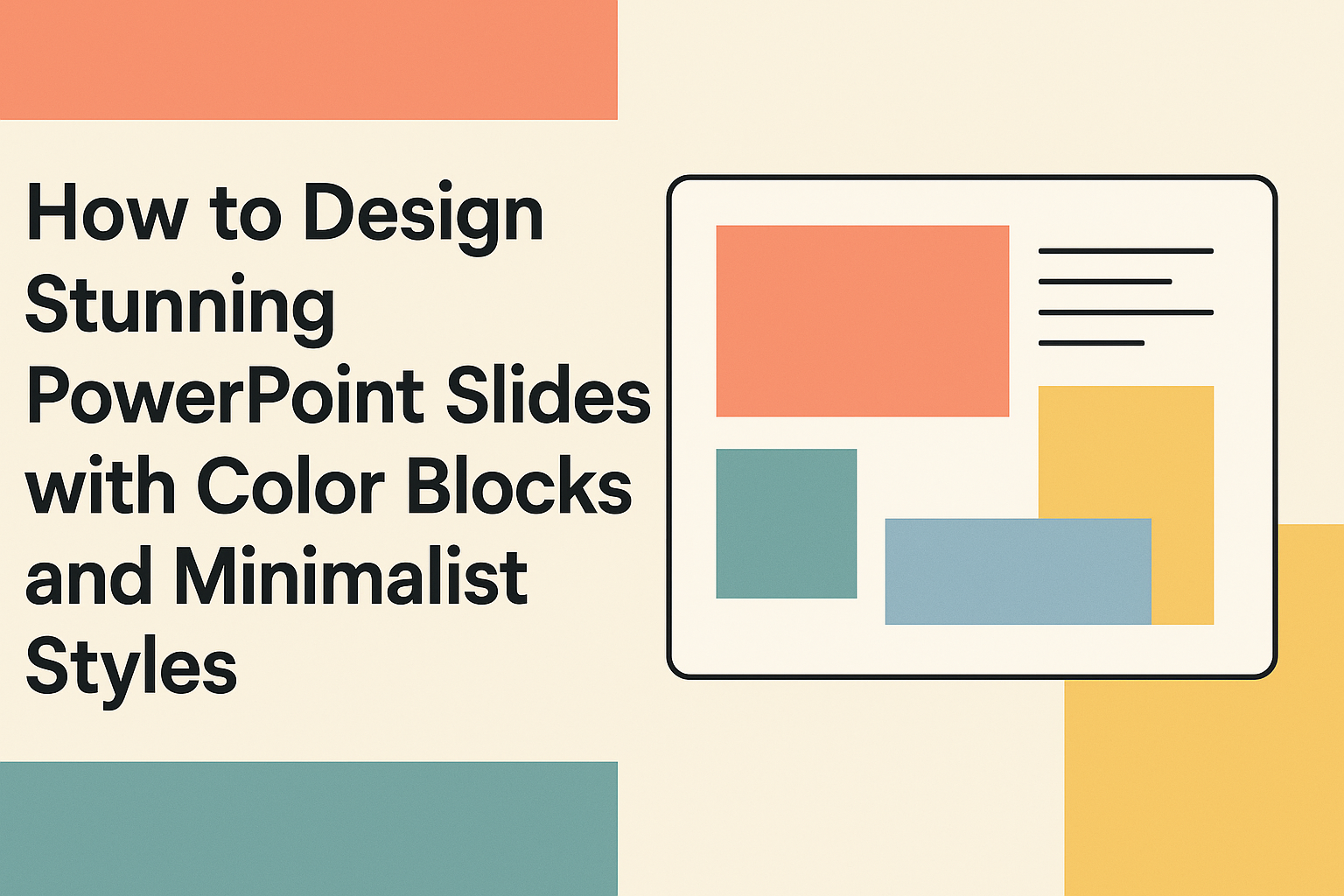
Designing with Color Blocks
Using color blocks can transform PowerPoint slides into eye-catching designs. This approach helps create structure while delivering content in an engaging way. The following details explore how to create effective layouts, balance colors and content, and use gradients.
Creating a Color Block Layout
To start, choosing a grid layout is essential. This will help in organizing slides effectively. A classic approach includes dividing the slide into sections, each featuring a different color block.
It’s best to use contrasting colors for the blocks. For example, a dark block can be paired with light text. This combination enhances readability. Tools like PowerPoint’s “Shapes” feature allow easy creation of these blocks.
Employ a uniform style across slides. This keeps the presentation cohesive and professional. Using similar shapes and sizes for blocks promotes visual harmony.
Balancing Colors and Content
Balancing colors with content is crucial for a polished look. Too many bold colors can overwhelm viewers.
It’s wise to limit the palette to two or three main colors. Accent colors can highlight important points while ensuring the main text remains easy to read.
Consider using a color wheel to find complementary colors. This can guide choices that enhance visual appeal.
White space should not be ignored. It provides breathing room around blocks and content. This space helps draw attention to key messages without distraction.
Using Gradients Effectively
Gradients offer a modern touch to color blocks. A smooth gradient can add depth and interest to a slide. To achieve this, select colors that gradually transition from one to another. This makes slides visually engaging.
Keep gradient usage subtle, as overpowering effects can distract from the content. Light gradients work well for backgrounds while keeping text legible.
Experiment with different directions, such as vertical or horizontal gradients. This can set the tone of the slide. The right gradient can enhance emotion and support the presentation’s message.
Incorporating Visuals and Icons
Using visuals and icons effectively can enhance the appeal of PowerPoint slides. Choosing the right images and icons helps convey the message clearly while keeping the design minimalistic and engaging.
Selecting Relevant Imagery
Choosing the right images is crucial. They should relate directly to the content being presented. For instance, if discussing environmental issues, images of nature or sustainable practices can make a strong impact.
When incorporating visuals, ensure they are high quality. Blurry or pixelated images can distract from the message.
Adhering to a consistent style further reinforces the visual appeal. Stick to images that share a similar color palette or filter to create harmony on the slides.
Using images sparingly can also be effective. One powerful image can often communicate a point better than several smaller ones.
Simplifying with Icons
Icons play a vital role in minimalist design. They convey ideas quickly and help reduce clutter on slides.
Simple line icons are popular because they are easy to recognize and do not overpower the text.
When selecting icons, consistency is key. Using a single style across all icons maintains a cohesive look. Brands may also have a set of icons that reflect their identity, which can enhance brand recognition.
It’s essential to choose icons that convey the message clearly. For example, a pencil icon can represent “edit,” while a magnifying glass can indicate “search.” Icons should enhance understanding, not confuse the audience.
Crafting Engaging Content
Creating engaging content is essential for capturing the audience’s attention. Effective text and highlighted points can make a presentation memorable and impactful. Here are some important strategies to consider.
Writing Concise Text
Concise text helps audiences easily grasp the main ideas. Focusing on key messages is crucial.
Each slide should use short sentences to convey information clearly.
Bullet points can also enhance readability. For example:
- Use simple language.
- Limit each bullet to one idea.
- Aim for no more than six bullets per slide.
Avoid jargon or complex terms that can confuse the audience. Keeping text minimal allows visuals to complement the words rather than overwhelm them. This way, the audience can focus on what is being said without distractions.
Highlighting Key Points
Highlighting key points draws attention to the most important information. This can be done through bold text or using contrasting colors.
For instance, if a slide’s main message is about benefits, present it like this:
- Increased efficiency
- Cost savings
- Improved user experience
Incorporating visuals alongside key points also enhances understanding. Charts or icons can make data more relatable and easier to remember.
By ensuring that crucial information stands out, presenters can maximize the impact of their message. This approach keeps the audience engaged and improves retention of the content.
Transitions and Animations
Transitions and animations can greatly enhance a PowerPoint presentation. They guide the audience’s focus and make the content more engaging. It’s essential to use these features effectively to maintain a professional look.
Using Subtle Transitions
Using subtle transitions keeps the audience’s attention on the message rather than the animation. Simple effects like Fade or Push can make slides feel seamless.
For instance, the Morph transition allows for smooth movement between slides, creating a sense of flow.
To apply these transitions, select the slide and choose your preferred effect from the Transitions tab.
He suggests testing each effect to see how it impacts the overall presentation. A well-placed transition can enhance storytelling, reinforcing key points without being distracting.
Animating with Purpose
Animations should have clear objectives. They help emphasize important elements, such as bullet points or images.
When animating, choose effects like Appear, Wipe, or Fly In to keep it consistent with a minimalist style.
It’s best to limit the number of animations on a slide. For example, animating bullet points to appear one by one can maintain the audience’s focus.
Setting the timing carefully helps create a smooth narrative flow, making the presentation more effective. Remember, each animation should support the content, not overshadow it.
Practical PowerPoint Tips
Creating effective PowerPoint slides requires attention to detail and design elements. Focusing on alignment and consistent formatting can enhance the overall look of the presentation.
Aligning Elements on Slides
Proper alignment makes slides look clean and professional.
He should use the alignment tools in PowerPoint to center text and images. This can be done by selecting the objects and using the “Align” feature in the toolbar.
It is also helpful to use guides and gridlines. These tools can assist in positioning elements precisely.
He can activate gridlines from the “View” menu for better spacing.
Another tip is to maintain equal margins. This technique creates a balanced look.
He should make sure that text boxes and images have consistent spacing around them. Using a simple checklist for alignment can help avoid clutter.
Effective Use of Slide Master
The Slide Master feature is useful for maintaining a consistent design throughout the presentation.
By editing the Slide Master, you can set fonts, colors, and layouts for all slides at once.
You should start by accessing the Slide Master view from the “View” tab.
Here, you can modify the master slides for headings, title fonts, and background colors. This ensures that every slide looks unified.
Using Slide Master also helps when adding logos or footers.
Instead of placing these elements on each slide, they can be added once in the master. This saves time and keeps the design clean.