Designing a compelling business partnership graphic is essential for grabbing attention and communicating a message clearly.
Using Vectr, anyone can create stunning visuals that effectively showcase their brand and partnership. This free graphic design tool offers user-friendly features that make the process simple, even for beginners.
As businesses team up, a well-designed graphic can illustrate their collaboration and shared goals. A unique design not only enhances brand visibility but also strengthens the impact of their message. With Vectr’s versatile tools, creating an eye-catching graphic becomes an enjoyable task.
Whether promoting an event or highlighting a new partnership, having the right graphic can make a significant difference.
Readers will discover practical tips and step-by-step guidance to bring their creative ideas to life in Vectr.
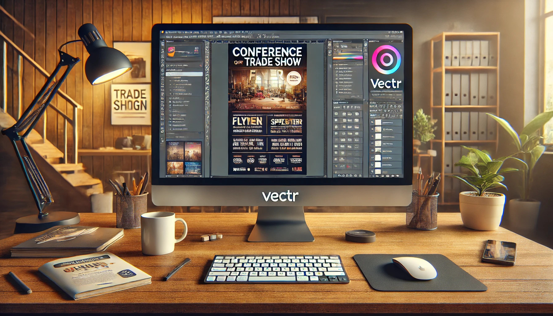
Understanding Vectr Basics
Vectr is a user-friendly tool for creating graphics. It offers a simple platform for users to craft eye-catching visuals, especially for business partnerships.
Knowing the basics will help users navigate and make the most of this powerful software.
Getting Started with Vectr
To begin using Vectr, a user must first create an account. This can be done through the Vectr website by clicking on “Sign Up.” Registration is quick and can be done using an email address or Google account.
Once signed in, the user is greeted by the dashboard. This interface includes a menu bar, sidebar, and a central workspace.
The menu bar at the top provides access to tools and settings. The sidebar holds useful options for layers, shapes, and other elements.
Navigating the User Interface
The user interface is designed to be intuitive and easy to use. The workspace is where all design action happens. Users can click and drag elements from the sidebar directly into this area.
The menu bar provides essential functions like saving projects or adjusting settings. Users can find tools for shapes, text, and images.
Familiarizing oneself with these settings helps streamline the design process, making it more efficient.
Designing Your Business Partnership Graphic
Creating an effective business partnership graphic involves several crucial steps. The design should reflect the essence of the partnership, showcasing branding and key messages clearly.
It’s essential to pay attention to the canvas setup, color scheme, branding elements, and typography.
Setting Up Your Canvas
To start designing, choosing the right canvas size in Vectr is important. Usually, a standard poster size of 24” x 36” works well for both print and digital use. This size allows for plenty of space to include details without feeling cramped.
Next, consider the orientation. A vertical layout is often great for posters, while a horizontal one might be better for banners.
Once the size and orientation are set, make sure to align the canvas grid for easier placement of elements.
Finally, it’s a good idea to utilize guides and margins. This helps ensure that important content isn’t cut off during printing or display.
He or she can use Vectr’s features to manage alignment and spacing effectively.
Choosing a Color Scheme
A well-chosen color scheme can make or break a graphic. Start with the colors that represent both businesses involved in the partnership. A combination of these primary colors creates a unified look.
Using a tool like Adobe Color can help in finding complementary colors. Stick to 2-3 main colors to keep things simple.
It’s also helpful to use shades and tints of these colors for depth.
Incorporating contrasting colors for text and background improves readability. Ensure that the colors evoke the right emotions related to the partnership. For instance, blue suggests trust, while green indicates growth.
Incorporating Logos and Branding
Logos and branding elements should be front and center. This gives the audience an immediate recognition of both brands involved.
When placing these elements, he or she should ensure they are clearly visible but not overpowering the design.
Both logos should be sized proportionately. Make sure neither logo appears larger than the other unless one brand is more dominant.
Additionally, leave sufficient space around the logos to avoid crowding.
Consistency in font and color for branding elements is crucial. This creates a harmonious look that ties everything together.
It’s often wise to refer to brand guidelines for accurate usage.
Adding Text and Typography Elements
Text content should be clear and concise. Start with a strong headline that conveys the partnership’s value.
Keep the font choice simple and easy to read, avoiding overly decorative fonts.
Utilizing a hierarchy in typography helps guide the viewer’s eyes. Use larger fonts for headings and smaller sizes for subtext.
A good practice is to limit the number of different fonts to two for a cohesive look.
Bullet points can effectively highlight key details, making the information easy to digest. Lastly, ensure the contrast between text and background is high to enhance readability.
Using Advanced Vectr Features
Advanced features in Vectr can enhance designs significantly. Understanding how to work with layers, groups, and filters will allow anyone to create more dynamic and engaging graphics.
Working with Layers and Groups
Layers are essential in design as they help organize elements. In Vectr, each object is on its own layer by default. Users can rearrange layers by clicking and dragging them in the Layers panel.
Grouping layers is another useful technique. By selecting multiple layers and pressing Ctrl + G, users can group them together. This simplifies movement and editing.
Grouping can help keep the design tidy and facilitate adjustments.
It is also helpful to lock layers while working on other parts of the design. This prevents accidental changes.
With careful layer management, it becomes easier to focus on detailed aspects of the graphic.
Applying Filters and Effects
Filters and effects add depth and flair to designs in Vectr. Users can access these options by selecting an object and clicking the “Effects” menu.
Various effects are available, such as shadows, blurs, and gradients.
Using a shadow effect can make text or objects pop. A slight drop shadow creates a three-dimensional look.
Similarly, applying a blur effect can draw attention to certain aspects of the graphic.
Additionally, users can experiment with color adjustments. Changing brightness or contrast can dramatically change the mood of a design.
Regularly previewing changes helps maintain visual balance across the graphic.
Exporting and Sharing Your Design
Once the design is complete, it’s time to export and share it. Vectr makes this process easy and straightforward.
To export the graphic, the user can follow these steps:
- Click on the File menu at the top left corner.
- Select Export from the dropdown options.
- Choose the desired format, such as PNG, JPG, or SVG.
Each format has its benefits. For instance, PNG is great for high-quality images with transparent backgrounds. Meanwhile, JPG is useful for photos, while SVG is ideal for scalable graphics.
After selecting the format, they can set the resolution and size. It’s important to choose a size that fits the intended use, such as web or print.
Sharing the design can also be done directly through Vectr. Users can generate a shareable link by clicking on the Share button. This allows others to view or collaborate on the design without downloading files.
Additionally, they can export the design to cloud services like Google Drive or Dropbox. This is helpful for easy access and storage.