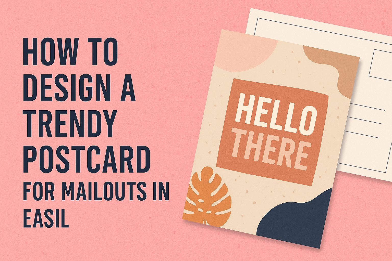
Designing a trendy postcard for mailouts can be a fun and creative process. Easil offers a range of customizable templates that make it easy for anyone to create eye-catching postcards that stand out in the mailbox.
By choosing vibrant colors and engaging designs, anyone can grab the attention of their audience and deliver their message effectively.
Understanding the essential elements of postcard design helps in crafting a piece that resonates with recipients. From selecting the right layout to incorporating compelling images, every choice makes a difference.
With Easil’s user-friendly tools, users can explore countless options to express their unique style and brand identity.
Whether it’s for a special event, a business promotion, or just a friendly greeting, a well-designed postcard can leave a lasting impression. With a little creativity and the right resources, anyone can produce a postcard that not only looks great but also drives engagement and response.
Understanding the Basics of Postcard Design
When designing a trendy postcard, it’s important to know its purpose and target audience. The right size and orientation will also play a key role in the design process.
These factors ensure the postcard effectively grabs attention and conveys the intended message.
Defining Your Purpose and Audience
Clearly defining the purpose of the postcard helps guide the design choices. Is it meant for a special event, a promotion, or simply to keep in touch? Knowing the goal allows for a focused message that resonates with the audience.
Identifying the target audience is equally essential. Are they young adults, families, or business professionals? Each group may have different preferences.
Tailoring the design elements, such as colors and images, to appeal to this audience enhances engagement and increases the chances that the postcard will be noticed and remembered.
Choosing the Right Size and Orientation
Postcards come in various sizes and orientations, and selecting the right ones is crucial. Common sizes include 4” x 6” and 5” x 7”, both of which fit standard mailing regulations.
Choosing a size that aligns with the content and design is beneficial.
Orientation also matters. Horizontal postcards can create a fun landscape effect for images, while vertical postcards may offer a more elegant look.
It’s important to consider how the design elements will fit within the chosen size and orientation to maintain balance and clarity in the overall design.
Creating Eye-Catching Visuals
Effective visuals are key to grabbing attention with postcards. This section presents practical tips on choosing a color scheme, using images and graphics, and applying layout principles to create stunning postcards.
Selecting a Color Scheme
Choosing the right color scheme is crucial. Colors evoke emotions and set the tone for the postcard.
A good approach is to use a complementary color scheme. This creates contrast and makes elements stand out. For example, pairing blue with orange can create a vibrant effect.
Start by selecting 2-3 main colors that reflect your brand. Tools like Adobe Color or Canva’s color palette generator can help.
Consider the audience as well. Bright colors attract a younger crowd, while muted tones appeal to a more mature audience.
It’s important to maintain consistency with colors across all marketing materials. This builds brand recognition.
Incorporating Images and Graphics
Images and graphics play a vital role in capturing attention. High-quality visuals can make a postcard memorable.
When selecting images, ensure they resonate with the postcard’s message. For instance, using photos of happy customers can foster trust.
Graphics, such as icons or illustrations, can also enhance the design. They add a fun touch when done right.
Avoid cluttering the postcard with too many images. Instead, focus on one or two striking visuals. This helps direct the viewer’s attention.
Lastly, always ensure that images complement the text. The visual and textual elements should work together to communicate the message clearly.
Layout and Composition Principles
A well-organized layout enhances readability. Good composition guides the viewer’s eye through the postcard.
Start by deciding on a focal point. This should be the most important message or image. Place it in a prominent area, like the center or top third of the postcard.
Use white space effectively. It prevents the design from feeling overwhelming and highlights essential elements.
Pay attention to alignment as well. Keeping text and images neatly aligned creates a polished look.
Lastly, consider hierarchy with text size and bolding. Make key messages larger or bolder to ensure they stand out.
By applying these principles, anyone can create a postcard that stands out in the mail.
Crafting Compelling Content
Creating effective content for postcards requires attention to detail. Key elements include persuasive text and the right typography. These components work together to capture attention and encourage action.
Writing Persuasive Text
Persuasive text is crucial for making an impact. It should speak directly to the audience, addressing their needs and desires. Use clear, concise language to convey the message efficiently.
Start with a strong opening statement that grabs attention. This could be a question or a bold declaration. Next, explain the benefits of the offer clearly.
Utilize bullet points or short lists to highlight key features. This makes the information easy to navigate. Ending with a clear call to action encourages the reader to take the next step, whether it’s visiting a website or attending an event.
Using Effective Typography
Typography sets the tone of the postcard. Selecting the right fonts is essential for readability and visual appeal.
Choose a font size that is easy to read from a distance. Using a mix of bold and regular fonts can help emphasize important points.
Limit font styles to two or three to maintain a clean look.
Spacing plays a vital role as well. Adequate spacing around text helps it stand out. This avoids a cluttered appearance and keeps the focus where it belongs.
Lastly, consider the color of the text. High contrast colors enhance visibility and grab attention quickly.
Printing and Mailout Considerations
When designing a postcard, it is essential to consider both the printing options and postal requirements. Making informed choices in these areas can ensure that the postcard not only looks great but also reaches its destination successfully.
Choosing Paper Stock and Finishes
Selecting the right paper stock is crucial for a professional look and feel. Options include:
- Glossy Finish: This type enhances colors and images, making them pop.
- Matte Finish: Offers a more subdued look and is better for writing messages.
- Recycled Paper: A sustainable choice that appeals to eco-conscious recipients.
The thickness of the paper can also impact durability. Common weights for postcards range from 14 pt to 16 pt. Heavier cards are less likely to bend during handling.
It’s wise to request samples from printing companies to see how different stocks will actually look.
Understanding Postal Regulations
Before mailing postcards, it is important to follow postal regulations to avoid extra fees.
USPS requires specific dimensions for postcards:
- Minimum size: 3.5” x 5”
- Maximum size: 6” x 11”
Each postcard must also have space for the address and a stamp.
This typically means leaving a 1” x 1” area in the upper right corner for the stamp and adhering to guidelines for the address box.
Failing to comply can lead to delays or returns, so double-checking these details is recommended.