Creating a professional resume is essential in today’s competitive job market.
With Affinity Designer, anyone can craft a visually appealing resume layout that stands out to employers. This tool offers flexibility and design capabilities, making it easy to customize templates to fit individual styles and needs.
As candidates seek to showcase their skills, a well-designed resume can make a significant difference.
By understanding the features of Affinity Designer and applying some key design principles, individuals can create a resume that captures attention and clearly communicates their qualifications.
In this blog post, readers will find helpful tips on how to use Affinity Designer effectively for resume layouts. With the right approach, designing a resume can be a fun and rewarding experience that leads to better job opportunities.
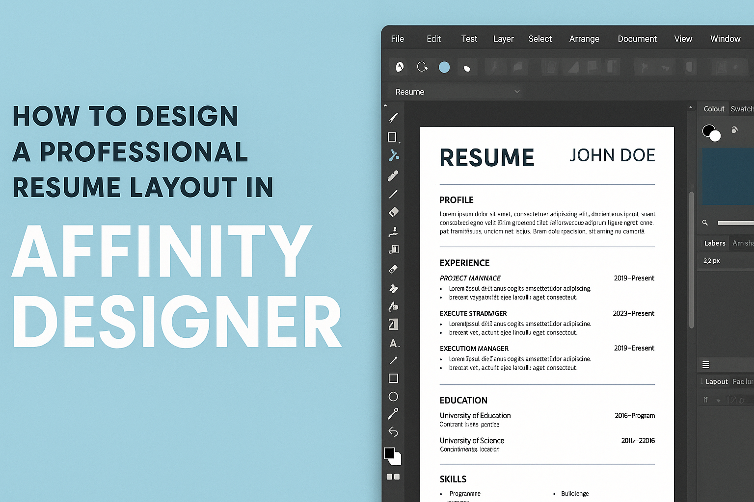
Getting Started with Affinity Designer
Affinity Designer is a powerful tool for creating professional designs.
Understanding the workspace, setting up a document, and knowing essential tools will make the design process smoother and more efficient.
Understanding the Workspace
The workspace in Affinity Designer is designed for ease of use. It features a toolbar on the left side, a context toolbar at the top, and a panel on the right for layers, swatches, and more. Users can customize their workspace to fit their style.
To manage the layout, windows can be docked or floated as per preference.
Knowing where to find specific features will save time and effort. Familiarizing oneself with the primary sections will help in navigating the software with confidence.
Setting Up Your Document
Setting up a new document is simple. Start by clicking “File,” then “New.” Users can select a template or specify document dimensions. Common sizes for resumes are A4 or Letter.
Adjusting the DPI (dots per inch) is also crucial for print quality. A standard DPI for print work is 300.
Once the document is set up, users can modify the background color and grid settings for better alignment during design.
Essential Tools and Shortcuts
Affinity Designer comes with several essential tools that help in creating designs effectively. The Move Tool allows for easy positioning of design elements, while the Text Tool is vital for adding and formatting text.
Keyboard shortcuts can enhance usability. For instance, pressing V selects the Move Tool, and T will switch to the Text Tool.
Learning these shortcuts can boost productivity and make the design process feel more fluid.
Crafting Your Resume Layout
Creating a professional resume layout is essential for making a strong first impression. Key elements include choosing a suitable style, using grids for alignment, selecting the right typography, and adding unique design features. Each aspect plays a significant role in showcasing qualifications effectively.
Choosing Your Resume Style
Selecting the right resume style is the first step towards an appealing design. Common styles include chronological, functional, and combination formats.
- Chronological: This style lists work experience in reverse order, which suits those with a solid work history.
- Functional: This format focuses on skills, making it ideal for those changing careers or with gaps in employment.
- Combination: Merging both styles, it highlights skills while detailing work history.
Consider the job target when choosing a style to best present qualifications to potential employers.
Working with Grids and Alignment
Grids are crucial in creating a balanced and organized layout. Using a grid system helps maintain consistent spacing and alignment.
- Margins: Keep margins uniform to ensure the content does not feel cramped.
- Columns: A two or three-column layout can help separate information neatly.
- Alignment: Ensure text and graphic elements align properly for a polished look.
Grids make it easier to structure sections like contact information, skills, and work experience, leading to a more readable document.
Typography Selection and Usage
Typography can significantly impact the overall look of a resume. Choosing fonts wisely enhances readability and professionalism.
- Font Type: Use sans-serif fonts like Arial or Helvetica for modern appeal. Serif fonts like Times New Roman can convey tradition.
- Font Size: Ensure the text is legible, typically between 10-12 points for body text and 14-16 points for headings.
- Emphasis: Use bold or italics to highlight key information, but avoid overusing them.
Consistent typography helps maintain cohesion throughout the resume, making it visually appealing.
Adding Distinctive Elements
Adding unique design aspects can make a resume stand out. Small touches can enhance the look without being overwhelming.
- Borders: Consider subtle borders for sections to create separation.
- Icons: Use icons for contact details and skills to add a visual element.
- Color: A limited color palette can accentuate headings or sections without distraction.
These distinctive elements should complement the overall style, drawing attention to important information while maintaining a professional appearance.
Refining and Finalizing
Refining and finalizing a resume in Affinity Designer is crucial for creating a polished and professional look. This stage involves fine-tuning the color palette, ensuring clarity, and preparing the document for distribution.
Color Scheme and Visual Harmony
Choosing the right color scheme can make a big difference in a resume’s impact. A harmonious color palette should reflect professionalism and personal style.
- Stick to 2-3 colors: Use a main color and one or two accent colors to keep it visually appealing.
- Consider contrast: Make sure text color contrasts well with the background for readability.
- Use neutrals: Incorporate shades of gray or white to balance brighter colors.
Testing different combinations can help identify what looks best.
Proofreading and Editing Tips
Proofreading is a vital part of finalizing a resume. Mistakes can leave a bad impression.
- Read aloud: This helps catch errors that might be missed when reading silently.
- Use tools: Programs like Grammarly can assist in identifying grammatical issues.
- Get a second opinion: Asking a friend or mentor to review can provide fresh insights.
Taking the time to ensure everything is correct is essential for creating a professional document.
Exporting Your Final Design
After refining the design, exporting it correctly is necessary for sharing.
-
File format: Save the resume as a PDF for a professional look that preserves formatting.
-
Resolution: Check settings to ensure high-quality output, especially for print.
-
Check for compatibility: Ensure the file is accessible on different devices and systems.