Creating an eye-catching Instagram feed can seem overwhelming, but it doesn’t have to be.
You can design a professional-looking Instagram feed in Vectr by utilizing its user-friendly tools to create sleek graphics and layouts. This approach not only enhances visual appeal but also helps strengthen brand identity.
With Vectr’s versatile features, users can easily customize templates and designs to match their style and message.
By focusing on consistency in color schemes and typography, they can craft a feed that captures attention and engages followers.
In the following sections, readers will discover practical tips and tricks for maximizing Vectr’s capabilities, allowing them to showcase their content in the most effective way possible. Whether for personal use or business, these insights will lead to a standout Instagram presence.
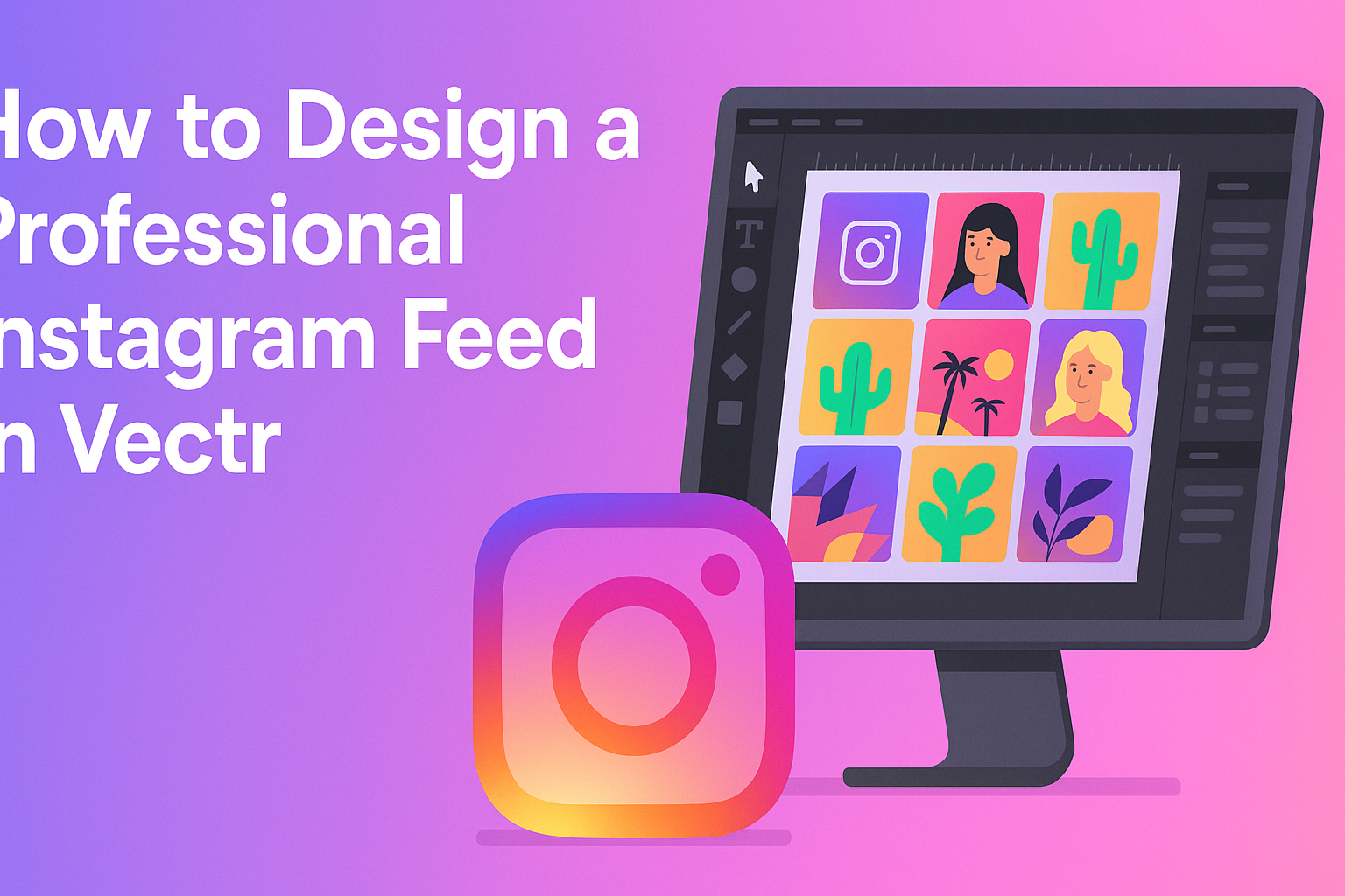
Understanding Vectr Basics
Vectr is a straightforward graphic design tool that allows users to create stunning visuals. It provides an intuitive interface, making it easy to navigate and find essential tools. This section will help users get comfortable with Vectr’s workspace.
Navigating the Vectr Interface
When users first open Vectr, they see a clean interface with several key areas.
The menu bar at the top offers options like File, Edit, and View. On the left side, the tools panel contains all the design tools needed for creating graphics. The main area is the canvas, where users will design their artwork.
Finding the right tools quickly helps streamline the design process. For instance, the zoom tool allows users to focus on details, while the selection tool is essential for moving and resizing objects. Understanding where everything is located will improve the overall design experience.
Setting Up Your Canvas
To create a new project, users should first set up their canvas. Clicking “Create File” in the top left corner opens a dialog where page size can be set. Choosing a square dimension is often best for Instagram posts, such as 1080×1080 pixels.
Users can also set the background color at this stage. A clean, white background works well for most designs. Adjusting the canvas settings beforehand will help shape the visual style of the Instagram feed.
Essential Tools for Design
Vectr provides various tools to craft eye-catching graphics.
The pen tool enables precise drawing for custom shapes, while the text tool adds typography easily. Both tools are vital for personalizing designs.
Shape tools like rectangles and circles allow quick creation of basic elements. Users can access these tools in the left panel and drag shapes onto the canvas. Each element can be resized and customized with the properties panel on the right side.
Getting familiar with these essential tools can greatly enhance the creative process in Vectr. As users become more comfortable, they can experiment with layers and effects to elevate their designs.
Creating a Cohesive Feed Aesthetic
A cohesive Instagram feed aesthetic can make a significant impact on how viewers perceive a brand. By focusing on color, typography, and consistent use of filters, anyone can create a polished and professional look.
Choosing a Color Palette
Selecting a color palette is an essential first step. It sets the mood and personality of the feed. A good palette typically includes 3-5 colors that complement each other well.
For example, a soft pastel palette can evoke calmness, while bold colors can attract attention. It’s wise to choose colors that align with the brand’s values and message.
Once a palette is picked, stick to it. Use these colors in backgrounds, text, and graphics. This consistency helps create a recognizable brand identity.
Incorporating Fonts and Typography
Fonts can greatly affect the aesthetics of an Instagram feed. Choosing 1-2 key fonts is ideal for maintaining a uniform style.
Serif fonts often convey sophistication, whereas sans-serif fonts offer a modern feel. Balance is key; headers might use a bold font while body text remains simple for readability.
It’s important to maintain consistent usage across all posts. Limit the number of different styles to ensure a clean look. This allows the audience to focus on content rather than being distracted by mixed font styles.
Using Filters and Overlays Consistently
Using the same filters and overlays across posts can tie them together visually. This practice enhances the overall theme and ensures images feel connected.
Choose a set standard for filter adjustments—brightness, contrast, and saturation levels should remain consistent.
One approach is to create a signature filter that reflects the brand’s personality. This way, every photo shares a similar style, making the feed visually appealing and pleasing to the eye. The key is to keep the adjustments subtle rather than extreme to maintain natural imagery.
Designing Individual Posts
Creating a professional Instagram feed requires attention to detail in each individual post. This involves crafting engaging visuals, utilizing templates, and maintaining a balanced visual hierarchy for clarity.
Creating Engaging Visual Content
To capture attention, visuals must be striking and aligned with the brand’s identity. High-quality images are essential. They should reflect the theme of the Instagram page, whether it’s vibrant, minimalistic, or artistic.
Using tools like Vectr, users can enhance their images with filters and effects. Adding text overlays with catchy phrases or quotes also increases engagement. Bright, bold colors can attract more views, while text should be easy to read against the background.
Incorporating elements like illustrations or icons can add personality to posts. Ensure that the content resonates with the audience and encourages interaction, such as likes or comments.
Working with Templates and Grids
Templates simplify the design process. Vectr offers pre-made templates that can save time when creating posts. Users can easily adjust colors, images, and fonts to fit their unique style.
Grids help in organizing content visually. A grid system ensures consistency across posts, making the overall feed look polished. Important elements should align with these grids for a cohesive appearance.
When planning posts, it’s helpful to visualize how each piece fits into the entire feed. This creates a harmonious layout and tells a story through the images, enhancing viewer retention and engagement.
Balancing Visual Hierarchy
Establishing a visual hierarchy is crucial for effective communication. This means making the most important elements stand out. Larger images or bold fonts catch the eye first.
Using contrasting colors can guide viewers’ attention to key messages. For example, a bright call-to-action button on a darker background can be very effective.
Keeping a balance between images and text also helps. Too much text can overwhelm, while too few visuals may not engage. Thoughtful spacing and alignment promote clarity and focus, making it easier for the audience to absorb information quickly.
Scheduling Content for Consistency
Consistency is vital for a professional Instagram feed.
Establishing a posting schedule helps maintain a steady flow of content. This can be done using various tools designed for social media management.
Setting specific days for themed posts, like “Motivation Mondays” or “Throwback Thursdays,” creates expectation among followers.
The routine makes it easier for he or she to plan content ahead of time.
Using a calendar can also help in organizing posts.
He or she can consider using captions, hashtags, and visuals aligned with the schedule. This approach enhances brand recognition and keeps the audience engaged over time.