Creating an effective product comparison table can simplify the decision-making process for users.
A well-designed table helps users quickly see differences between products, making it easier to choose the right one.
In the world of web design, using tools like Sketch can streamline this process.
When designing in Sketch, it’s essential to keep the table clear and visually appealing.
Clear labels, proper spacing, and consistent styling enhance readability and user experience.
Users will appreciate a table that neatly organizes information without overwhelming them.
By mastering the design of product comparison tables, designers can greatly improve the functionality of their web pages.
Engaging tables not only help users make informed decisions but can also lead to increased customer satisfaction and conversions.
Understanding Product Comparison Tables
Product comparison tables play a vital role in helping users evaluate their options. They enable quick assessments and can guide users toward the best choice based on their needs.
Purpose and Importance
The main purpose of a product comparison table is to present information clearly. It allows users to see differences between products or services at a glance. This is especially important when people face many options.
A well-designed comparison table can help boost conversions by making decision-making easier.
When users understand the distinct features and benefits of each option, they are more likely to follow through with a purchase.
It can also reduce confusion, guiding users to a choice that suits their preferences.
Elements of an Effective Table
An effective product comparison table should include several key elements.
First, it needs clear headers for products and attributes. This makes it easy for users to navigate.
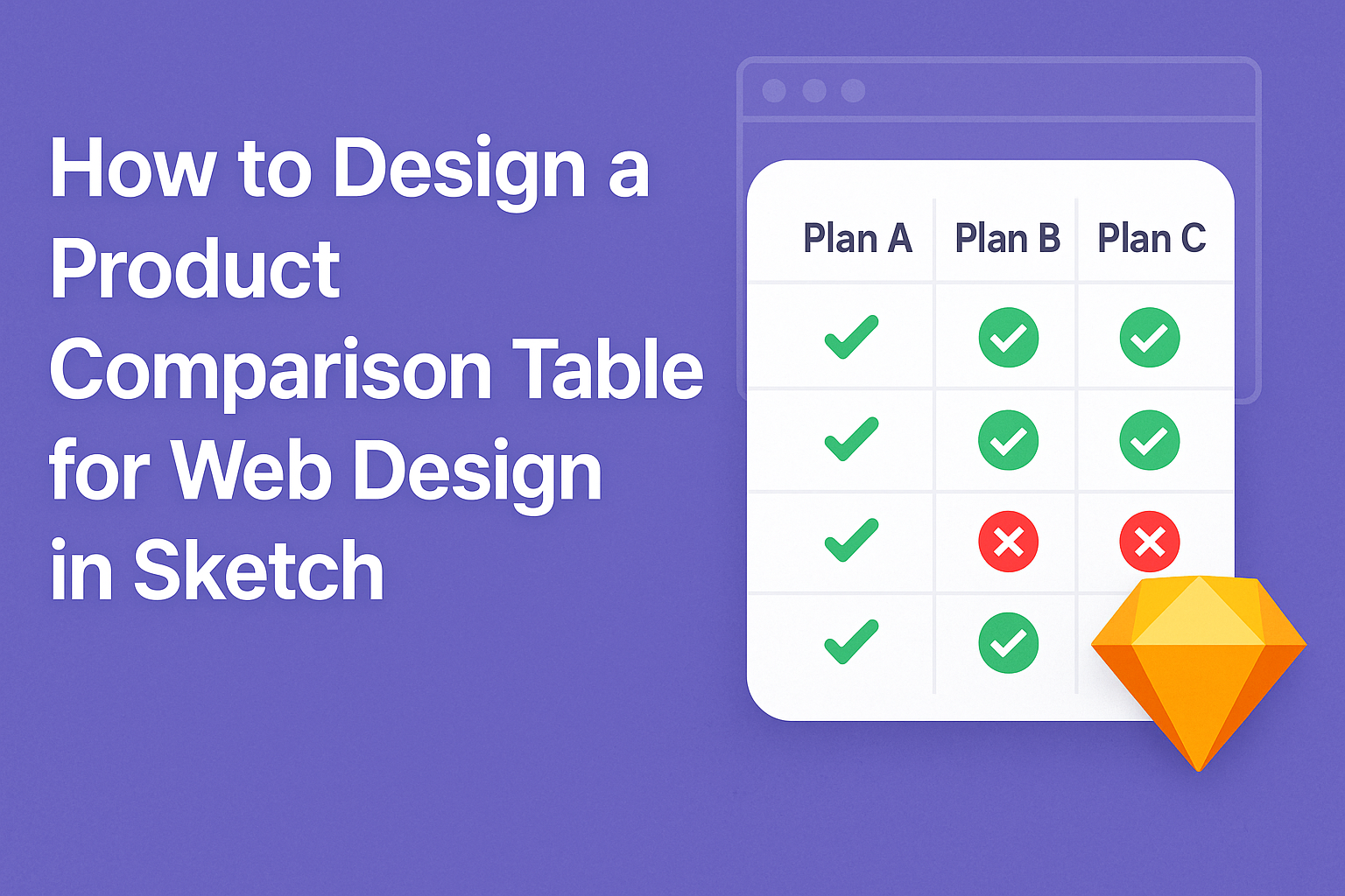
Next, the table should highlight important features like price, specifications, and benefits. Including visual cues, such as checkmarks or color coding, can help users quickly identify the best options.
Finally, consider the layout. A clean design that avoids clutter is essential. This ensures that the information is digestible and visually appealing.
By focusing on these elements, the table can effectively serve its purpose of aiding user decisions.
Designing in Sketch
Designing in Sketch allows designers to create visually appealing product comparison tables with ease. With its intuitive interface and powerful tools, users can set up their workspace, utilize vector and shape tools, manage typography, apply colors, and create reusable symbols.
Setting Up Your Workspace
Setting up a workspace in Sketch is essential for efficient design.
Users should start by arranging their panels to access tools quickly. The Inspector panel provides options for adjusting shapes, colors, and layers and can be docked on the right side for easy access.
Next, it’s important to select a suitable canvas size. Using standard sizes aligned with web design ensures that the designs are web-ready.
Users can create multiple artboards to manage different screens or sections of the product comparison table, keeping everything organized.
Adjusting grid settings is also beneficial. Grids help align elements and maintain consistency throughout the design.
A well-organized workspace can greatly improve workflow and overall design quality.
Using Sketch’s Vector and Shape Tools
Sketch’s vector tools offer flexibility in design.
Designers can create custom shapes and icons that enhance the visual appeal of comparison tables. For beginners, starting with basic shapes like rectangles and circles can help create a foundation.
The Pen tool is key for drawing unique shapes. It allows users to click and drag, creating curves and angles as needed. Combining shapes can produce sophisticated icons that represent various product features.
Also, the ability to manipulate vector points makes adjustments easy. Designers can refine their designs by selecting and moving points to ensure everything aligns perfectly.
Skilled use of these tools results in clean and professional-looking designs.
Working with Text and Typography
Typography plays a crucial role in the readability of product comparison tables.
Choosing the right fonts can make a significant difference. Sketch allows users to explore various font options and styles that fit the brand’s identity.
Establishing a clear hierarchy in text helps guide readers through the table. Headings should be bold and larger in size, while body text should be legible and consistent.
Keeping font sizes uniform ensures that all comparisons are easy to read.
Utilizing text styles saves time when applying consistent typography across the design.
Users can create specific styles for headers, subheaders, and body text, making it simple to maintain a cohesive look throughout the comparison table.
Applying Color and Texture
Colors can evoke emotions and draw attention. In Sketch, designers can use the Color Picker to select exact colors that match brand guidelines.
Creating a color palette for the comparison table adds consistency and improves visual appeal.
Textures can also enhance designs. Using lightly textured backgrounds gives depth to the table without overwhelming the text. Designers can apply gradients and patterned fills to certain elements to make them stand out.
It’s important to consider color contrast. High contrast between text and background ensures readability. Tools in Sketch can help users check contrast ratios, ensuring that the final design is accessible to all users.
Creating Reusable Symbols
Reusable symbols save time and effort in design workflows.
In Sketch, designers can create symbols for elements that appear multiple times in the product comparison table. For example, a star icon for ratings or a button for information can be created once and reused.
Users can easily edit symbols in one place, and changes will reflect everywhere the symbol is used. This feature enhances consistency and reduces the chances of errors.
Moreover, nesting symbols allows for greater flexibility. Designers can create more complex components, combining different symbols to create new designs without starting from scratch. This approach minimizes repetition and streamlines the design process.
Enhancing Usability
Usability is crucial when designing a product comparison table. This section focuses on responsive design, visual hierarchy, and accessibility features to ensure the table is user-friendly for everyone.
Responsive Design Considerations
Responsive design ensures that a product comparison table looks good on all devices.
Designers should use flexible grid layouts and scalable fonts. This helps the table adjust to different screen sizes, whether it’s a smartphone, tablet, or desktop.
Using media queries in CSS can help adjust the table layout based on screen width. Designers will want to consider touch targets for mobile users, making buttons and interactive elements larger for easier tapping.
An optimal approach is to display fewer columns on smaller screens. This can prevent users from feeling overwhelmed with too much information at once.
Visual Hierarchy and Scannability
Visual hierarchy guides viewers through the content, making it easy to find key information.
Using bold headers and contrasting colors can draw attention to the most important features. This helps users quickly identify the essential differences between products.
A good layout uses spacing effectively to avoid clutter. White space gives the eyes a break and makes the table more inviting.
Lists can also improve scannability. Bullet points or icons help highlight features efficiently.
Overall, maintaining clear and organized information is essential for user navigation.
Accessibility Features
Accessibility is vital for inclusivity, ensuring everyone can use the comparison table.
Designers should follow Web Content Accessibility Guidelines (WCAG) to create accessible content.
Using proper contrast ratios between text and background helps visually impaired users. Also, adding alternative text for images and using semantic HTML will improve screen reader experiences.
Keyboard navigation is another important aspect. Users who rely on keyboards should be able to tab through the table easily. Clear focus indicators should also guide users as they navigate through the information.
Finalizing and Exporting
Finalizing and exporting a product comparison table requires attention to detail and effective communication. Ensuring that the design meets the objectives while being user-friendly is key. This section covers important steps like reviewing the design, gathering feedback, and exporting files correctly for development.
Preview and Iterate
Before moving to the export stage, it’s crucial to preview the design thoroughly. This helps identify any layout or content issues.
Designers should view the table in various screen sizes to ensure it adapts well.
Iterations might be necessary based on this review. He or she may tweak colors, fonts, and spacing. Using feedback loops can refine the design further.
Sketch offers prototyping tools to simulate interactions, which can highlight functional areas needing adjustment.
Collaboration and Feedback
Collaboration plays a vital role in finalizing the design.
Sharing the product comparison table with team members or stakeholders invites diverse perspectives. Using tools like InVision or Marvel allows for easy sharing and commenting.
Designers should actively seek constructive feedback on clarity and usability.
Questions to consider include:
- Is the information easy to read?
- Do the comparisons make sense to users?
- Is the layout visually appealing?
Addressing this feedback may lead to important adjustments or improvements. Collaboration fosters a sense of ownership among team members.
Exporting Assets for Web Development
Exporting the final design correctly is essential for a smooth transition to development.
Designers should export images, icons, and other components in suitable formats like PNG or SVG.
Knowing the proper resolution is key—typically, 72 DPI is standard for web use.
It’s helpful to organize exported assets into folders based on their use.
Naming conventions matter, too; using clear, descriptive names saves developers time.
He or she should also create a style guide to accompany the assets, detailing fonts and color codes.
This ensures consistency in implementation across the site.