Creating a branded web popup graphic can be a fun and rewarding project. With PicMonkey, users can design eye-catching popups that match their brand’s style easily.
To start, one simply needs to choose a template, customize it with colors and fonts, and add eye-catching images or text.
These popups can boost engagement on websites and help capture visitor attention. By using PicMonkey’s tools, anyone can create professional designs without needing extensive graphic design experience. Engaging popups can lead to increased conversions and a stronger connection with audiences.
Readers can discover tips and tricks to make their popups stand out, while also learning how to utilize PicMonkey’s features effectively. This guide helps anyone, from beginners to more experienced users, create custom graphics that reflect their brand’s identity.
Getting Started with PicMonkey
PicMonkey is a powerful design tool that helps users create stunning graphics easily. From signing up to exploring available tools, each step is important for a smooth design experience.
Creating an Account
To start using PicMonkey, one must first create an account. This process is simple and quick.
Users can sign up by visiting the PicMonkey website and clicking on the “Start Free Trial” button. They will then need to enter their email address and create a password.
After that, they can choose a plan that fits their needs, including free trials to test out features. Users can also sign up using their Google or Facebook accounts for convenience.
Navigating the Interface
Once an account is made, navigating the PicMonkey interface is straightforward. The main dashboard displays options like Create New, My Projects, and templates.
Users will find a toolbar on the left side that contains different categories such as photos, graphics, and text. The canvas area in the center shows the current project.
Familiarizing oneself with these sections will make designing much easier and efficient.
Exploring the Tools and Features
PicMonkey offers a variety of tools and features to enhance designs. Users can access photo editing tools, design templates, and customizable graphics.
Popular features include:
- Photo Editor: Adjust colors, brightness, and contrast.
- Design Templates: Choose from hundreds of ready-made designs.
- Text Options: Add and customize text with different fonts and styles.
Learning to use these tools allows users to create professional-looking graphics that suit their branding needs.
Designing Your Web Popup Graphic
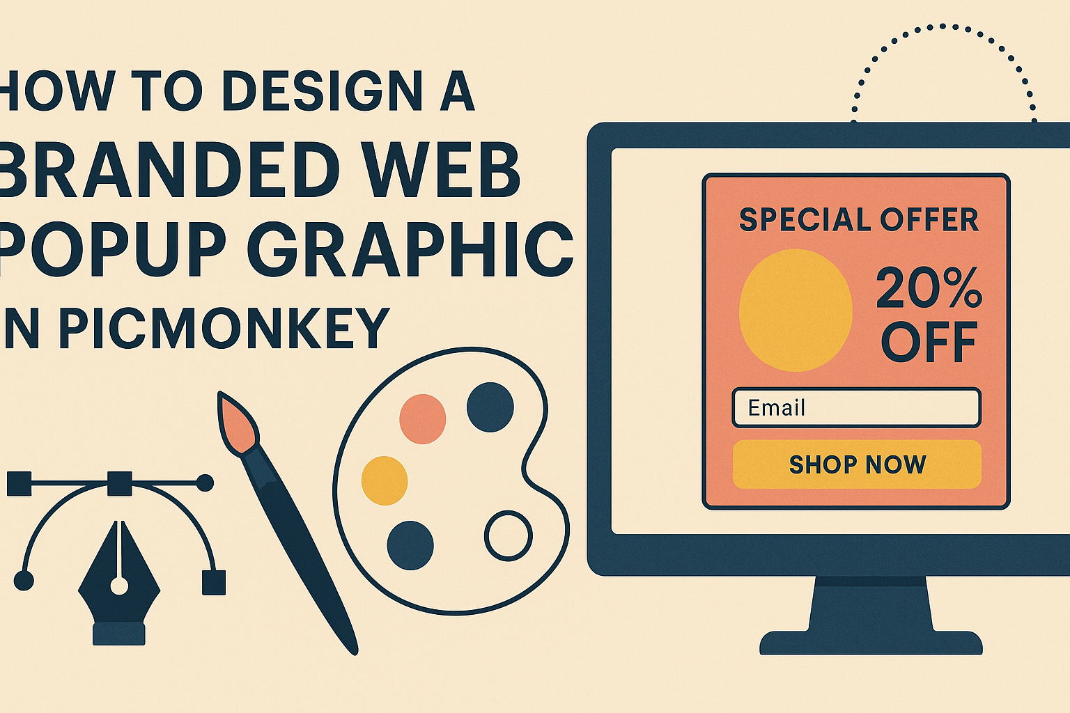
Creating an effective web popup graphic involves careful choices about size, branding, and text. Each detail plays a crucial role in grabbing attention and sharing a message.
Choosing the Right Size and Template
Selecting the right size for a popup is important. A common size is 600 x 400 pixels, which balances visibility and aesthetics. It should fit nicely on the screen without overwhelming users. PicMonkey offers various templates to choose from.
Using templates can speed up the design process. They provide a structure to start from, making it easier to customize. It helps to start with a basic layout that can be adjusted later.
Always consider where the popup will appear on the website. Centered popups are eye-catching, while corner placements can feel less intrusive. Think about user experience as they browse the site.
Incorporating Brand Elements
Branding is essential for a popup graphic. It should reflect the company’s identity clearly. Using the logo, specific colors, and consistent imagery will reinforce brand recognition.
Choose a color palette that aligns with the brand’s website colors. This creates a harmonious look. Consistency in using fonts also helps build trust. Stick to one or two font styles that match the brand’s personality.
Including brand elements ensures that users identify the popup with the business. This familiarity increases the chance of engagement. The goal is to create a seamless experience that feels organic to the site.
Adding Text and Typography Tips
Text in a popup should be clear and concise. A strong call-to-action (CTA) is crucial for driving conversion. Phrases like “Get 20% Off!” or “Sign Up Now!” grab attention effectively.
Limit the amount of text to keep it readable. Users should understand the message in seconds. Use bullet points if necessary to highlight key offers or benefits.
Typography plays a big role in legibility. Choose clear, easy-to-read fonts, and ensure that the font size is large enough to see without straining. Contrast between text and background color is also important for readability.
Customizing with Advanced Features
Customizing a branded web popup in PicMonkey can take center stage with advanced features. These tools allow for more creative flexibility to enhance the overall design. This section delves into how to effectively use layers, apply unique filters, and manipulate transparency.
Using Layers for Complex Designs
Layers are essential in creating complex designs within PicMonkey. By using layers, one can stack images, graphics, and text separately. This allows for easy adjustments without affecting other elements.
To start, add an image to the canvas and then layer additional graphics or text on top. Users can adjust the order of layers, ensuring that more important elements remain visible.
It’s also possible to use layer effects, such as drop shadows or outlines, to add depth. These enhancements help to direct focus and create a polished, professional look.
Applying Filters and Textures
Filters and textures can dramatically transform a popup’s appearance. PicMonkey offers a variety of filters that can adjust color and mood, catering to brand identity.
For instance, a vintage filter might evoke nostalgia, while a vibrant filter could create excitement. Experimenting with these options can lead to interesting aesthetics.
Textures, on the other hand, can add a tactile feel to the design. Applying a subtle texture can make the background more engaging without overwhelming the main content. This can lead to a visually appealing and rich design.
Leveraging the Transparency Tool
The transparency tool is invaluable for fine-tuning designs. By adjusting transparency, users can create layered effects and soft backgrounds. This helps elements blend smoothly into the overall design.
To use this tool, select the desired layer and adjust the transparency slider. This feature allows for more control over how prominent or subtle a graphic appears.
For example, lowering the transparency of an image can help it act as a background, supporting text without overshadowing it. This balance is crucial in ensuring that every element works harmoniously together within the popup.
Best Practices for Web Integration
Integrating the popup graphic into the website should be done thoughtfully.
First, choose a suitable placement on the page, ideally where it catches the visitor’s eye without being intrusive. A common choice is mid-screen, ensuring it’s noticeable but not overwhelming.
Next, it’s important to ensure that the popup is responsive.
This means testing it on different devices to make sure it looks good on desktops, tablets, and phones.
Finally, utilizing a clear call-to-action within the popup can guide users effectively. This helps increase engagement and conversions.