Creating eye-catching graphics is easier than ever with design tools like Canva. Adding a perspective text effect can make any project stand out and grab attention.
To create perspective text in Canva, users need to select their text, open the effects panel, and adjust the perspective settings for a dynamic look.
Many people want to enhance their designs to make them visually appealing. Utilizing perspective text is a great way to achieve that.
With just a few simple steps, anyone can transform standard text into something that pops and captivates an audience.
As they explore this technique, users will discover how it enhances their projects. From social media posts to marketing materials, the perspective text effect can elevate the overall design.
By learning this skill, they can truly make their work shine.
Getting Started with Canva
Canva is a user-friendly design tool that makes creating graphics easy. By following a few simple steps, users can start designing right away.
Creating an Account
To start using Canva, one must first create an account.
This can be done by visiting the Canva website and clicking the “Sign up” button. Users can choose to sign up using their email address, Google account, or Facebook account.
After completing the sign-up form, a verification email may be sent. Clicking the link in the email confirms the account.
Once verified, users can log in and access Canva’s features for free or upgrade for premium options.
Exploring the Interface
Once logged in, users will find a clean, intuitive interface. The main dashboard showcases various design options, organized into categories.
On the left side, users will see a toolbar with options for creating a design, exploring templates, and accessing projects.
The center area displays templates and previous designs.
Users can easily navigate and choose where to begin. Canva also provides a search bar for quickly finding specific design types, which makes starting a new project easy and efficient.
Selecting the Right Template
Choosing the right template is critical for a successful design. Canva offers a wide array of templates for various purposes, such as social media posts, presentations, and posters.
To find templates, users can browse categories or use the search function.
Each template can be customized by clicking on it, which opens it in the editor.
In the editor, elements such as text, colors, and images can be changed. This flexibility allows users to personalize their designs to fit their needs and style perfectly.
Designing Your Text
When creating perspective text in Canva, selecting the right font and color, adding the text to the canvas, and adjusting its size and alignment are essential steps. These choices can dramatically change the look of the text and how well it fits into the overall design.
Choosing Fonts and Colors
Choosing the right font is crucial. A bold font may stand out better in perspective, while a script font can give a softer touch.
Canva offers a variety of fonts, so it’s important to find one that matches the mood of the project. For example, comic fonts are fun, while serif fonts feel more formal.
Colors also play a big role. High contrast between text and background helps the text pop. Consider using complementary colors to make the design more appealing.
Adding Text to Your Canvas
To add text, users simply select the “Text” option from the sidebar. They can choose to add a heading, subheading, or body text.
Once the desired text is in place, it can be moved around the canvas. Users can drag the text box where it fits best in the design.
It is also possible to adjust the spacing between letters, which can enhance the perspective effect. Slightly changing the spacing can create a more visually interesting layout.
Adjusting Text Size and Alignment
Once the text is added, size adjustment is important. Users can click and drag the corners of the text box to make it larger or smaller.
Finding the right size ensures that the text is readable from a distance. Text should not overwhelm other design elements but rather fit seamlessly within the layout.
Alignment is also key. Users can center the text, align it to the left or right, or even justify it. Proper alignment can make the overall design look polished and professional.
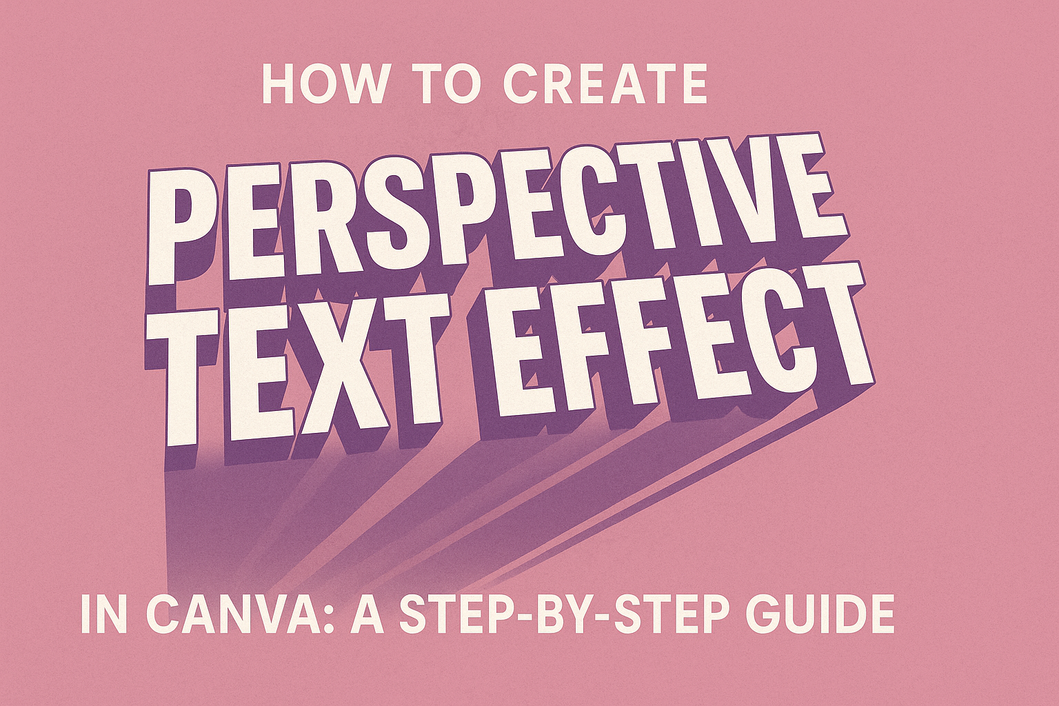
Applying Perspective Effect
Applying the perspective effect in Canva can transform simple text into eye-catching designs. Users can choose from pre-set effects or customize the perspective manually to suit their creative needs.
Using Pre-Set Effects
Canva offers several pre-set perspective effects that make applying depth easy. To access these, select the desired text box and click on the “Effects” button in the toolbar.
Here, users can find options like “Perspective” that provide instant adjustments. Just click on the effect, and it will immediately apply to the text.
Users can then fine-tune settings by adjusting sliders. This allows them to increase or decrease the effect’s intensity, ensuring the text fits perfectly with their design.
It’s a quick way to add flair without going too deep into customization options.
Customizing the Perspective Manually
For those wanting more control, customizing the perspective manually is straightforward. First, select the text and go to the “Effects” panel.
From there, users will find an option for “Custom” adjustments.
The sliders will allow them to shift the text in various directions—up, down, left, or right.
This feature provides significant flexibility. Users can create a unique appearance that matches their vision.
Experimenting with these settings can lead to stunning results. Using this manual approach helps users achieve exactly the style they want for their projects.
Enhancing Your Design
To create an engaging design in Canva, incorporating various visual elements is key. This not only boosts the appeal of the text effect but also unifies the overall design. Using images and backgrounds strategically can elevate the viewer’s experience.
Incorporating Images and Elements
Using images can add depth to the perspective text effect. It’s effective to place related images behind or alongside the text. For example, if the text is about travel, using a scenic background works well.
- Choose Relevant Images: Select images that complement the text theme.
- Positioning: Adjust the positioning to ensure the text is legible.
- Opacity: Consider lowering the opacity of the image. This helps text stand out while still being visually interesting.
These techniques enhance the viewer’s focus on the text while providing context. Experimenting with different elements can also bring unique ideas to life.
Adding Backgrounds
A background can significantly affect how the perspective text is perceived.
Consider using simple colors or gradients to create contrast. This ensures the text remains front and center.
- Choose Colors Wisely: Bright colors may catch attention but can distract from the text. Neutral colors help keep the focus where it needs to be.
- Textures and Patterns: Subtle textures or patterns can add a layer of interest without overwhelming the text.
- Layering: Be mindful of how the background layers with the text. Make necessary adjustments to maintain clarity.