Creating Magic Charts in Canva Sheets makes turning data into clear visuals quick and simple. It lets users transform raw numbers into charts that update automatically when the data changes. This helps anyone make professional-looking charts without needing design skills.
The tool works right inside Canva Sheets, so users can see their charts change in real time as they edit their spreadsheets. It’s useful for reports, presentations, or any time visual data is needed.
People can adjust the chart data easily by clicking the items and typing new values. The charts update on the spot, keeping everything synced and polished without extra effort. For more details on how Magic Charts work, see this guide on using Magic Charts in Canva Sheets.
Understanding Magic Charts in Canva Sheets
Magic Charts in Canva Sheets make turning data into visuals simple and quick. Users can easily create charts that update automatically and look professional. These charts help show numbers clearly and support many different needs.
What Are Magic Charts
Magic Charts are smart charts built inside Canva Sheets. They connect directly to your data. When data changes, the chart updates right away without extra steps. This saves time and keeps visuals accurate.
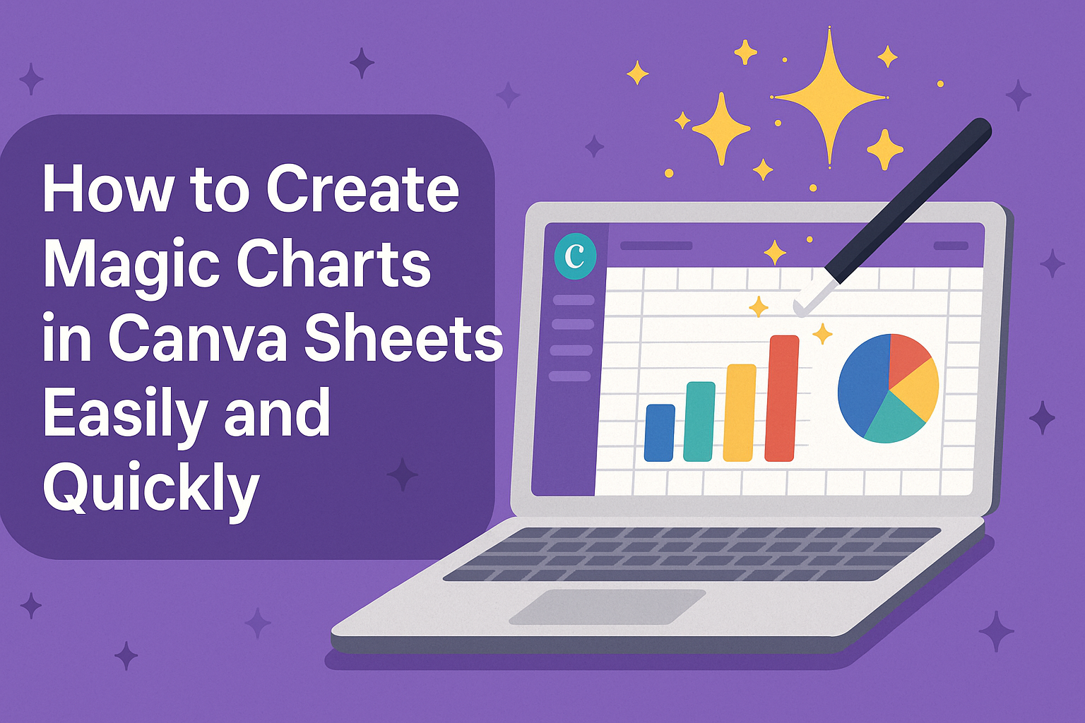
They support different types of charts, such as bar graphs, line charts, and pie charts. Users don’t need design skills to make charts because Magic Charts work with templates and simple editing tools. This makes chart creation faster and easier.
Key Features and Benefits
Magic Charts link to your spreadsheet data, so charts refresh automatically when you update the data. This means no manual fixing or re-creating charts after changes.
The tool offers a variety of chart styles and templates. Users can customize colors, fonts, and labels to match their brand or project style. Canva also lets them disconnect the chart from the data source if they want a static image instead.
Because Magic Charts integrate into Canva’s design workspace, users can add charts directly to presentations, reports, or social media posts. This all-in-one design process saves time and keeps work consistent.
Use Cases for Magic Charts
Magic Charts work well for business reports, school projects, and marketing presentations. They help show sales trends, survey results, or budget info clearly.
People who track digital product sales or ad campaigns can quickly turn numbers into visuals that explain performance. Teachers and students can use them for class reports without needing extra software.
The easy setup and automatic updates make Magic Charts useful for anyone needing clear, attractive charts with minimal effort. More details on how to use them in Canva Sheets can be found in this guide on using Magic Charts.
Getting Started with Canva Sheets
Canva Sheets lets users create and manage data easily for making Magic Charts. It focuses on visual content while keeping spreadsheet functions simple and clear. Users can start fresh, bring in existing data, and find their way around the tools quickly.
Creating a New Spreadsheet
To create a new spreadsheet, users start by opening Canva and selecting the Sheets option. They can choose a blank sheet or a template tailored for different needs like budgets or schedules. This step sets up a clean workspace ready to hold data.
Once the new sheet opens, users can add rows and columns by clicking the plus signs. They can enter data directly or format cells with options like bold text or colors to keep things organized. Canva’s design-friendly feel makes spreadsheets look neat and clear.
Importing Your Data
Users can bring in their existing data by importing files into Canva Sheets. Supported file types include Excel and CSV formats, which maintain data structure during upload. This avoids starting from scratch.
After importing, data syncs instantly with Canva Sheets, so it stays ready for making charts. Users can also update the spreadsheet later, and Magic Charts will reflect those changes automatically, keeping everything linked and current.
Navigating the Canva Sheets Interface
The Canva Sheets interface is clean and user-friendly. At the top, users find menus for editing, formatting, and adding features like charts or formulas. The sidebar offers quick access to templates and other tools.
Grid lines and cell labels make data easy to follow, while toolbar icons simplify common tasks like sorting and filtering. Canva also highlights selected cells clearly, helping users track what they’re working on. The interface supports a smooth workflow from data entry to visualization.
Preparing Data for Magic Charts
Getting data ready for Magic Charts means making sure it is clear and well-organized. The data should be easy for Canva Sheets to read and translate into visuals without errors. This involves setting up the right format, sorting data logically, and fixing any common problems.
Formatting Your Data
Data should be arranged in columns and rows, with each column having a clear header. Headers usually describe the type of information below, like “Product” or “Sales.” It’s best to keep headers short and simple.
Numbers should be consistent in style. For example, don’t mix percentages, decimals, and whole numbers in the same column. Dates must be in the same format throughout. Empty cells can confuse the chart, so fill or remove them.
Using text for categories and numbers for values helps Magic Charts know what to graph. If importing data, it’s important to check it looks right before creating the chart.
Organizing Data for Visualization
Data must be structured so it matches the chart style planned. For example, a bar chart requires one column for categories and one for values. For pie charts, values need to represent parts of a whole.
Make sure data points are in the correct order. Sorting from highest to lowest or by date can make the chart easier to understand. Large datasets should be trimmed to the key information you want to show.
Grouping similar items in the same column helps keep charts clean. For example, if tracking sales by regions, keep “East,” “West,” and “South” in one column rather than separated.
Troubleshooting Common Data Issues
If the chart is not showing right, the first step is to look for empty or mismatched data. Cells with text where numbers belong often cause errors. Removing or correcting these fixes many problems.
Duplicate headers or columns can confuse Canva Sheets. Each column should have a unique title. Also, check for hidden spaces or special characters that might break data reading.
If Magic Charts still won’t update, refreshing the page or clearing placeholder data and re-entering the information can help. Making sure data is simple and consistent avoids many common errors.
For more detailed help on Magic Charts, check out the guide on using Magic Charts in Canva Sheets.
How to Create Magic Charts in Canva Sheets
Creating Magic Charts in Canva Sheets involves a few simple steps. Users start by accessing the chart tool, then pick the type of chart that fits their data. After that, they adjust the settings to get the right look and finally customize colors and styles to match their needs.
Accessing the Magic Charts Feature
To get started, open Canva Sheets where your data is stored. Look for the Magic Charts tool, usually found in the toolbar or under the insert menu. Clicking this will open a panel that helps transform your raw data into a chart.
The feature works in real-time, so any changes made to your spreadsheet will automatically update the linked chart. This saves time by removing the need for manual edits after updates. It’s designed to be easy for anyone to use without special skills.
Selecting the Right Chart Type
Choosing the correct chart type depends on the kind of data presented. Canva offers options like bar charts, line charts, pie charts, and more. For example, bar charts work well for comparing categories, while line charts show trends over time.
Users can preview each chart type before finalizing their choice. This helps ensure the data is shown clearly and makes sense to the audience. Switching to a different chart type is quick and keeps all the data intact.
Configuring Chart Settings
After selecting the chart type, users can adjust settings to clarify their message. This includes changing titles, editing labels, and setting up axes. Precise labeling is important to avoid confusion about what the data shows.
There are also options to add or remove grid lines and control how data points are displayed. Adjusting these settings makes the chart easier to read and more professional. The interface provides simple controls to make these changes quickly.
Customizing Colors and Styles
Magic Charts lets users personalize the look by changing colors and styles. Color options include palettes to match branding or personal preferences. Highlighting certain data with bold or different colors helps draw attention.
Style options include font choices, chart backgrounds, and border styles. This allows the chart to blend well with the document or presentation it will appear in. Users can experiment with styles and see changes live to find what works best.
For more details on using Magic Charts in Canva Sheets, see this page on Use Magic Charts.
Personalizing Your Magic Charts
Customizing charts in Canva Sheets helps make data clearer and more engaging. Users can add important titles, match their brand’s style, and fine-tune layout details. These steps improve both the look and function of the chart.
Adding Titles and Labels
Titles and labels give context to charts. They explain what the chart shows and make it easier for viewers to understand the data. In Magic Charts, users can click on the chart area where titles or labels appear and type new text.
It’s important to use clear and concise titles. For labels, users should name each axis and data set to show what the numbers mean. This avoids confusion and makes insights stand out.
Changing font size and style is also possible. Bigger fonts help key information pop, while consistent fonts keep charts looking neat. Users should check if the text fits well within the chart space without overlapping other elements.
Incorporating Brand Elements
Adding brand colors and logos makes charts recognizable and professional. Canva Sheets lets users pick custom colors for bars, lines, and other chart parts to match brand palettes.
Users can upload their logos or icons and place them near the chart. This small addition reinforces the brand identity without crowding the design.
Sticking to a limited color scheme ensures the chart stays easy on the eyes. Too many colors can distract or confuse viewers. Using brand fonts also keeps the chart aligned with other materials.
Adjusting Layout and Alignment
Proper layout helps the chart look balanced and readable. Users can move chart elements like legends, titles, and data labels by dragging them around the canvas.
Aligning items along gridlines or to the center creates a clean look. Canva Sheets offers snap guides that help position these elements precisely.
Spacing between parts should be even. Crowded areas can hide data points, while too much space wastes room. Adjusting the chart size itself allows users to fit it well in reports or presentations.
These tweaks make charts easy to read and visually appealing.
Collaborating and Sharing Magic Charts
Magic Charts in Canva Sheets let users work together smoothly and share their work easily. They can update charts in real time, share access with others, or export visuals for different uses.
Real-Time Collaboration in Canva Sheets
Users can invite team members to edit the same Canva Sheet at once. Changes to data or chart details update instantly for everyone. This keeps everyone on the same page without waiting for emails or file versions.
To collaborate, the owner sets permissions by sharing the Canva file link. They can allow others to view or edit the sheet and charts. Team members can add data, change values, or adjust the chart style. All updates happen live, making teamwork faster and easier.
Sharing Charts with Team Members
When the chart is ready, users can share it directly inside Canva. They can choose who gets to see or change the chart by adjusting access rights. This makes it simple to show work to colleagues without extra downloads.
Users can also copy the chart link to send in messages or emails. Team members open the link and interact with the chart inside Canva. Sharing can be limited to specific people or made public depending on the project needs.
Exporting Charts for Presentations
Magic Charts can be exported as images or PDFs for use outside Canva. This lets users add charts to slides, reports, or documents easily. Export settings include different formats and resolution options to match the intended use.
To export, users select the chart, choose their format, and download the file. This option works well for presentations where live data updates are not needed. Exported charts keep their design quality and are ready to share anywhere.
Advanced Tips for Magic Charts
Magic Charts in Canva Sheets can be fine-tuned for more precise data displays and better visuals. Users can filter data, link several charts together, and add interactive features to make charts more engaging.
Using Filters and Dynamic Ranges
Filters let users focus on specific parts of their data. For example, they can show only sales from certain months or specific products. This makes charts cleaner and more relevant.
Dynamic ranges automatically adjust the chart as data changes. If new rows or columns are added, the chart updates without needing manual changes. This is helpful for ongoing projects or reports that grow over time.
To apply filters or dynamic ranges, users select data in Canva Sheets, then set conditions or highlight ranges that change automatically as data updates.
Combining Multiple Magic Charts
Users can place several Magic Charts side-by-side to compare different data sets. For instance, they might show expenses next to income or sales in different regions in one view.
Combining charts helps reveal connections and trends. Canva allows easy resizing and aligning of charts, so dashboards look neat and professional.
Charts can be linked so changes in one update others. This keeps data accurate across all visuals without extra work.
Interactive Elements and Animation
Magic Charts support adding interactive features like tooltips. When hovering over parts of a chart, more data or details pop up. This helps users explore data without cluttering the chart.
Animations can highlight changes over time or draw attention to key points. Simple effects, like bars growing or segments appearing, make presentations livelier.
Users enable these features in Canva’s chart settings and adjust speed or style to fit their needs. These touches help make data easier to understand and more fun to look at.
Best Practices for Magic Chart Design
Effective Magic Charts show data clearly and help viewers understand key information fast. Using clear layouts, smart colors, and focusing on important details makes charts easier to read and more useful.
Design Principles for Readability
A clean layout is crucial for a Magic Chart’s readability. Avoid clutter by limiting the number of data points and labels shown at once. Using simple fonts and consistent sizes keeps the chart neat and easy on the eyes.
Spacing between elements helps prevent confusion. Proper alignment ensures everything looks organized. Adding grid lines or subtle borders can guide viewers without distracting them.
Labels should be clear and directly linked to their data points. Avoid overlapping text by adjusting label positions or using callouts. This helps users quickly grasp what the chart shows without guessing.
Choosing Effective Color Schemes
Colors should help separate data groups, not mix them up. Using contrasting colors for different categories or lines makes data easy to distinguish. Avoid using too many colors because it can confuse the viewer.
Stick to colors with good brightness and saturation for clear visibility, especially for charts shared on screens. It’s wise to check your color choices for color blindness to make sure everyone can understand the chart.
Using a limited palette of 3-5 colors usually works best. Soft backgrounds and darker colors for data lines or bars help the chart look balanced and professional.
Highlighting Key Data Points
Highlighting helps direct attention to the most important parts of the chart. Bold colors or larger shapes can make key points stand out without overwhelming the rest.
Using callouts or annotations can explain why certain data is important. This adds context and helps viewers understand trends or spikes easily.
It’s best to keep highlights simple. Overusing emphasis can confuse the audience or make the chart look busy. A clear focus on one or two main points keeps the message strong and clear.
Troubleshooting Magic Charts in Canva Sheets
Users may face issues like charts not showing correctly or data not updating. Knowing how to fix common problems quickly helps keep charts accurate and useful.
Fixing Display Issues
If a Magic Chart doesn’t display properly, the first step is to check the internet connection. Slow or interrupted connections can cause charts to load incorrectly.
Sometimes, charts appear distorted because the spreadsheet cells linked to the chart are too small or contain missing data. Adjusting the size of the cells or filling all data fields can improve the display.
Refreshing the Canva page or reopening the file often resolves temporary glitches. If the problem remains, clearing the browser cache or switching to a different browser might help.
Resolving Data Errors
When the chart does not update after changing data, ensure the correct data range is selected in Canva Sheets. Incorrect ranges can cause charts to show old or irrelevant data.
Data format matters too. Numbers should be formatted properly, and text fields need to be consistent to avoid errors in visualizations.
If changes are made directly in the chart, users should press Enter after typing new values. This action prompts the chart to update automatically.
Support Resources
Canva offers helpful guides and tutorials on Magic Charts that users can access anytime. These resources explain common issues and how to handle them step by step.
For more direct help, the Canva Help Center has articles like how to Use Magic Charts, which provide detailed instructions.
Community forums and user videos offer solutions from other users who faced similar challenges using Magic Charts in Canva Sheets.