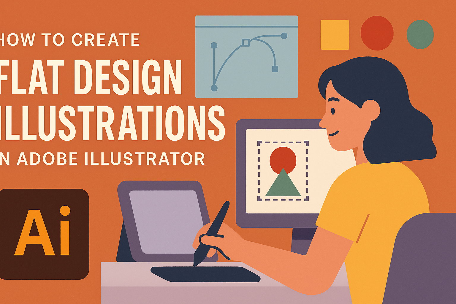
Creating flat design illustrations in Adobe Illustrator can be both exciting and rewarding. These illustrations are known for their simplicity and clean look, making them popular for many projects. To make a flat design illustration, users start by using basic shapes and vibrant colors to create a cohesive and eye-catching piece.
Illustrators use tools like the Pen Tool and Shape Builder Tool to refine their designs. These tools allow for the creation of unique shapes and lines that give the illustration a professional look. Checking out resources like the TutsPlus tutorial on flat design can be incredibly helpful.
Readers can find fun in experimenting with different styles and techniques. As they practice, they will gain confidence and develop their unique style. Even beginners can learn to create impressive illustrations by exploring beginner-friendly guides and practicing regularly.
Understanding Flat Design
Flat design focuses on simplicity and clarity, using bold colors and clean lines. It avoids complex textures and gradients, offering a straightforward user experience.
History and Evolution of Flat Design
Flat design began gaining popularity in the early 2000s. It was a reaction to skeuomorphic design, which tried to mimic real-world textures like wood and metal. Microsoft played a big role in spreading flat design with its Metro style in Windows 8.
As technology evolved, web and software design needed to be more efficient. Flat design offered a faster, more modern look that worked well on digital screens. Its clean lines and simplicity fit the growing demand for minimalist aesthetics in digital interfaces. Over time, flat design has continued to evolve, incorporating subtle gradients and shading to add depth without losing its minimalist roots.
Principles of Flat Design
Flat design uses basic shapes and bold colors. It focuses on function and usability, stripping away unnecessary decorative elements. The emphasis lies on easy navigation and user-centric interfaces.
Typography is also important in flat design. Simple, sans-serif fonts are often used to keep text clear and readable. There’s a focus on high-contrast backgrounds to ensure texts and icons are easily visible. This style is not only about aesthetics but also about improving user experience by guiding them through the content in a smooth, intuitive way.
Setting Up Your Adobe Illustrator Workspace
Creating flat design illustrations in Adobe Illustrator requires an efficient workspace. Setting up a workspace involves choosing the right document settings, familiarizing yourself with the interface, and customizing panels to suit your workflow.
Choosing the Right Document Settings
When beginning a project in Adobe Illustrator, selecting appropriate document settings is crucial. Start by choosing the artboard size that suits your project needs. Common dimensions include A4 for print or custom sizes for web graphics. Ensure the color mode aligns with your output format: RGB for digital and CMYK for print.
You should also set an appropriate resolution. A resolution of 72 PPI is standard for screens, while 300 PPI works best for print. Setting units in pixels generally is helpful for digital work, and using inches or centimeters is better for print.
Navigating the Adobe Illustrator Interface
The Adobe Illustrator interface is filled with tools and panels designed to help you create. Familiarity with the interface elements, such as the Toolbox, Control Panel, and Artboards, enhances your productivity. The Toolbox is where all the drawing tools are located, while the Control Panel provides options for the currently selected tool.
Artboards let you manage different parts of your project within a single file. Use Adobe’s user interface preferences to adjust the scaling of UI elements on different screen sizes. Knowing these details assists in creating a layout that feels intuitive and efficient for your projects.
Customizing Panels and Toolbars
Customizing panels and toolbars can significantly impact your workflow. Drag and drop panels to create a workspace that matches your design style, grouping tools frequently used together. It is possible to dock panels in different areas of the screen for easy access.
Focus on panels you use often, such as the Layers, Properties, and Pathfinder panels. Save these custom arrangements by going to Window > Workspace and selecting New Workspace. Utilizing video tutorials, such as those on YouTube, can further refine your workspace setup strategy. This allows workspace efficiency tailored to your specific creative processes.
Basic Tools for Flat Illustration
Creating flat design illustrations in Adobe Illustrator involves using a variety of tools to craft simple, yet striking visuals. Key tools include shape creation tools, the pen tool for precision drawing, and options to manipulate paths and anchors for refined detailing.
Using the Shape Tools
The shape tools in Adobe Illustrator are foundational for flat design. Users can start by selecting simple shapes like rectangles, circles, and polygons from the toolbar. These shapes can be combined and modified to form basic structures of a flat design character or object.
To adjust shapes, use the direct selection tool. This helps in altering specific points, making it easy to stretch or skew the shape. Color fills add life to these shapes. The fill option lets users select solid colors to apply vibrant or muted tones.
Drawing with the Pen Tool
The pen tool is ideal for creating precise paths and intricate designs in flat illustrations. It enables users to draw custom shapes by placing anchor points and curves. This tool provides control over the line’s path and curvature.
To begin drawing, select the pen tool and click to create anchor points. Adjust these points to form curves that match your design vision. The pen tool’s flexibility allows for smooth, flowing lines or sharp, jagged angles depending on the placement and adjustment of anchors.
Manipulating Paths and Anchors
Manipulating paths and anchors is crucial for refining flat illustrations. The direct selection tool can be used to click and drag anchor points, altering the path’s shape. Users can also adjust handles attached to these points for smooth curves and transitions between segments.
For more complex manipulations, use the anchor point tool. It modifies points to be either corner or smooth. Joining paths is another important function. By using the pathfinder tool or join options, separate paths can become a cohesive shape. This flexibility supports a seamless look in flat design.
Color Theory and Application
Creating flat design illustrations in Adobe Illustrator involves not just drawing shapes but also selecting and applying colors effectively. Good understanding of color can make your illustrations pop and engage viewers.
Choosing a Color Scheme
Selecting the right color scheme is crucial for flat design. A harmonious color palette can make a design stand out. Complementary colors are popular, as they are opposite on the color wheel and provide contrast. Analogous colors, positioned next to each other, create a serene look.
Adobe Illustrator offers tools like the Color Guide to help explore options. It’s wise to start with a base color and build your palette around it. This approach ensures consistency across the design. Moreover, testing colors on elements in small portions first can help decide if they fit the overall vision.
Applying Colors to Your Illustration
Once you have chosen a color scheme, it’s time to apply these colors to your shapes. Adobe Illustrator makes this process straightforward. Use the Eyedropper Tool to pick and reuse colors effortlessly.
Remember to balance colors within the design. For instance, use bold colors for focal points and softer shades for background elements. By doing so, it directs the viewer’s attention to the most important parts.
Keep the illustration simple and avoid overwhelming it with too many colors. Utilizing the same shades strategically helps maintain a cohesive look and feel. Adobe Illustrator’s Recolor Artwork feature can be useful in adjusting colors and seeing how different schemes work.
Using Global Colors and Swatches
Global colors in Adobe Illustrator offer great flexibility during the design process. When you change a global color, every element using that color updates automatically. This feature saves time and ensures consistency.
To create a global color, add a new swatch and select “Global” in the swatch options. Use these colors across your artwork for pastels, brights, or any tone you’re aiming for.
Custom swatches can be saved and reused in future projects. This becomes handy when developing a brand or style guide, where consistency is key.
Creating Depth and Complexity
Adding depth and complexity to flat design illustrations can make them more engaging and visually striking. Techniques such as layering, using textures, and applying shadows can transform simple designs into dynamic creations.
Layering Elements
Layering is a simple yet effective way to create depth in illustrations. By organizing elements in different layers, an artist can simulate depth, giving a flat design a three-dimensional feel. This involves arranging objects so that some elements overlap others, creating the perception of foreground and background.
For example, placing a character in front of a backdrop gives the illusion of depth. Using the arrange feature in Adobe Illustrator, elements can be sent forward or backward, enhancing the sense of layering. This not only adds complexity but also guides the viewer’s eye through the design.
Adding Textures and Patterns
Textures and patterns bring an extra layer of depth to flat illustrations by breaking up monotony and adding interest. Adobe Illustrator offers a variety of brushes and filters that can be used to apply textures effectively. These tools allow artists to simulate the look of different materials and surfaces.
For instance, a beginner’s guide to using brushes explains how to highlight specific areas by adding texture, which can draw attention to particular parts of an illustration. Textures make digital artwork feel more tactile and dynamic.
Using Shadows and Highlights
Shadows and highlights are crucial for creating depth in illustrations. Properly placed shadows add dimensionality, while highlights can make certain elements pop. Techniques such as using gradients or the blend tool in Illustrator are effective for achieving this.
Shadows can be added to elements using the drop shadow effect, which makes them appear more realistic. By adjusting the angle and offset, the direction and intensity of light can be simulated. Highlights are often used on edges or surfaces facing the light, enhancing the overall depth and giving the illustration a more lifelike appearance.
Efficient Workflow Tips
Working efficiently in Adobe Illustrator can greatly improve the design process. To achieve this, it’s important to organize projects effectively, streamline actions, and make use of reusable elements.
Utilizing Layers and Groups
Using layers and groups in Illustrator helps keep the design organized. Layers act like transparent sheets where different parts of the artwork can be added separately. By naming and organizing layers, users can quickly find and edit specific parts of the design. Groups are similar but are used for smaller sets of objects. Grouping similar items can simplify the process and make it easier to move or transform multiple objects at once.
Being organized means less time searching through a cluttered workspace. Lock layers that don’t need editing to avoid accidents. Also, setting layer colors helps differentiate between each section quickly, especially in complex projects.
Mastering Shortcuts and Quick Actions
Shortcuts speed up design activities, and knowing them boosts efficiency. Actions like copying, pasting, and undoing can be done in less time when using keys instead of menus. Common shortcuts include Ctrl/Cmd + C for copy, Ctrl/Cmd + V for paste, and Ctrl/Cmd + Z for undo.
In Illustrator, Quick Actions lets users perform frequent tasks faster. Users can create their custom actions for repetitive tasks, saving time on those daily activities. Learning and using these shortcuts consistently can lead to a smoother design workflow and reduce the time spent on minor tasks.
Implementing Symbols and Assets
Symbols and assets in Illustrator can be huge time-savers. Symbols are reusable art objects that update across all instances when edited. This means changing one symbol updates all of its copies throughout the project, perfect for logos or repeating elements.
Assets are similar and provide a library of design elements that can be used across different projects. Users can manage assets by saving frequently used elements and reusing them in different designs. By incorporating symbols and assets into the workflow, designers not only maintain consistency but also boost productivity by reducing repetitive tasks.
Exporting Your Design
Exporting your flat design can be crucial for sharing and using your artwork across different platforms. Developers and designers often need to consider the right file formats, optimize designs for web or print, and understand the best ways to save and share illustrations.
File Formats and Their Uses
Choosing the right file format depends on the purpose of your design. JPEG and PNG are common choices for web graphics. PNGs are great for maintaining transparency which is important when overlays are needed.
For vector-based designs, SVG is recommended because it maintains quality at any scale. To ensure print quality, PDF files are ideal as they preserve detail and color profiles. Illustrator files (AI) can be used when further editing is needed by the recipient.
Optimizing for Web and Print
Web optimization focuses on file size without losing quality. Reducing dimensions and choosing appropriate formats like PNG for transparency are key. For illustrations displayed only online, use a resolution of 72 PPI.
For print, ensure high resolution, typically 300 DPI. CMYK color mode is standard for print to match the printing ink. Converting text to outlines before printing ensures fonts don’t change unexpectedly. This prevents any issues that may arise from missing fonts during printing.
Saving and Sharing Your Illustration
Save your designs in multiple formats for flexibility: use AI for editing, PDF for sharing, and JPEG or PNG for quick previews. Always name files clearly with version numbers or dates to easily keep track of changes.
For sharing, email smaller files like JPEGs for review. Use cloud services for larger files, since they provide easy access and collaboration. Platforms like Adobe Creative Cloud offer direct sharing options where team members can leave feedback on the artwork.